

01 Overview
RUNNING VIOLET
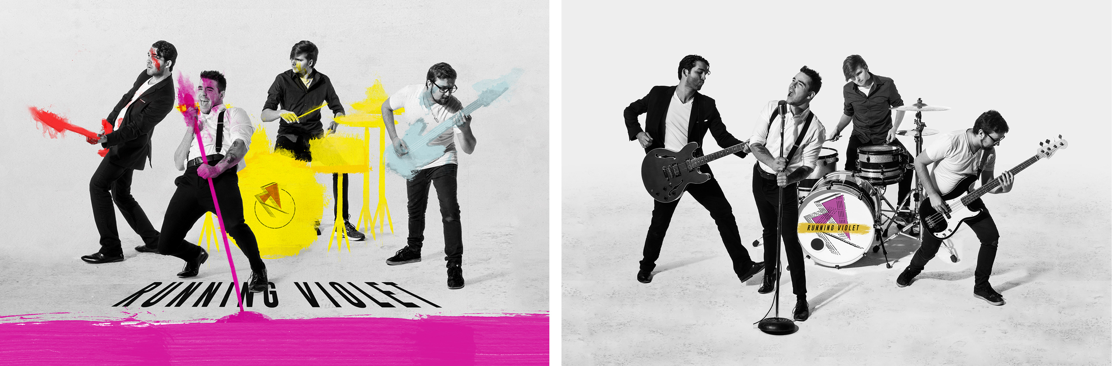
Running Violet is an ambitious Toronto based Indie band. A frequent headliner at the likes of Horseshoe Tavern, Cameron House and The Silver Dollar Room. However they don't shy from performing at the big stages; such as The Opera House and unique events like New Years at The Royal Ontario Museum. I was matched up with the band when they were still figuring out who they were. They had the sound, but they needed an equally compelling image.
Logo & Branding | Web & UI/UX Design | Print Design & Production | Photography | Copywriting | Social Media Content | Art Direction
02 Branding
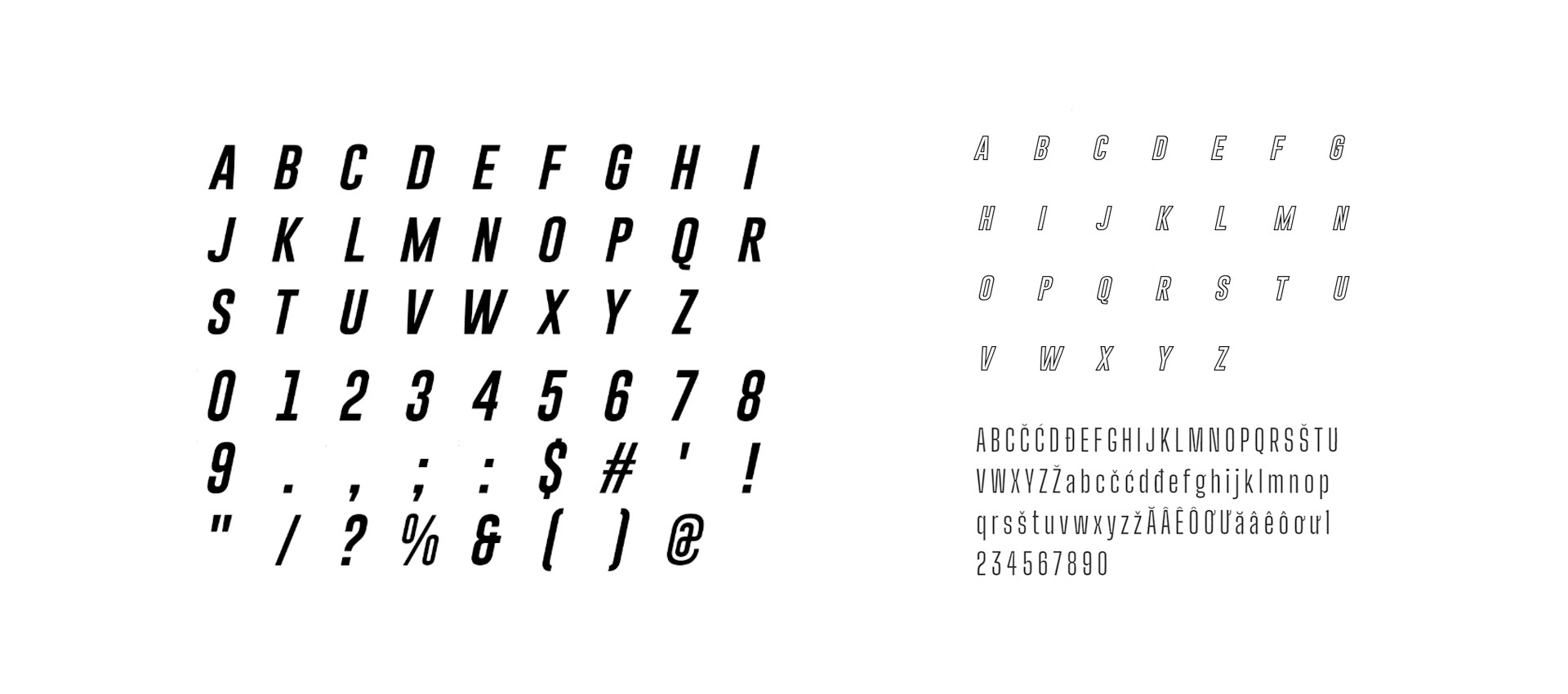
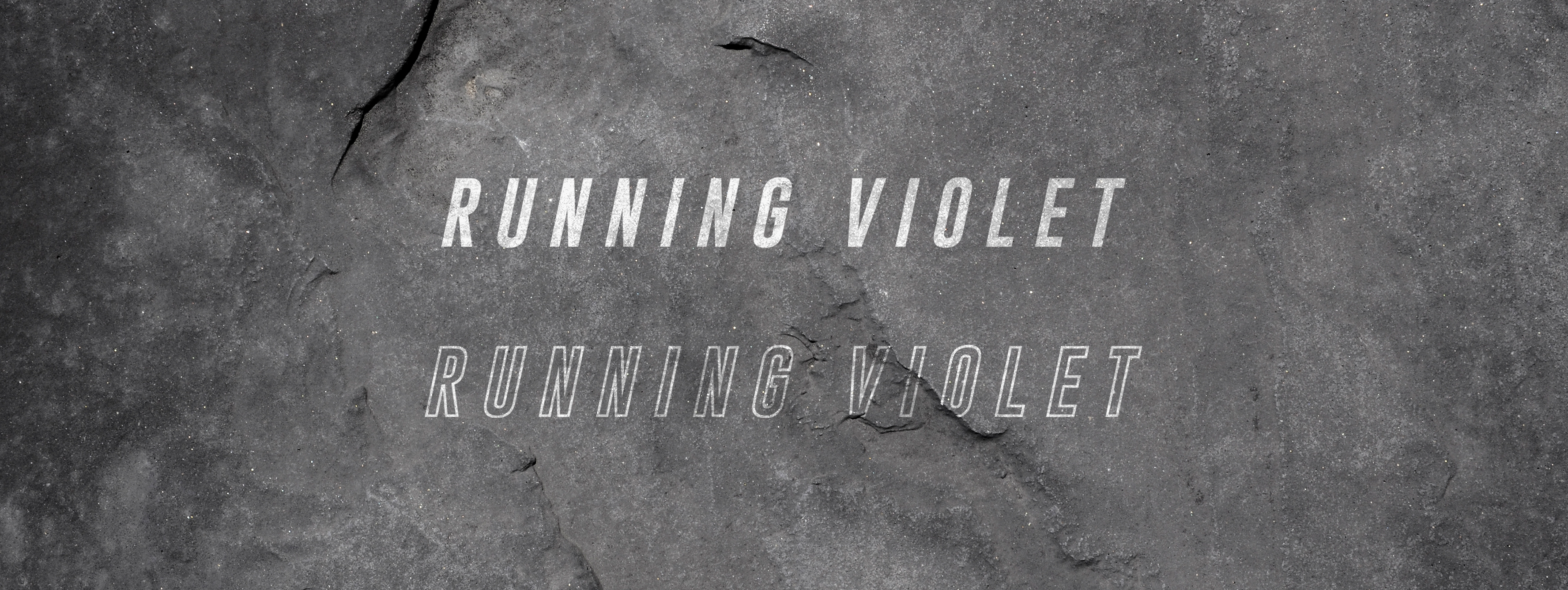
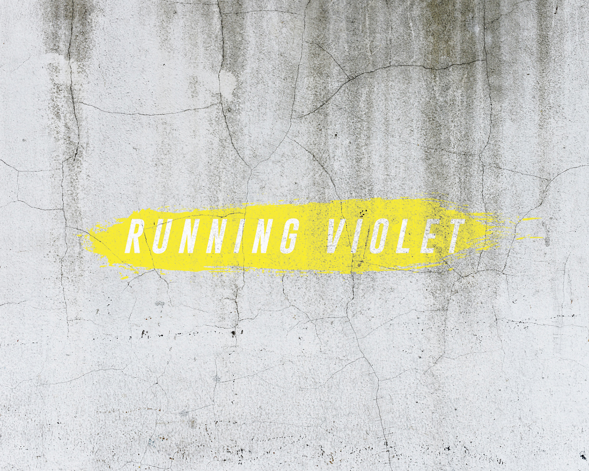
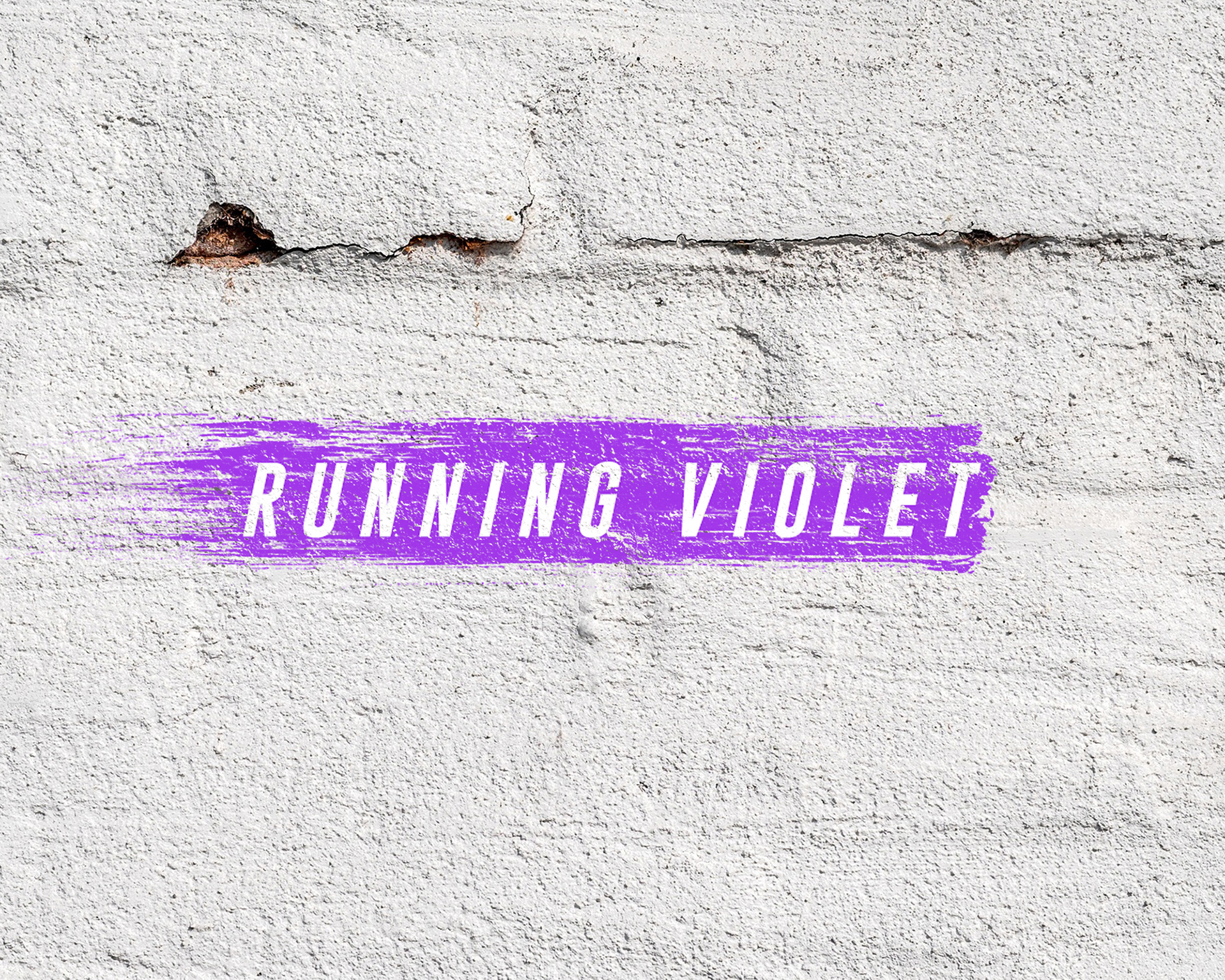
The Style Guide
I was not branding just the band, but also the look and feel of their first album. The plan was for them to change their visuals (i.e. music video style, album covers, websites, photoshoots etc.) as they changed their themes, subject matter, motifs etc from album to album, but still carrying something unifying as they move forward.
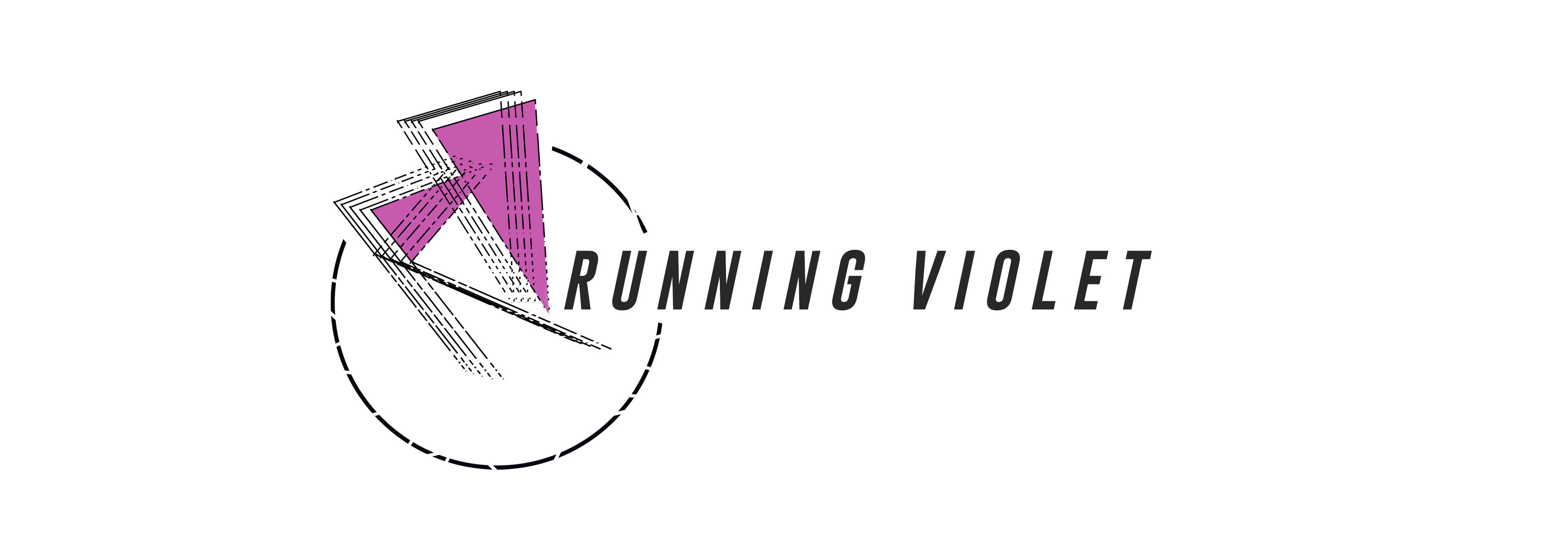
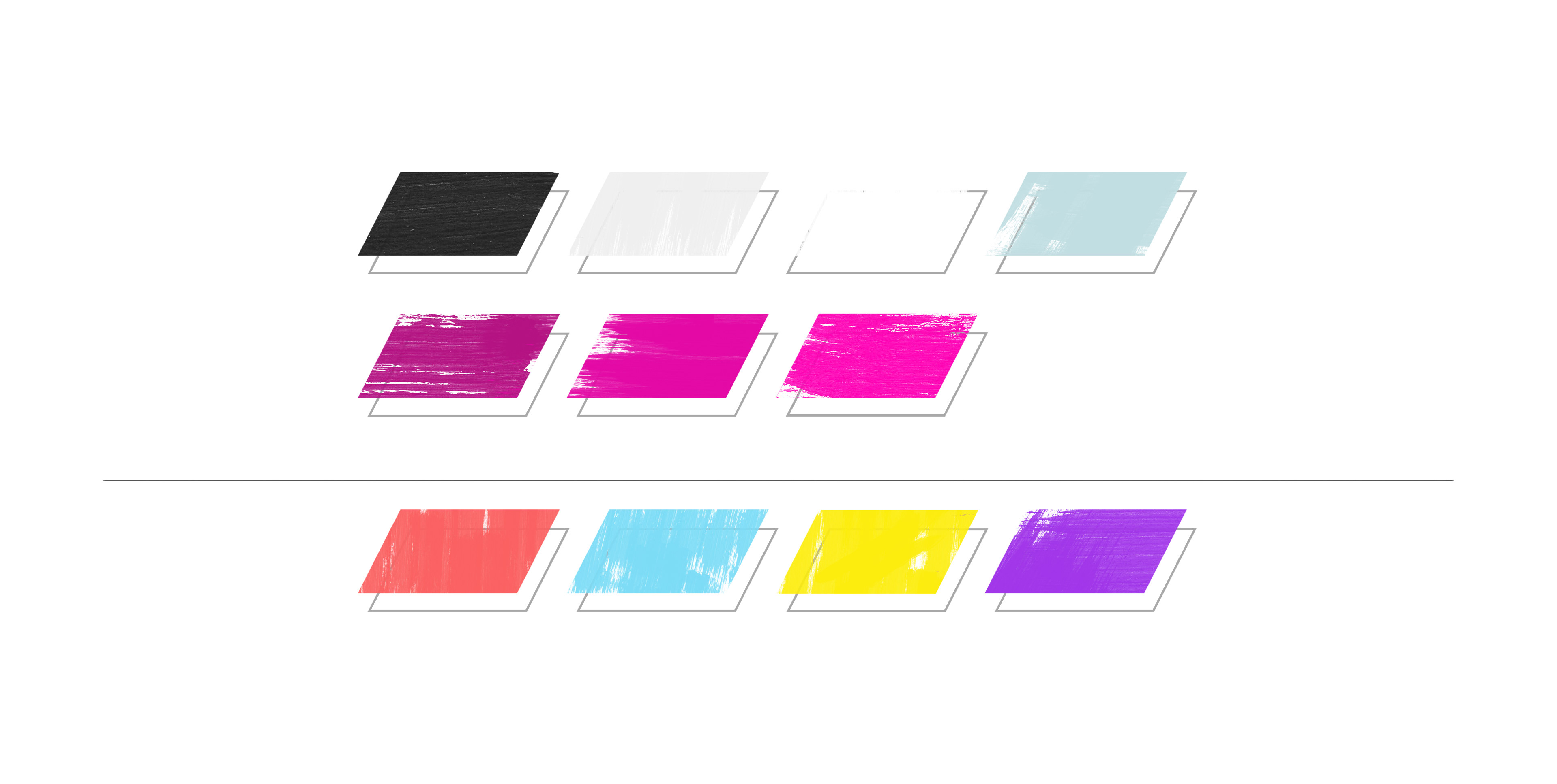
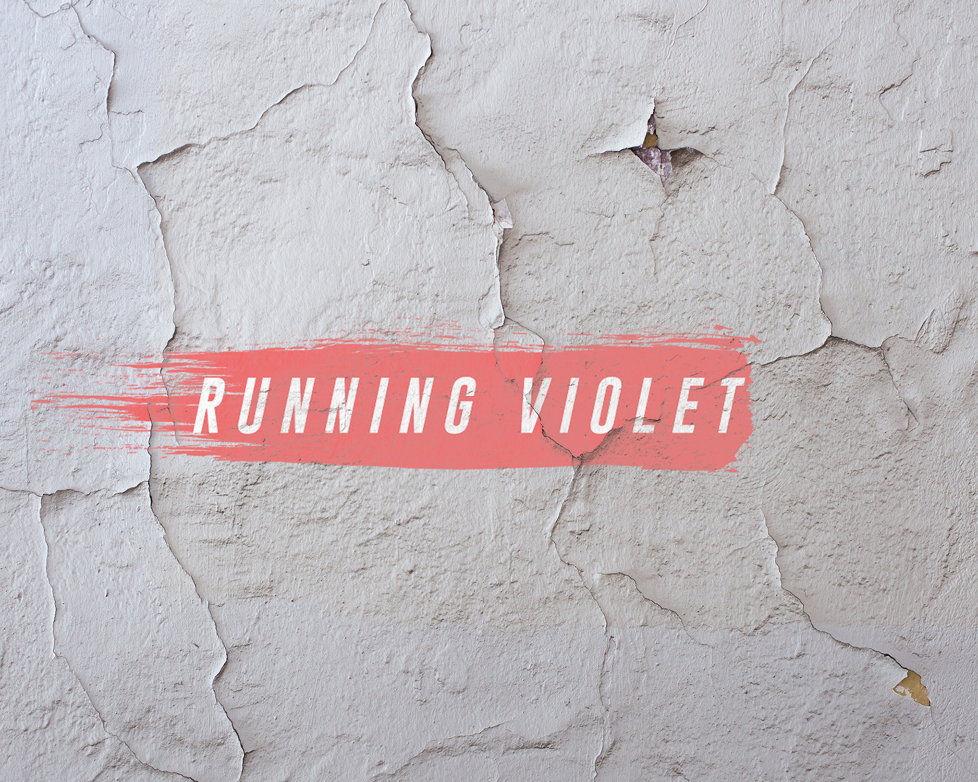
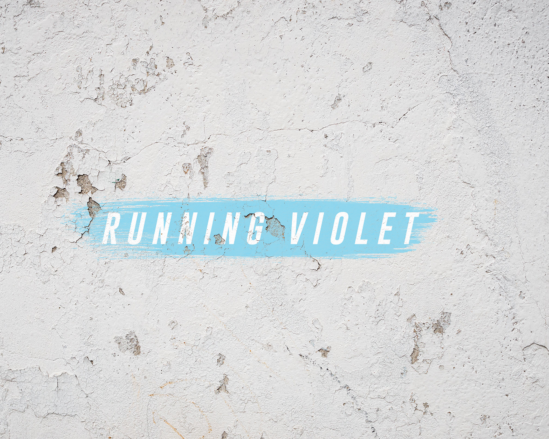
I wanted to capture the movement of their sound and their name. With an action like "Running" and color like "Violet", motion and saturated poppy colors were the two main elements I wanted to play with. The brush strokes, with italicized lettering always providing them with energy and direction, and the heavy font adding their gravitas.
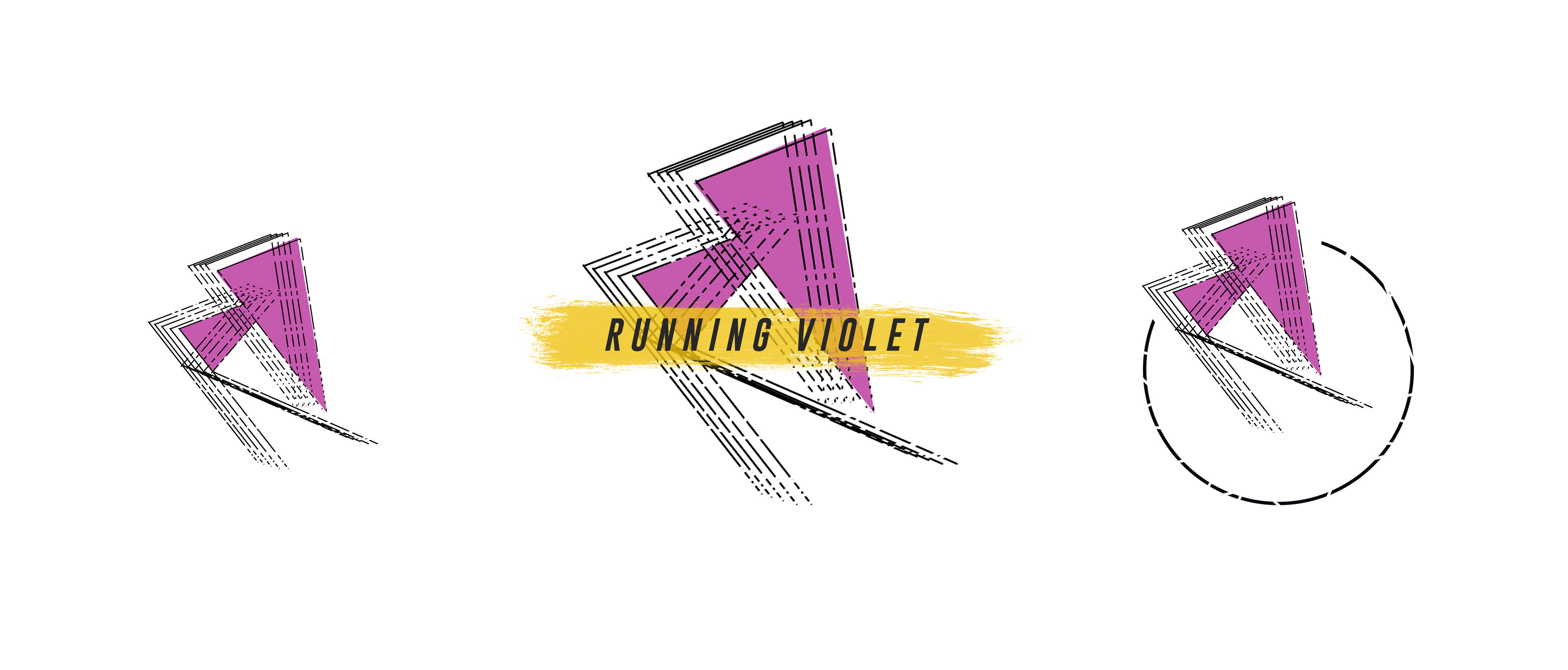
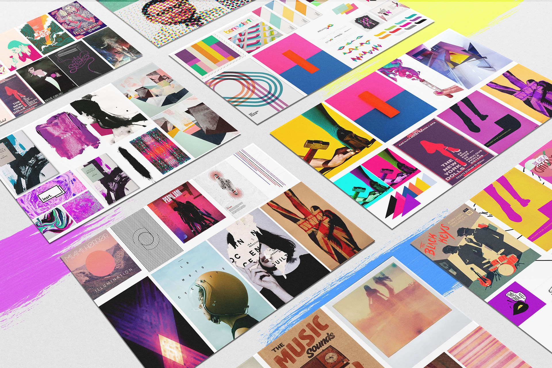
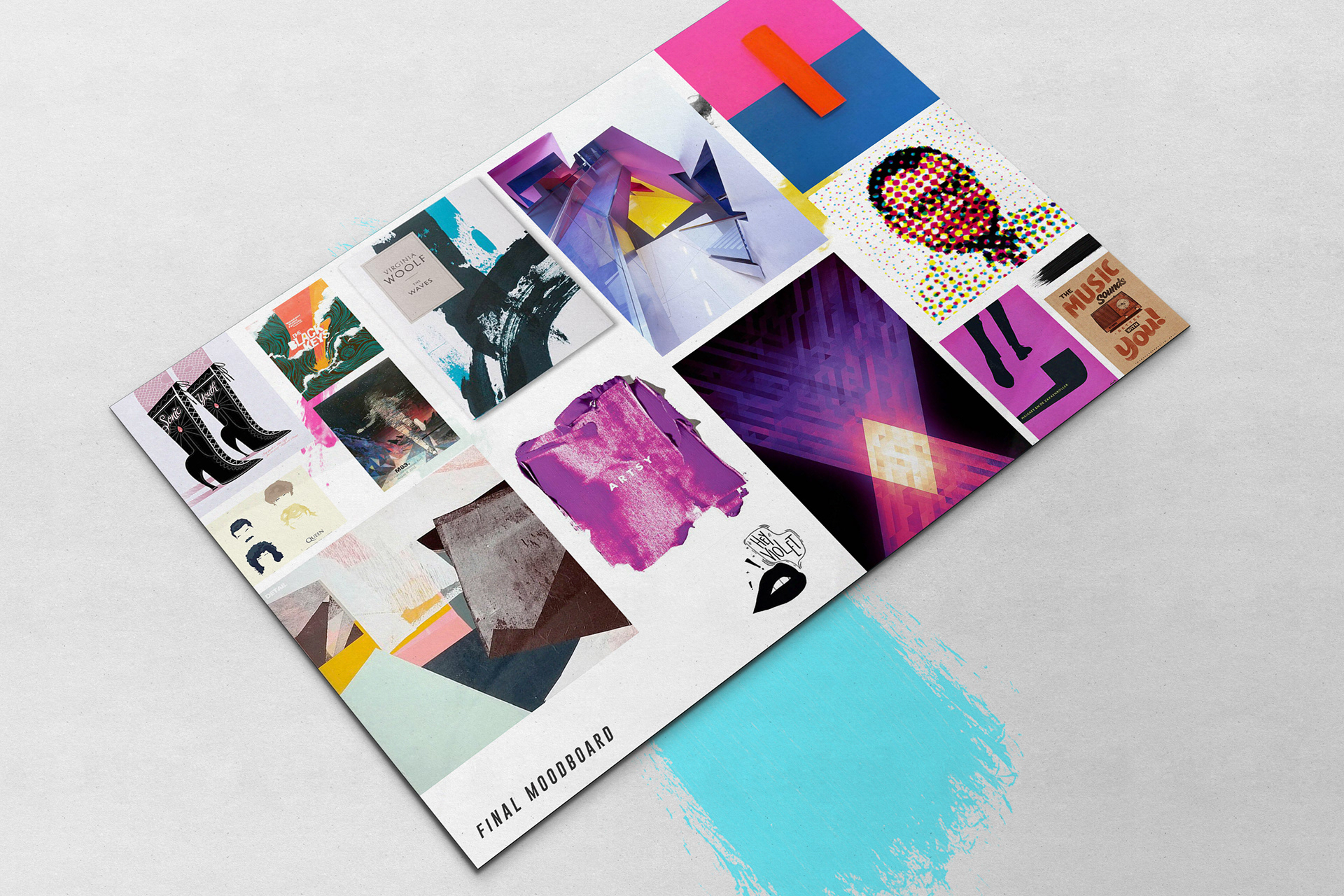
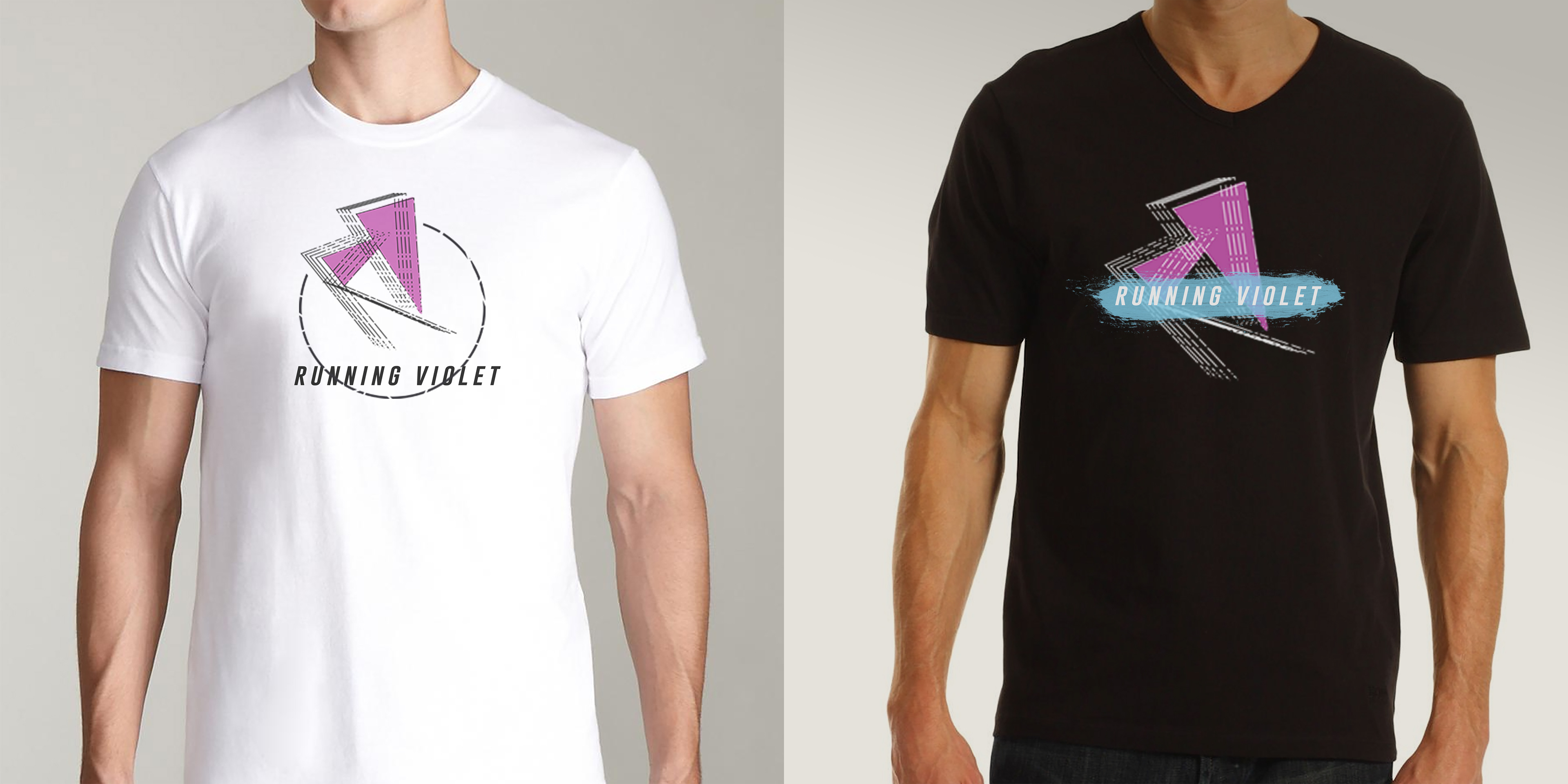
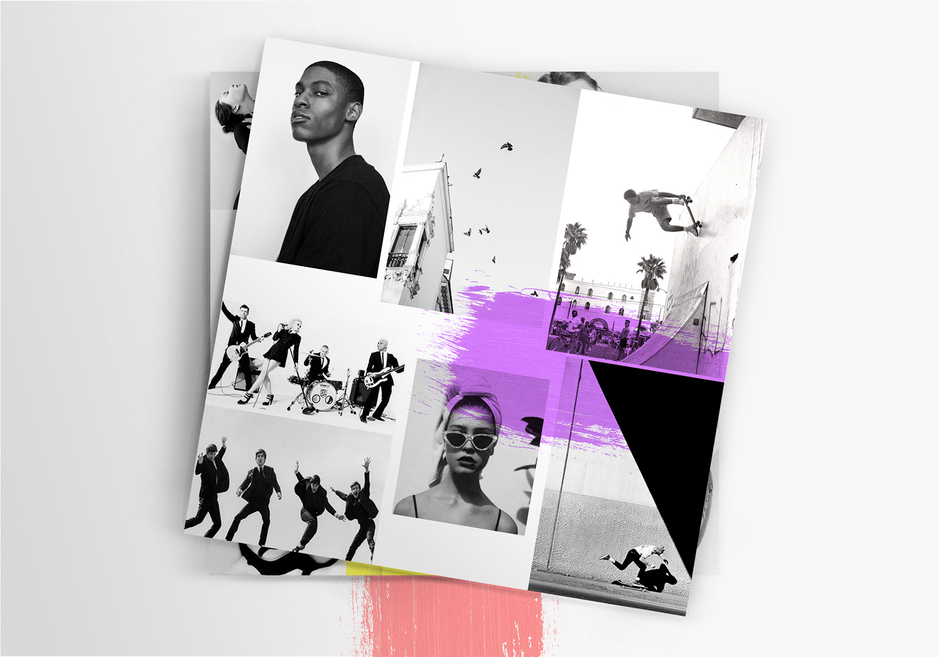
Acknowledging the band by their initials "RV" was also something that the band wanted. The core of the brand became a simple Lettermark “RV” logo. To elaborate on the core I created various mood boards to capture the different essence of the band, then brought it together in one unifying board that became visually identifiable as Running Violet.
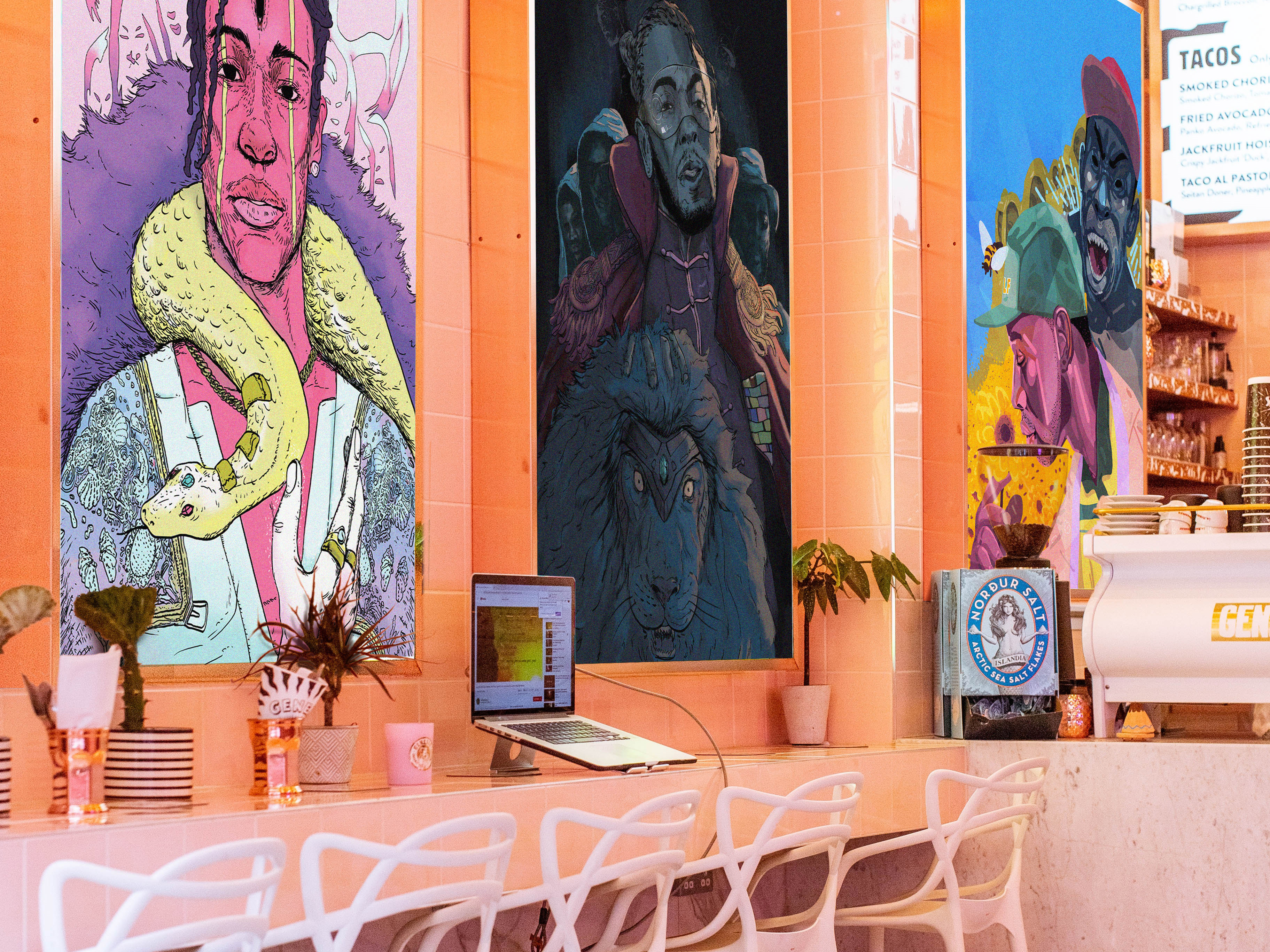
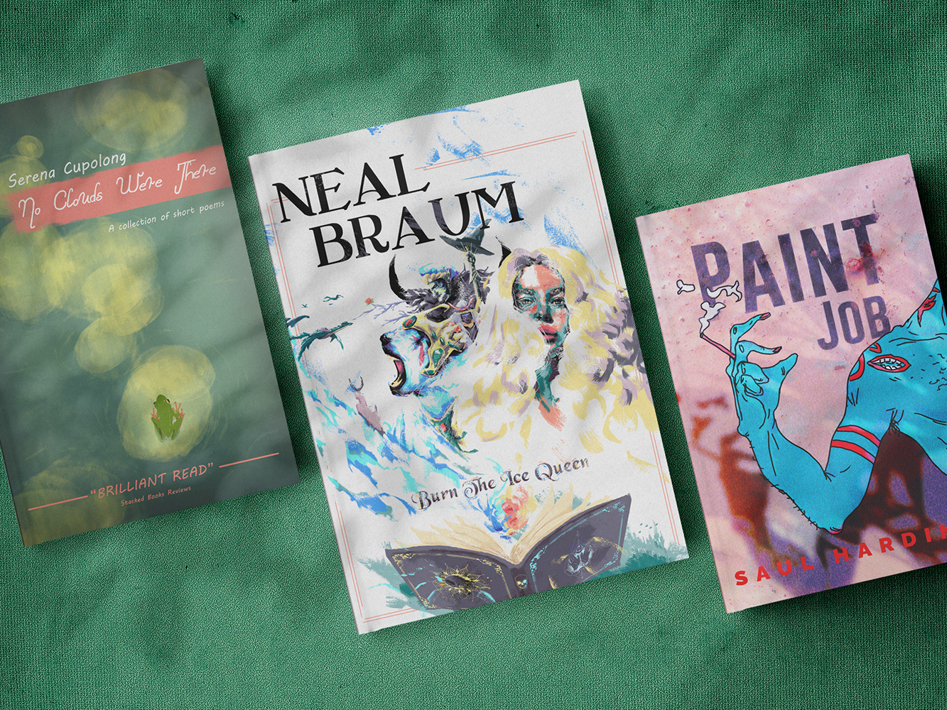
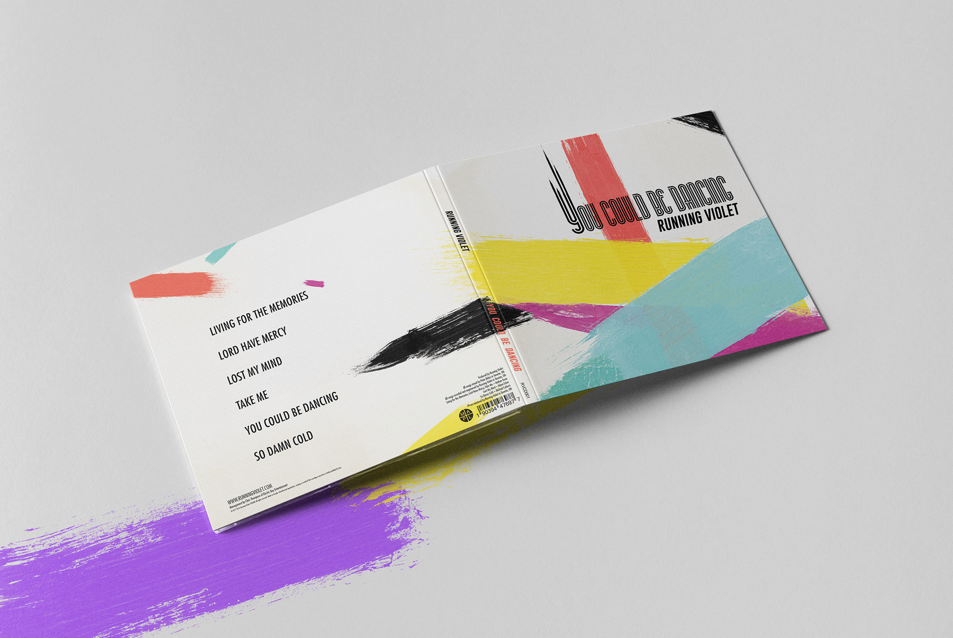
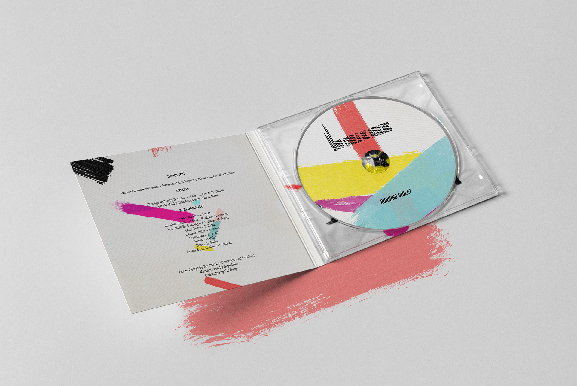
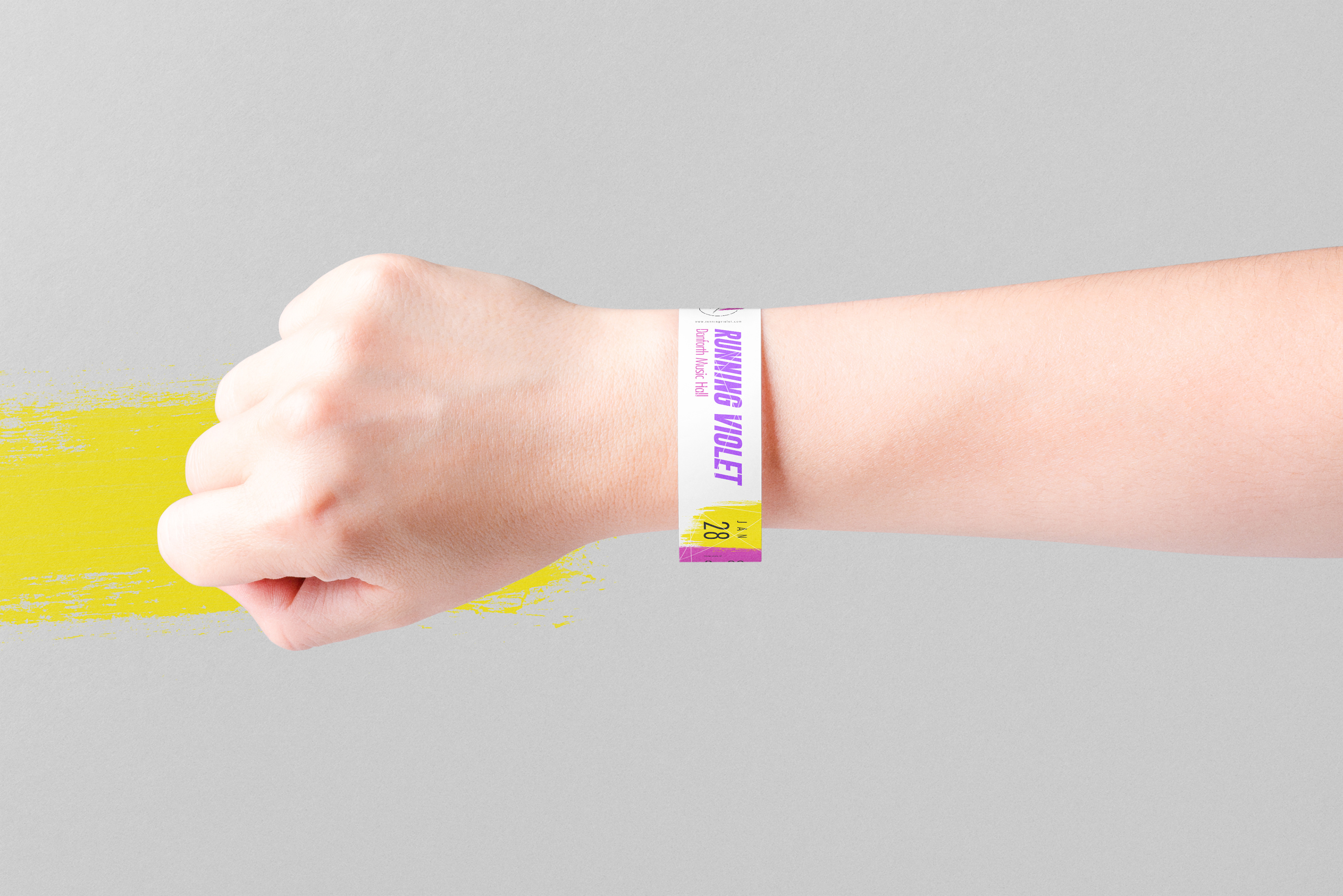
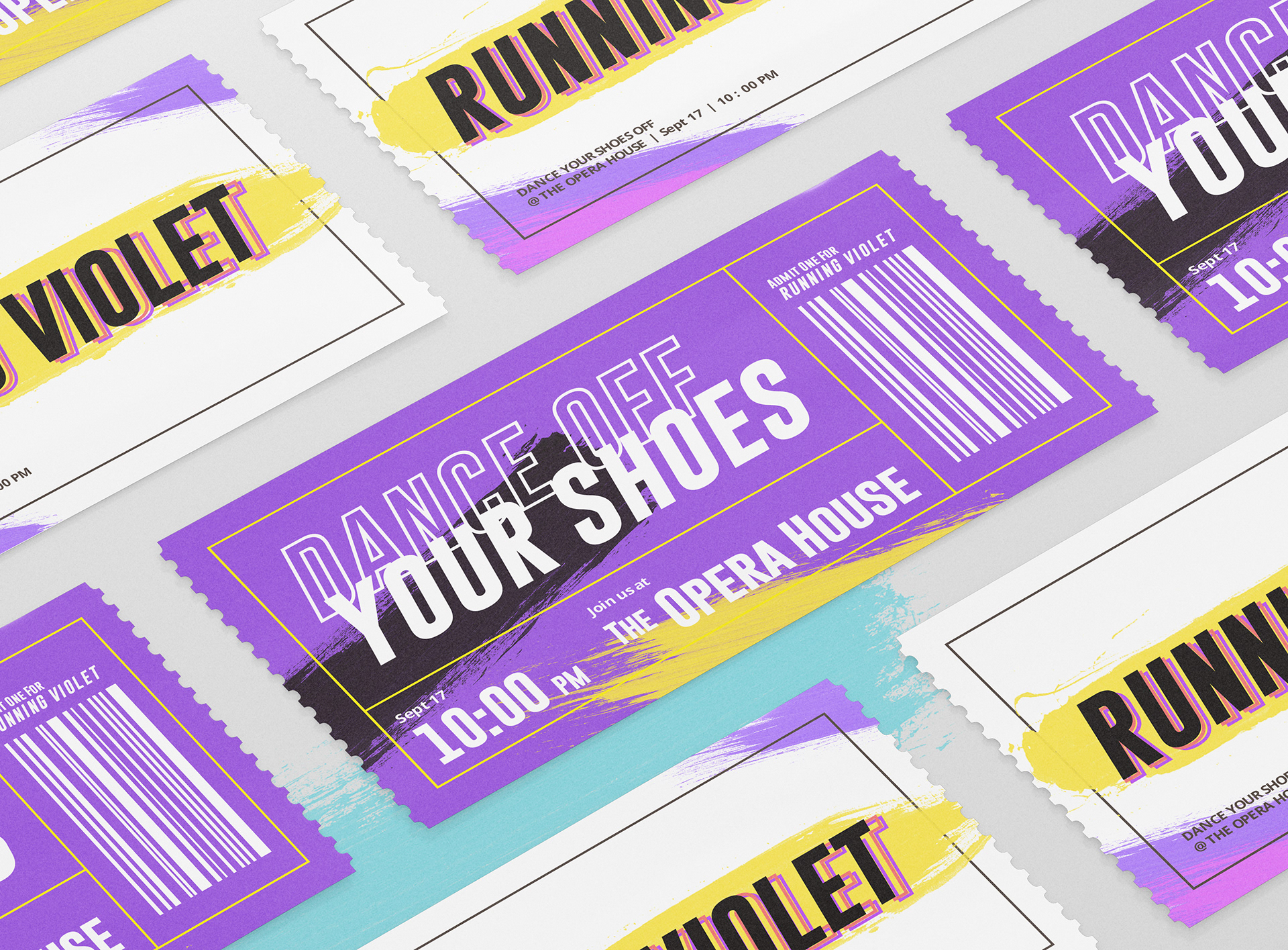
03 The Collateral
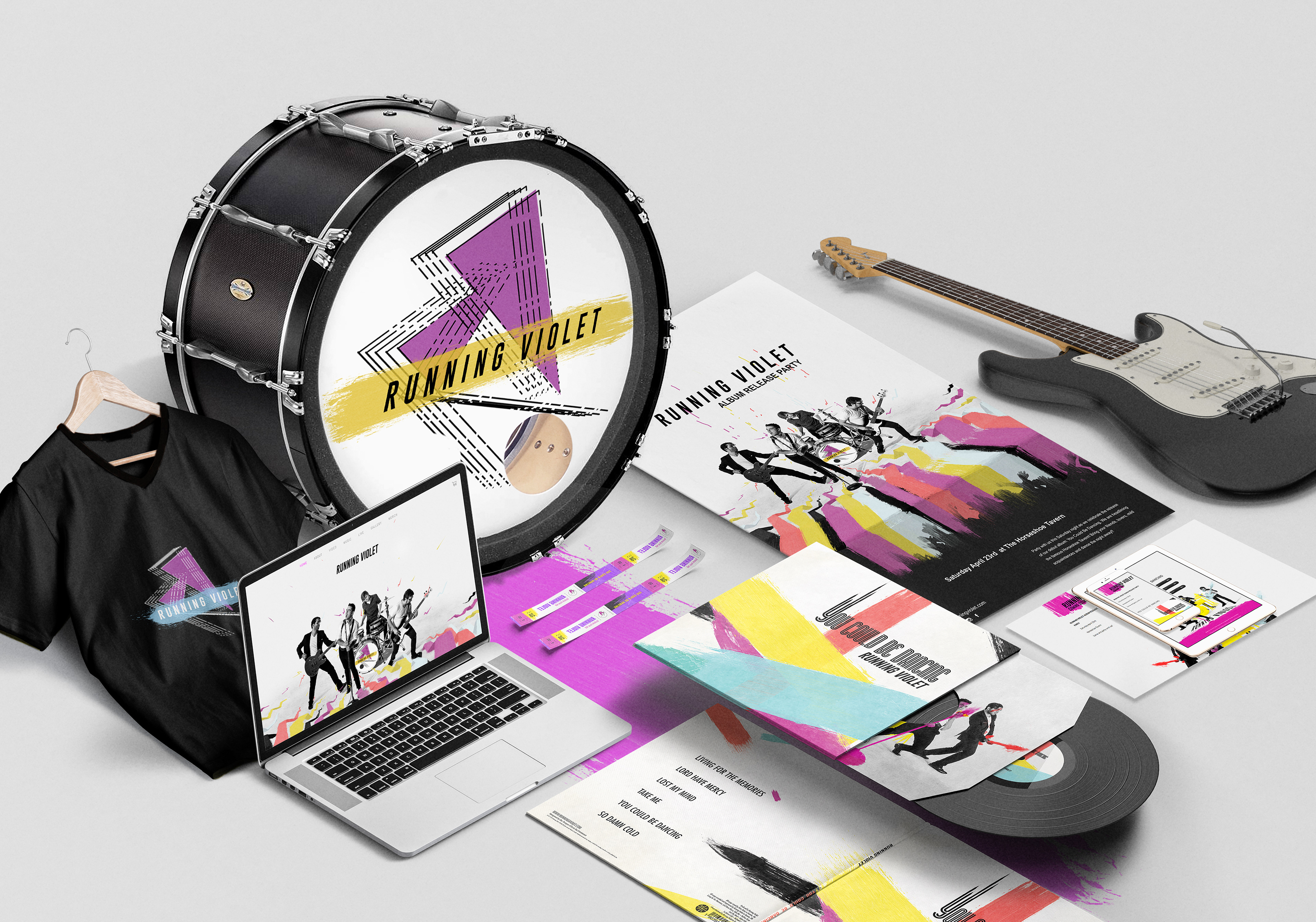
Getting it on PRINT
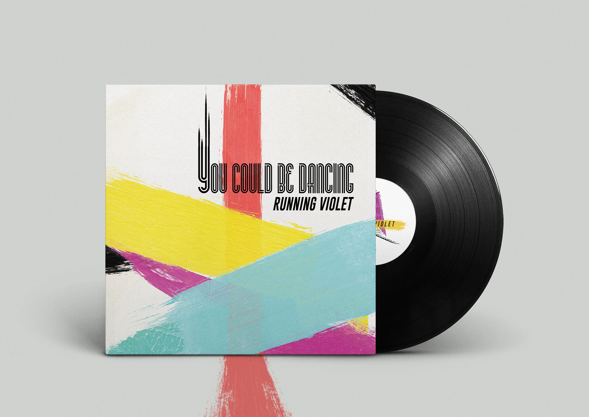
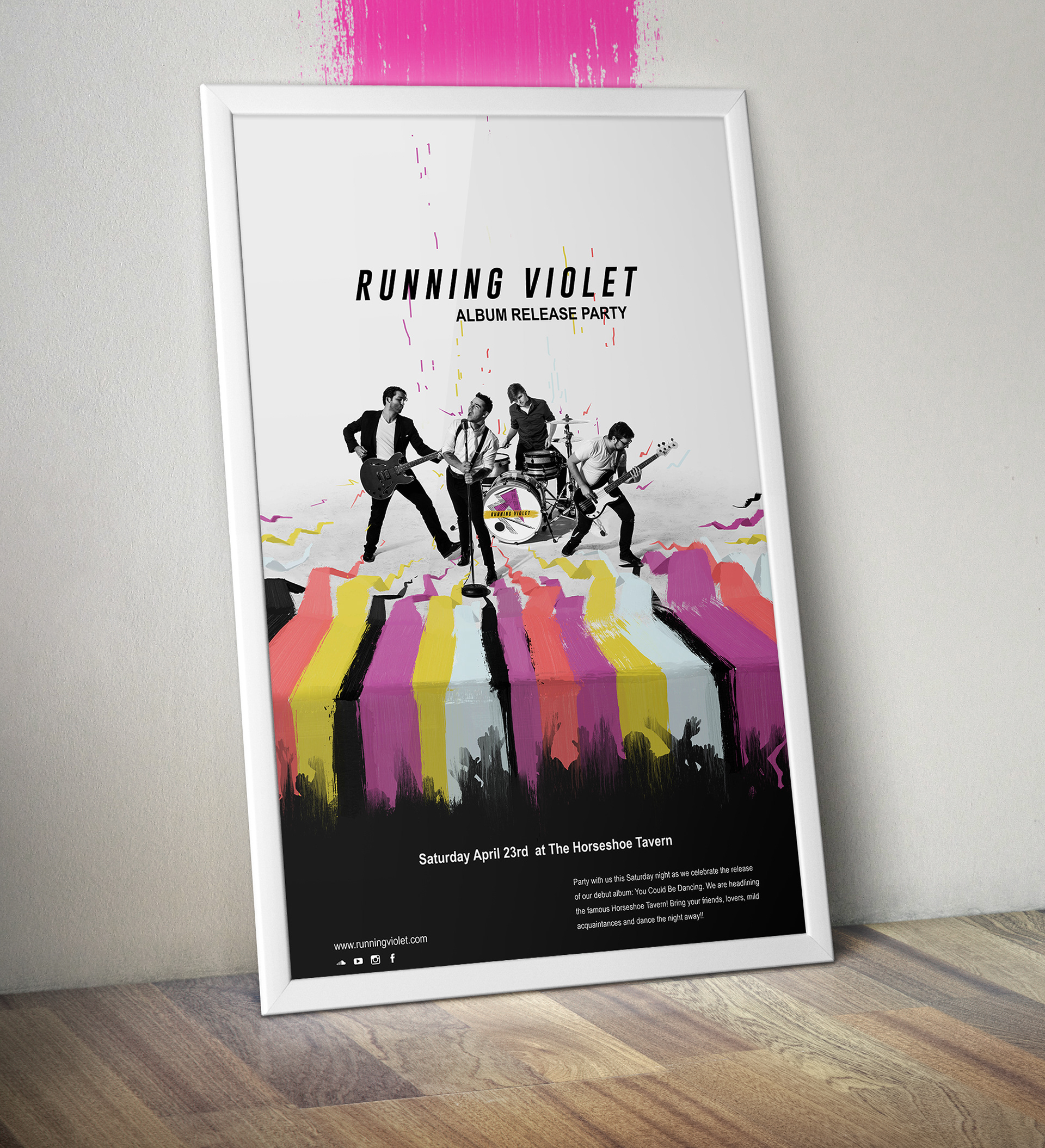
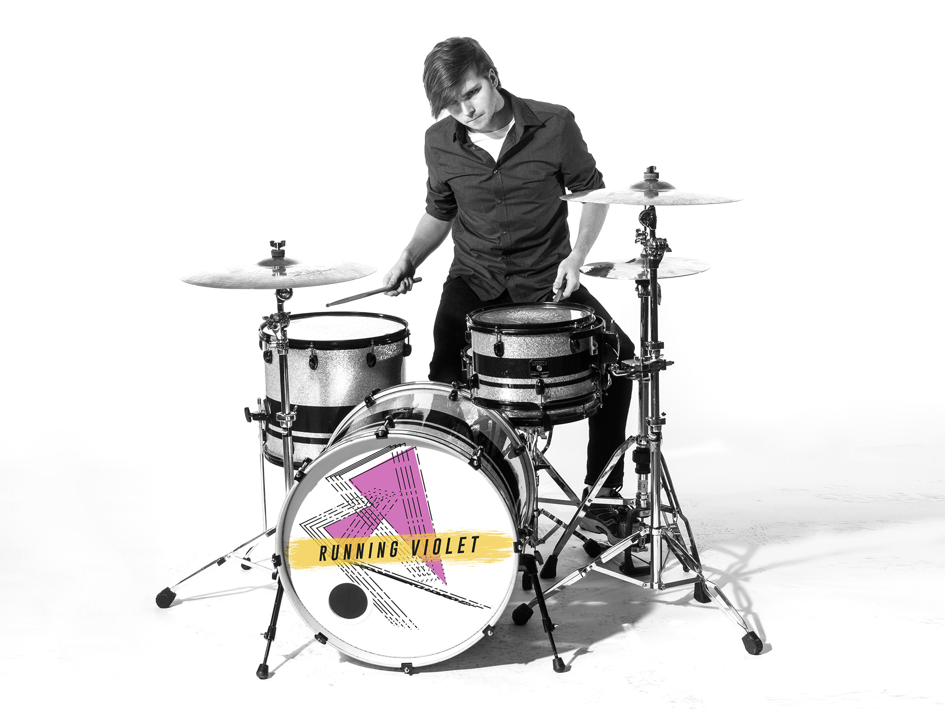
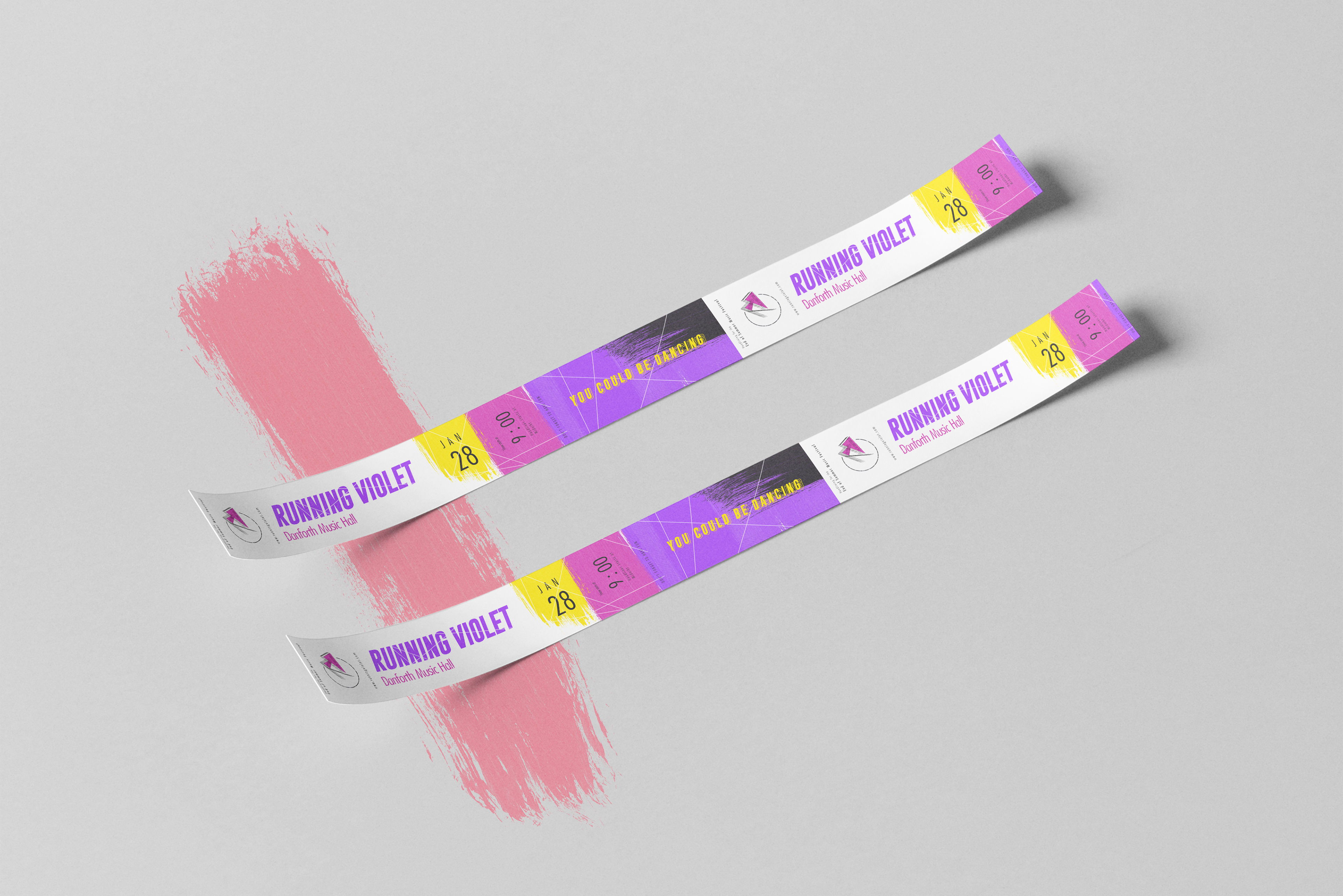
I had a chance to display the branding of the band on a lot of fun print materials. From album covers, to large promotional posters, to tickets and t-shirt, to (my personal favorite) the canvass of the bass drum. A piece the audience sees for every live show, for all the music videos, and more. Like the rest of the promotional, merchandise, and other print collateral; the design for the drum was a bolt of energy on a simple, white space background.
The album, and the poster (which was created to promote the concert in celebration of the launch of their debut album) were the two main visual elements that unified all the branding aspects, from the photography style to brush strokes to the bold italicized typography. Later on it also inspired to create the merchandise and event tickets, providing a harmonized look for each live show. Layering the band’s sound with a strong cohesive visual imagery.
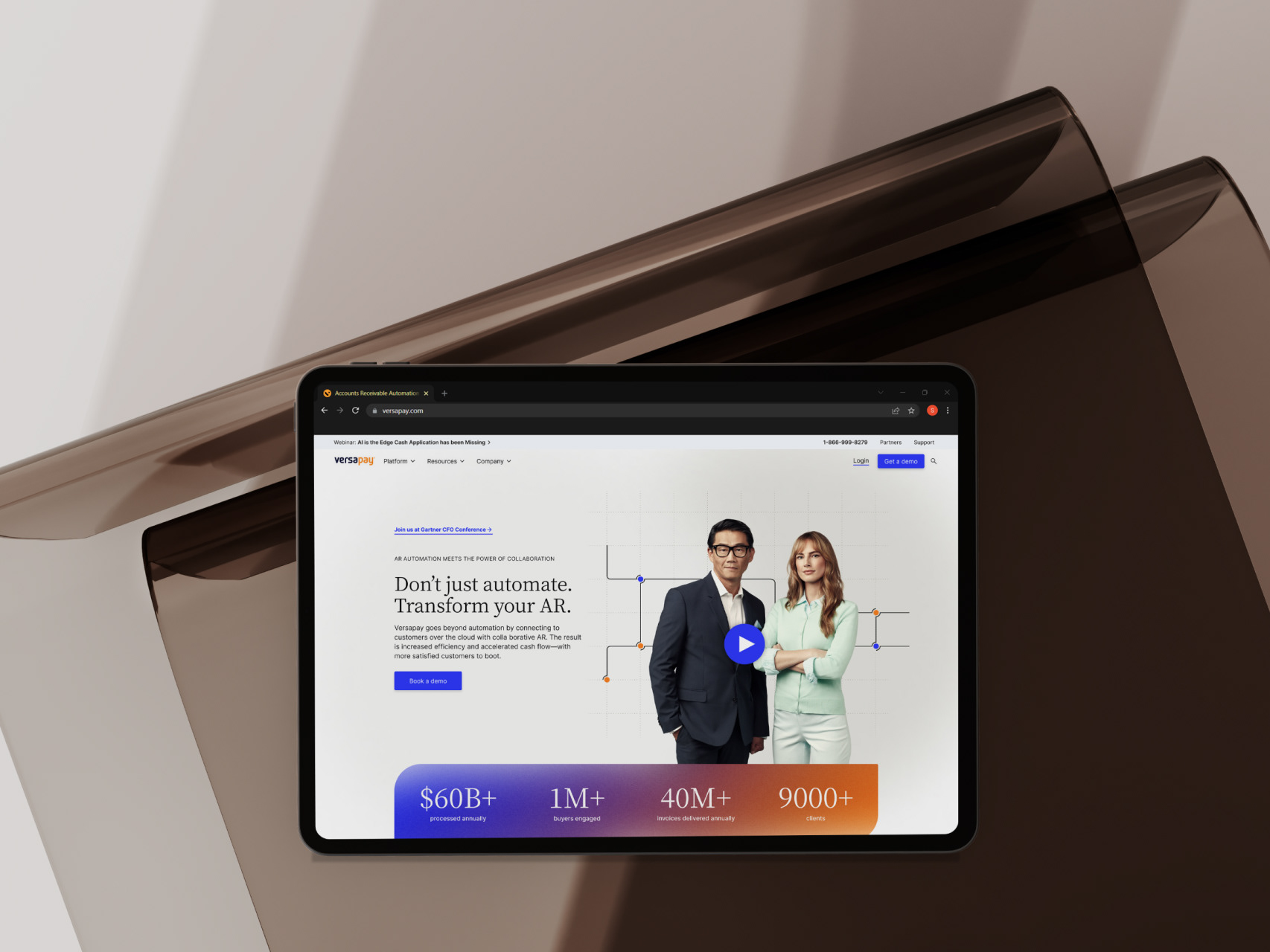
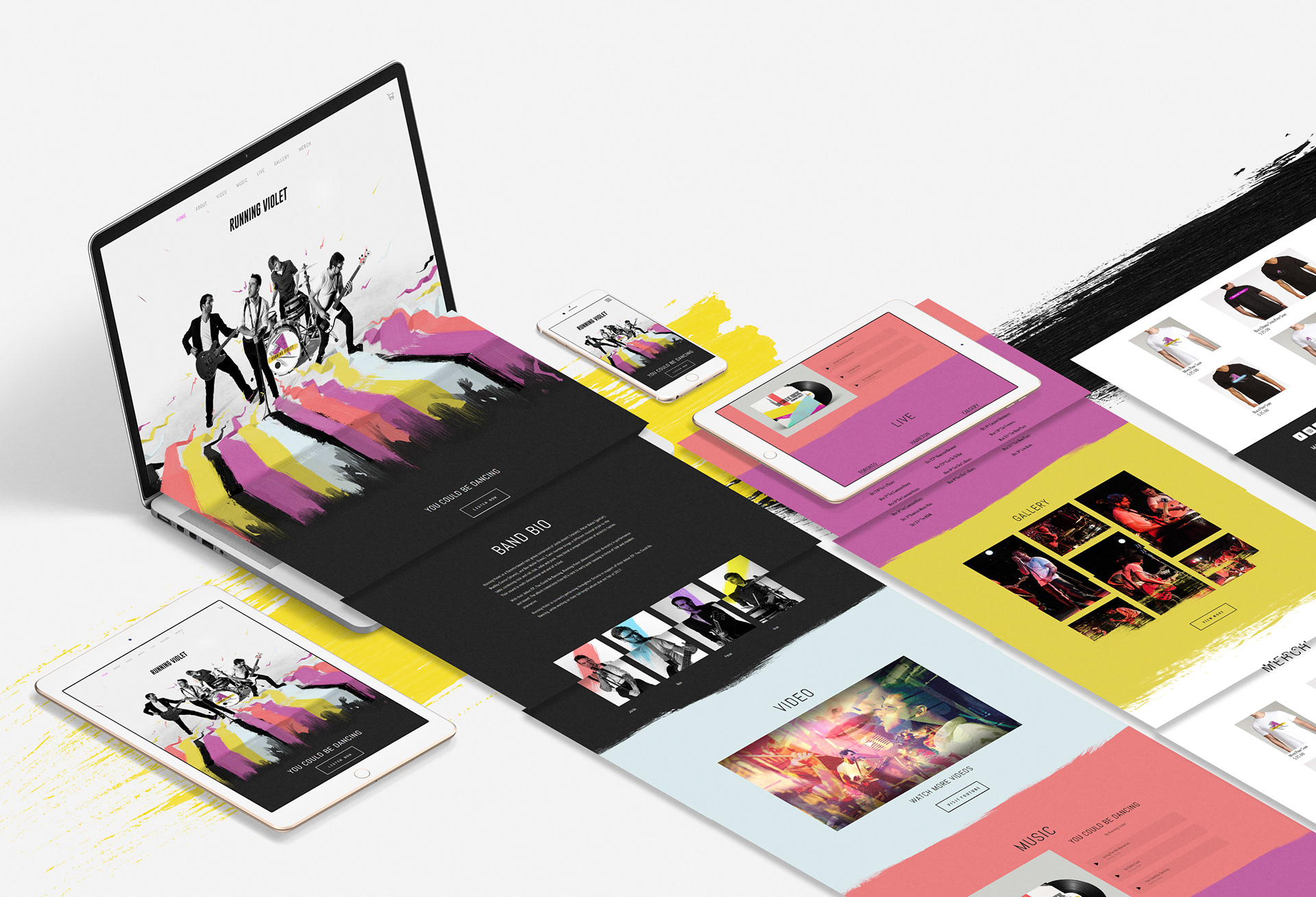
04 Website & Social
the Digital presence
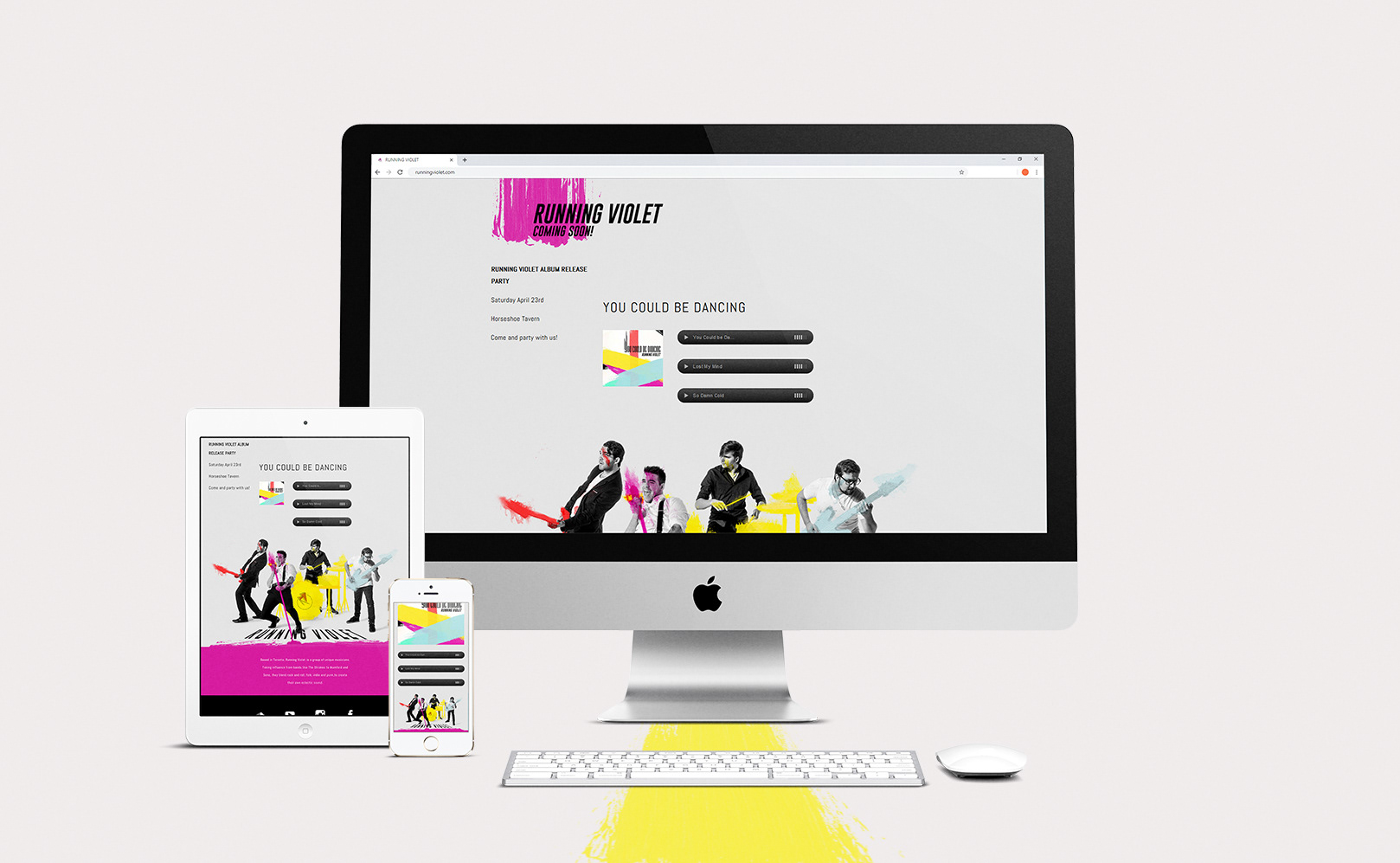
For the website I decided a simple one page vertical scrolling site would be the most beneficial. Everything in the grasp of the user, and since the site would be much more media heavy as opposed to information it would not be overwhelming.
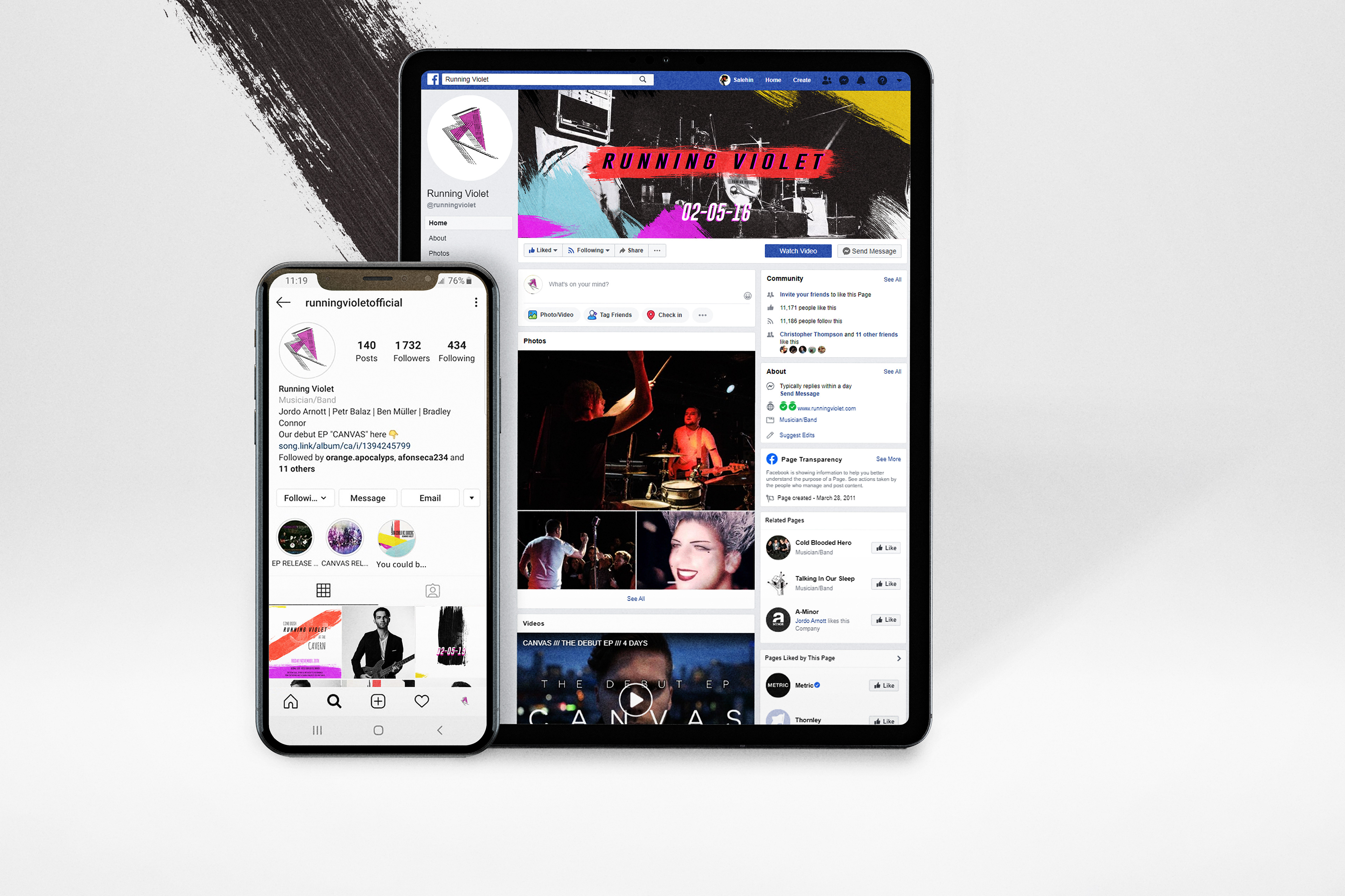
I separated each section with the strokes and colors; further emphasizing the playfulness and movement of the brand. To start things off I hit the viewers with an adaptive web version of their Debut Album Release Poster, just when they land. Giving Running Violet the larger than life presence they deserve. I then brought along that similar look and pacing on to the design of their social media posts.
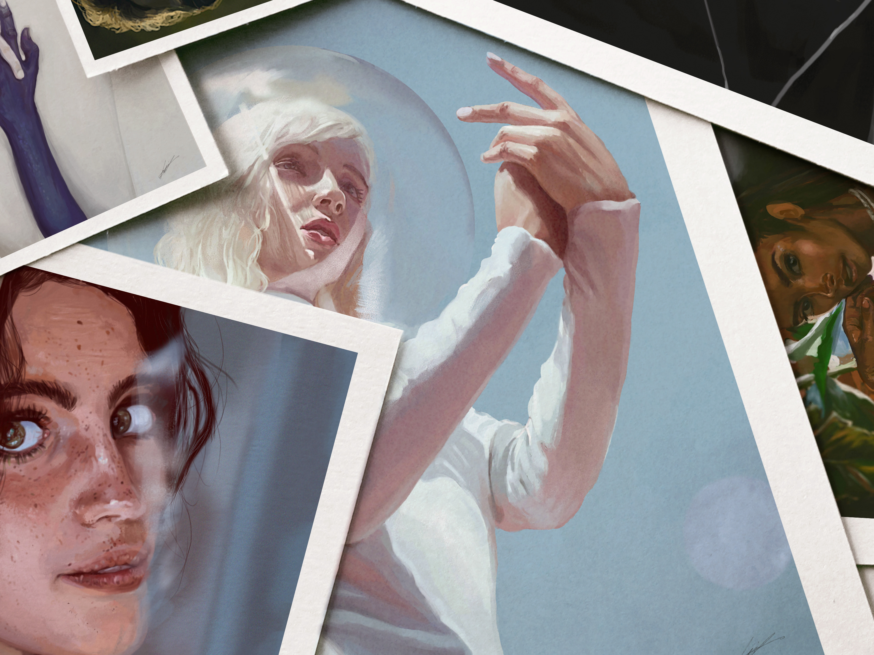
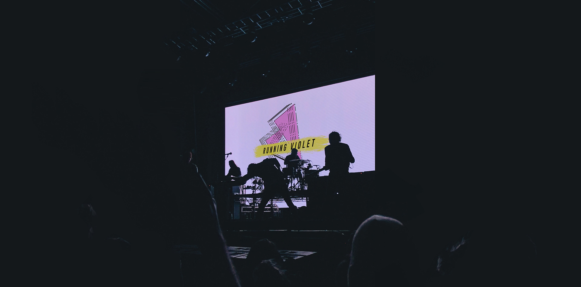
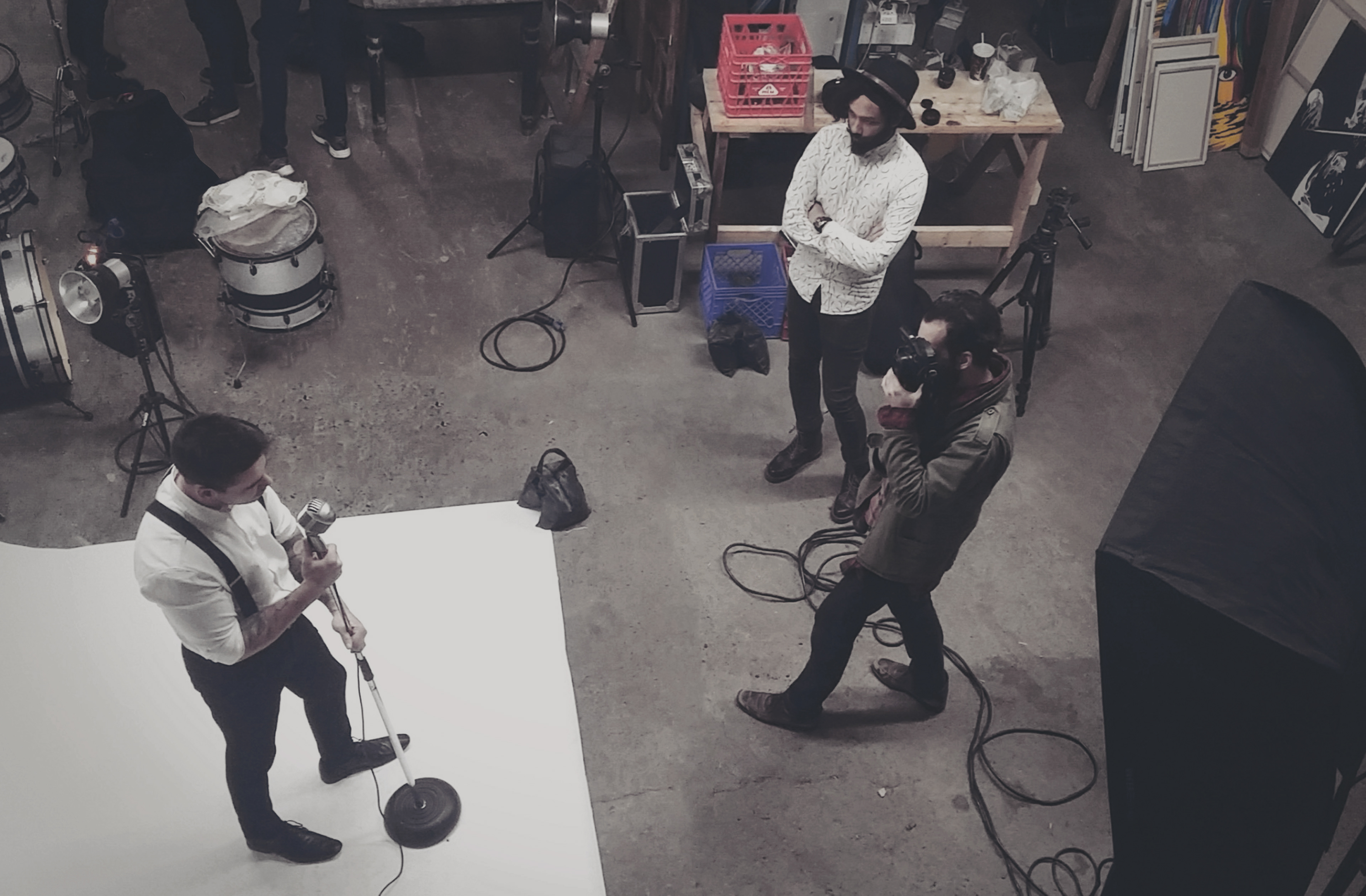
05 Direction in Photography
balancing the extensions
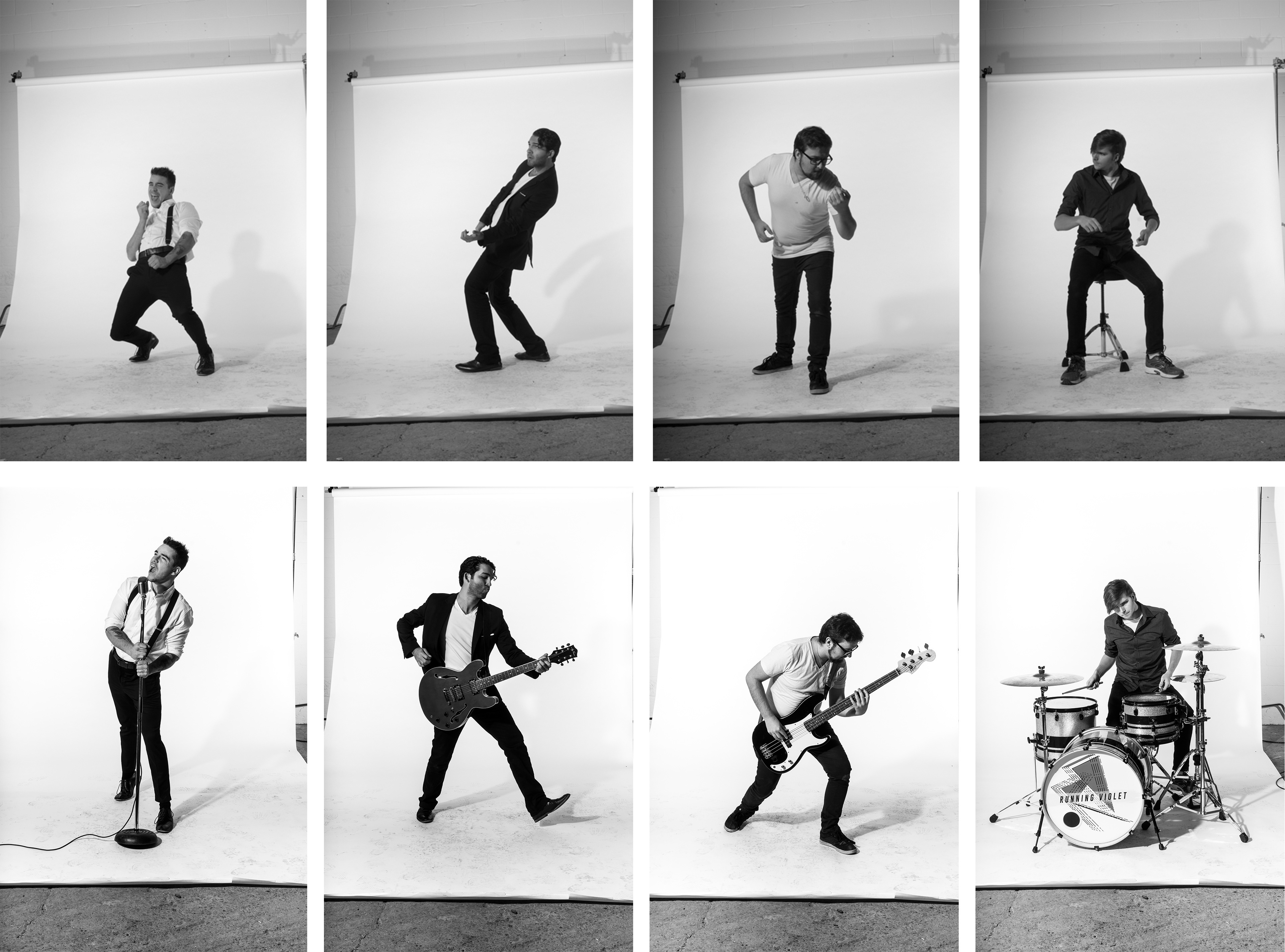
With the brush strokes being prominent, bold, and colorful, there was a need for other elements to be subdued. The photography was styled in black and white for that reason, even the clothing choices for the photo/ video shoots were black and white, and somewhat formal, so the unrefined energy from the brush strokes seemed even larger in contrast.
As any other visual element, it was first researched and mocked up, to take the theoretical into the physical. To understand the lighting, tonal values on paper and implement them on to reality.
06 Synopsis
running violet
2017
Branding for bands is usually an unique experience and this was no exception. I had the pleasure of fully constructing their unique visual story for their debut to the Toronto music scene. A complete look coinciding with their first album: "You could be dancing".
Furthermore, since the look and feel of the band was going to change from album to album I had a chance to really dig in and listen to their songs, and lyrics and was able to bring forth the paint stroke/ splatter visual that is apparent in every element. Providing an extra layer of depth that is sentimental and true to the characterization of Running Violet as presented in their debut album.
___________________________________________
Thank you for viewing!