


01 Overview
MathemaTIC (Part 1)
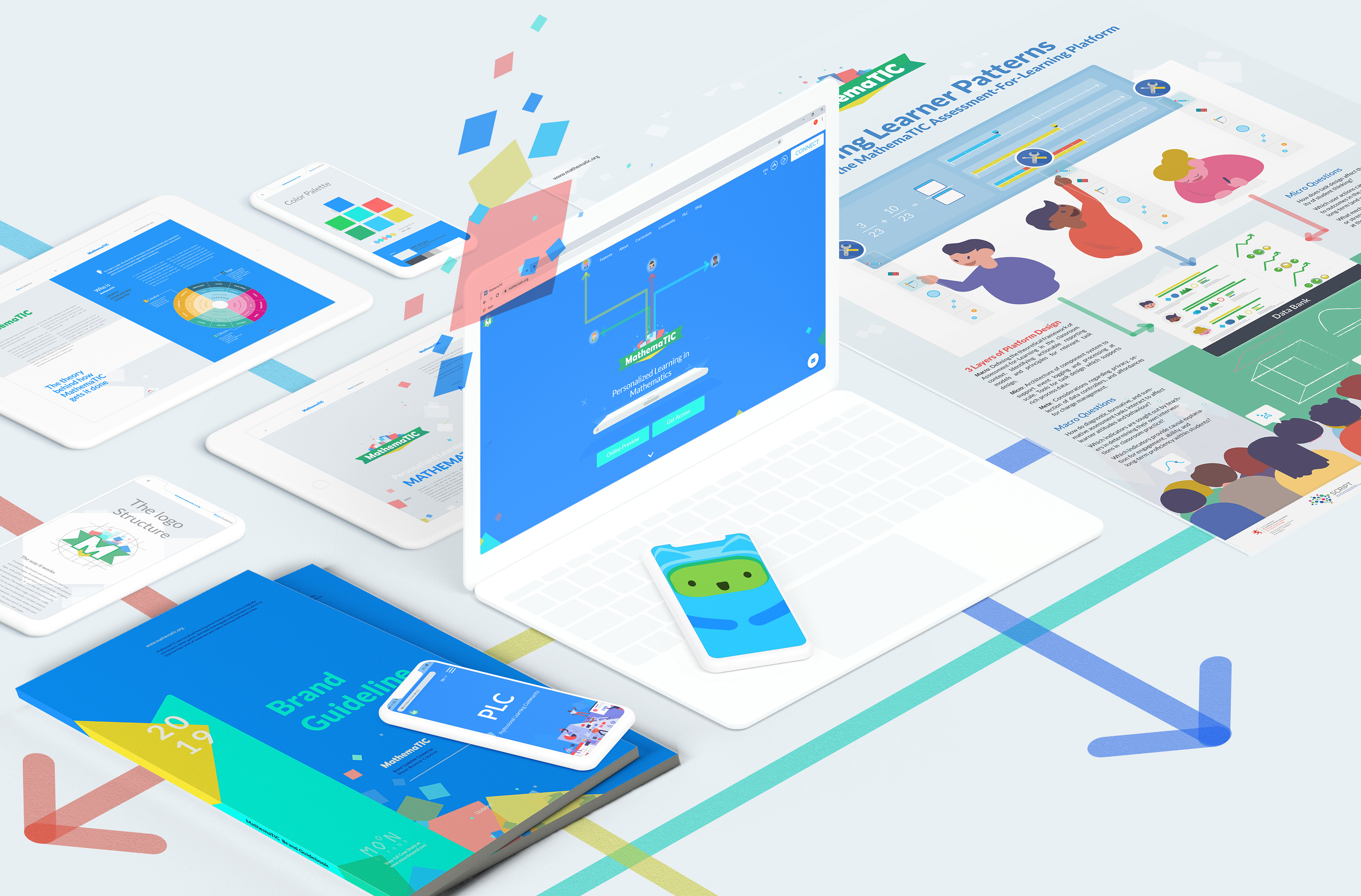
MathemaTIC is a personalized learning platform for students to engage in, and have fun while learning math, in primary and secondary schools. Students work through interactive mathematical items and are provided with adaptive scaffolding to activate prior knowledge by using several learning strategies which lead to adaptive help-seeking.
Logo | Branding | Web & UI/UX Design | Production | Photography | Typography | Illustration | Animation | Art-Direction | Print | Marketing Design

02 Context
THE SPLIT
This project had many different elements so I have decided to split the case study into two parts for the sake of presentation. This case study showcases primarily the Branding and Web Design/ Development side of the project, whereas part 2 displays Product Design/ App Development and Game Design (which also includes animation elements such as character design, storyboarding, layout, art direction etc.)
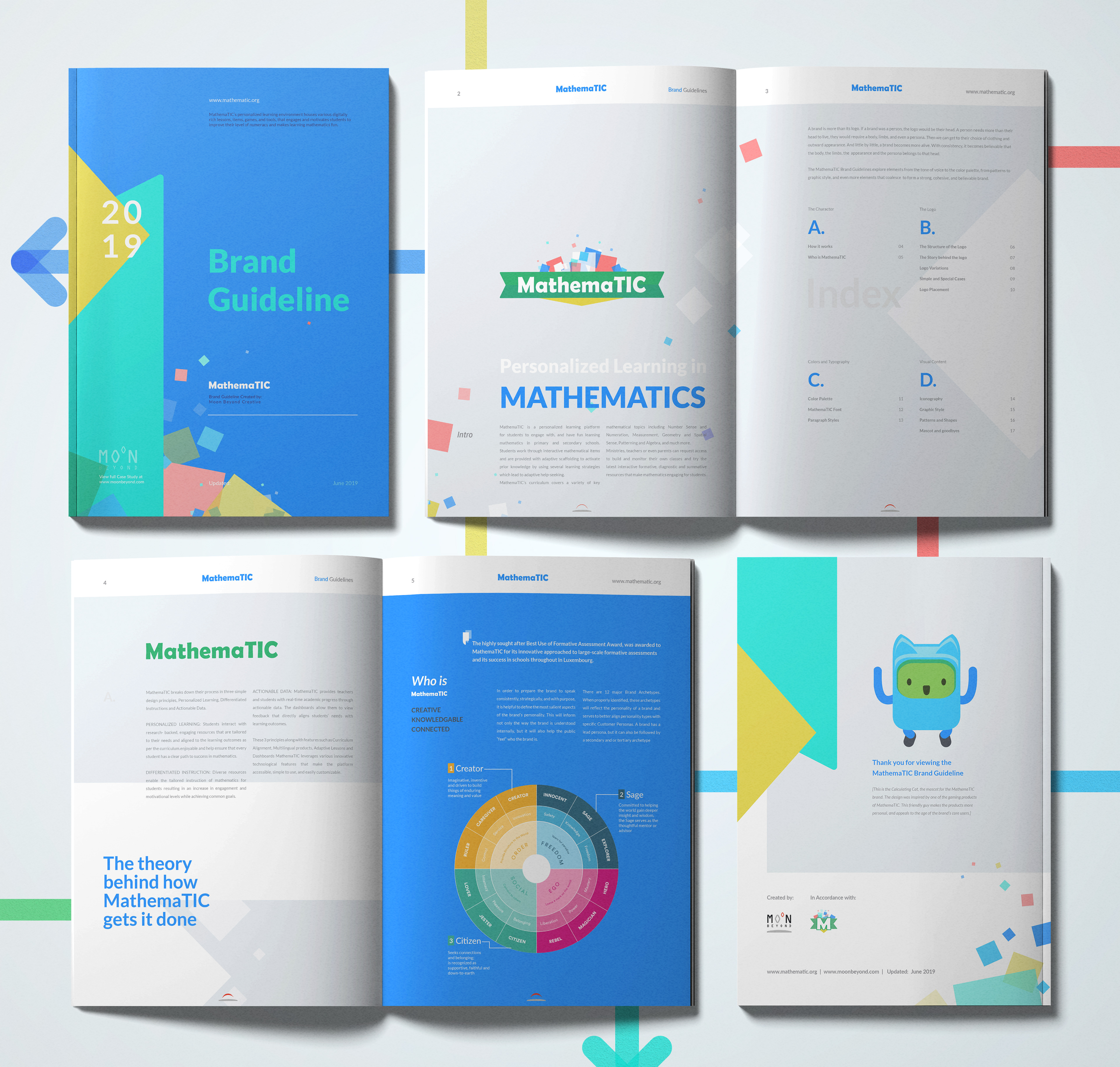
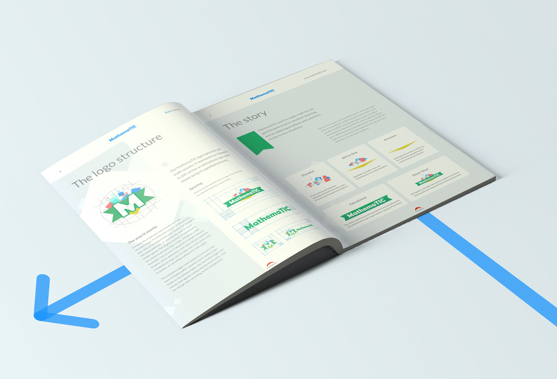
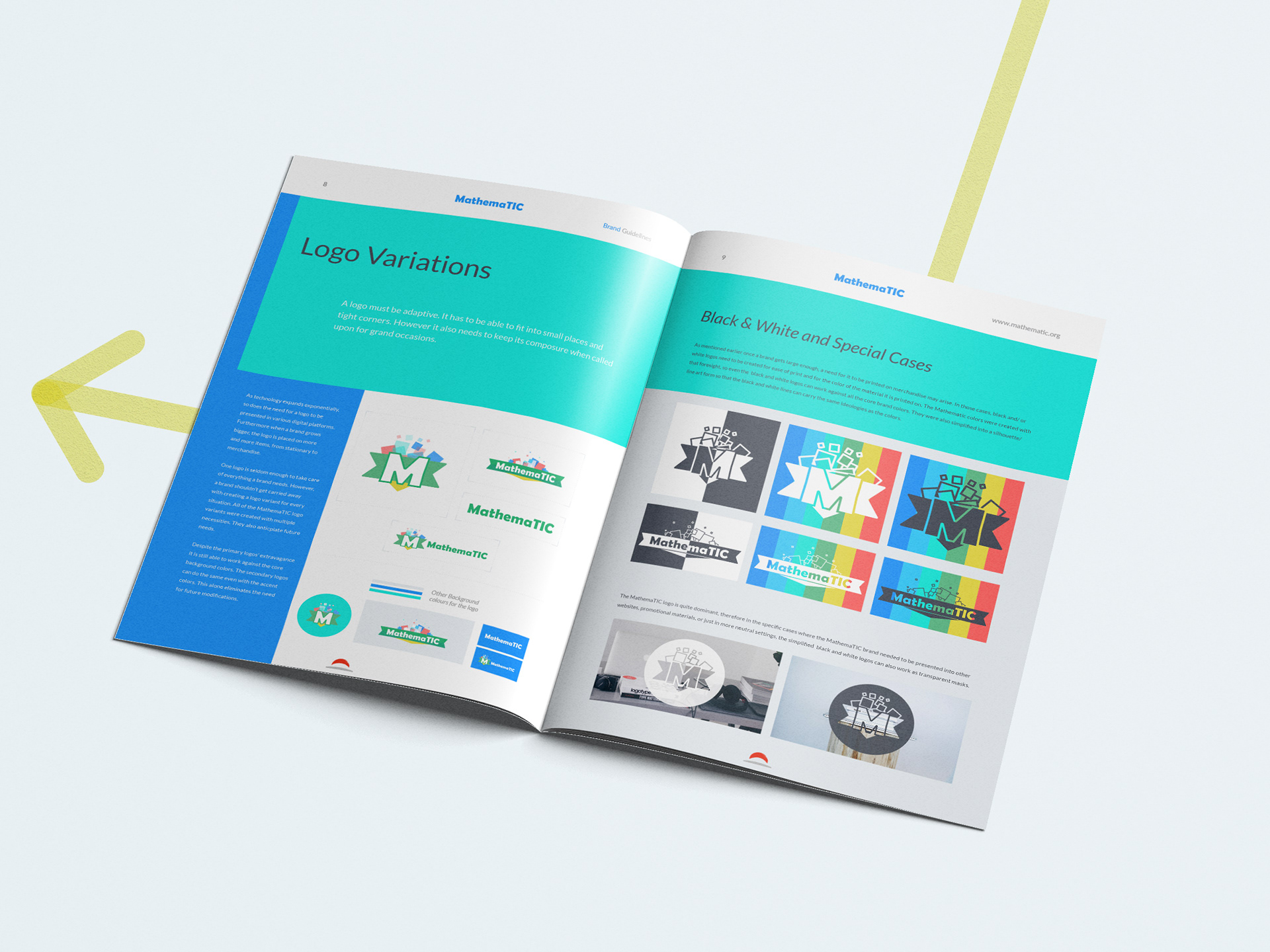
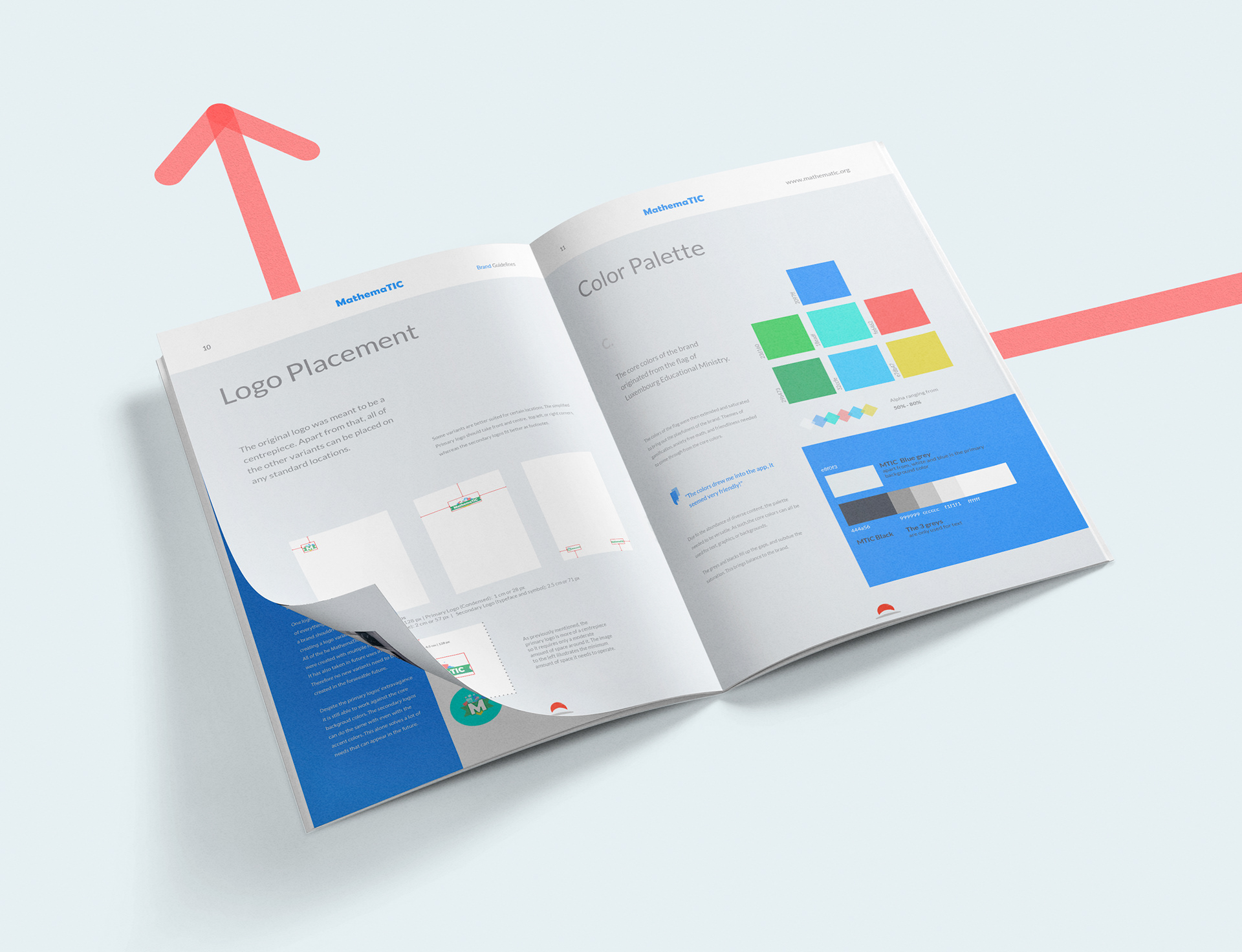
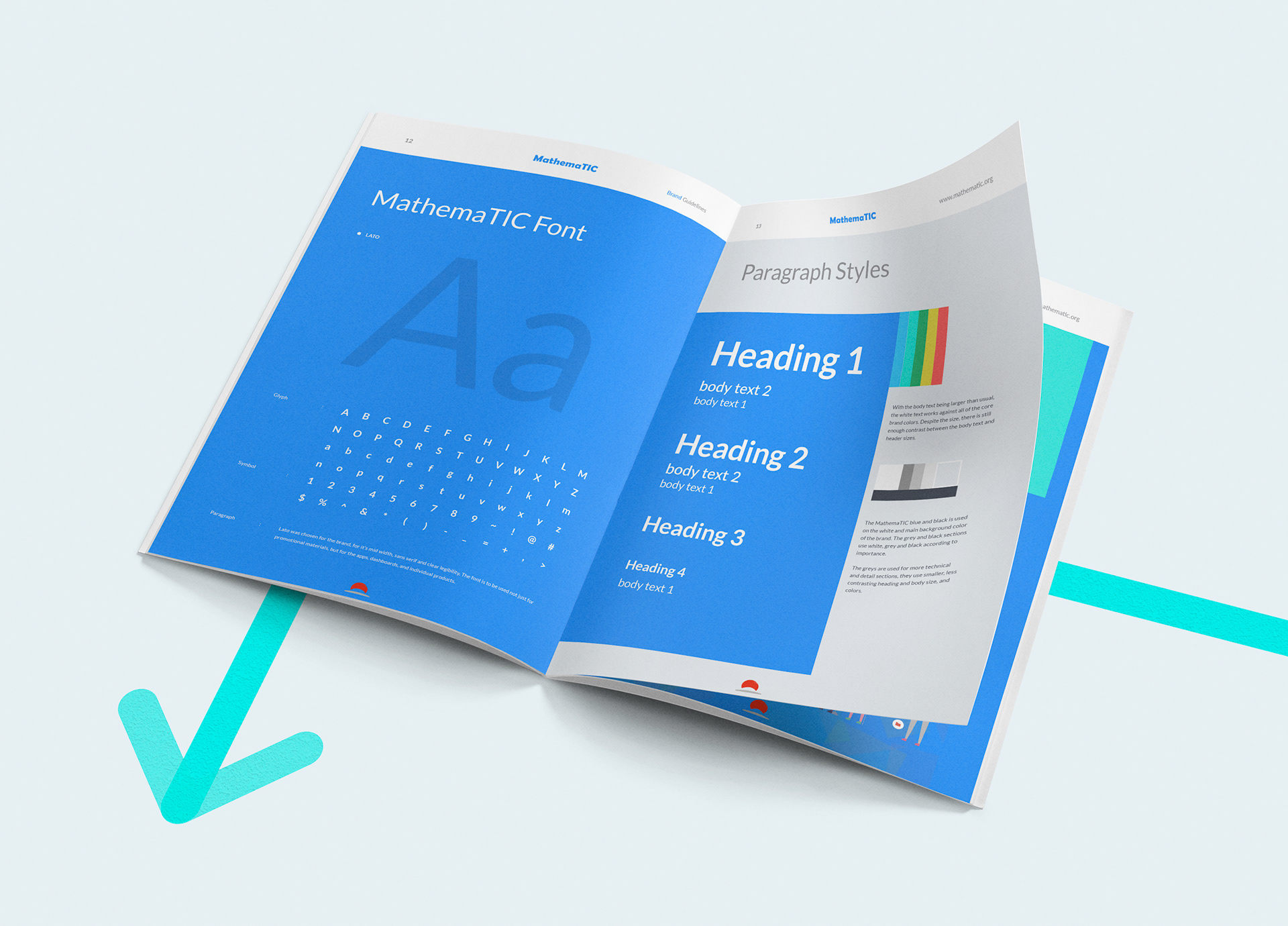
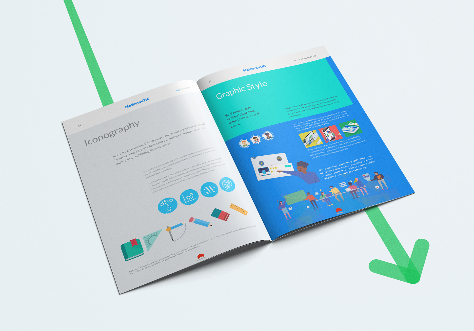
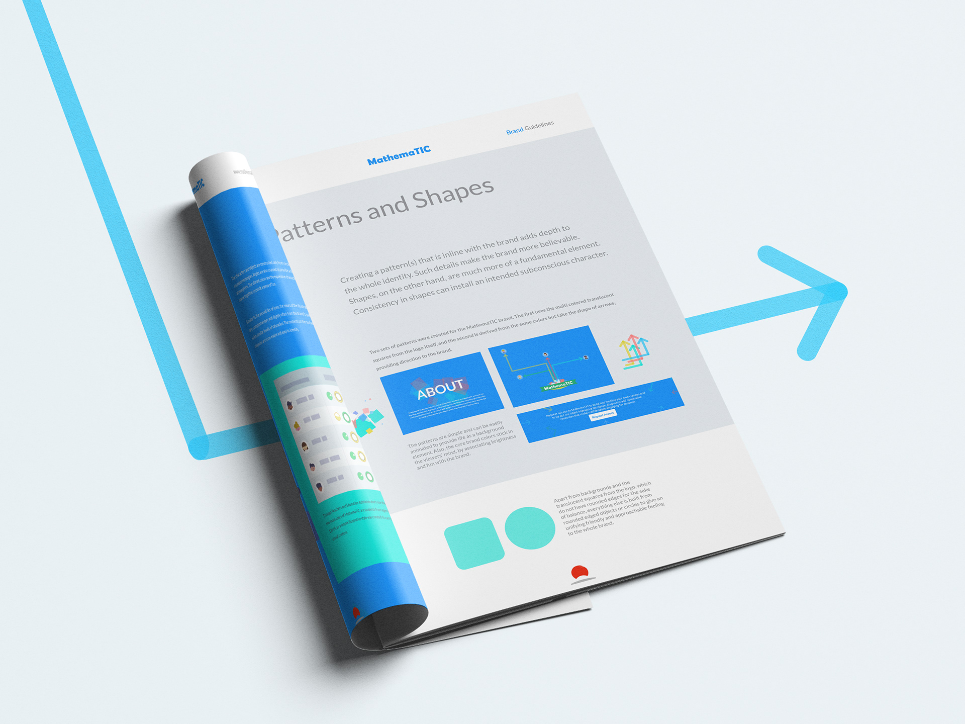
03 Brand Guideline
The Story
The MathemaTIC products have quite a few linear levels of users. From education ministers, to teachers, to parents, and lastly and most importantly; students (from ages 6-14). Therefore the main emphasis of the brand is “fun” enveloped by an educational tone, creating a balance for all users.
More details about the brand, the story, the process, the origin, the technicalities and guides for use, and other specifications are all put together in a Brand Guide booklet, and examples of it are presented below.
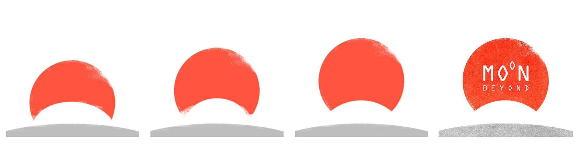
04 Moon Beyond
LEAVING A MARK
I am the visual end of Moon Beyond Creative, (my partner handles all of the front and back end development) a two person boutique Design agency focusing on Web and Branding, but frequently venturing out to other visual and tech branches.
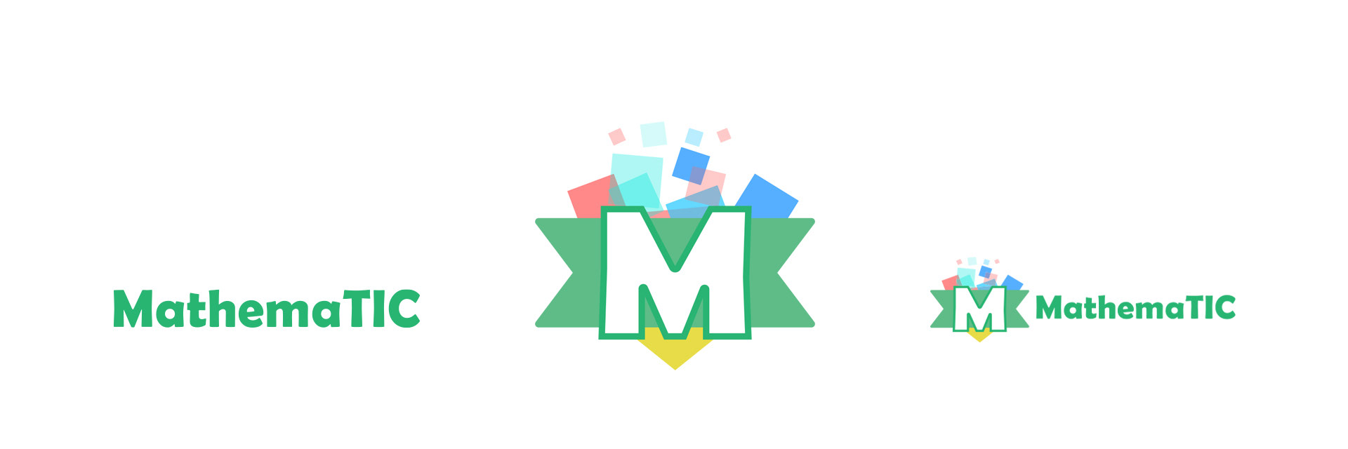
The main interpretation for the Moon Beyond logo is Mars rising on the surface of the moon. To leave that mark, all of the multi page documents have that rising concept animating, as one flips through the pages (it’s also a way to visualize page numbers).


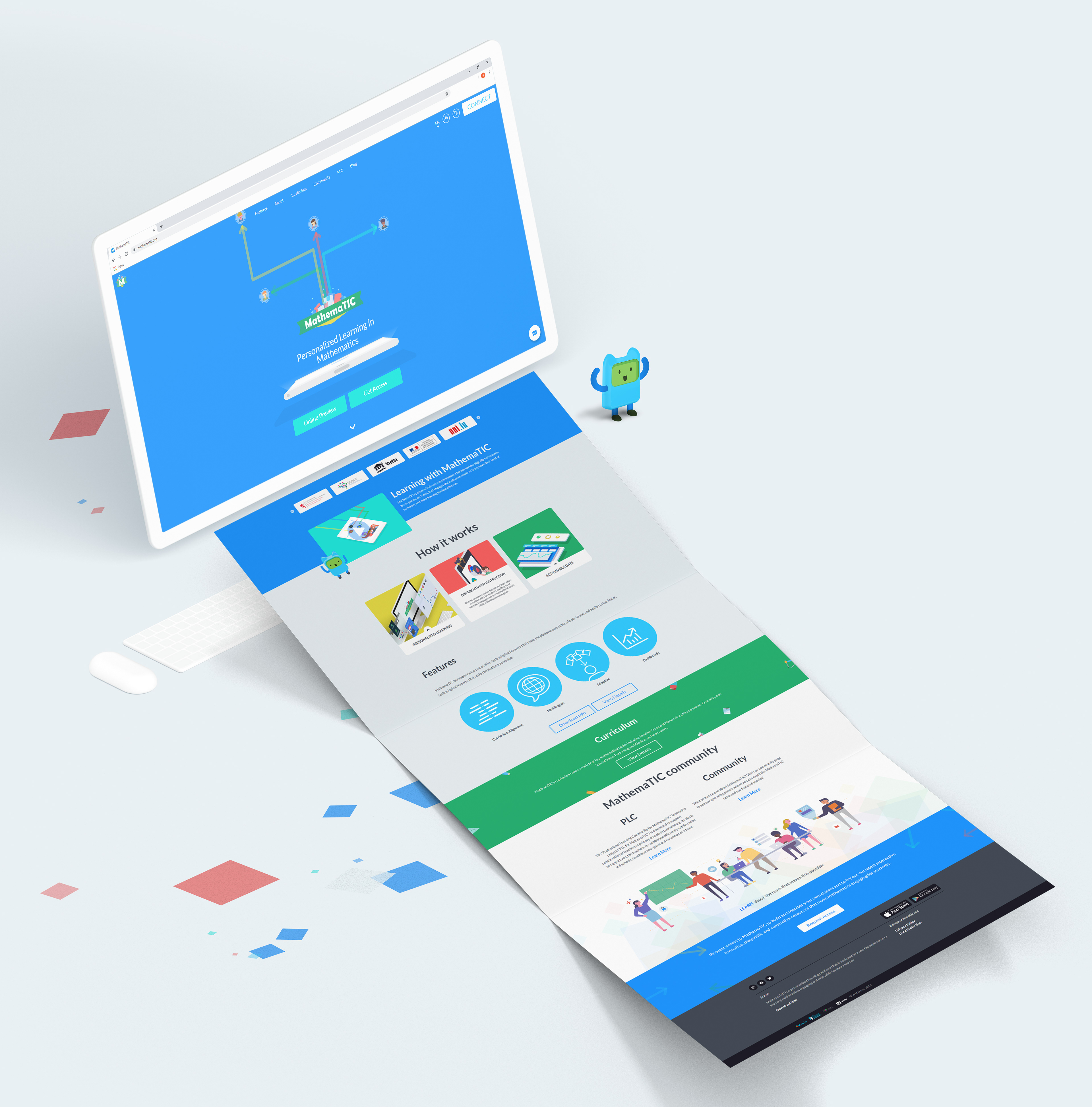
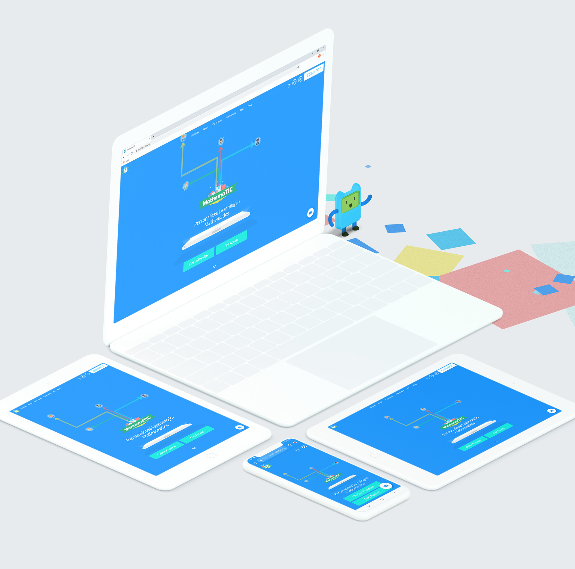
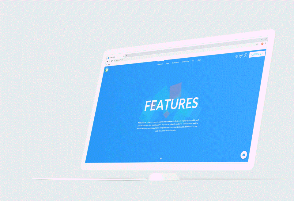
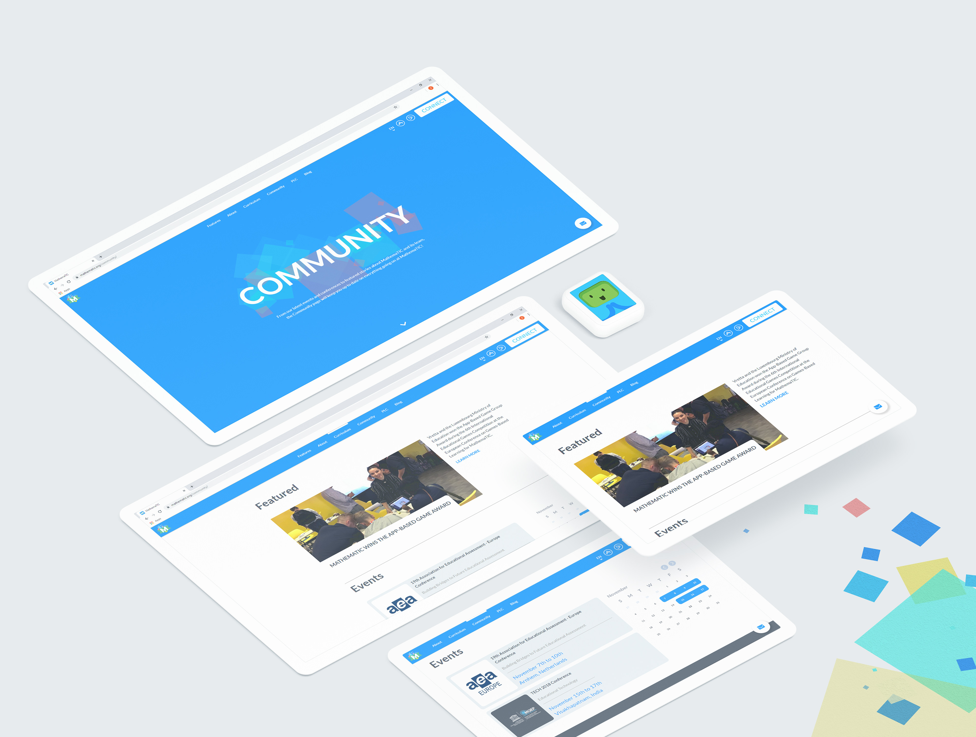
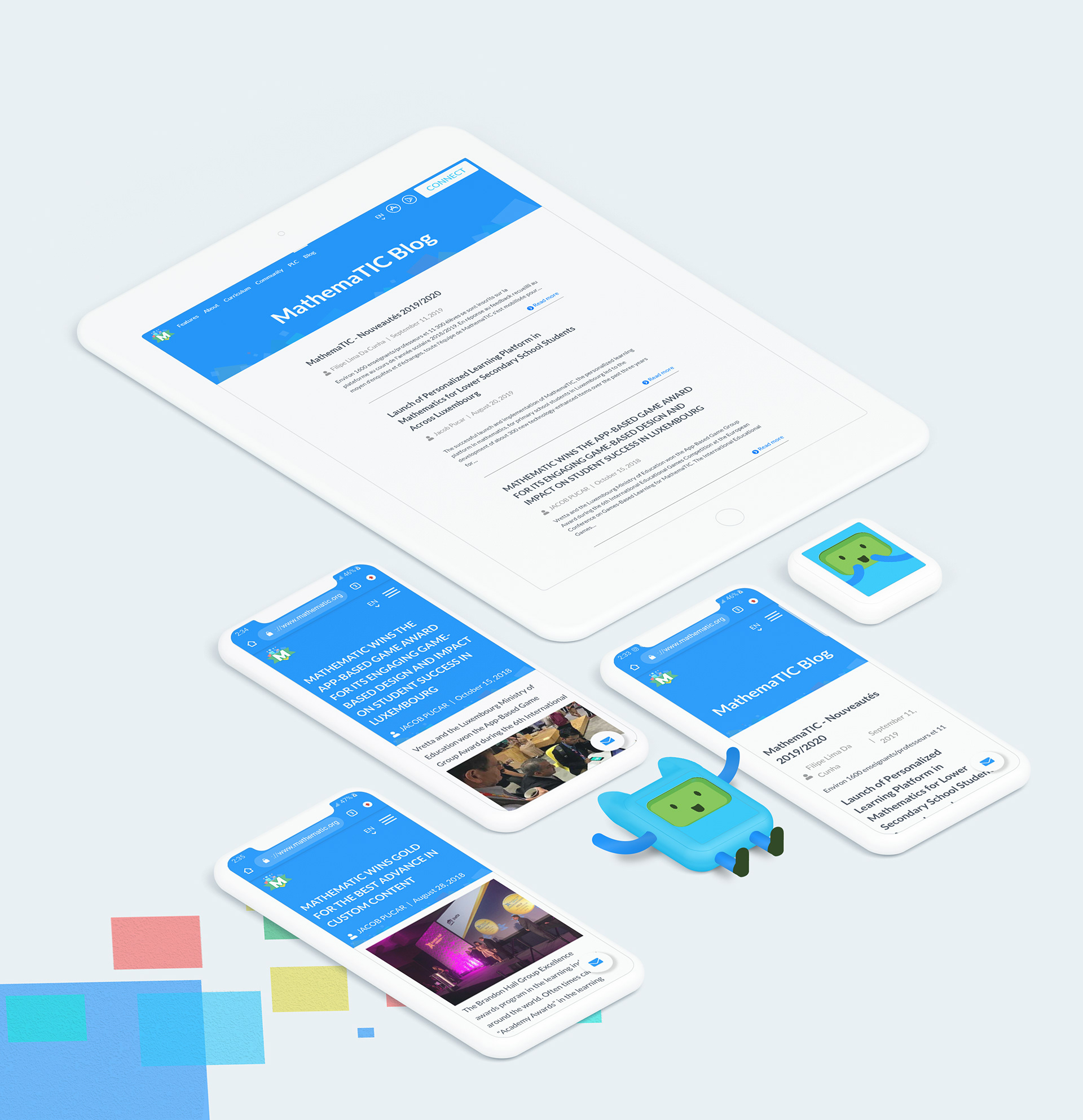
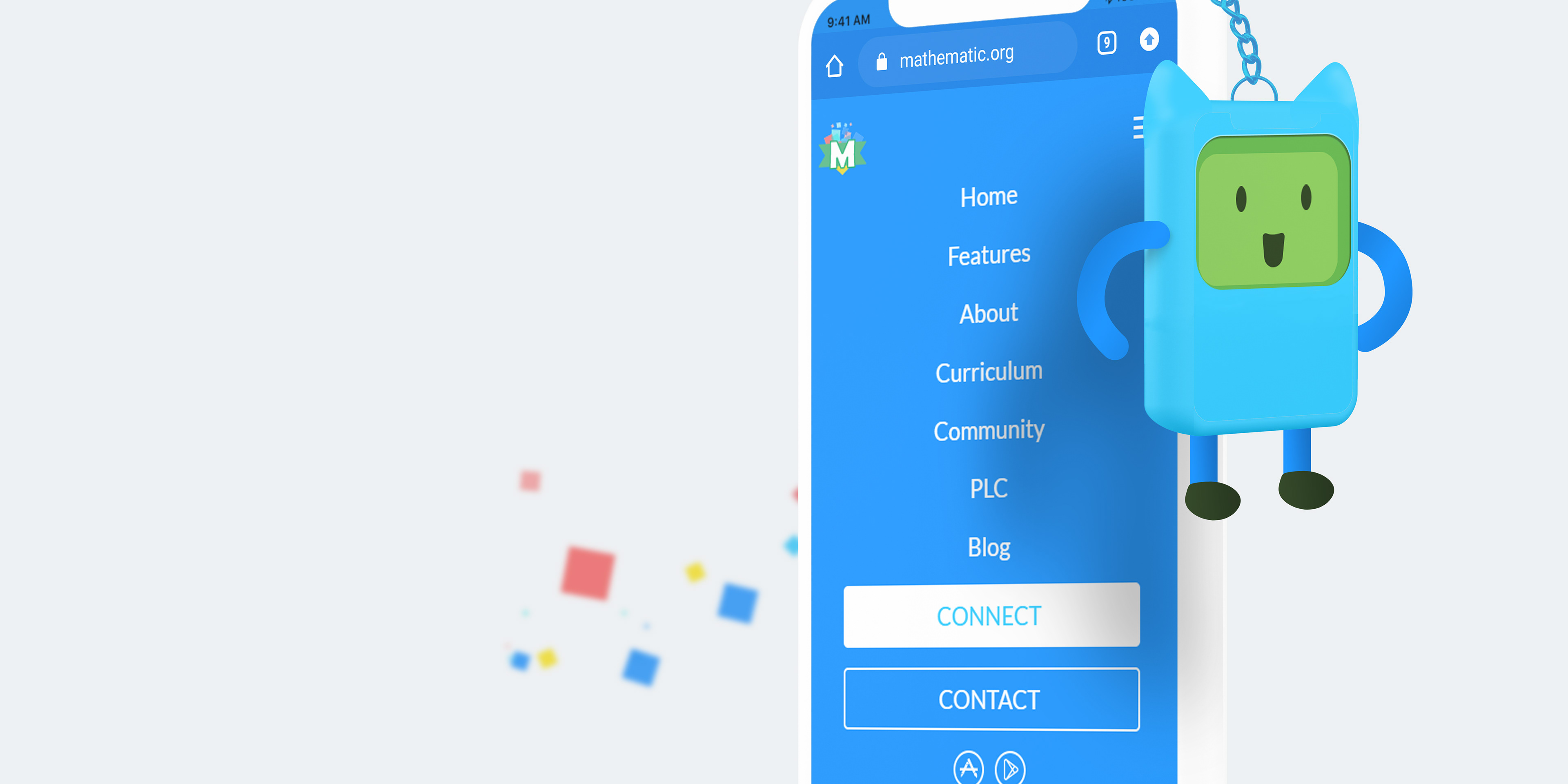
05 The Website
A Digital Presence
The MathemaTIC Website is primarily a marketing website, however it needed to be coupled with a heavy dose of information. It was challenging and exciting to find new ways to blend typography with layout, and subtle animation to keep the content fresh for serious users, and easy to skim through for casual viewers.
It is also multilingual, currently in 4 languages, and even if new languages were added, with longer than usual wording, the design of the site shouldn’t faulter.
The site always has direction, whenever a natural stop occurs there is always a callout to another section or a “learn more”, or leading to the Login/ Signup for the Platform.

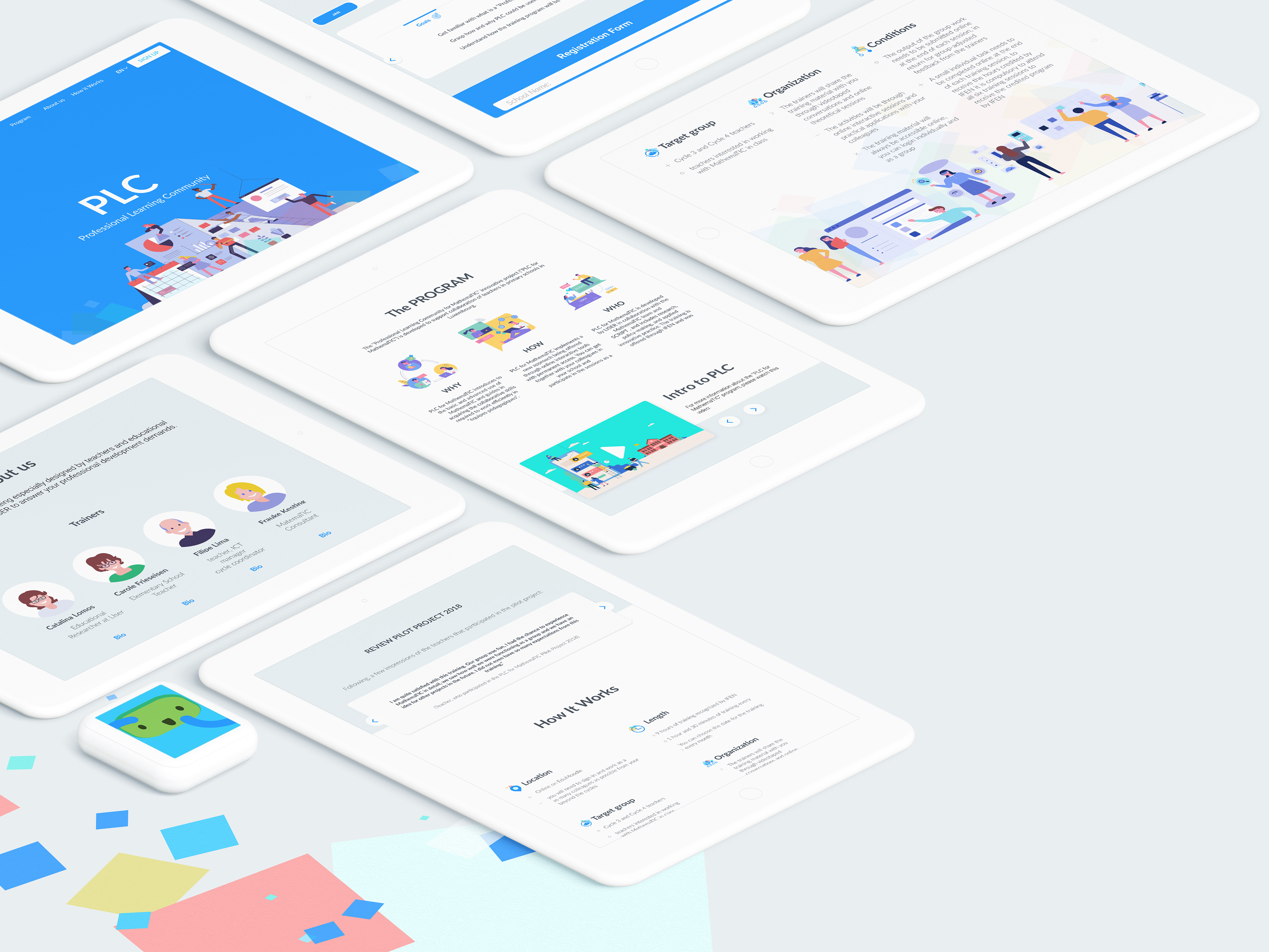
06 Subsidiary
PROFESSIONAL LEARNING COMMUNITY (PLC)
The Luxembourg Education Ministry created a training program for MathemaTIC for the teachers; named PLC. It can be accessed through the main site, leading to a separate one page site with different navigation, but with the same branding.
The PLC site is very information heavy, so the functionality needed to be really concise, and the content is organized in layers so it doesn’t feel too overwhelming.

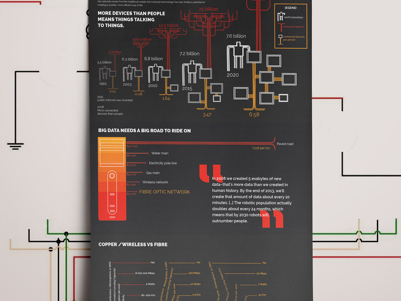
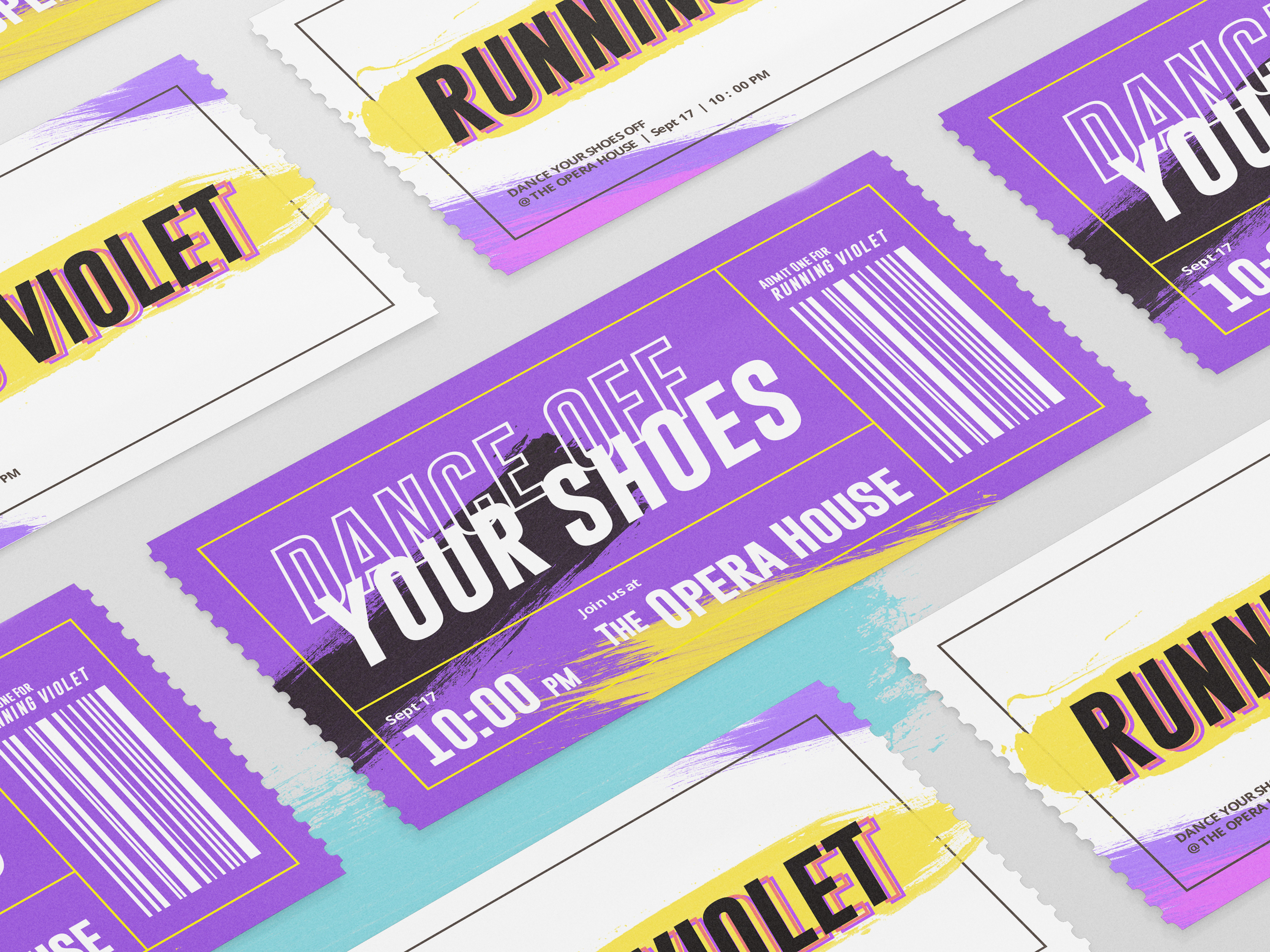
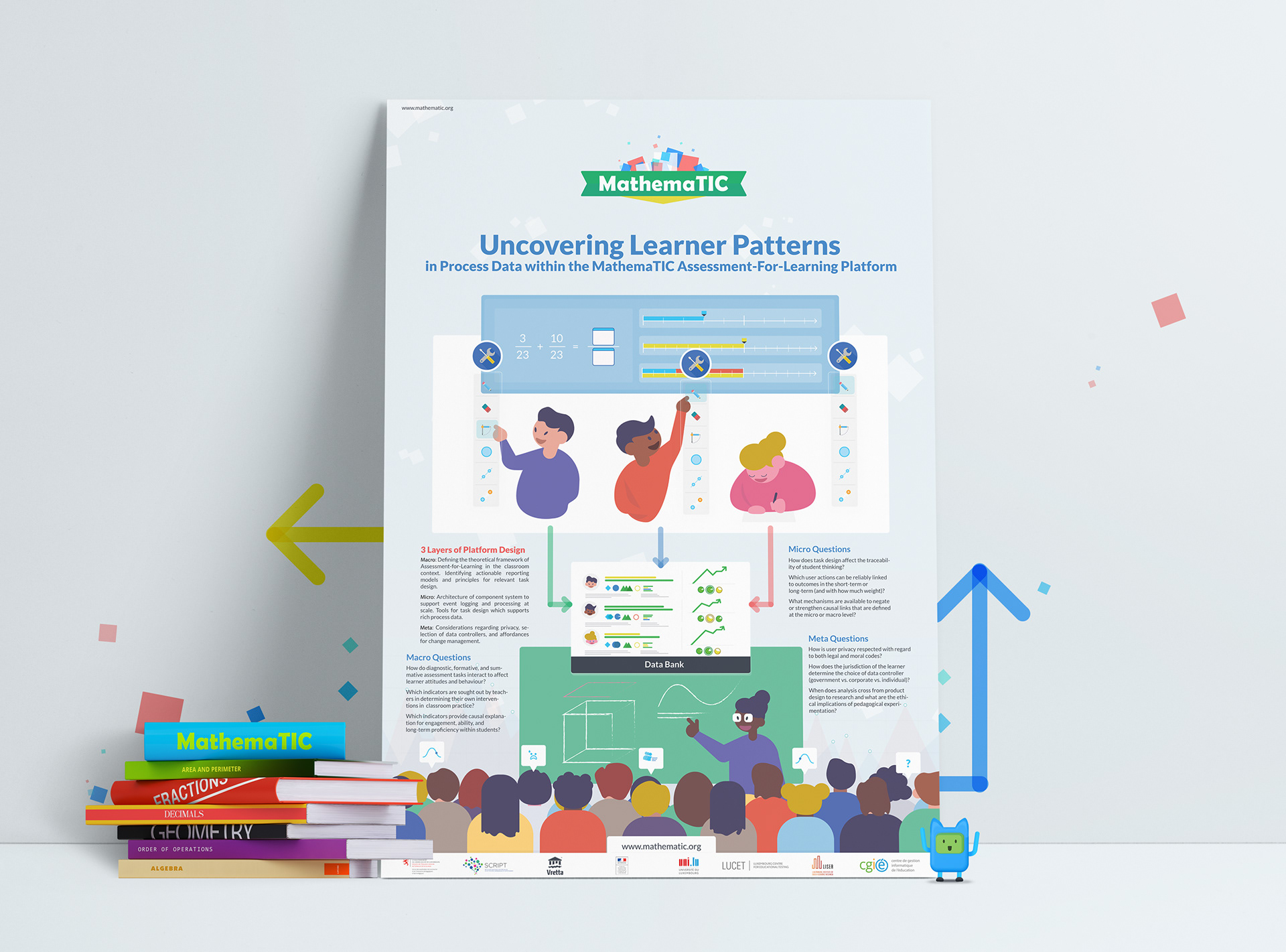
07 Marketing Collateral
putting it in Print
The branding for MathemaTIC was done thoroughly. So when the time came to create marketing collaterals such as: brochures, flyers, posters etc. Visually all I had to think of was the layout. The paragraph styles and grid breakdown, graphic and illustration styles, patterns and positioning had all been taken care of during the branding phase. Below is an example of a marketing/ informational poster.
MathemaTIC is a product line of “Vretta” (an e - learning organization). They partnered with the education ministry of Luxembourg to create each lesson, game, assessment, platform, systems etc. Since then, they have incorporated the MathemaTIC products to the education system of Portugal, Germany, France and counting.
As mentioned earlier this was quite a large project, large enough that it had to be split into two (part 1 web design and branding, part 2 product and game design) in order to showcase it fairly. Also being a product of Vretta, and Luxembourg Ministry, it was quite fun and challenging to incorporate both of their essence into the brand and website.
___________________________________________
Thank you for viewing!