

01 Overview
CONDO CONCIERGE
Condo Concierge provides professional amenities and security services for higher end clients. Their company takes pride in its finesse and ability to oversee all facilities for luxury establishments, and have them running smoothly and efficiently. For this project I wanted to focus on the elegance and class that condo concierge represents.
Logo & Branding | Web & UI/UX Design | Marketing & Stationery Design | Print Production | Photography | Copywriting | Social Media Content | Art Direction
02 Branding
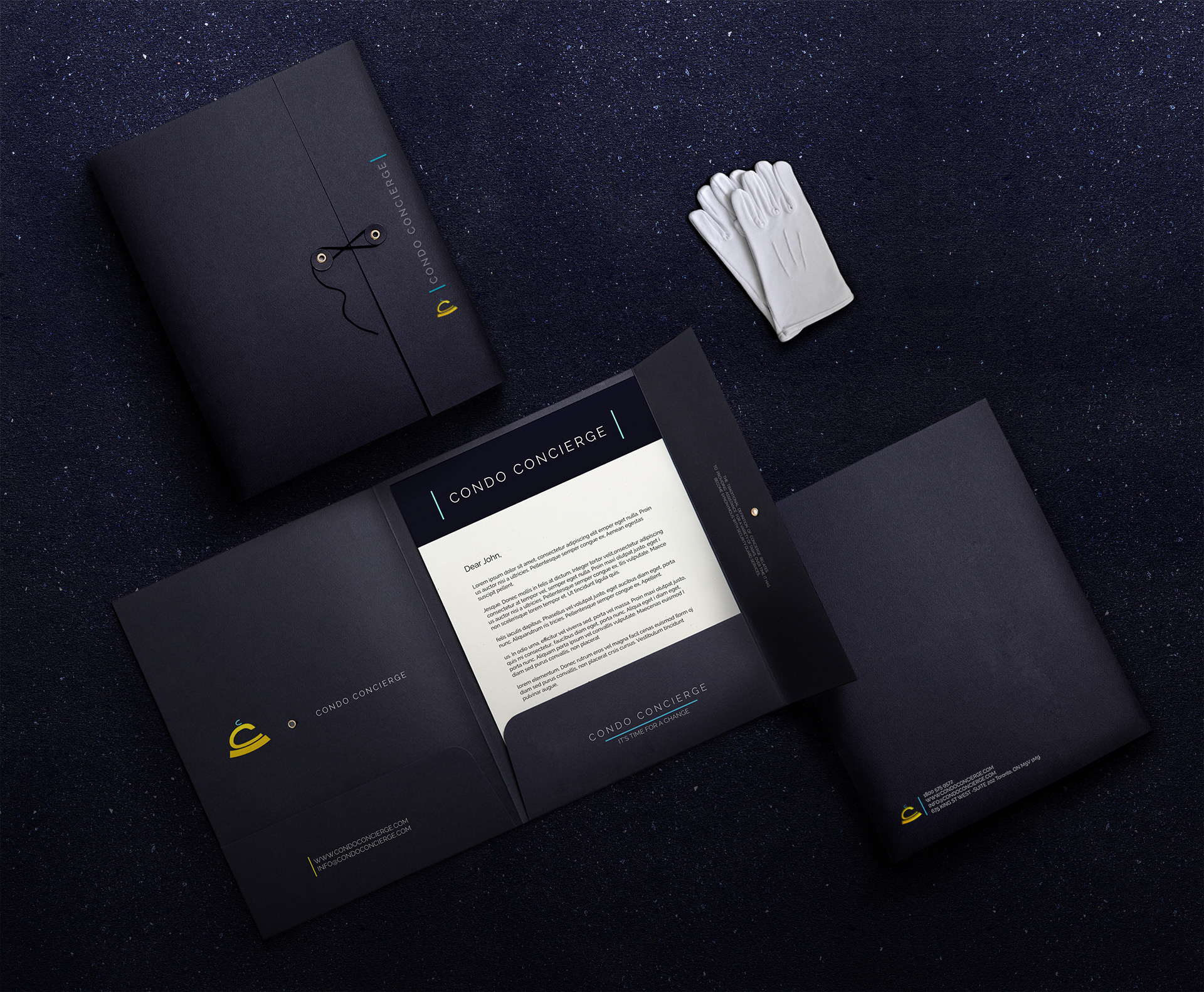
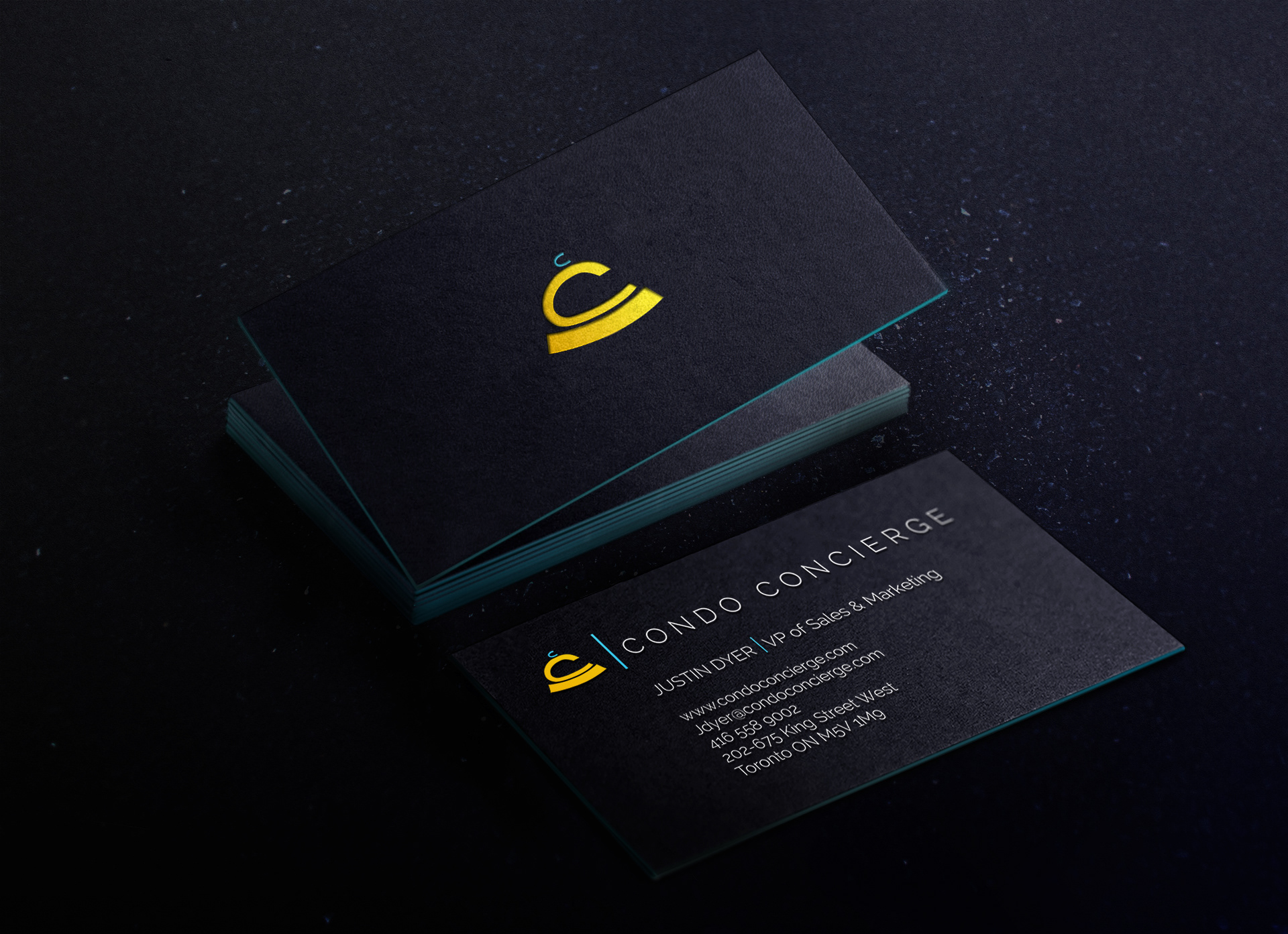
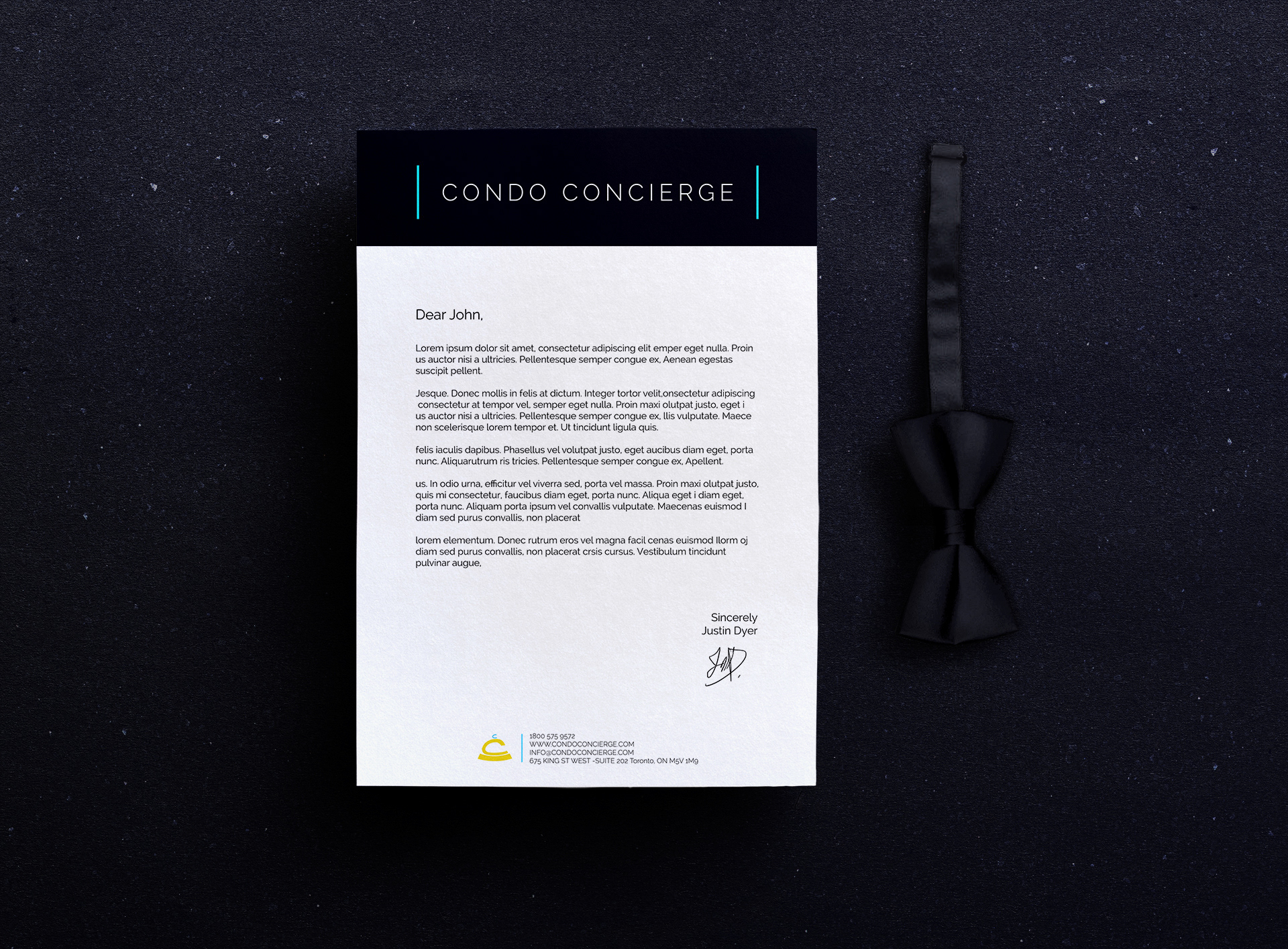
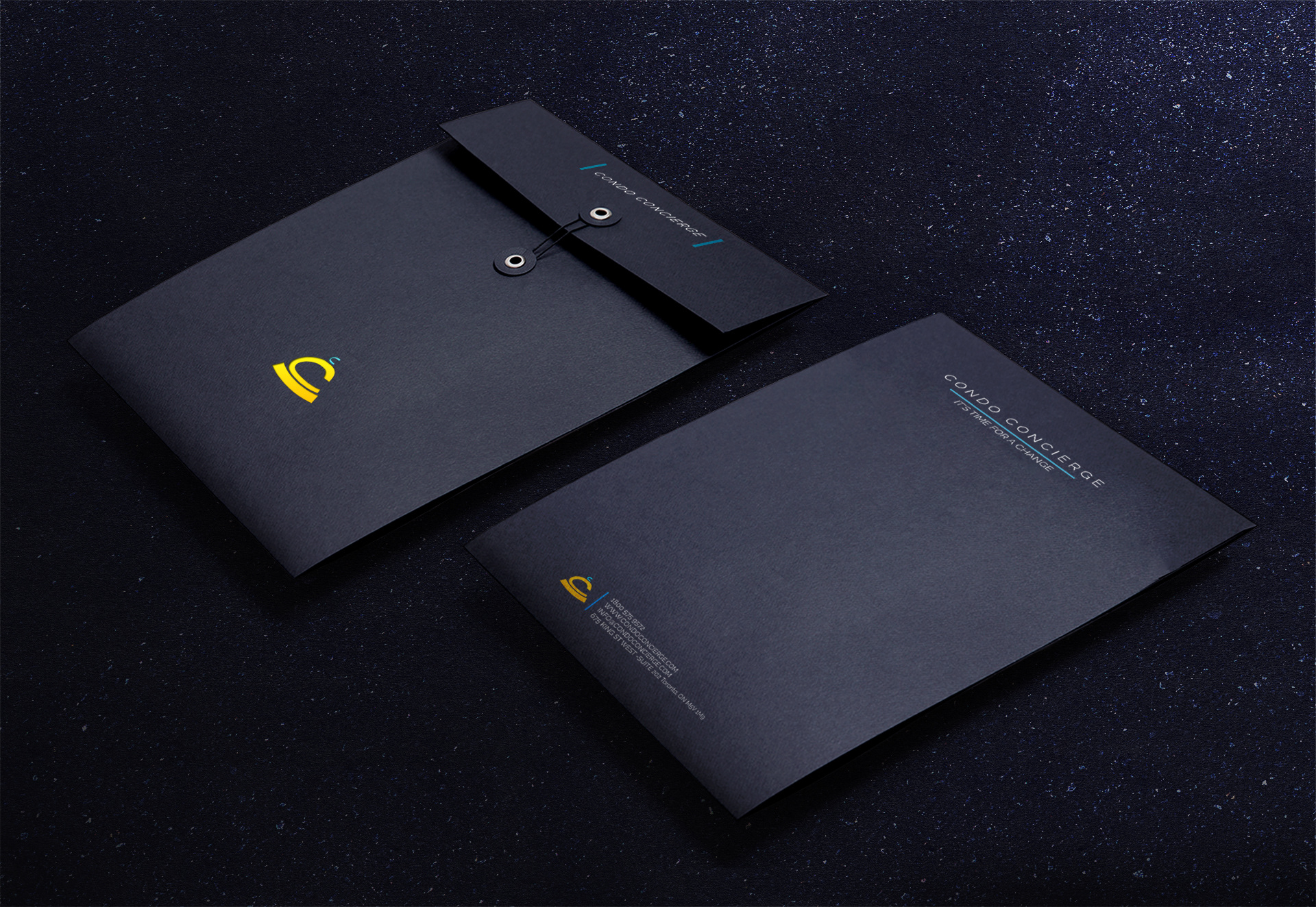
THE COLLATERAL
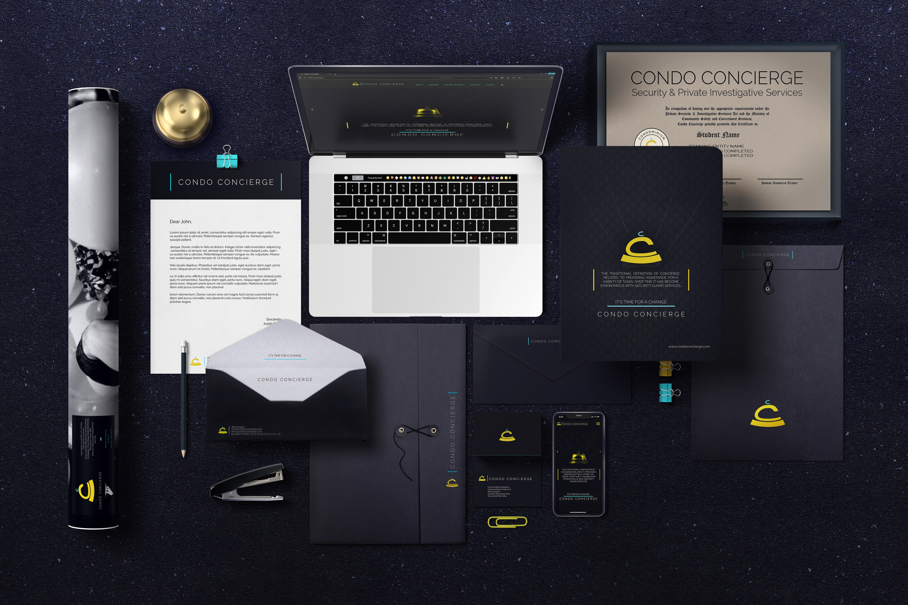
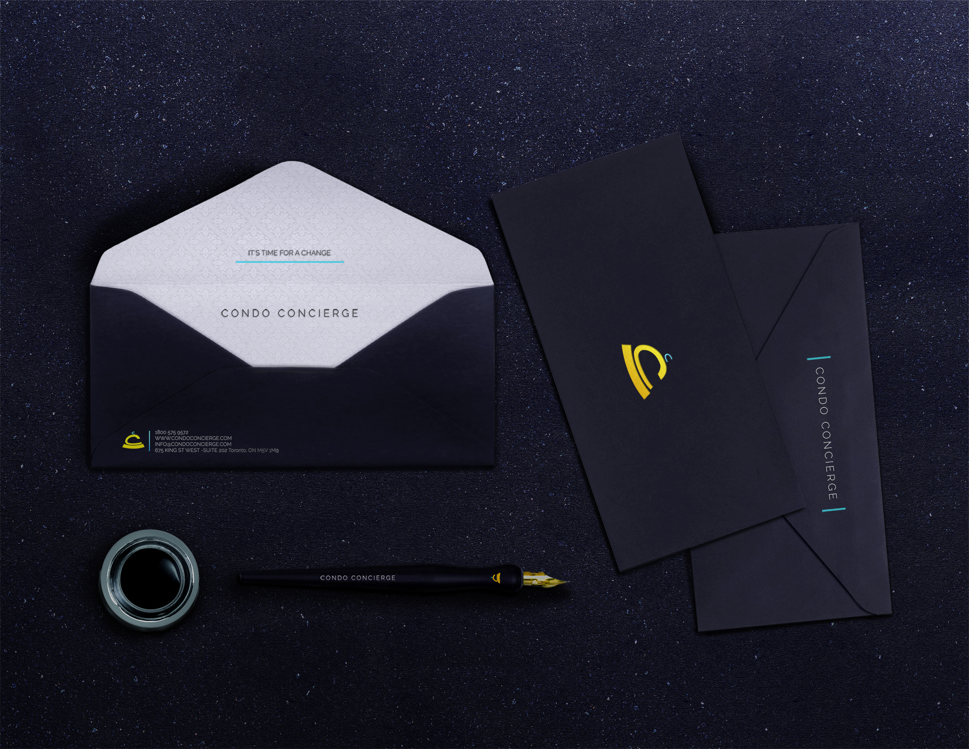
Subtlety was my major point of focus to bring about Condo Concierge’s elegance. The luxury that represents the brand is a gentle reminder not an attention seeking scream. So I had a lot of fun playing with different accent colors to produce a sophisticated and stylish look befitting of a company that caters to their level of clients. Yellow, teal, and white representing gold, platinum and diamond (solid swatches providing a more focused look as opposed to the typical gradients that are usually used to represent those materials) appear as accent tones, creating an exclusive presentation.
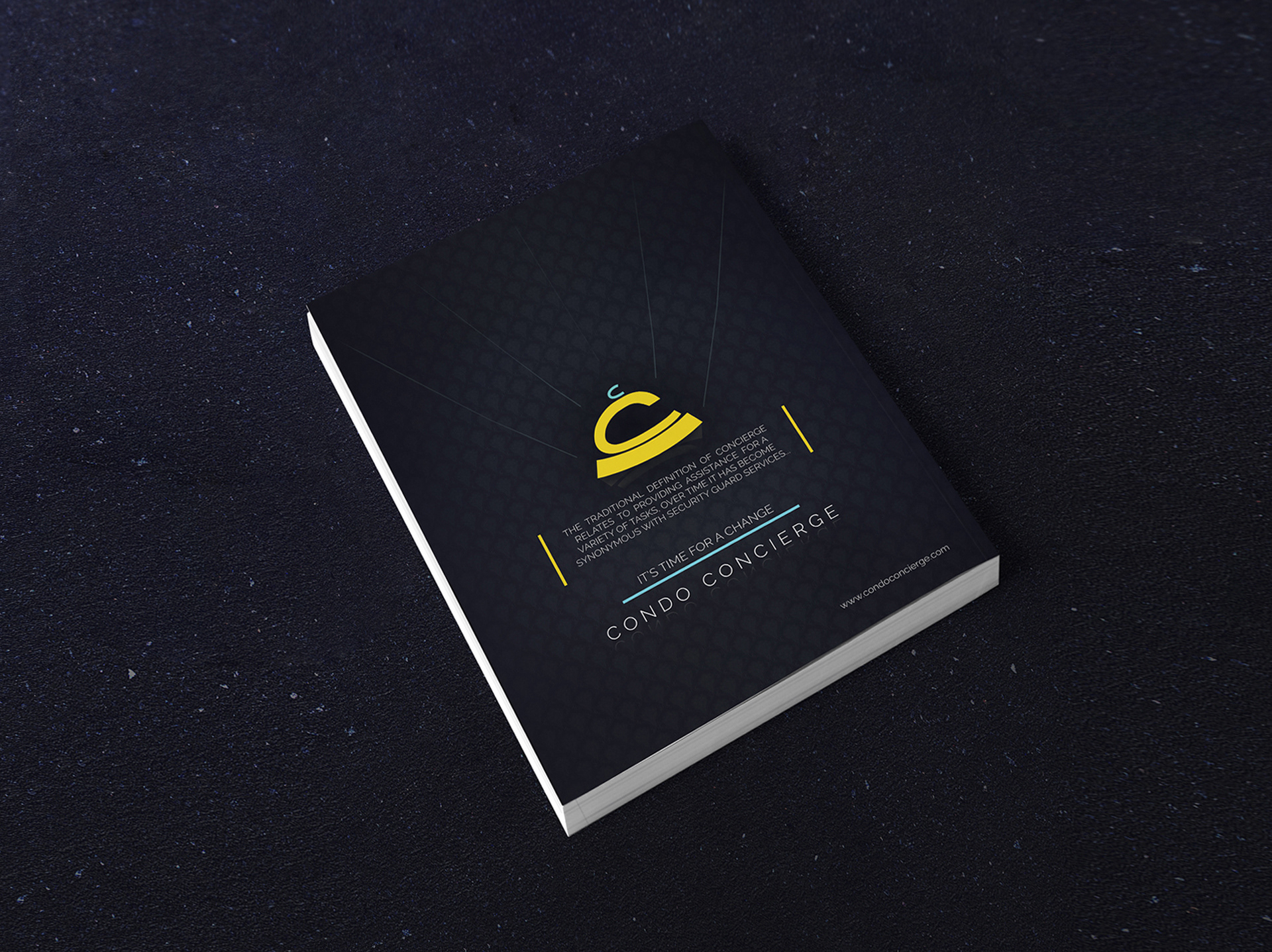
Furthermore the thin letters and lines on a dark indigo background bring substantial contrast and an elegant shine. The subtlety of the logo, two C’s that form a concierge bell, further illustrates the refined taste associated with Condo Concierge.

The stationery was created with thick matte materials adding to the sense of quality that comes from within, coupled with debossing of the logo which mimics the inner depth of Condo Concierge’s foundation. On the other hand the marketing materials, which are for external use, are smooth and glossy, exhibiting that luxurious shine which is in keeping with the clientele.
03 The Website
The DIGITAL PRESENCE
03-A The Structure
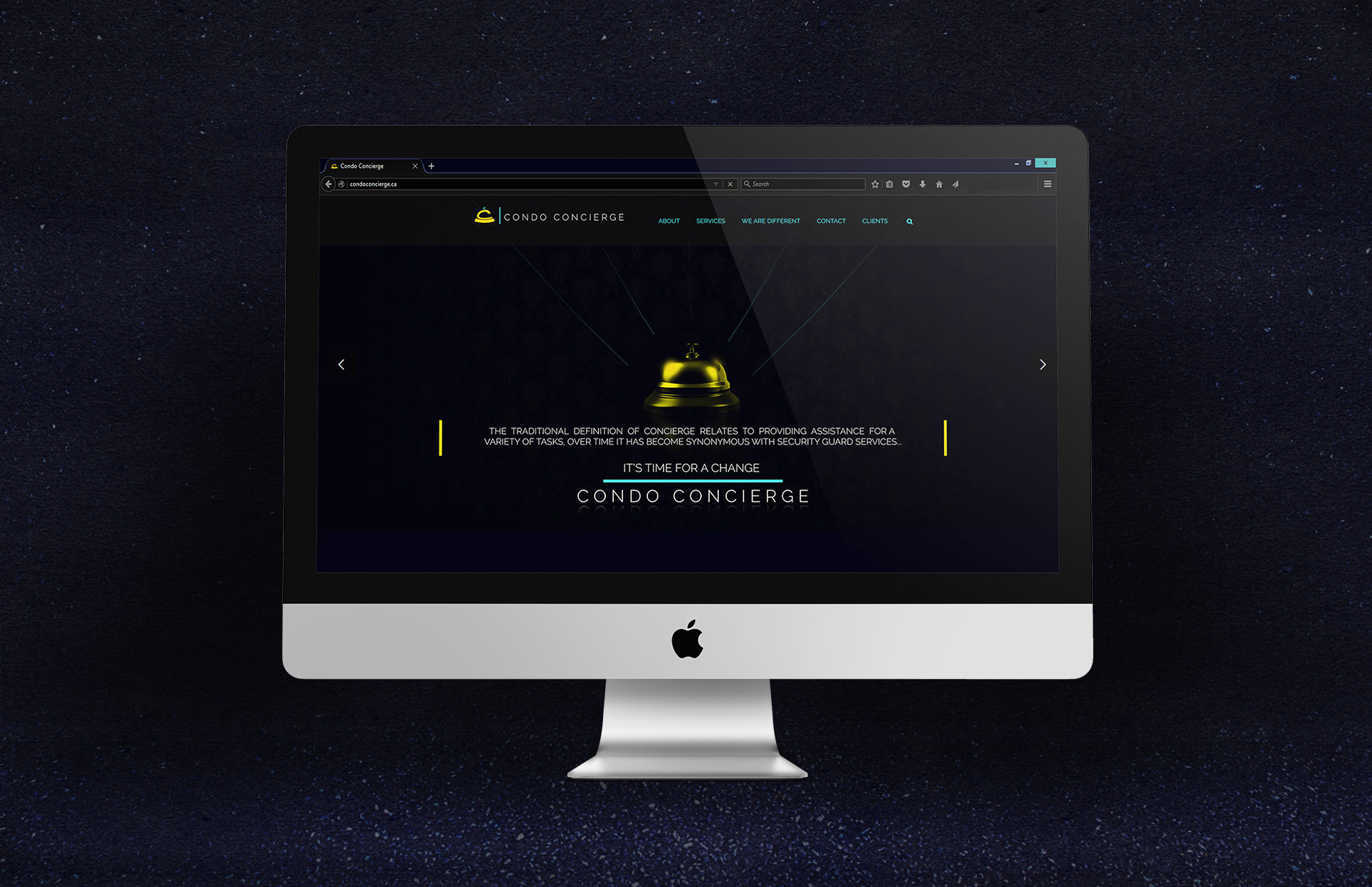
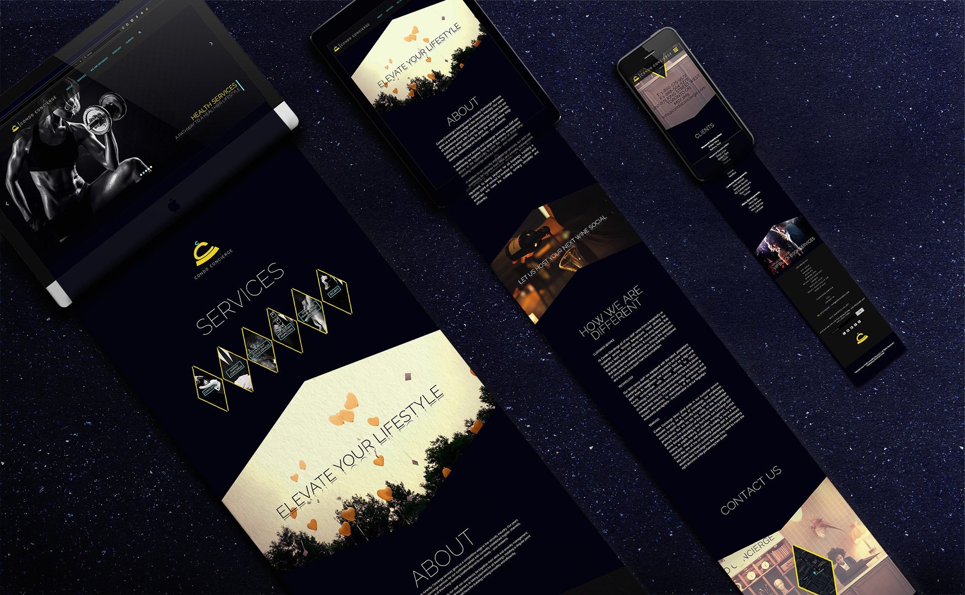
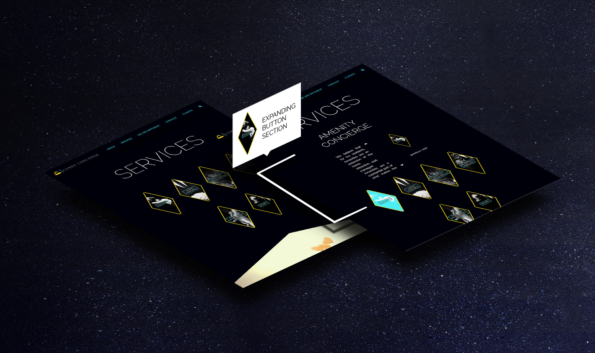
I was able to display the same elegance and class on the design of the website. I created a simple one page site, with expanding sections, spaced with large media to pace the viewers reading, and feel the essence of the brand.
03-B
the first style
The brand was created with two tiers photography style, the first being black and white with the brand’s dark indigo as the darkest dark, and taking the highlights down to a mid-tone, but leaving the brightest white as is for contrast. The dark indigo was infused as the background, and the subject matter was always singular.
Together it gave a sense of exclusivity and sole focus, the darkened feel providing elegance and with the vibrant accent colors overlaid on top, giving a hint of royalty, everything a luxurious client would want to look for. The site starts off with slider images styled in that manner with important taglines about the brand’s services. The viewers feel the class of the brand and can get what they need without having to scroll at all.
03-C
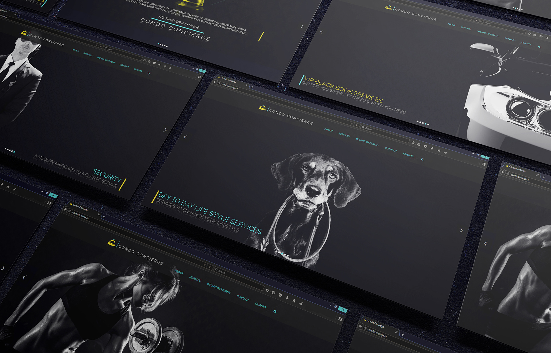
the Second style
The secondary style was styled with a friendlier tone, the lighting mimicked a fireplace providing warmth, and the subject matter always luxurious. The site provided these images usually with the zoomed in version of the brand’s kite like shapes (which represented diamonds) and as background for titles for the headers of each section. This creates a larger than life feel and the angular shapes of the picture book ends each section subtly and fights against visual fatigue because the site holds quite a bit of informational texts.
04 Marketing
BEING SEEN
04-A The Higher End
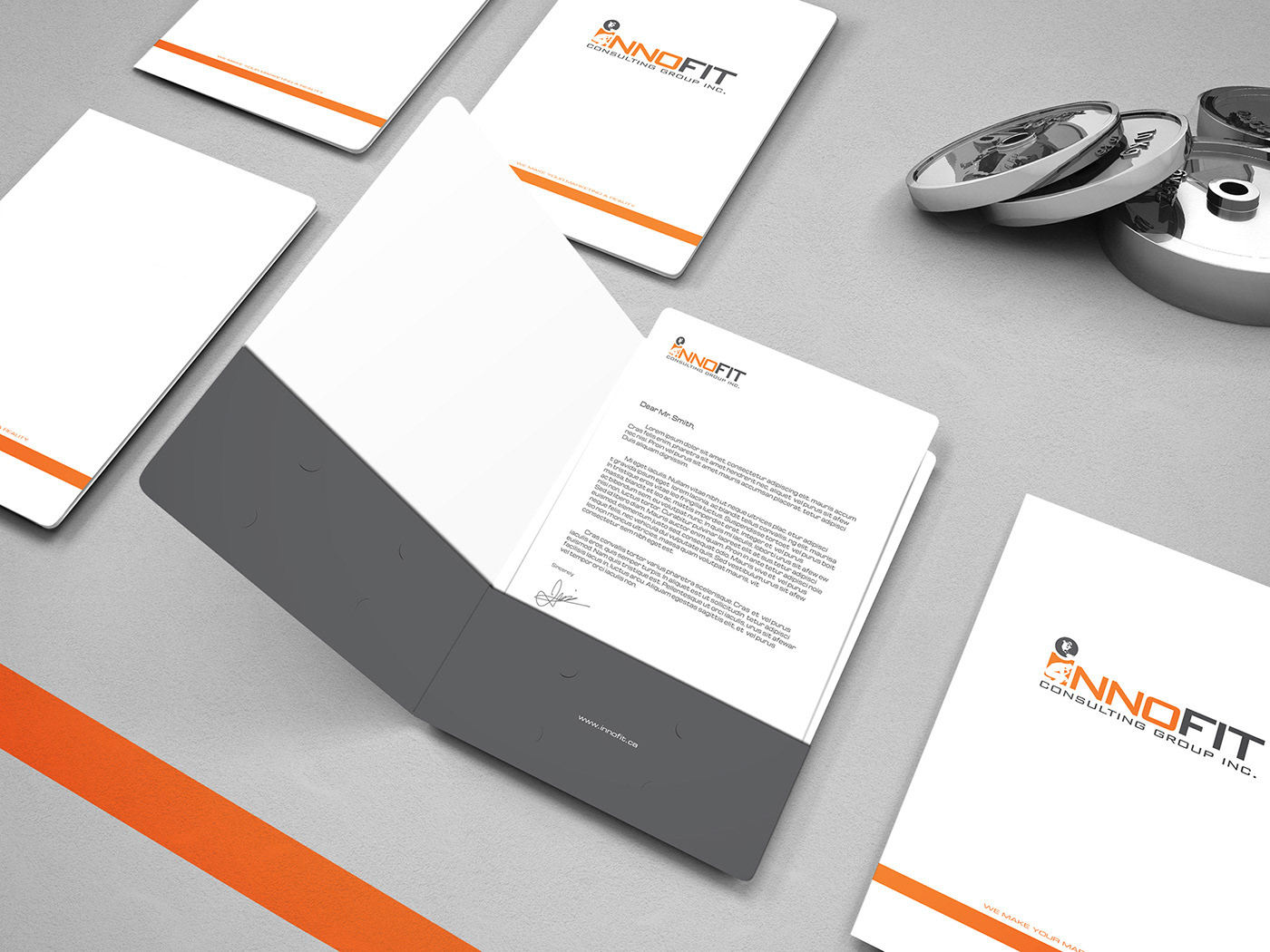
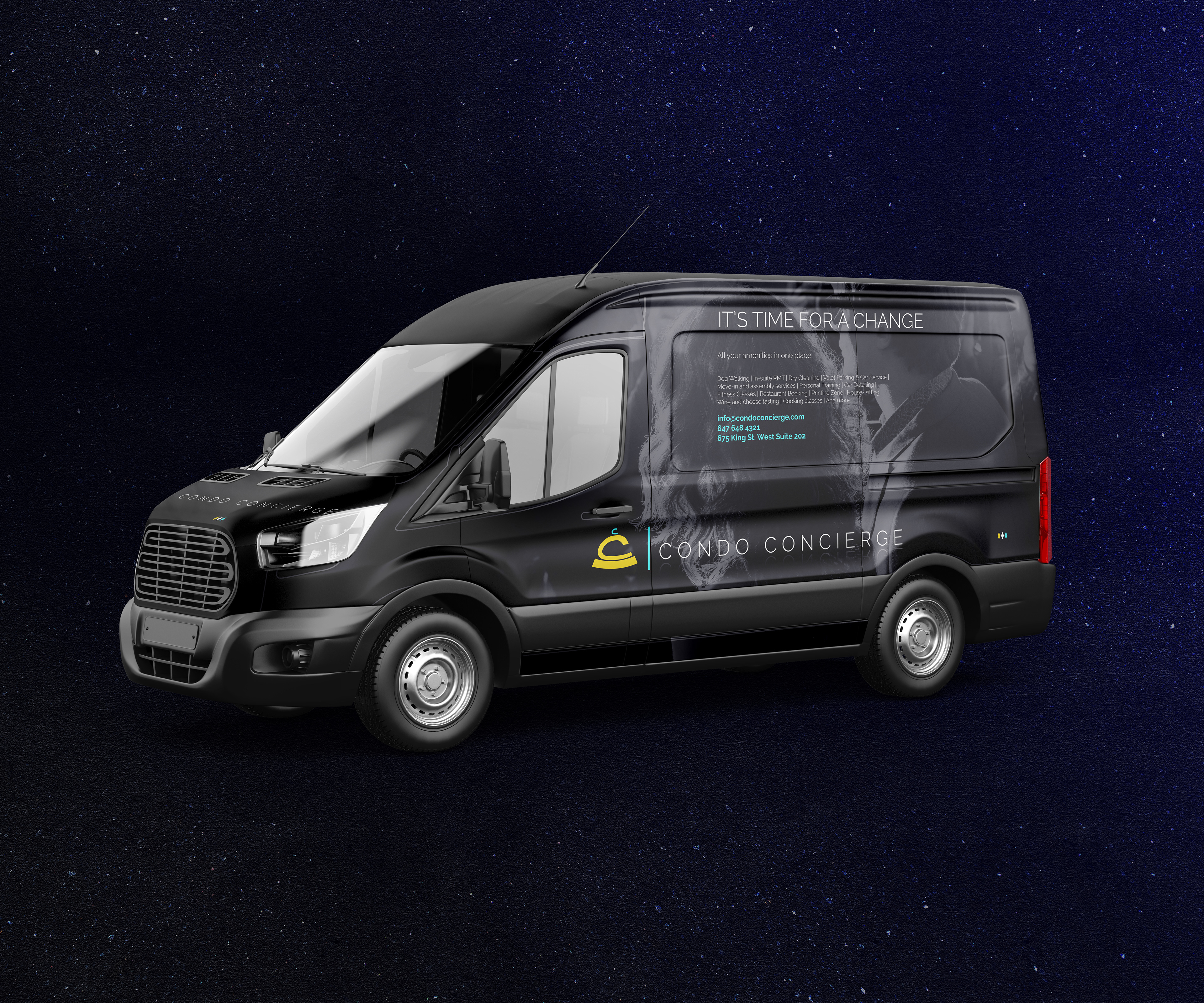
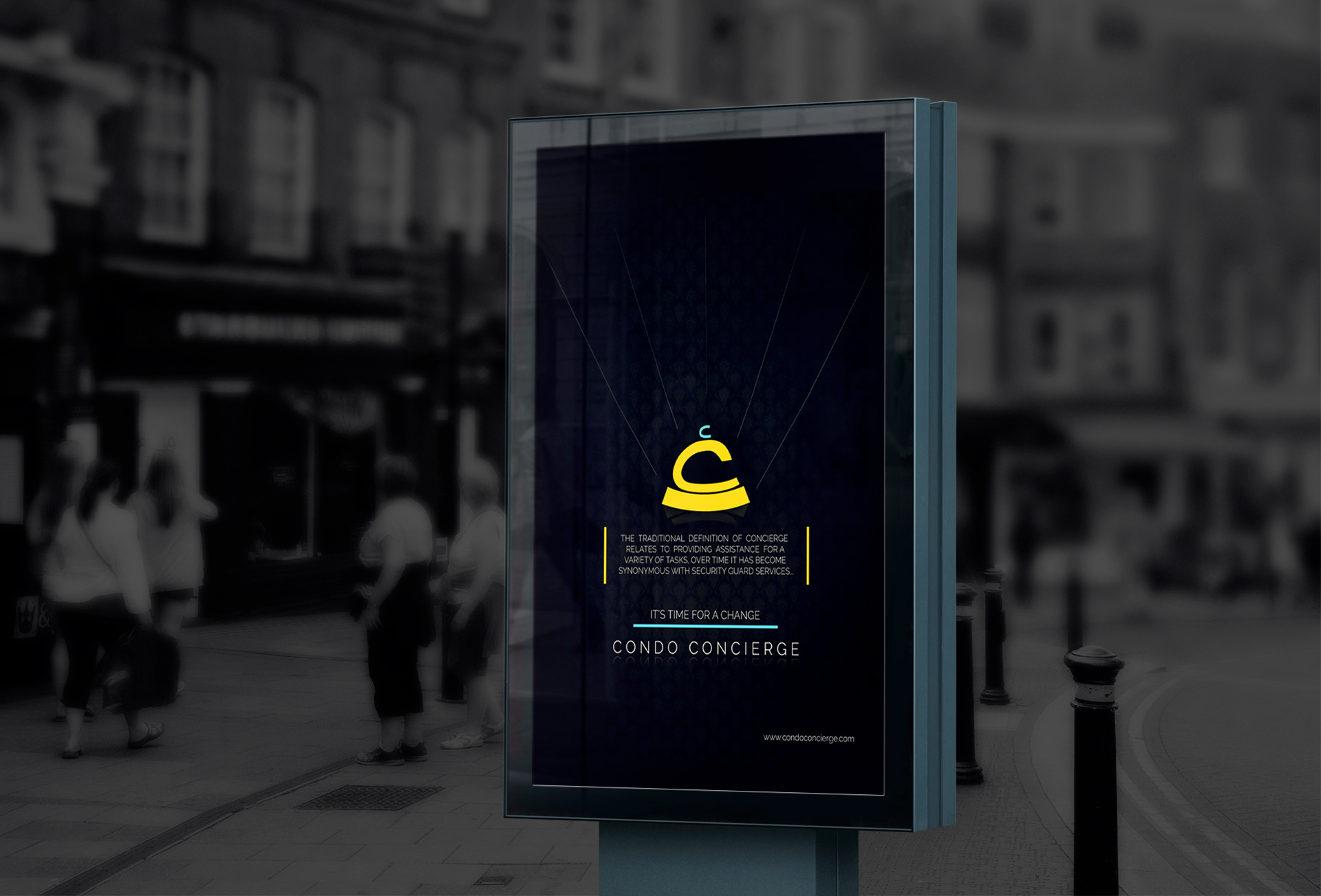
Condo Concierge started off a division of Innofit, another of my first clients. Its niche was for higher end clients, whereas Innofit appealed to all. Even though Innofit was solidified in the industry, to gain high end clients is still a difficult task under the subsidiary's new name. Quite a few promotional ads needed to be carefully crafted. Instead of seeming as new, it was advertised as a change. Hence the tagline “It’s time for a change”.
04-B Depth By Patterns
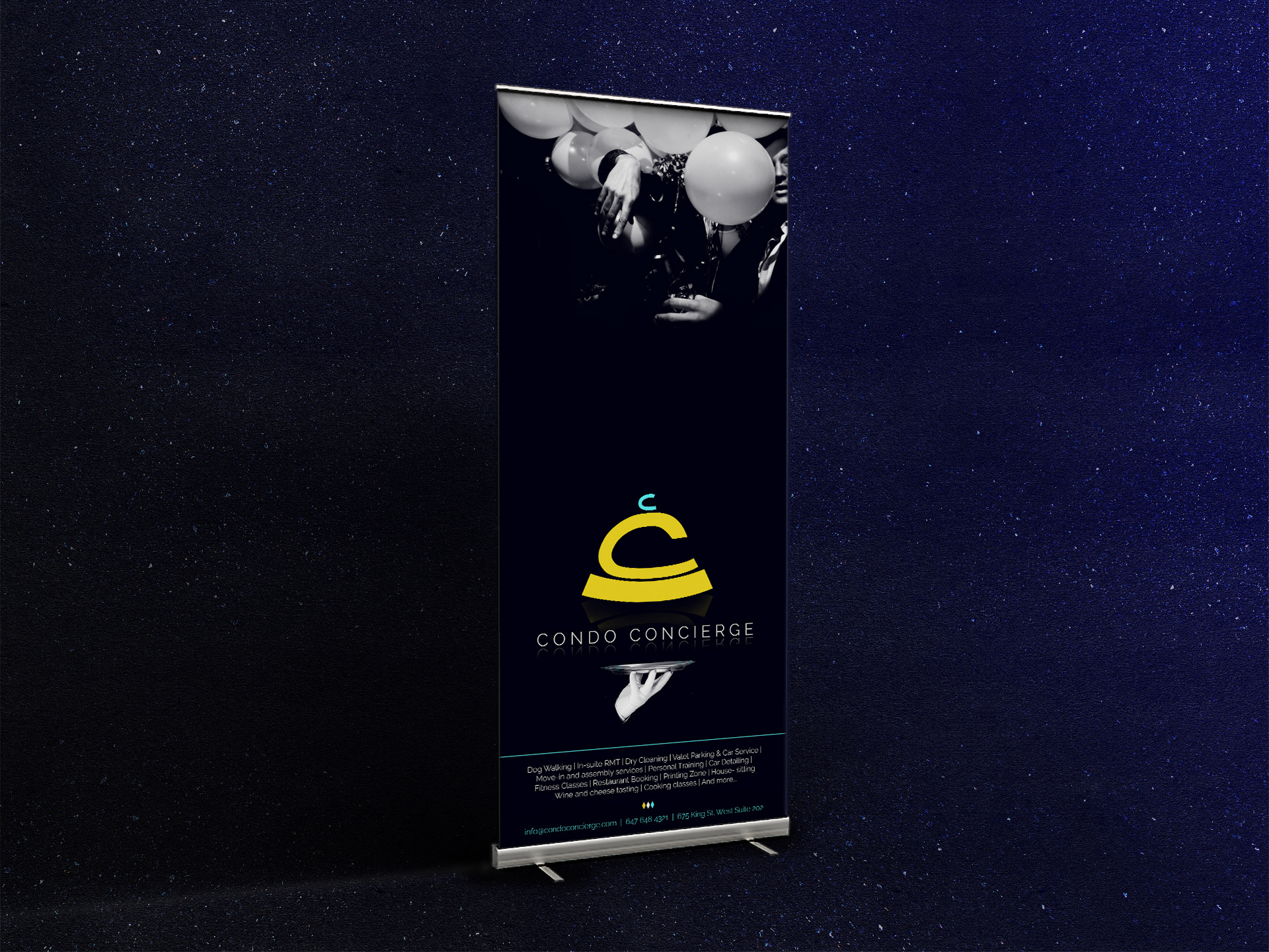
To add more depth to the brand, several elegant patterns were created. The patterns are mostly used as backgrounds for graphics or adding textures to the primary picture style (the tonal black and white style as mentioned above). The patterns had a chance to be seen on the site, but they really shined on the marketing materials. From magazine ads to trade show banners. Whenever a graphic or a picture seemed too minimal, the patterns added that extra layer of glamorous exuberance.
04-C The Little Things
The Kite shapes mentioned in the website portion, is an essential part of the brand, as it’s used in various contexts. In the site it is used to contain images and buttons for expanding sections, however it can also be used to end a content block. Three kite shapes colored in teal, yellow, an white. It can be seen in the print on the Condo Concierge van, on the bus stop ad, magazine ad, tradeshow banner etc. Providing another visual reminder on the viewers mind.
05 Synopsis
CONDO CONCIERGE
2016
This project was a great experiment in exploring an unorthodox way to emote a high-class feel. Since the brand’s tagline is “It’s time for a change” I couldn’t stick to the usual gradient luxury style, it needed to showcase its class its own way. The logo went through many iterations before I settled on the final shape and color, adding just a little bit of friendliness to top it off.
I started working on the project right after it was named, catering to it every step of the way, adding layers of depth from the colors, to pictures styles, to patterns, to shape recognition, and more. Making sure the brand is able to present its distinguished persona through its visuals and more.
___________________________________________
Thank you for viewing!