

01 Overview
INNOFIT
Innofit is a large consulting group offering services to condominium and hotel developers, management and residents. This was an important project for a company aiming to exude excellence and their ability to provide amenities on different levels. For this project I wanted to elaborate on the brand’s vision through its collateral and marketing content, and create a website that made the user experience seamless and informative while showing off their clean, customer first identity.
Branding | Web & UI/UX Design | Marketing & Stationery Design | Print Production | Photography | Copywriting | Social Media Content | Art Direction

02 Branding Collateral
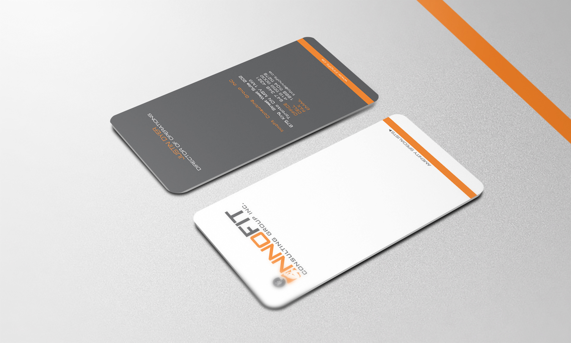
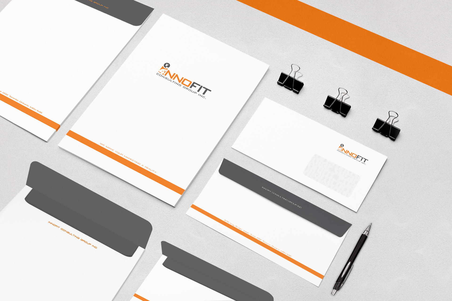
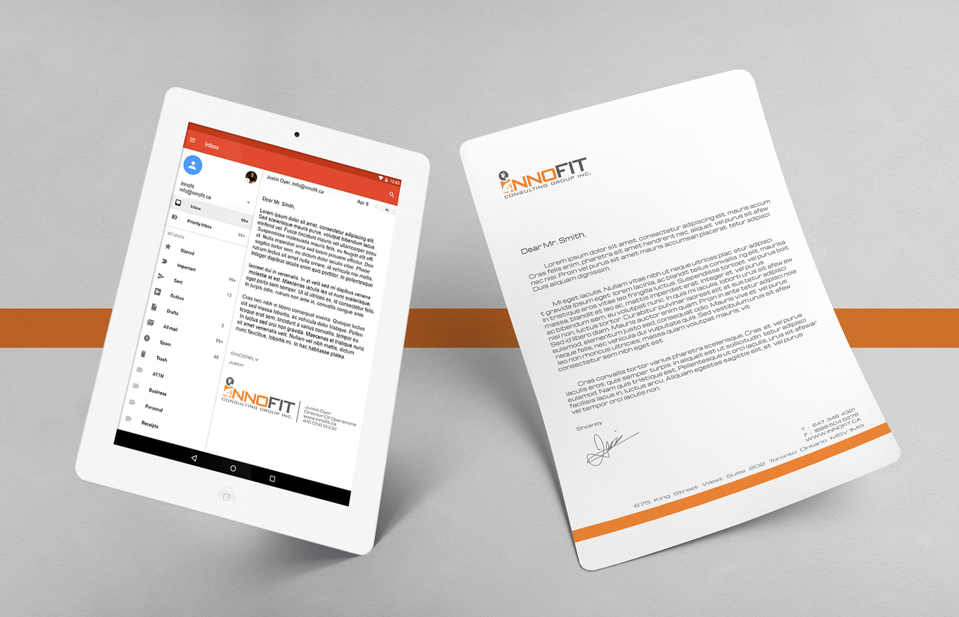
Knowing Who You Are
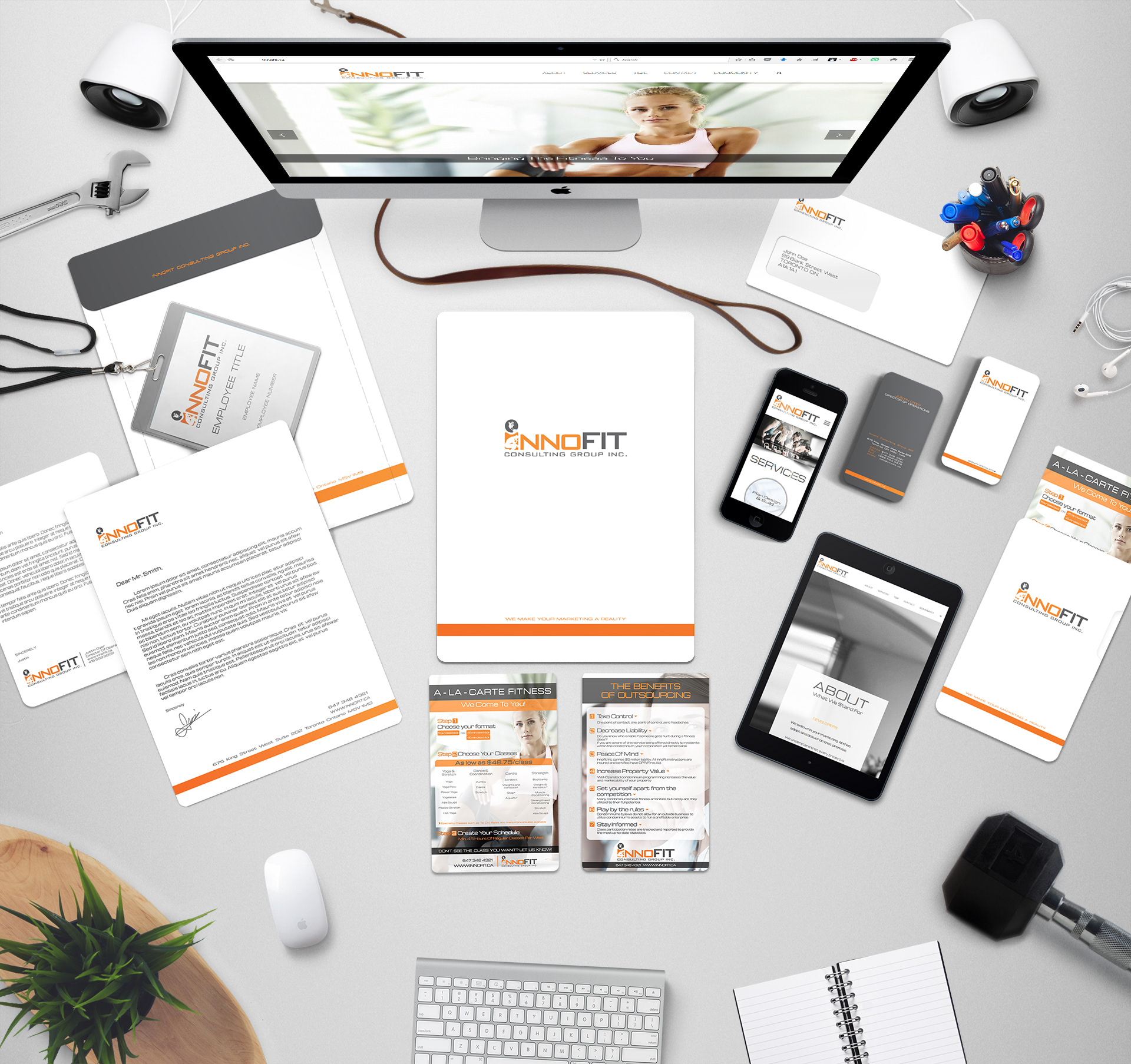
The brand primarily relies on white, as backgrounds, on its graphic elements, and as negative space to shine on its focus points. Providing a sense of cleanliness, and breathing room akin to the services that Innofit provides. The images also have very light backgrounds and a health driven light palette with enough contrast for it to be also used as a black and white image. The black and white images are used as secondary elements as they blend into the white backgrounds quite nicely, and since they have white backgrounds themselves it adds an extra layer of cohesion.
To provide both a sense of inclusion and privacy, a layer of blurred translucency is added to the elements. It corresponds with its amenities such as spas and gyms. In addition the elements are given rounded corners to all its edges, from print materials to graphics etc, presenting the wholesome, friendly approach the brand represents. And to top it all off a bright orange accent color is used to drive attention to points of focus and brings out the warm exuberance the brand stands for.
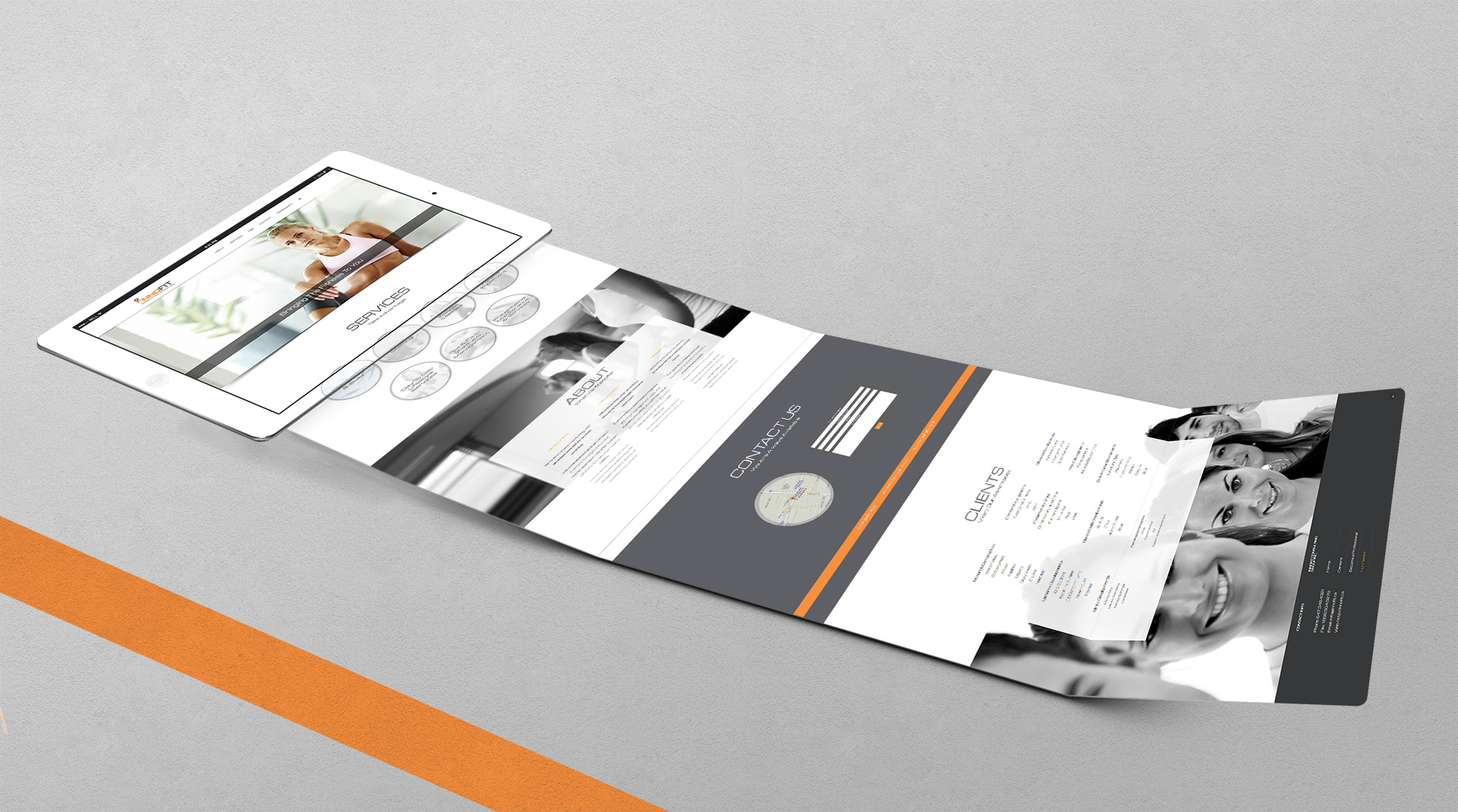
03 The Website
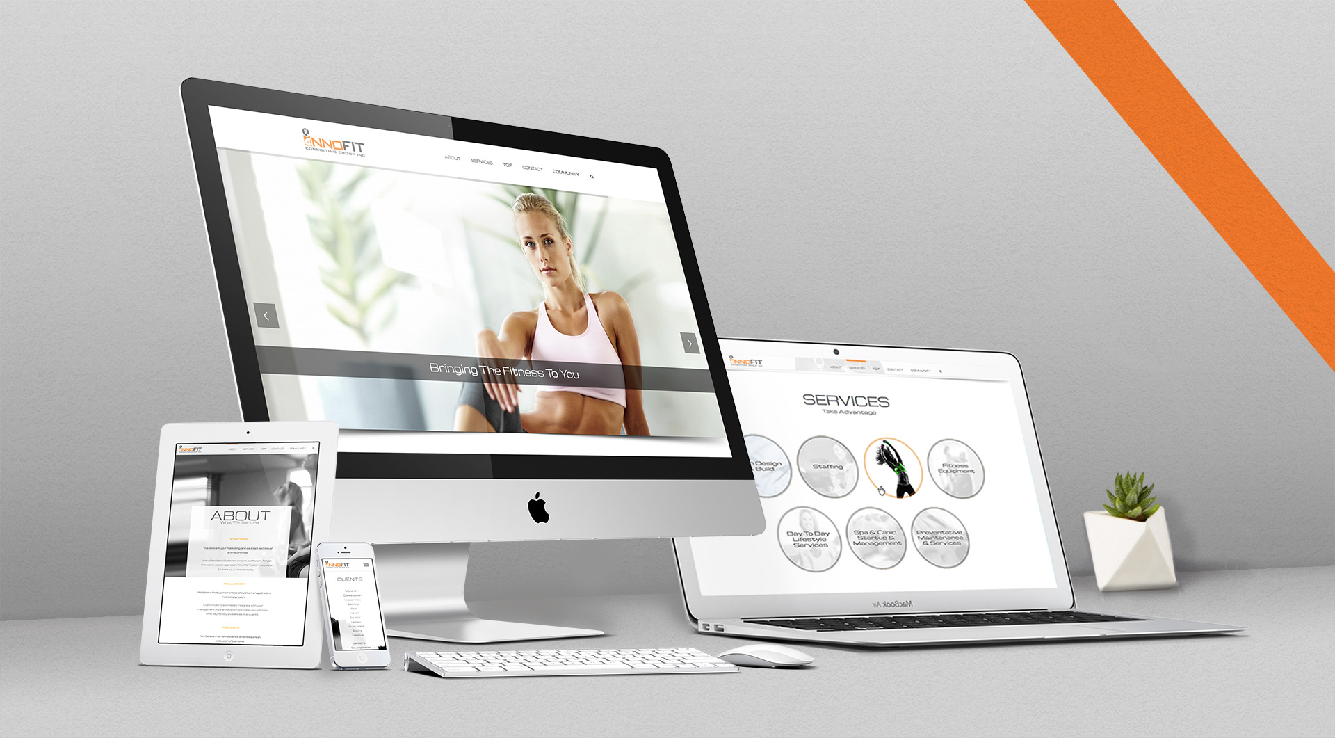
DIGITAL PRESENCE
Because of the long list of services the company provides I wanted to pace the flow of information so as to not overwhelm the users. This was done by spacing the marketing, promotional materials, and written content, while filling in gaps with large, clean and friendly images. Information about each service is made easily accessible with expanding content visualized with icons, staggering the amount of reading.
All the elements of the brand shine and solidify its presence on the site. From providing layers of hierarchy with black and white images turning into full color when the users hover over, to rounded edges and accent colors to bring out that sense of friendliness and more.
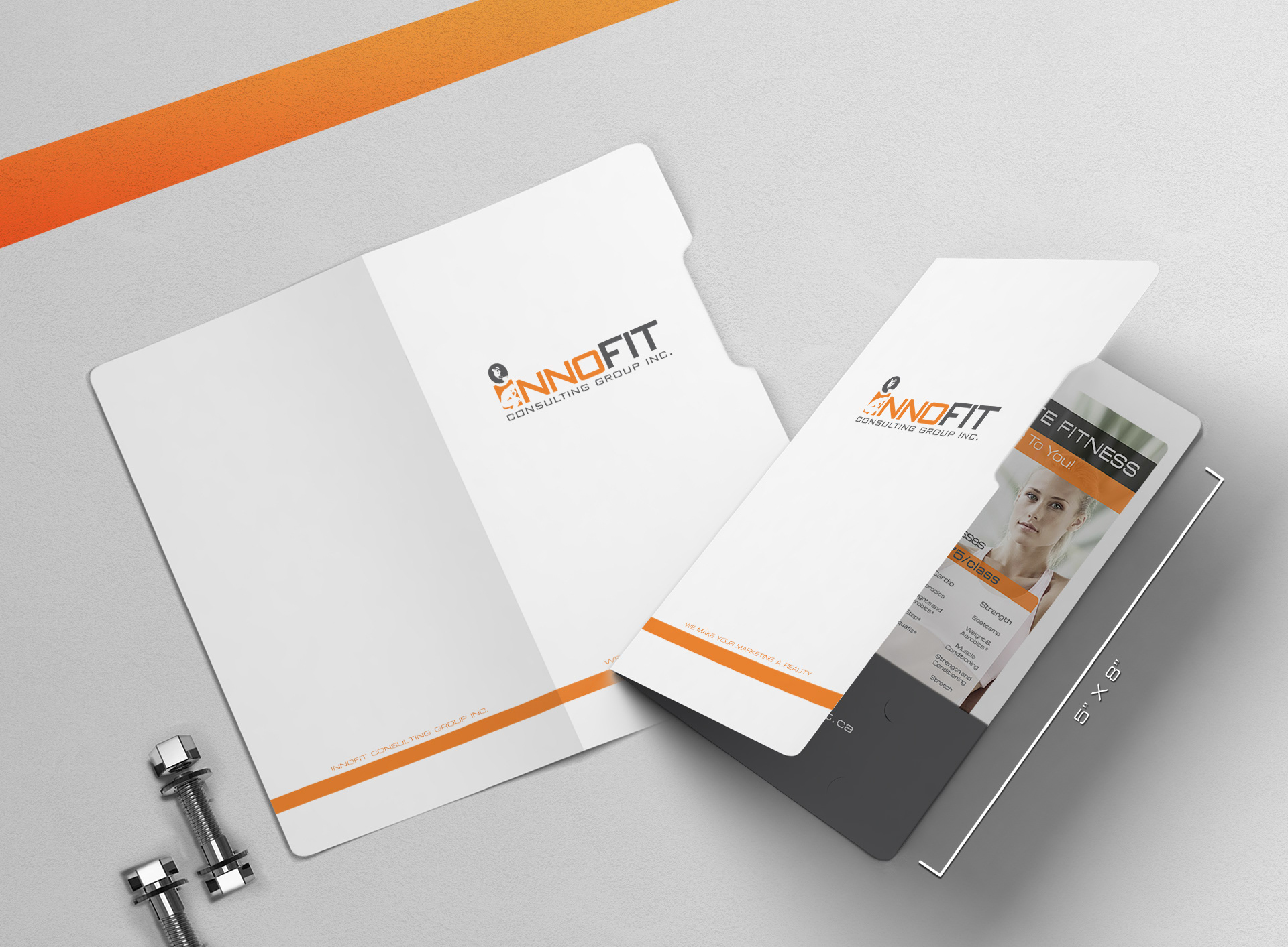
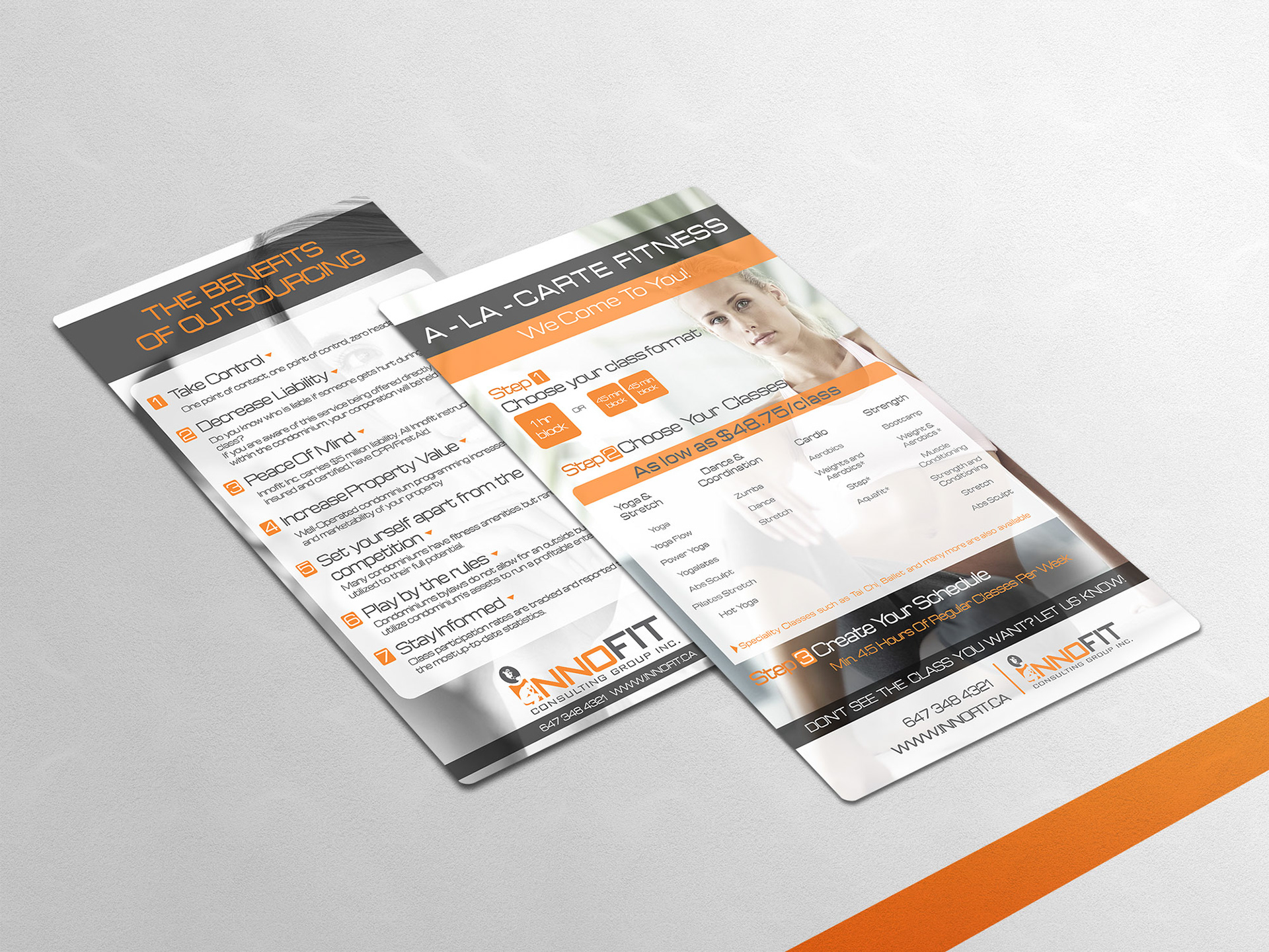
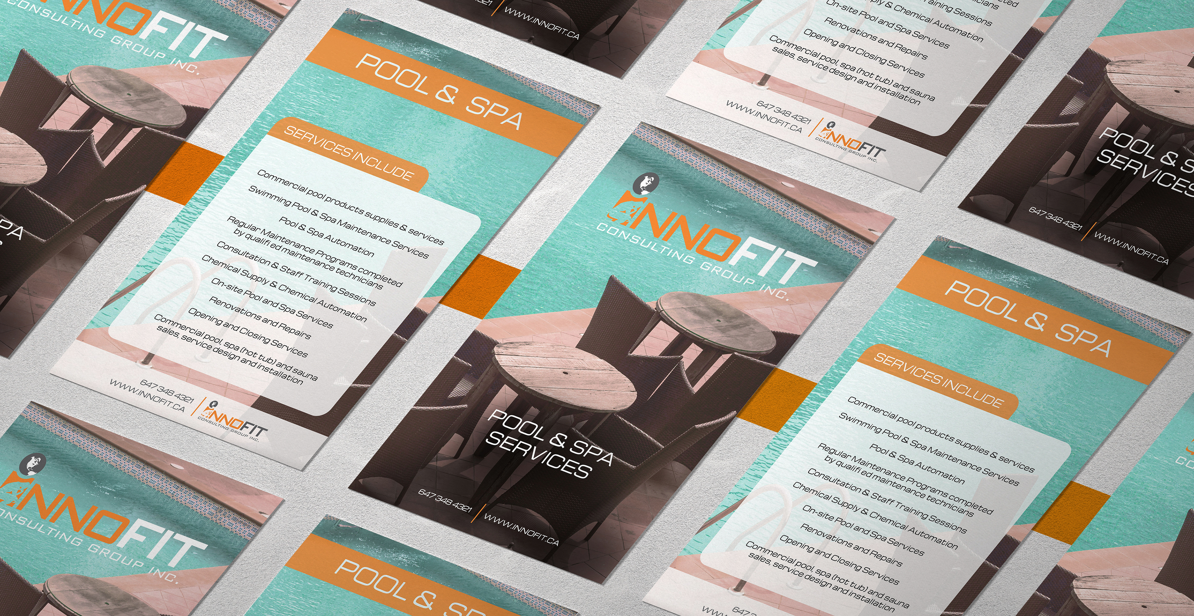
04 Marketing Design
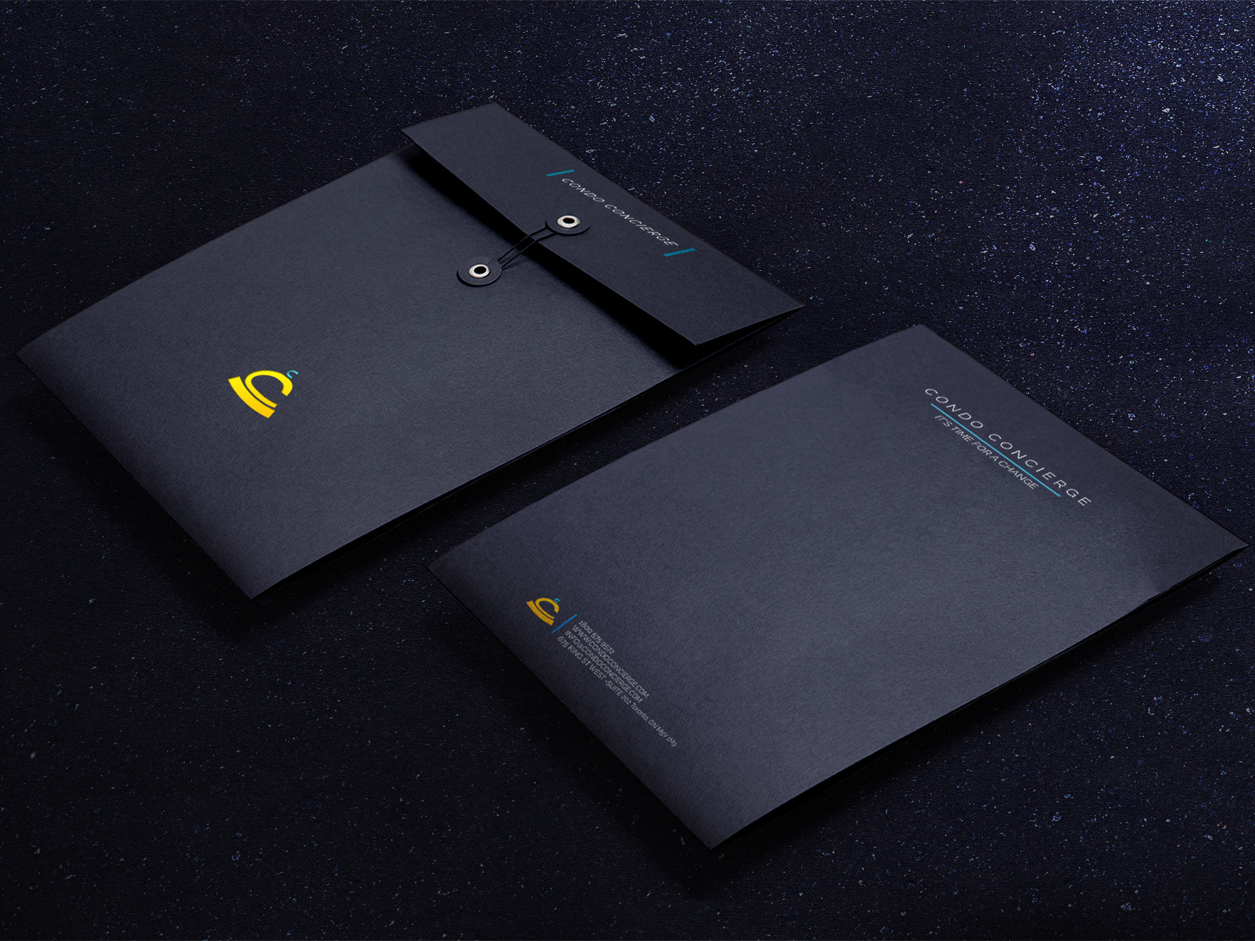
SOMETHING TO TAKE HOME
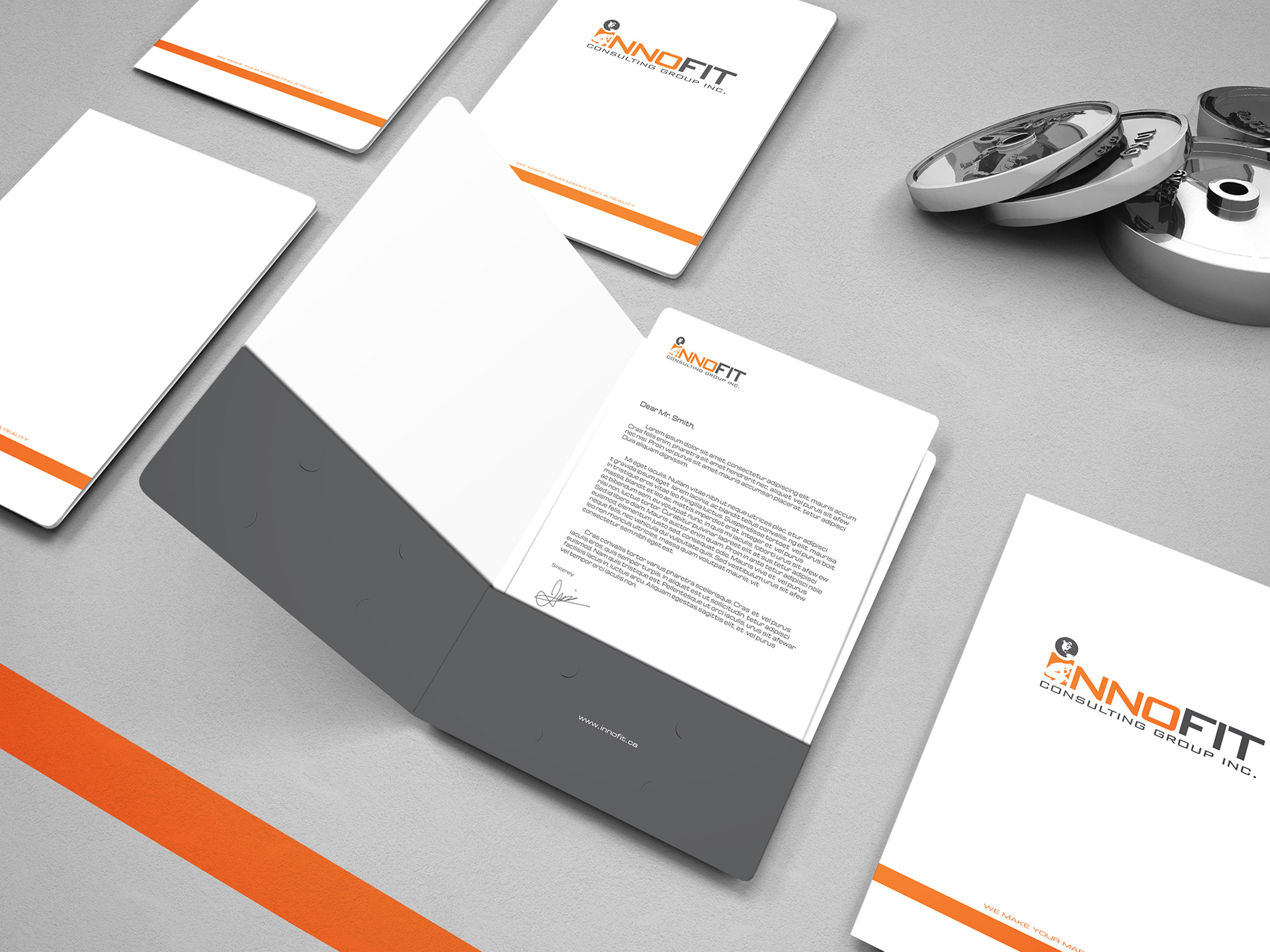
Marketing materials are where the brand gets a chance to elevate its presence with flashier content. Innofit’s marketing materials were mostly brochures and flyers, however they were all the same size, and special mini folders were created to encompass the collateral. So the client/ potential client was never handed just a flyer or brochure, but more of a mini presentation banquet. The brand’s information was provided within the folders, along with card holders providing a sense of completion and extra care.
The picture style remained the same for consistency, however multiple layers of the brand were added on top, such as the translucent sections and the orange accents. Increasing the flare of the brand, while still being recognizable as Innofit.
05 Synopsis
INNOFIT
2015
I was able to unify Innofit’s corporate identity through branding, web design, and marketing with a more light and fun personality, but also in keeping with their health related services. I was matched up with the brand when they were looking for a change. They had the name and the clientele, but they needed a full scope brand and a website to go with it, and then came the marketing materials.
Research was the main takeaway from this case study. I took a look at their competitors, created a lot of mood-boards, understood the level they want to reach, and then I worked on elevating their collateral, adding extra touches and solidifying their presentation. Making it all come together in the end in an unified, unique but accessible design.
___________________________________________
Thank you for viewing!