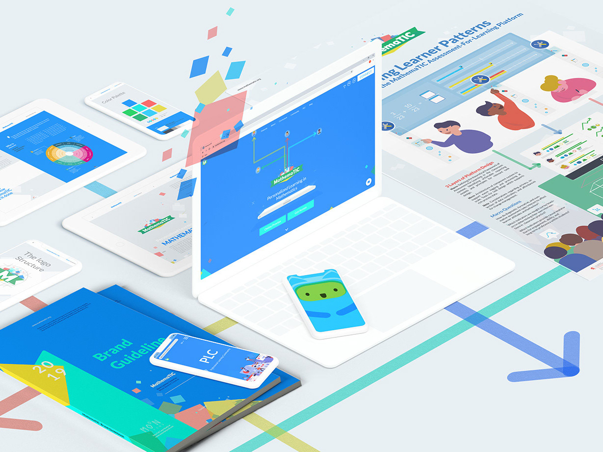


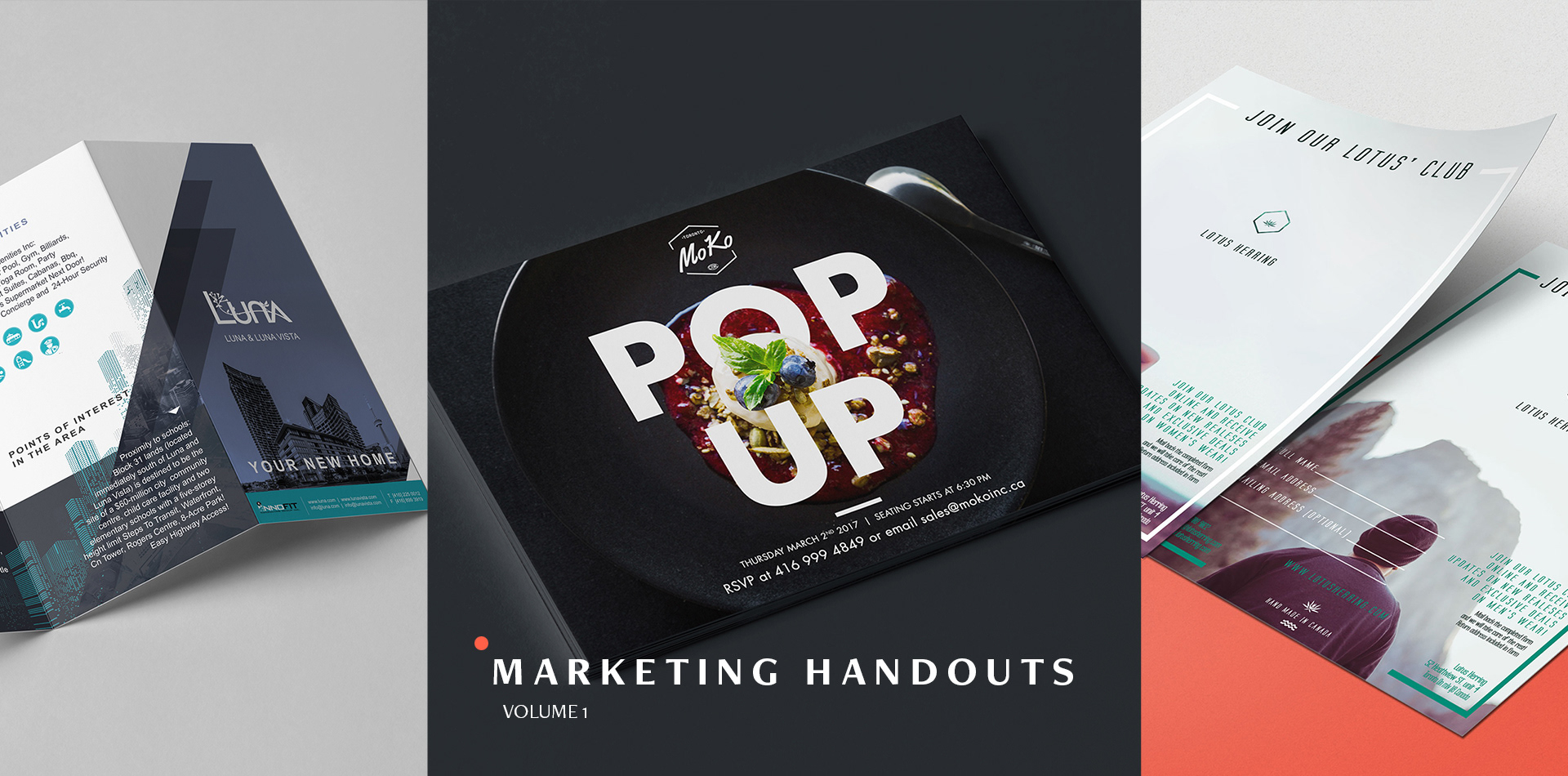
01 Overview
Marketing Handouts (VOL. 1)
A collection of some of my mid to small size Marketing Print Designs. From brochures to magazines to postcards to flyers. All done in diverse styles, including different styles of illustrations, iconography, pictures, and graphics. The following are created for print, to be handed, mailed, advertised in magazines or other similar sized productions.
Marketing Design | Print Production | Photography | Typography | Copywriting | Art Direction


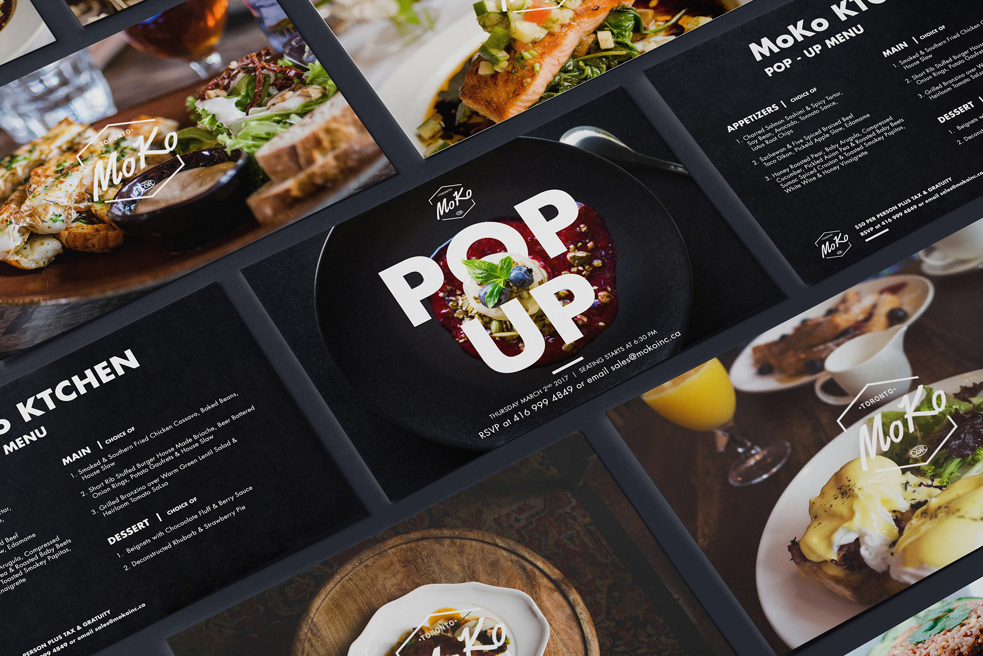
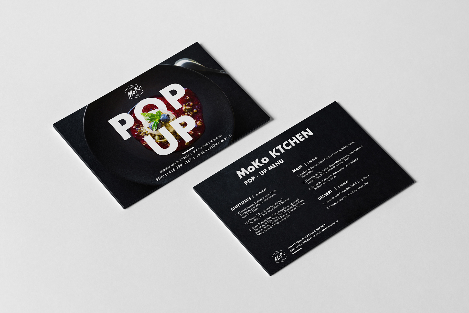
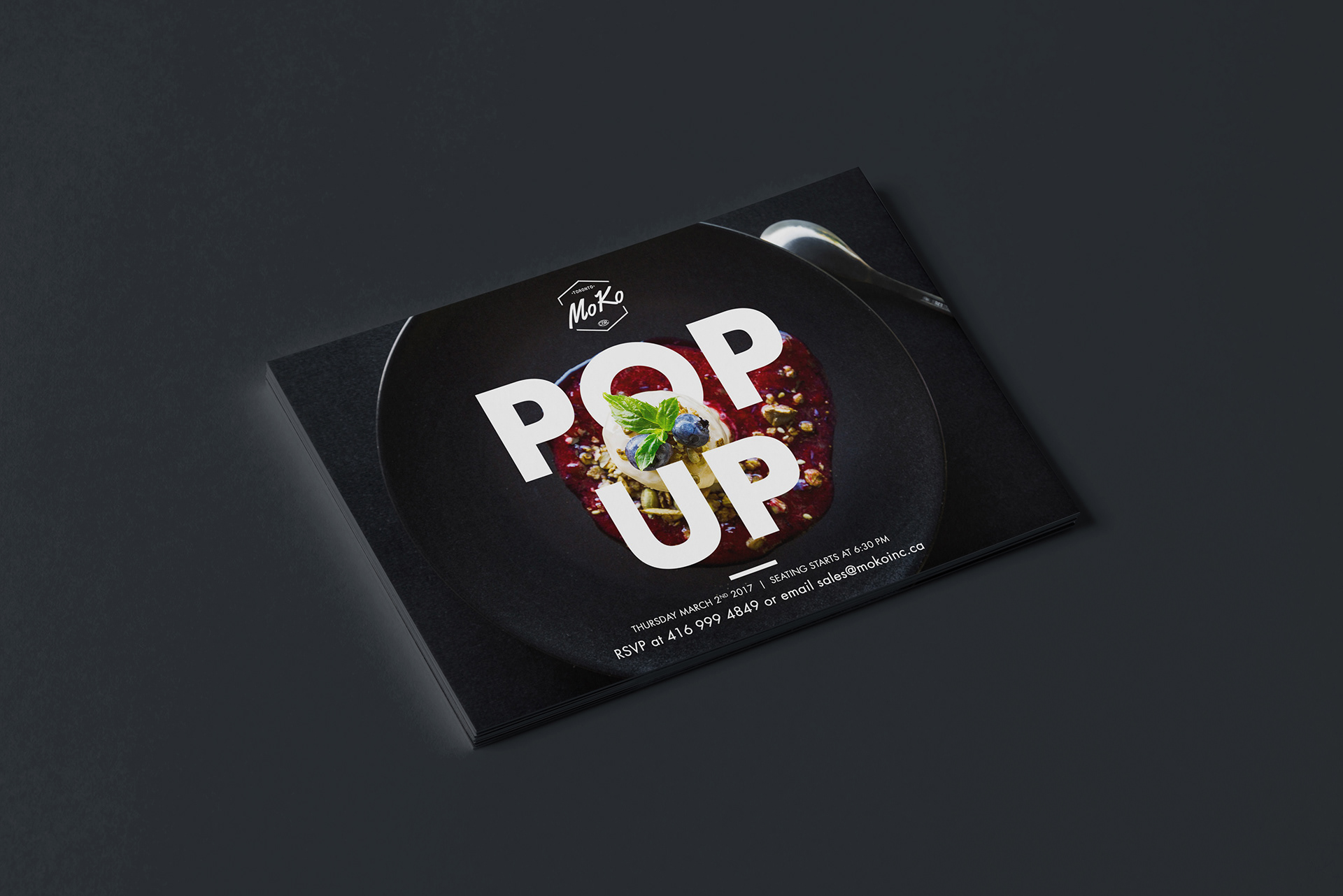
02 Moko Kitchen
POP UP MENU
I was paired up with a well known Kocher master chef through a mutual friend. He was in the process of opening up his own restaurant. At this point he finished up the essentials of the kitchen. And he wanted to have a pop up intimate dinner with a fixed menu.
The logo was the only branding work done so far, so after some playing around with the editing process of the pictures, I came up with a photography style, found a suitable font, and a dark color palette, all tying in to show off the rich, luxurious, intimate feel of the dinner. It was finished with a simple layout, with popping typography headers. And I followed through on the production to make sure it was printed on thick stock matte finish paper, to emphasize the quality.
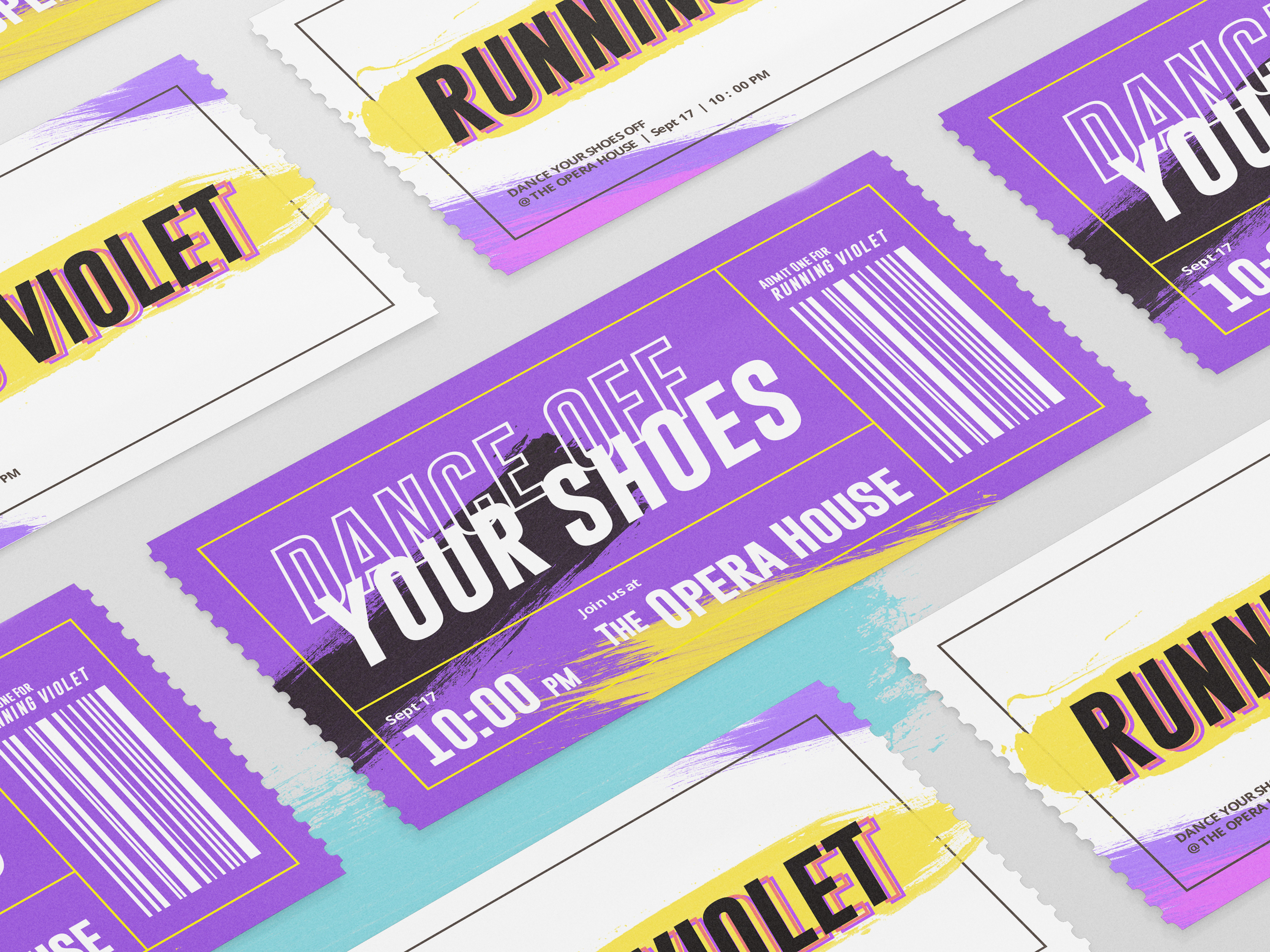
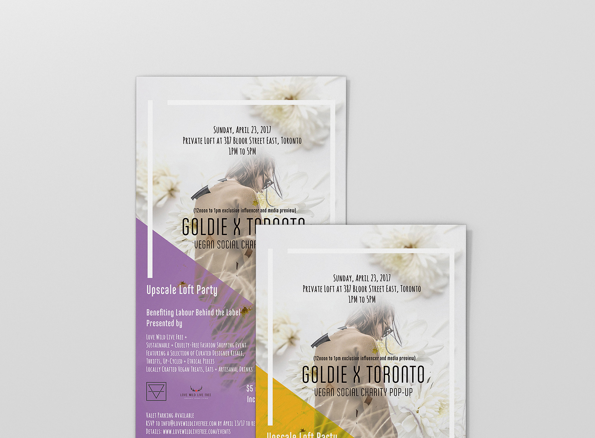
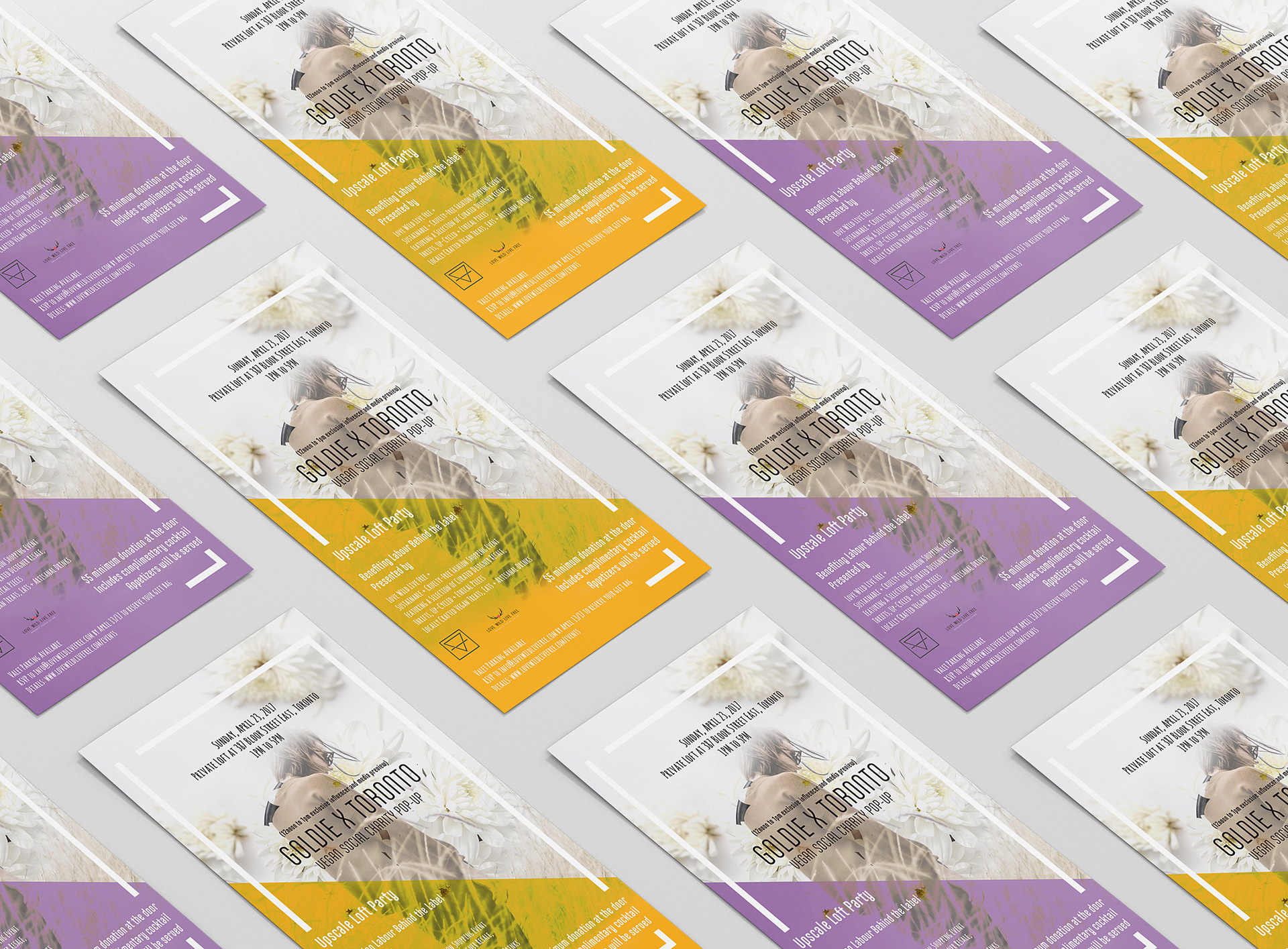
03 Goldie X Toronto
vegan Social Charity Pop-Up
Another simple one off marketing flyer for an event. Goldie was a small marketing agency that I worked with on several occasions. This was an unique flyer in the sense that two different versions of the flyer were printed. Both with a different overlaying color however conveying the same pastel feel. The reasoning for this was because this event was a partnership with Goldie and Love Wild Live Free. The purple and the yellow were accent extensions of both the brands, however they were given a pastel tone for the event.
Since it was a partnership, the event needed a design that stemmed from both the brands, so I created a photo style that can represent them both, and same with the font. Allowing it to have its own look, while still being recognizable as Goldie and Love Wild Live Free.
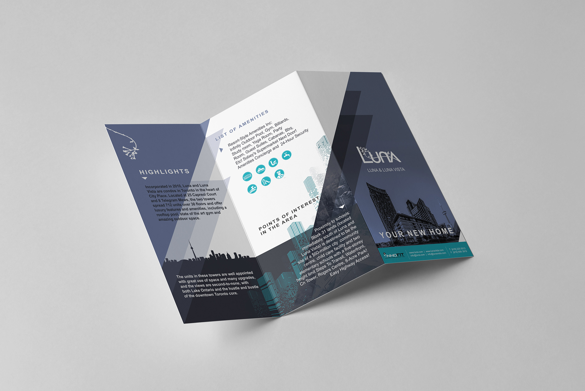
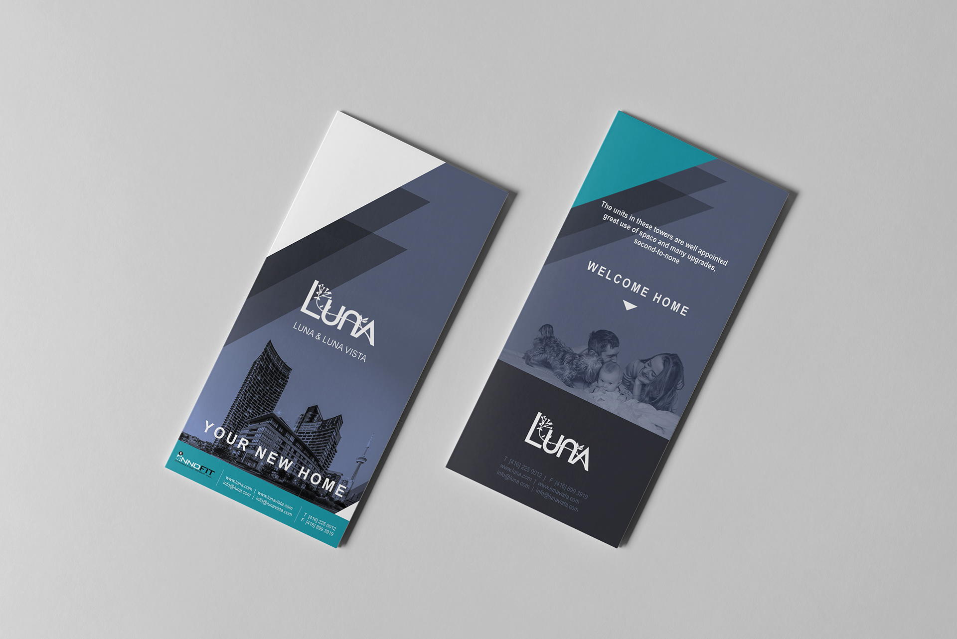
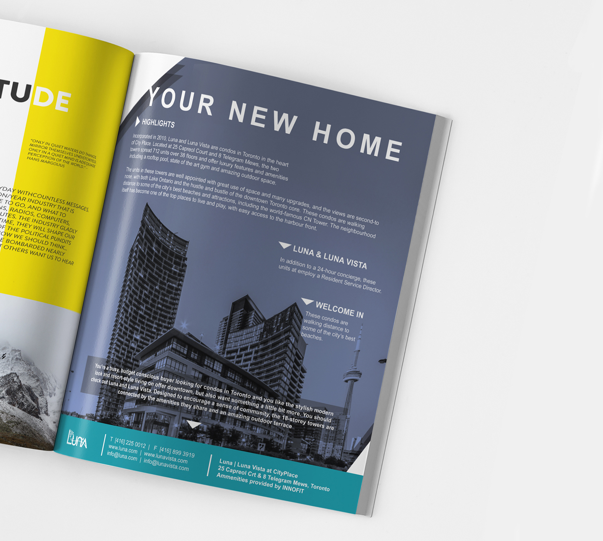
04 Luna & Luna Vista
YOUR NEW HOME
I was brought on board to create some marketing collateral on behalf of one of Innofit’s (one of my first clients) clients: Luna and Luna Vista, a pair of Condos in Toronto. It was a magazine ad, and a brochure mail out. Both providing similar information, with the magazine ad being more of a summarized version of the more informative brochure.
Similar to the others, only the logo was created for the brand thus far. In order to create a cohesive look for both the marketing collateral and whatever may follow I first needed to extend the brand. I started by creating a simple palette and a font that works with the logo, designed a correlating picture and icon style.
I found triangles to be the right shape for the brand, and I used it as directional points, and as part of the background, to create a consistent and energetic layout. The picture style contained an overlaying effect with the background, and to drive that point further, layers of transparency were added to other shapes to give the brand more depth. All coming together to provide an united front for this marketing campaign.
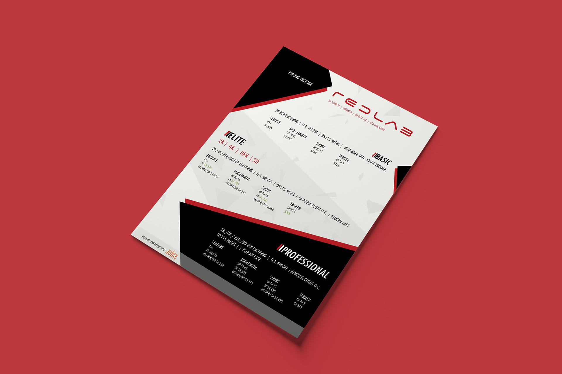
05 Redlab
Pricing Package
As the name suggests, the following design is a marketing flyer for Redlab with a breakdown of their pricing package. The brief was simple, I just needed to take the spreadsheet of the different price points and present them in an exciting way.
The brand wasn’t developed beyond the logo. So again my first step was to extend the brand’s visuals by creating a palette, choosing the font, creating energetic shapes to provide direction and a sense of breaking away (which was in the brand’s core). And to finalize, it was printed on glossy photo paper to give that polished touch for the recipients.
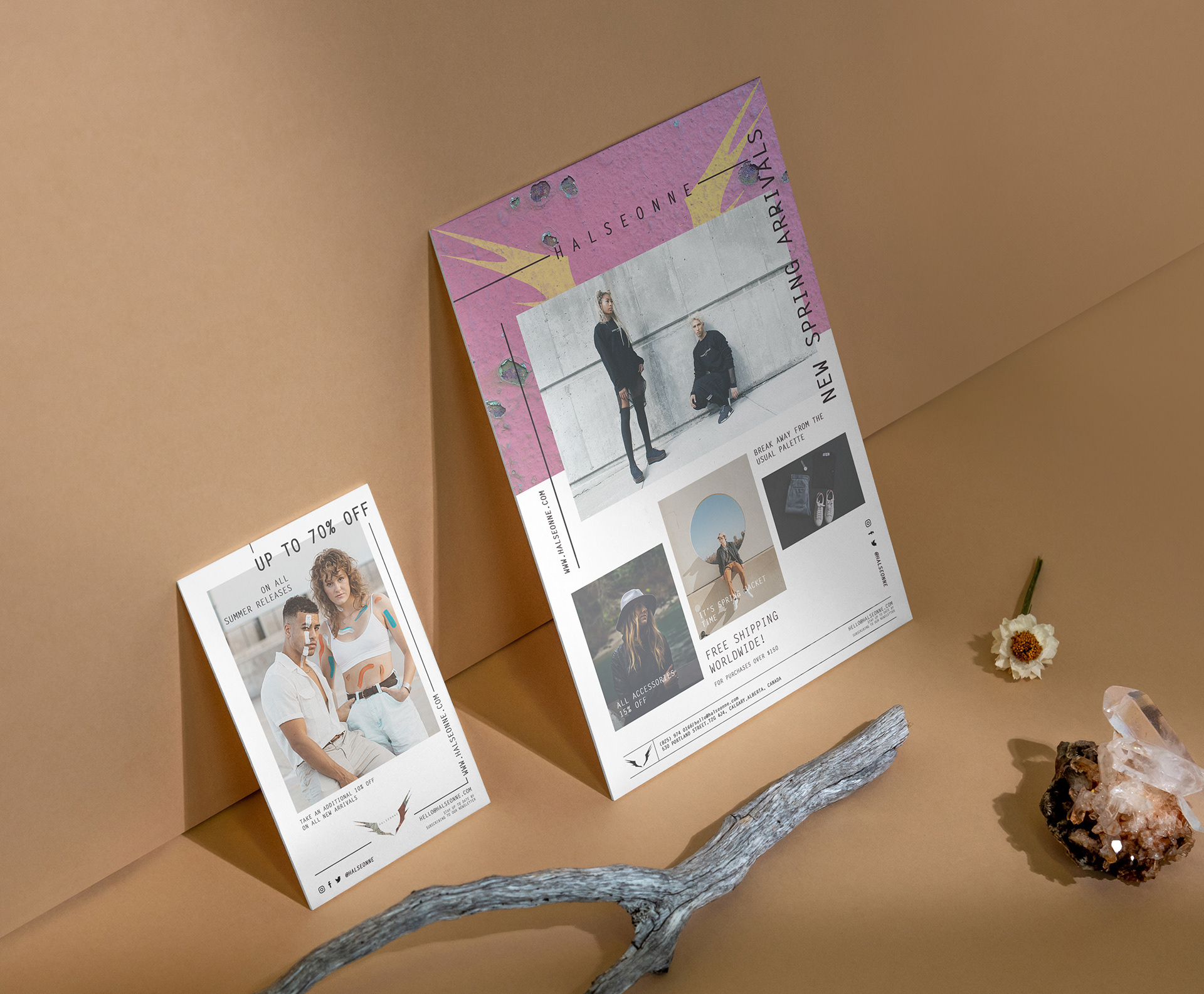
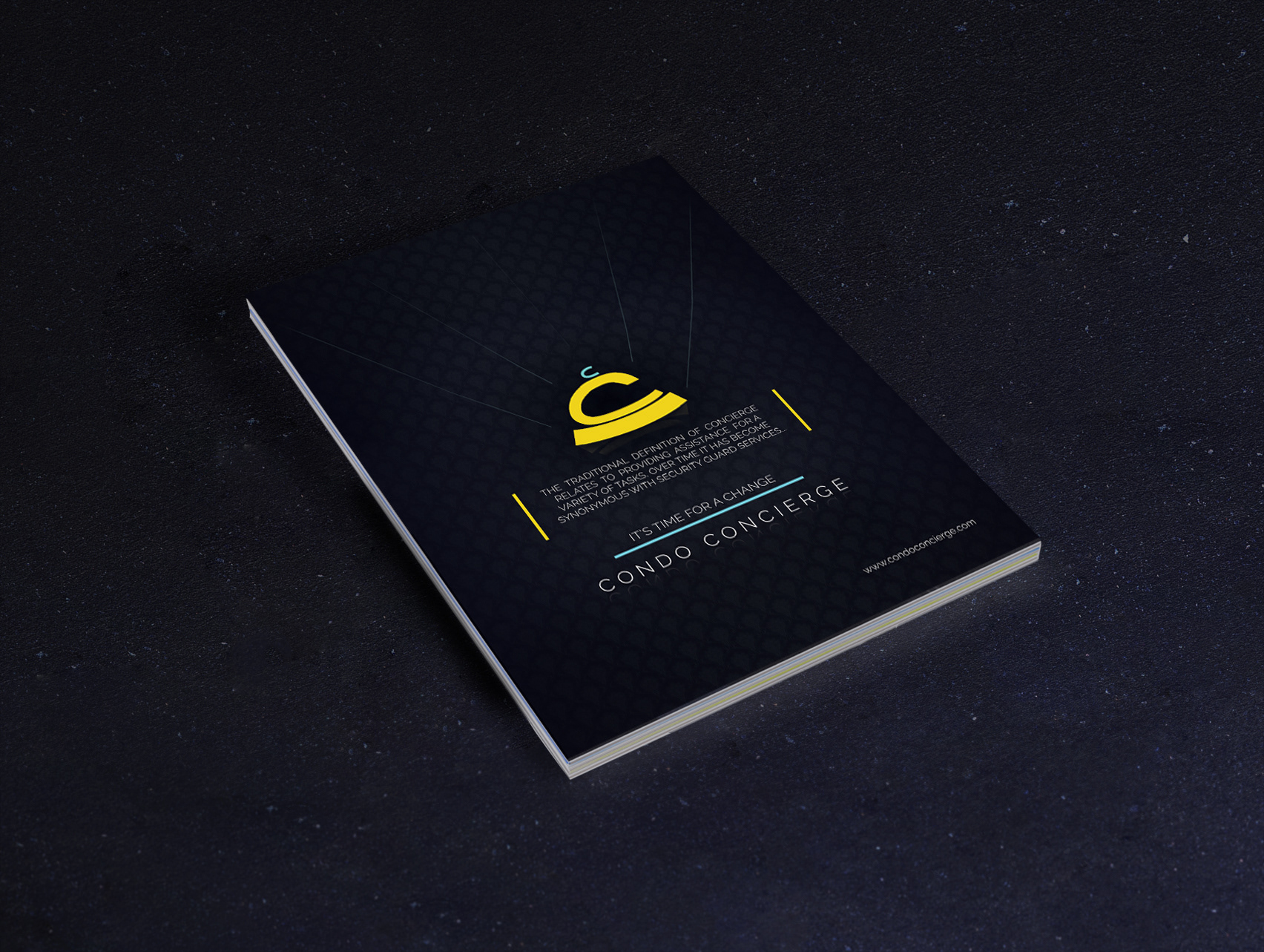
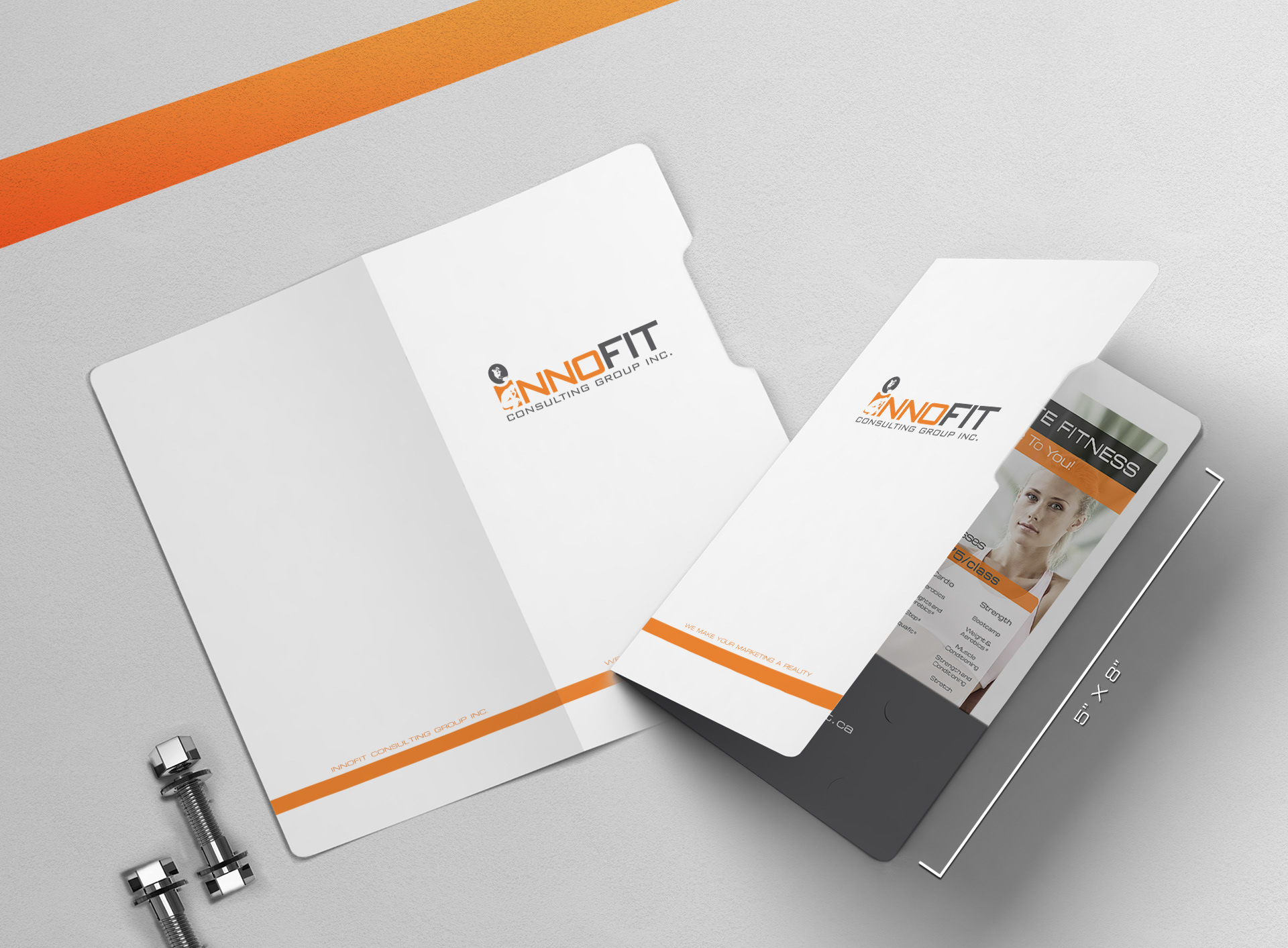
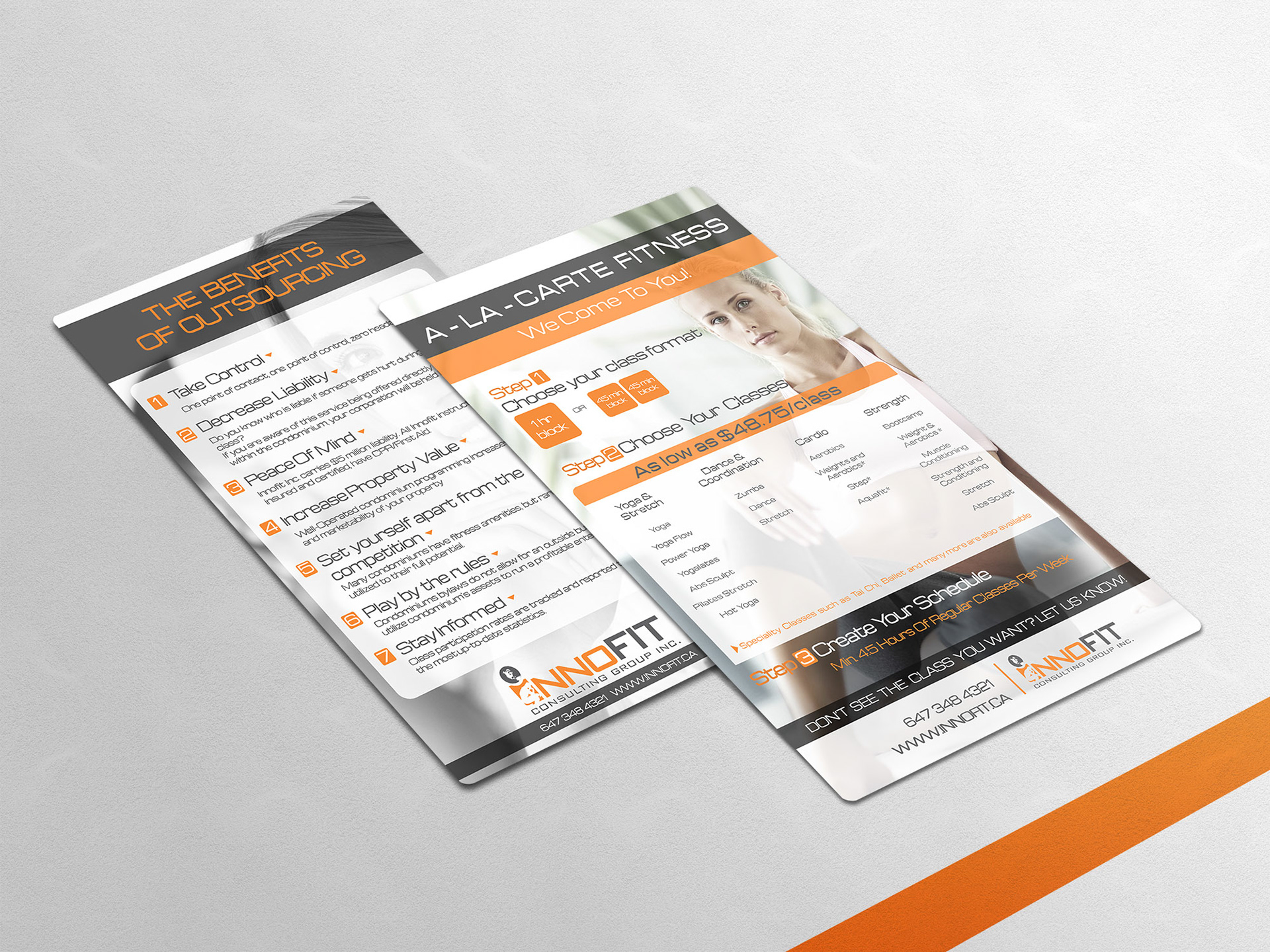
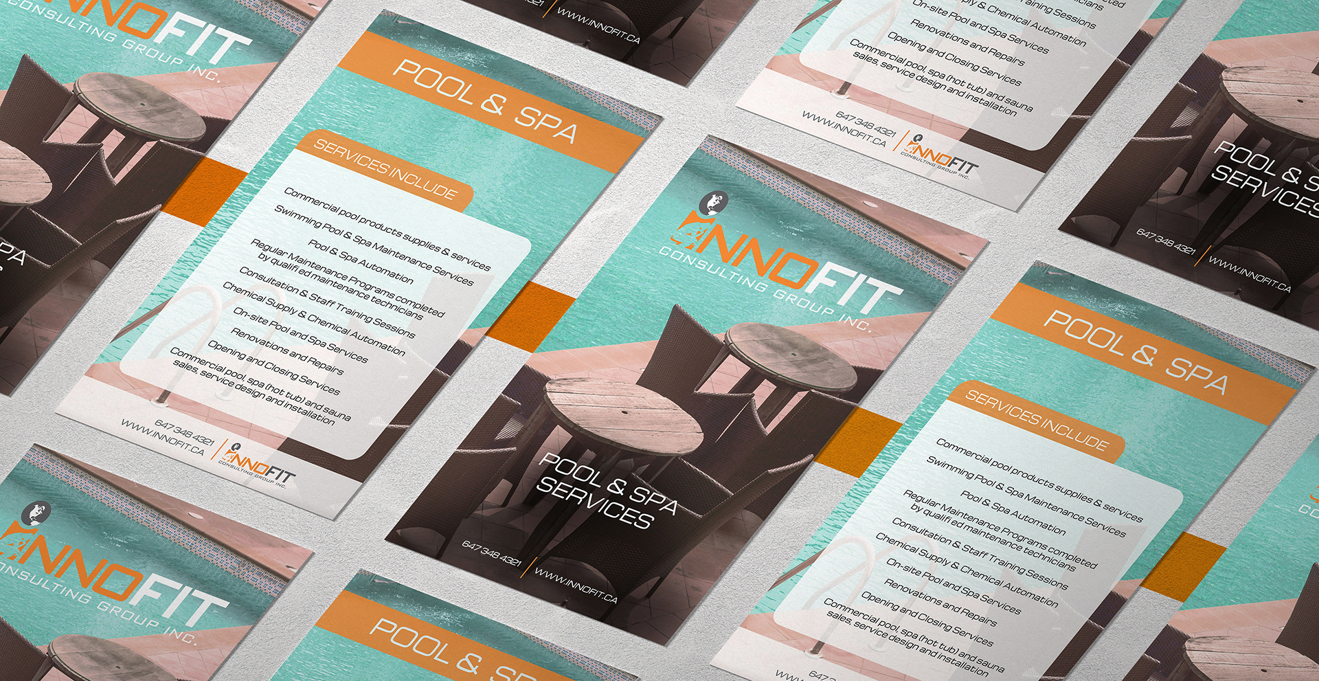
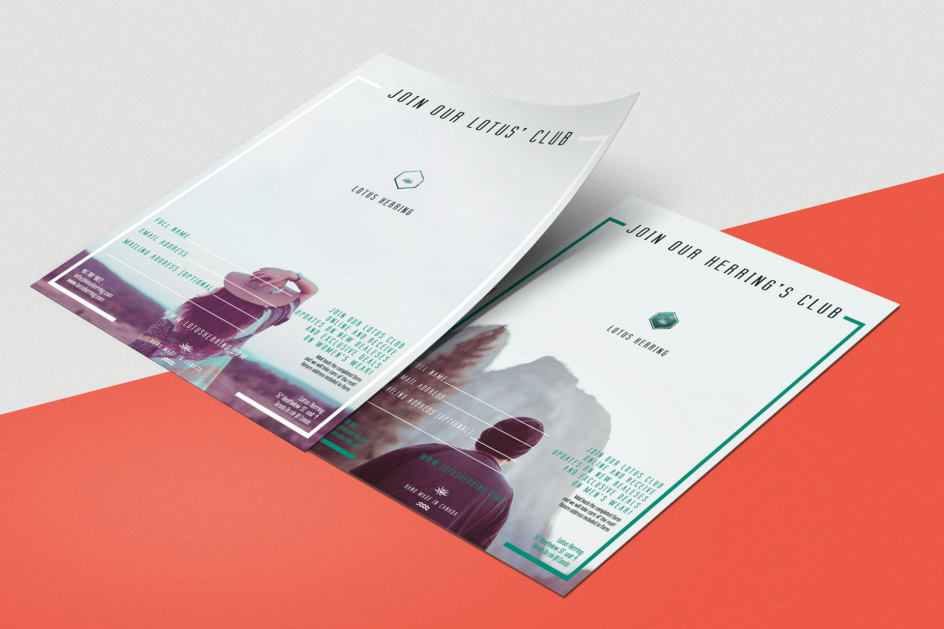
06 Halseonne | Condo Concierge | Lotus Herring | Innofit
PART OF A WHOLE
The next 4 pieces are examples of marketing collateral from some of the larger projects. I’ve created their full brand, designed their websites, and other marketing and editorial needs.
Click on the names of the brands to look at the full scope projects:
07 Synopsis
Marketing Handouts (VOL. 1)
2011-2017
I don't always work on full scope Cases, sometimes I am there just to add a certain flare to a certain section of a project. A client with their branding and website needs met will still require marketing materials, stationary, packaging, info-graphics etc. I make sure to extenuate the brand, find places where it has the potential to reach but haven't gotten there yet, and take it there.
Starting with the concept and providing Art direction, adding layers to the branding and seeing it through to the production phase, I am there every step of the way to provide a full service, identical to my full scope cases. Some of the products here are extracted from a larger case that I took in, such as: Halseonne, Condo Concierge, Lotus Herring, Innofit. Feel free to take a look at those projects and see how the Editorial piece fits in as a whole.
Hope you guys enjoyed this collection!
___________________________________________
Thank you for viewing!