

01 Overview
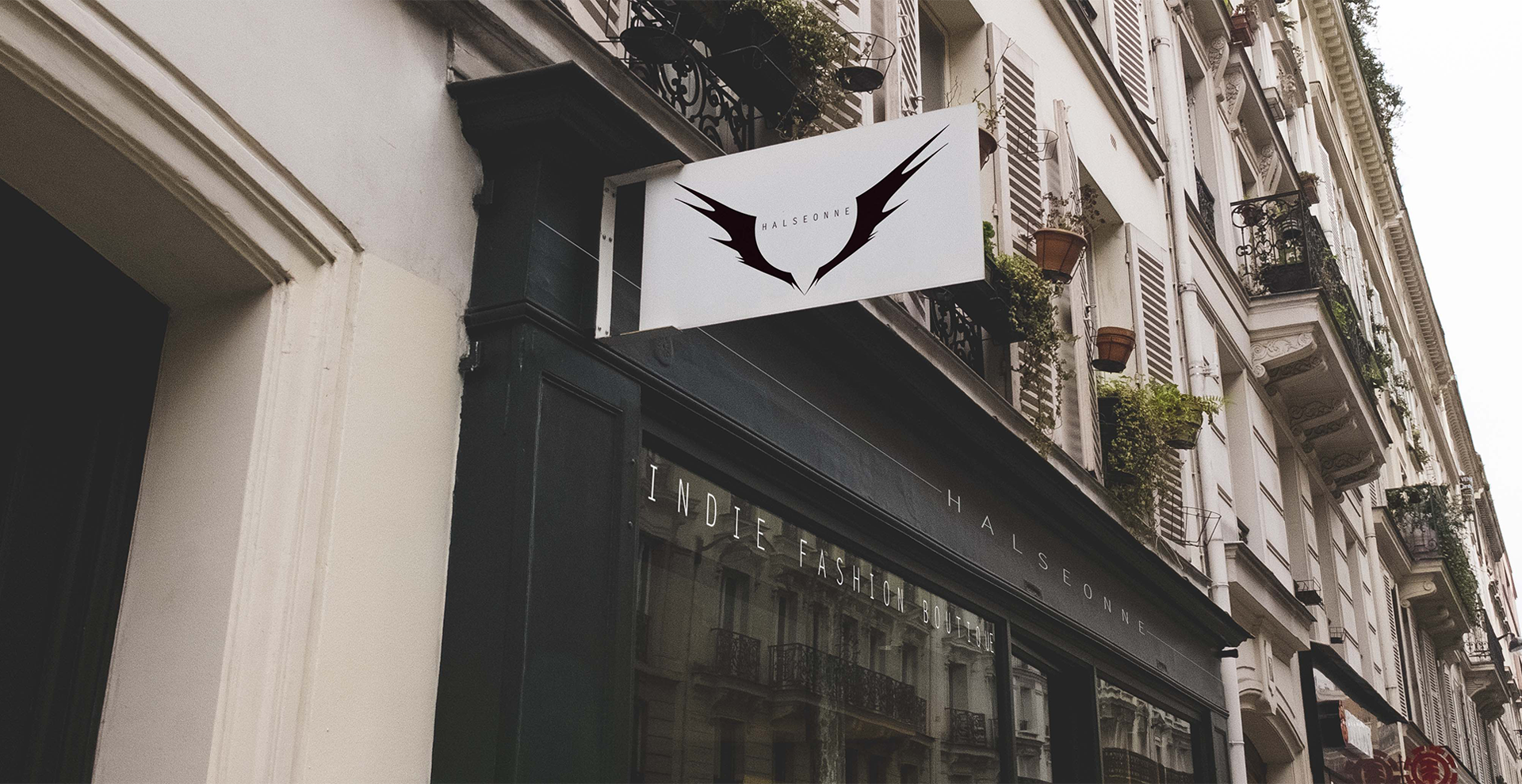
HALSEONNE
Halseonne is an indie fashion boutique that carries high end products for urban tastes. A brand with a distinct edge and style. I found it to be a fun challenge to match their alternative attitude with an equally compelling name. Once I created the name Halseonne, I wanted to shine its story through the visuals.
Logo | Branding | Naming | Marketing | Signage | Packaging & Labeling | Stationery | Photography | Typography | Production | Copy Writing | Art Direction
02 Creating an Identity
origin story
I began by working closely with the owners of the brand to create a word cloud to get the right feel. I struck the right nerve with words such as: youth in revolt, flight, urban luxury, soar, earthy stone, freedom, nostalgia etc.
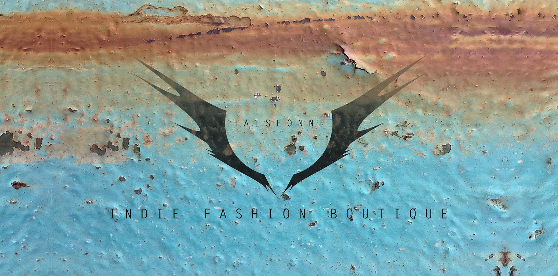
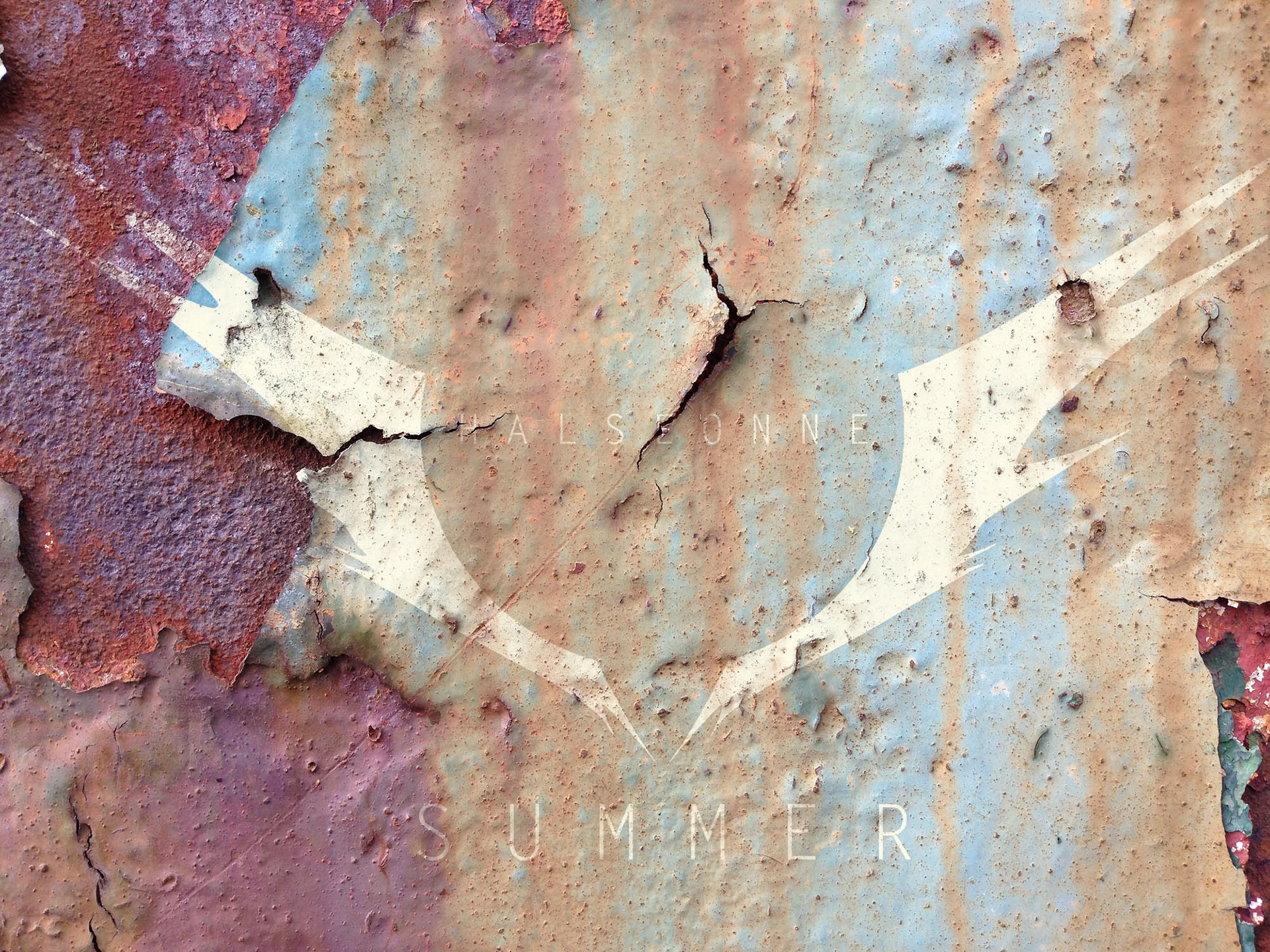
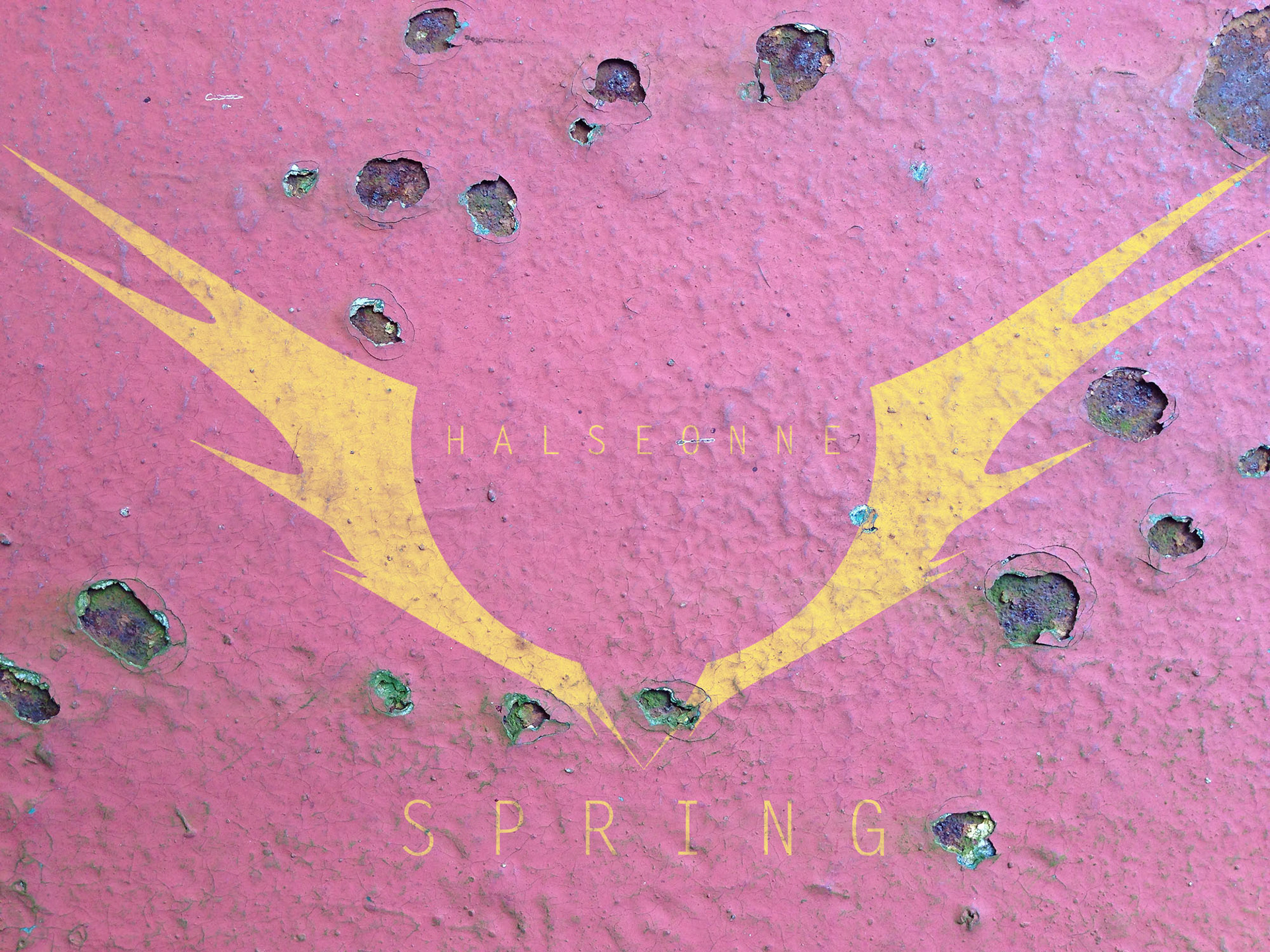
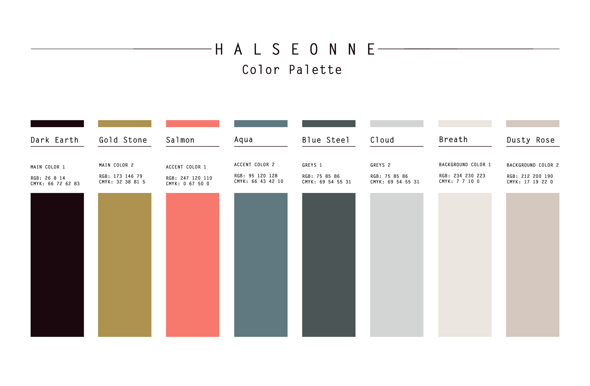
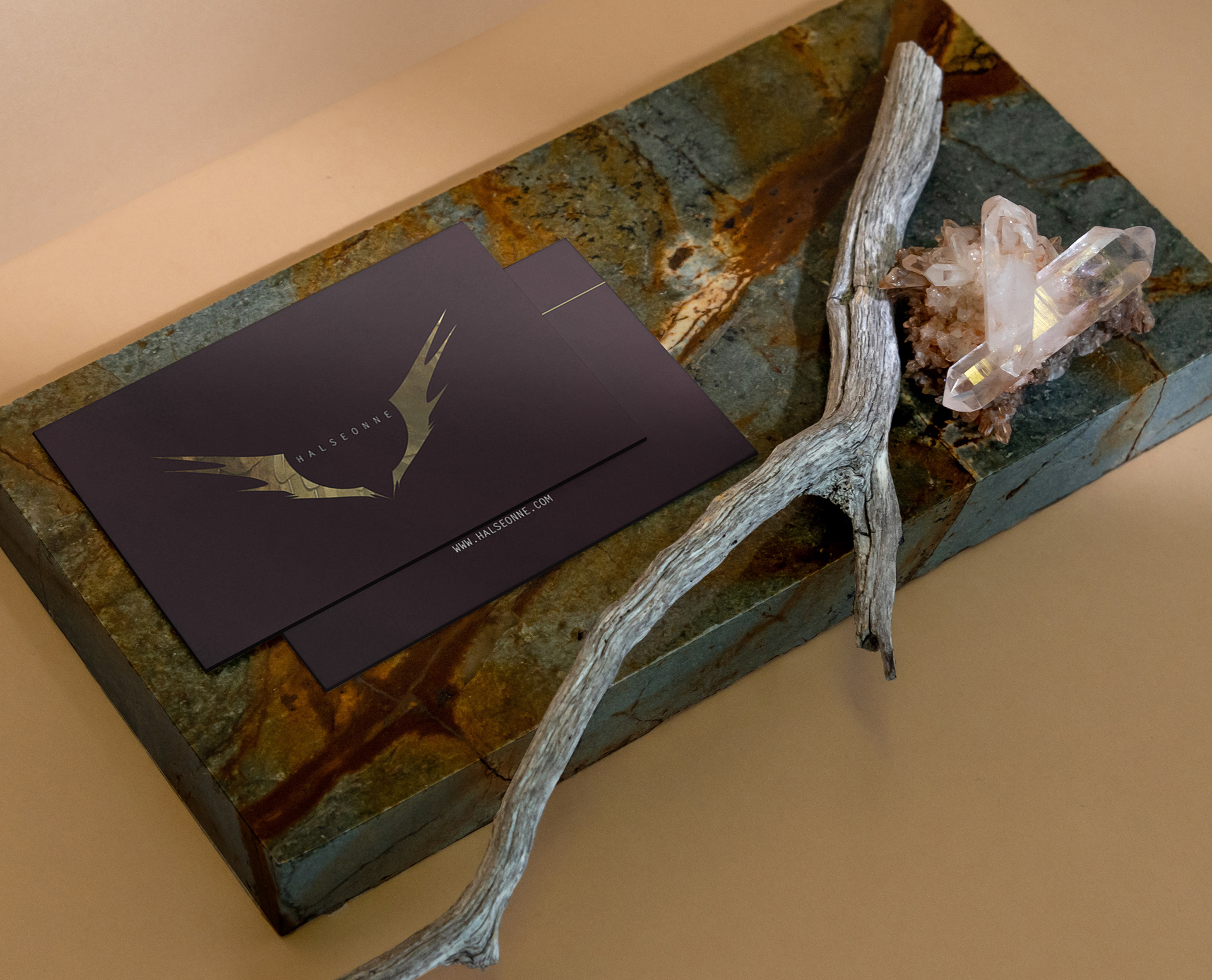
After thorough research and brainstorming, unifying and emoting those words as one, I came up with the name Halseonne. Coming from the word ‘halcyon’ meaning peace and tranquility it is also a species of kingfisher. I wanted Halseonne’s double meaning to be represented by both the colors and the logo. The muddy brown of the background keeps the brand grounded while the wings in the logo keep it afloat. The different textures show off its edges and roughness of the brands' rock star sensibility and rebelliousness.
The brand was created in a responsive manner. From small icons and packaging to large posters and signage, the logos, textures, patterns, graphic/ pictures can all scale without causing disruptions or space related concerns in the design. There is a design for every size.
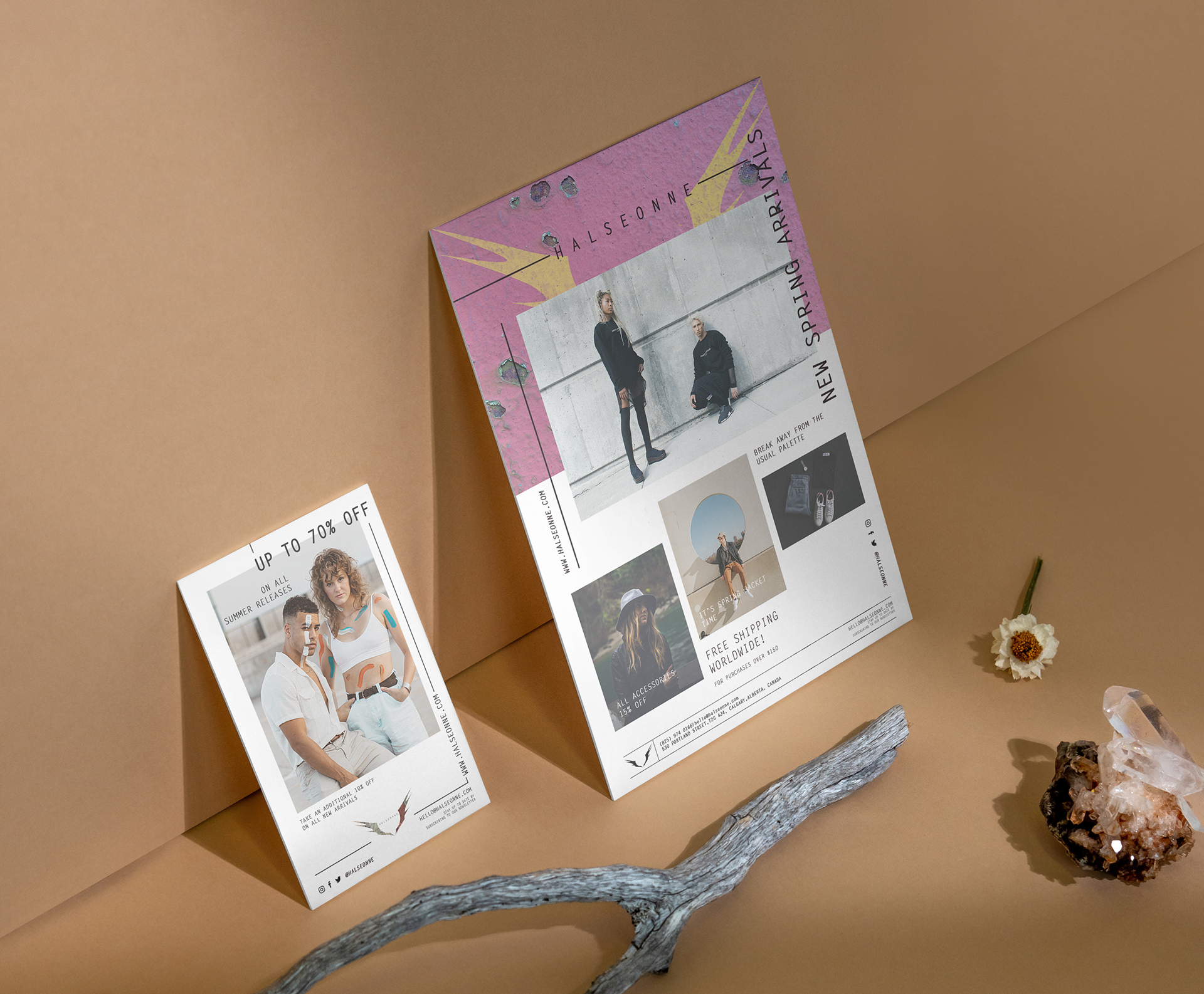
03 Marketing & Stationery
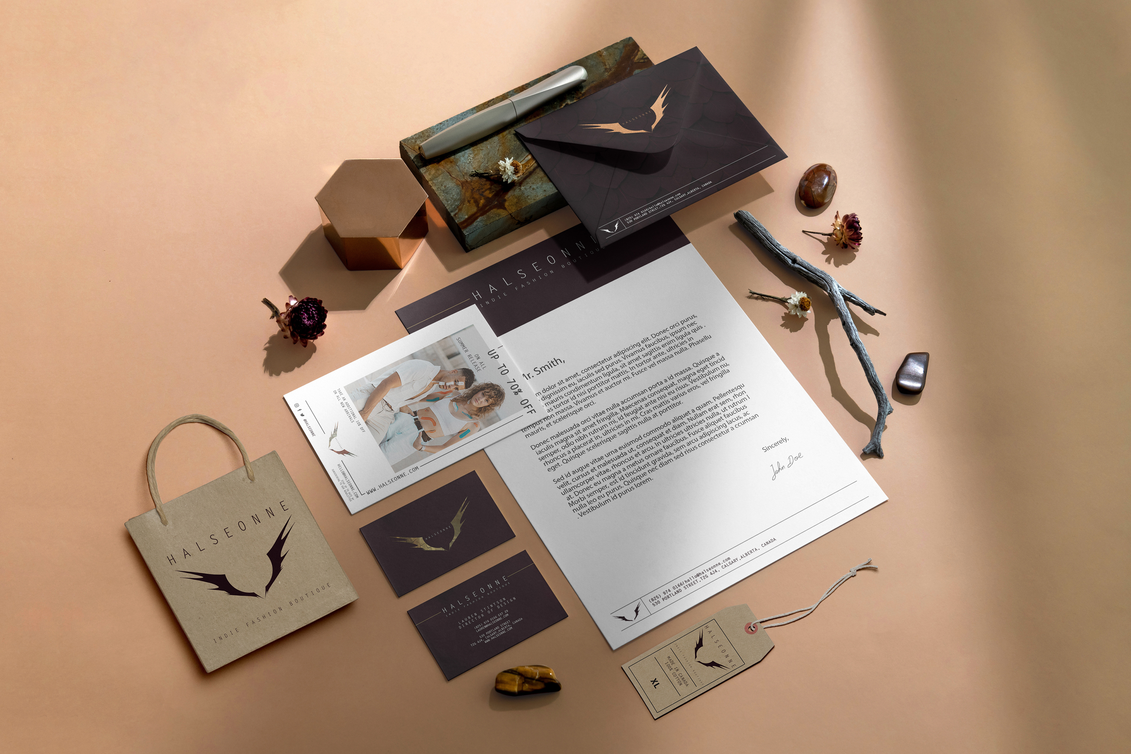
The Hard Copies
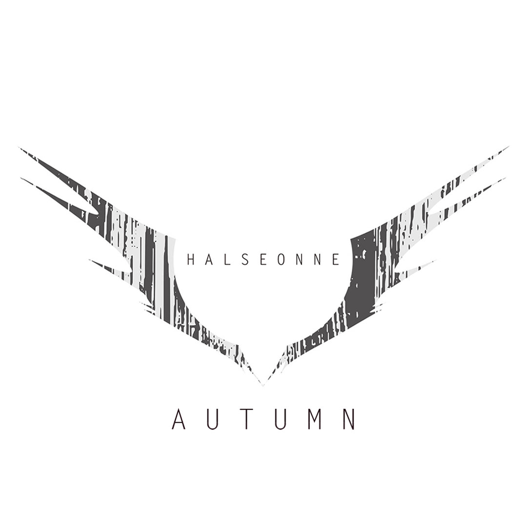
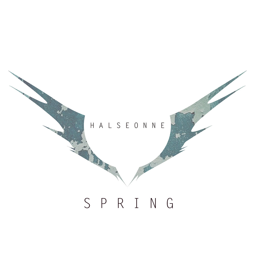
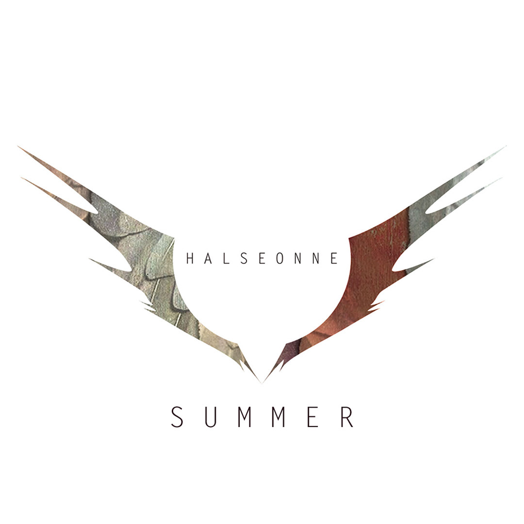
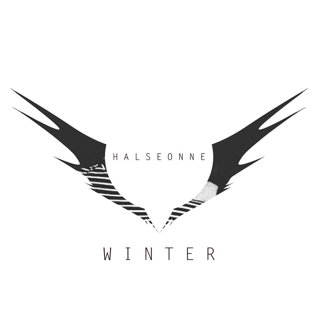
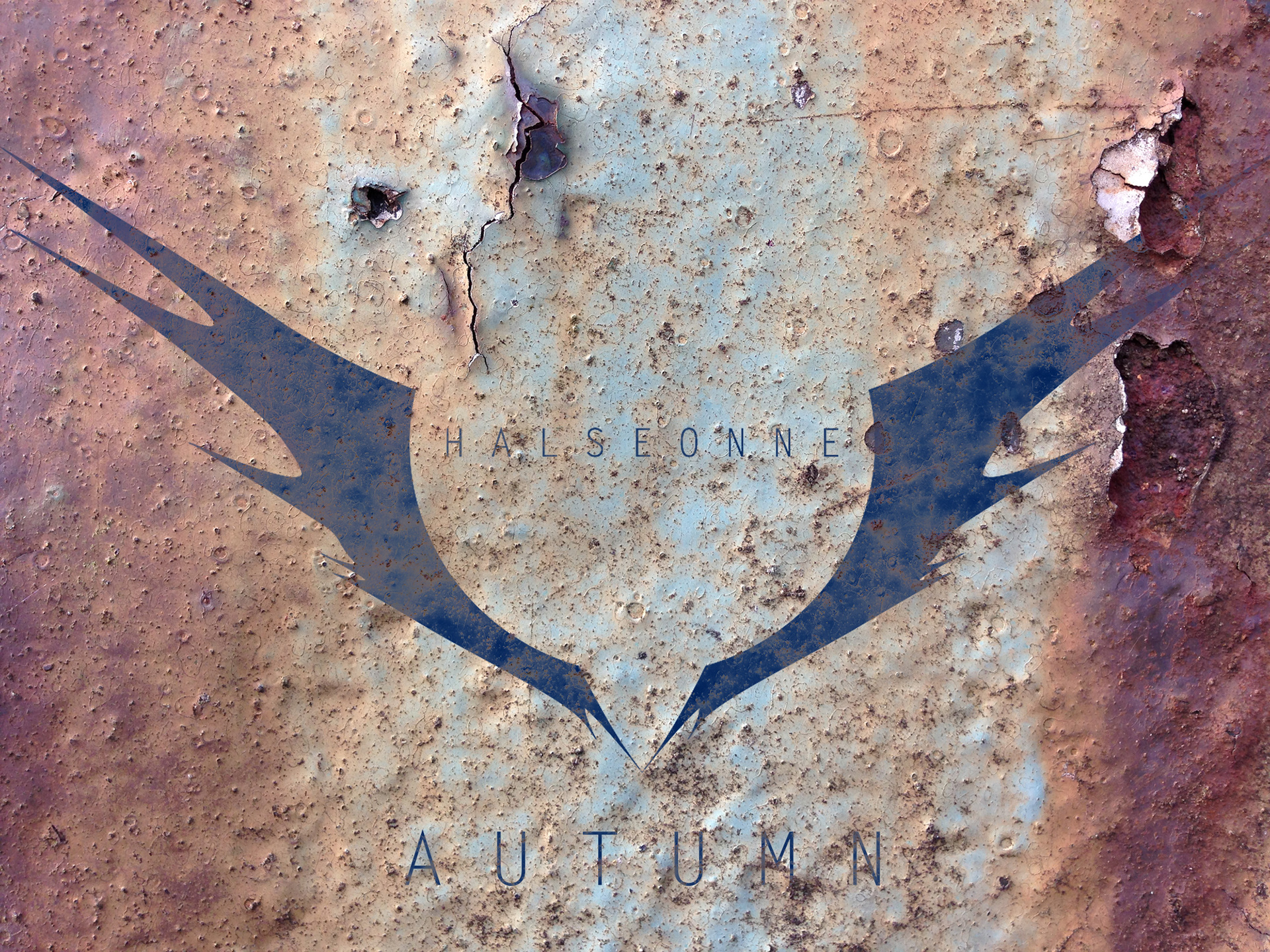
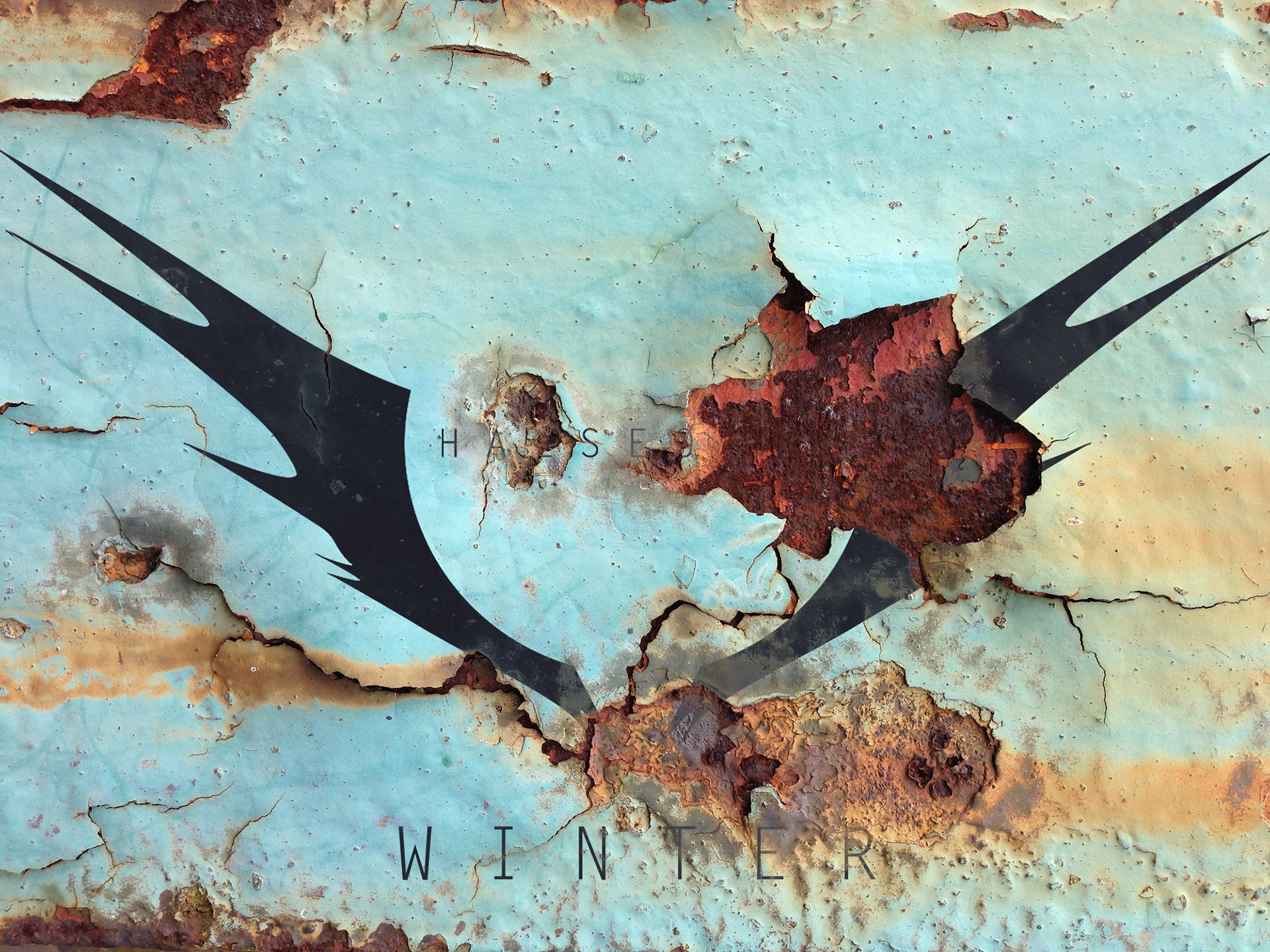
03-A Change In Seasons
In order to always have a fresh approach, and add in that extra point of connectivity that excites and allows the brand to be more memorable in the consumers mind, I re-styled the brand and logo for the four different seasons. Fashion changes as the weather changes, to accompany the new “Winter Drops” or “Autumn Release” the brand takes on a different note visually on the same design, which makes the new season just a tad bit more celebratory. And sometimes that’s all you need to separate yourself. Those variations were then channeled through the brand’s different campaigns, for sale, seasonal releases and more.
I extended the brand vision to its graphic and pictures. Using the brand’s color palettes and key words to provide art direction for the picture style, providing that earthy stone feel, with sharp edges from props to background. And making sure the picture style changed based on the guidelines for the appropriate seasons.
03-B
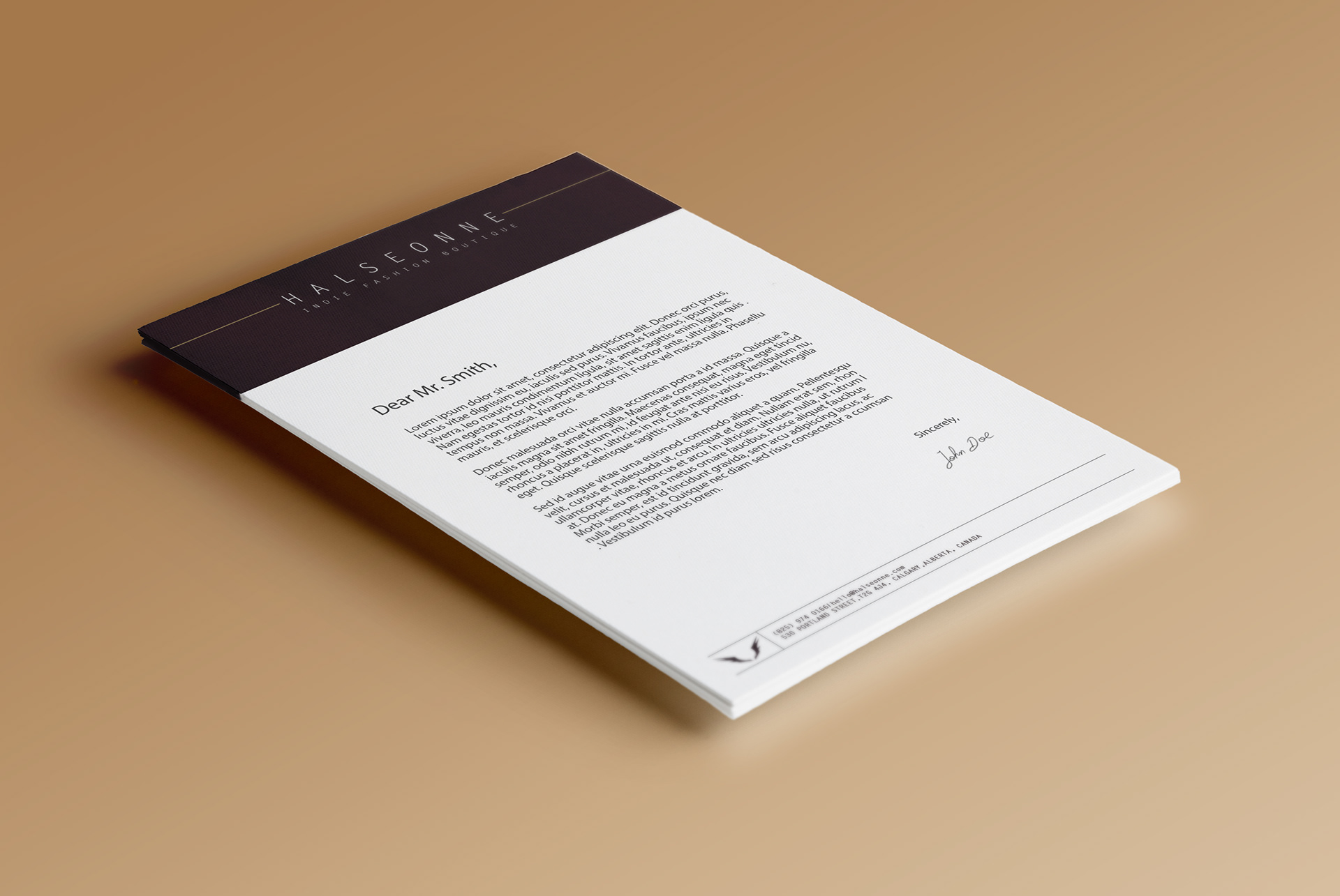
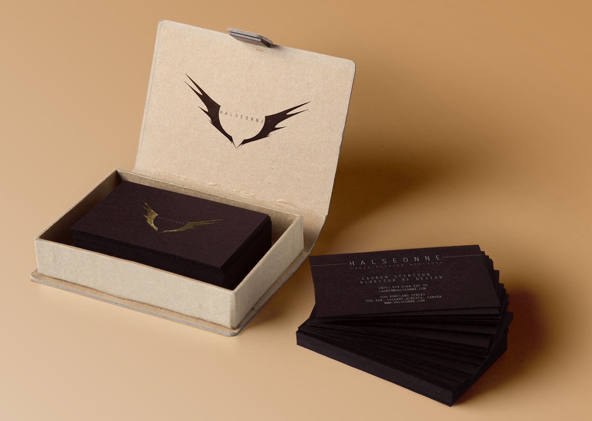
Looking Inward
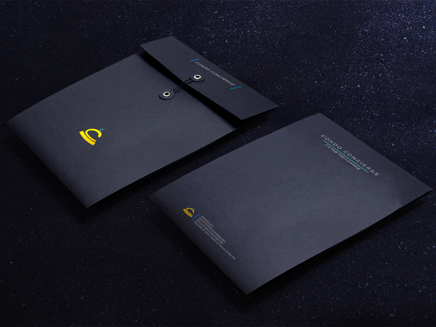
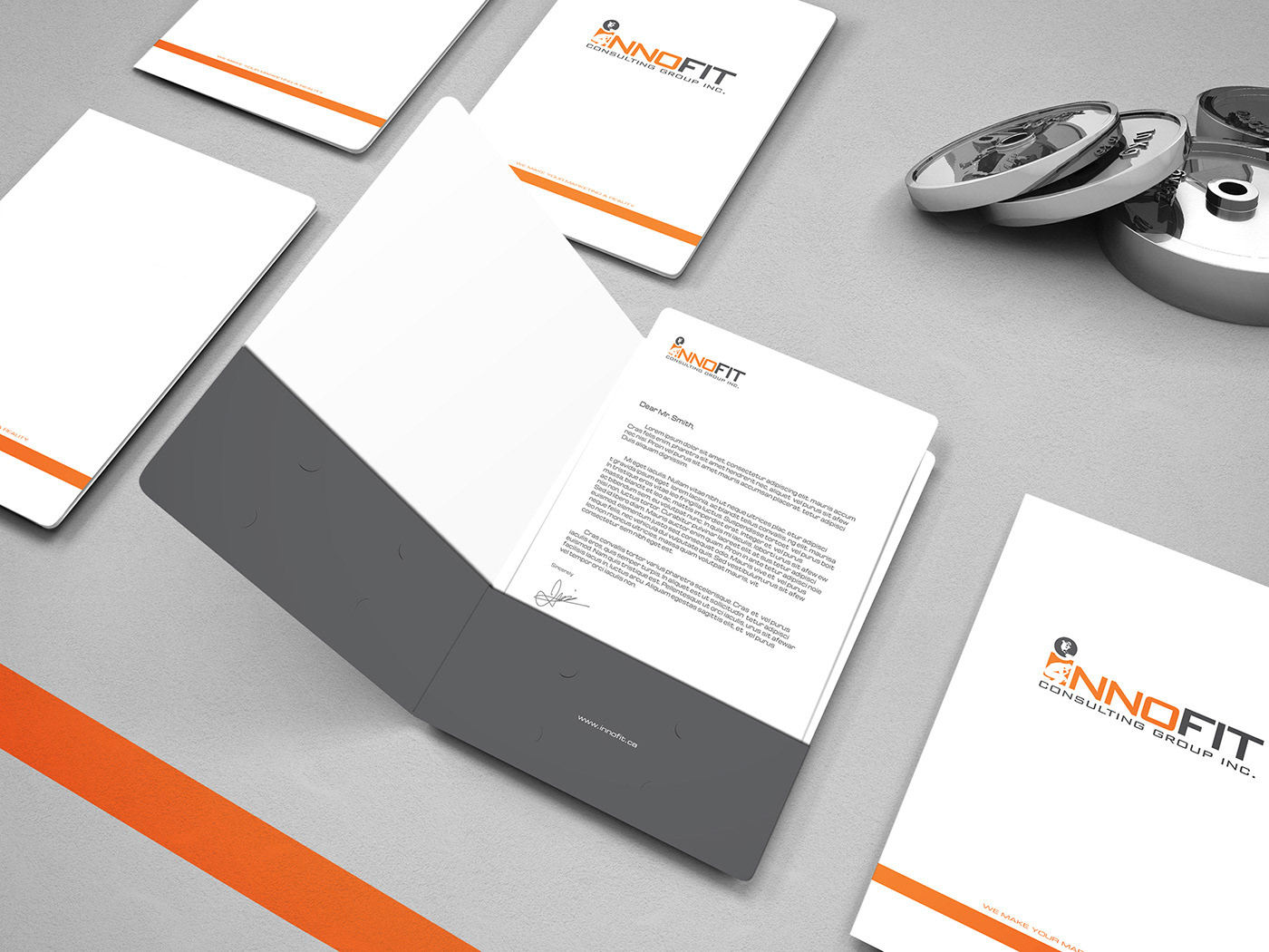
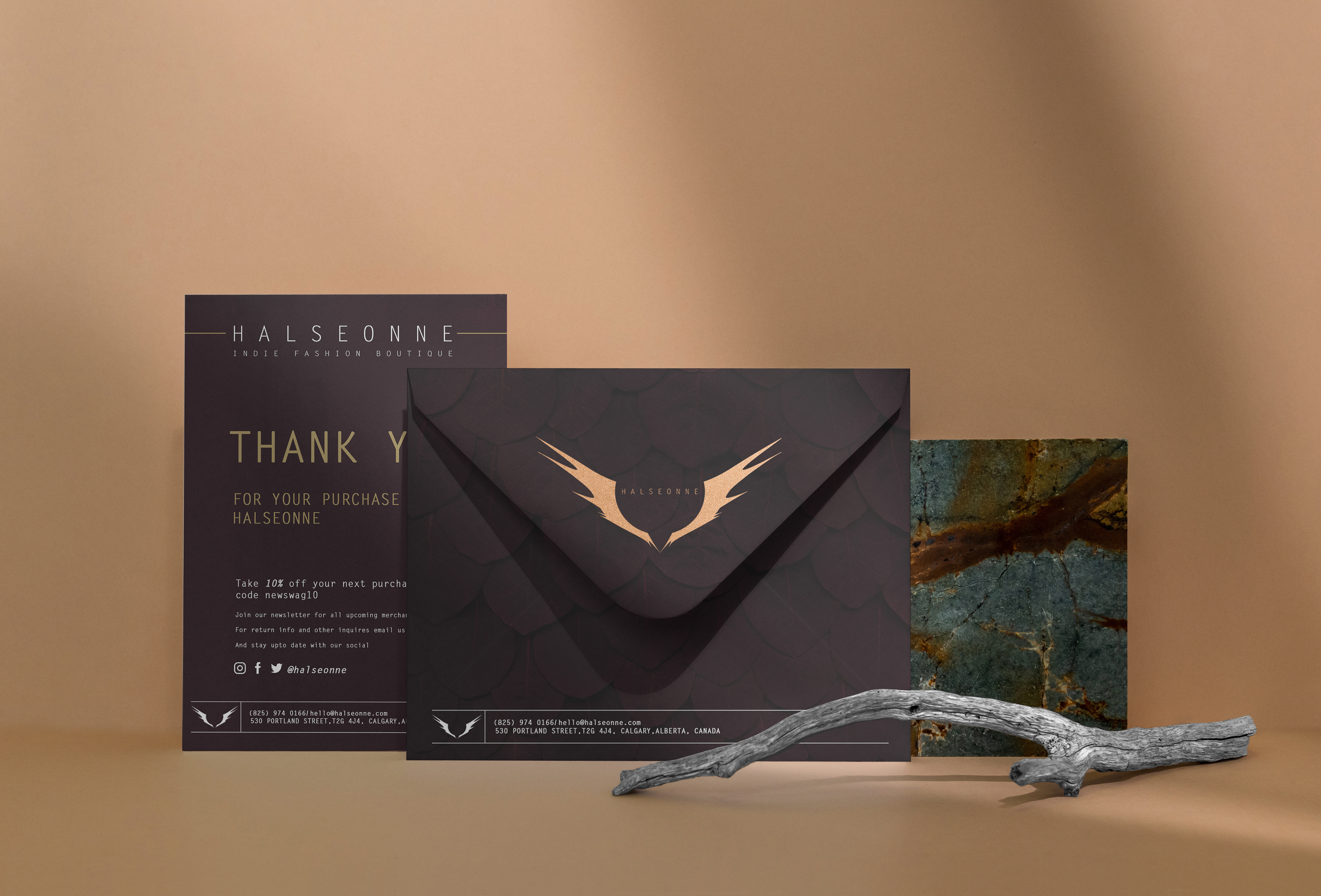
While the outward materials for marketing changes throughout the year the inward stationery remains consistent, providing a sense of inner stability, always knowing who you are. From The business cards, letterhead down to the little thank you notes for the consumers that come with each purchase. All carry the visual core of Halseonne’s brand.
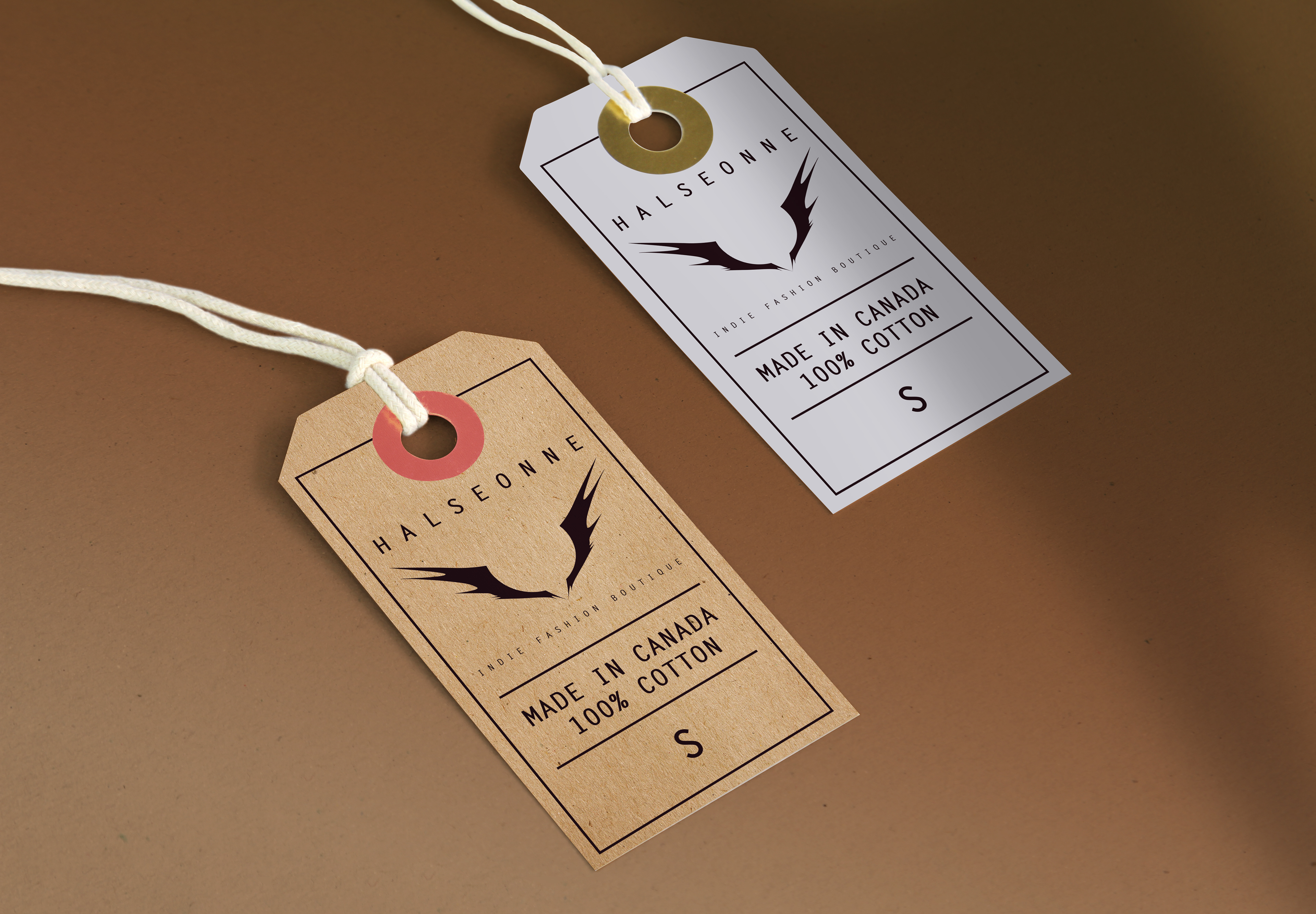
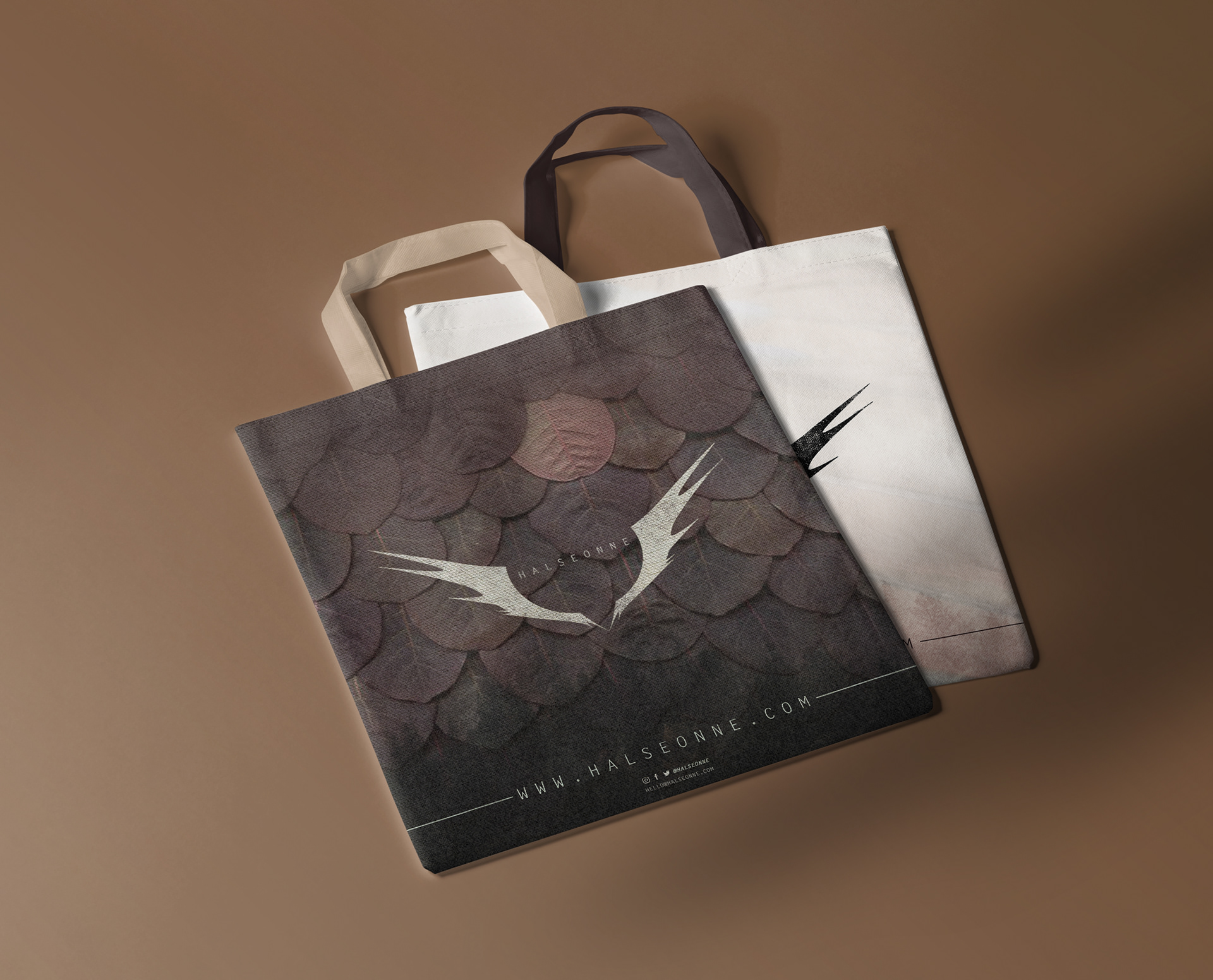
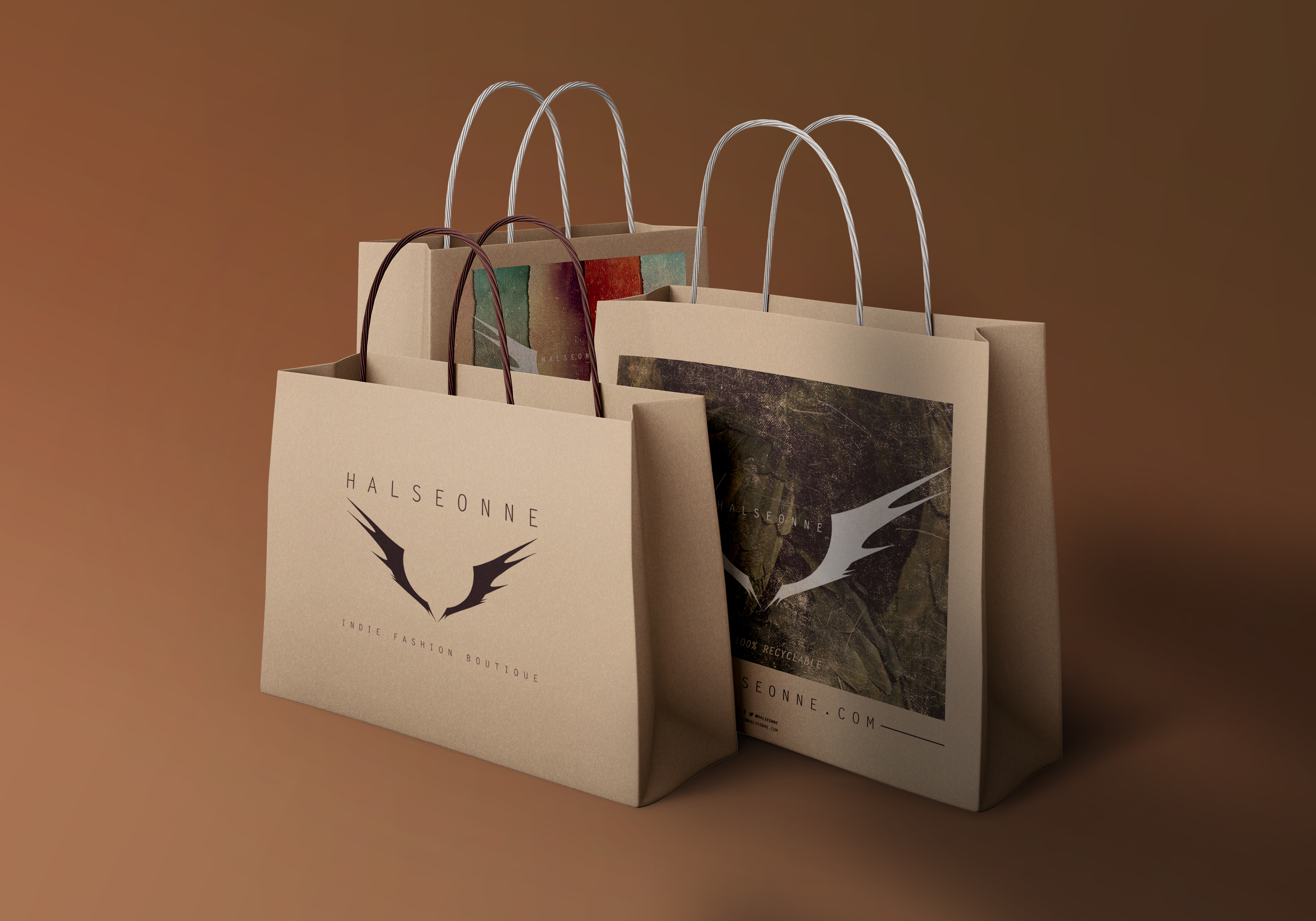
04 Packaging & Labelling
happy customers
Every fashion brand needs its unique touch, and a lot of times it comes through in the packaging and labeling. Even if an outsider does not know what you the customer bought, the sighting of a package, or a glimpse of a tag can exude a sense of desire.
The branding of the various seasons provided an easy route to elaborate Halseonne’s uniqueness on to the packaging and labeling. Taking care in crafting the right imagery so as to say it’s not just another tote bag, bringing back that “urban luxury” feel.
05 Synopsis
HALSEONNE
2018
I love open communication in every aspect of life, with Halseonne I had that from the get go. Bringing this vision out on to the physical world became so much easier when we created a visual language that I could speak to, to the owners of the brand. Starting with word clouds and mood-boards, really providing a strong base from the start, so we always know where to refer to.
From the base to naming to print production, I was there every step of the way, creating and nurturing the brand as it grew from just a nugget of an idea to a full fledged storefront, making it one of my favorite journeys. I always say that I’m not a designer, or an illustrator, but a storyteller (who loves creative problem solving). And to be able to tell a story from beginning to end, through any medium, is what I truly strive for.
___________________________________________
Thank you for viewing!