01 Overview
CULT CLASSICS
01-A The Idea
I have always enjoyed large, vintage movie posters. Especially from the monster genre; Creature From The Black Lagoon, Attack Of The 50 Feet Woman, Dracula etc. When I picture my ideal home, I always end up creating a stairway with those posters displayed alongside the stairs. During 2018, I decided to get a booth at Fan Expo for the first time, and I knew exactly the type of content I wanted to create.
01-B The Subject
The subject matter for my art has never ventured much towards the fan-art side of things, I've always been more interested in the underdog story. So I created a series for the "Cult Classics". I knew I wanted to create huge posters, so if I wasn’t in love with the subject, or if I felt like every other fan artist had their take on it, the process would get stagnant. Working on the underdogs would prevent blockage down the road.
01-C The Story
I started to dig up past memories for the posters. Nostalgia is a huge motivator for creation, and selling value. I wanted to create something unique and deep seeded. Putting characters from a show in cool poses and composition for such large pieces of work wouldn’t be enough. I started to create a story around each series and created characters that fit the story. After all, these were supposed to be movie posters.
01-D The Style
For the style, using the vintage movie posters as an inspiration, I started to create something of my own. I change my style for every series that I do, to keep things fresh, and learn something new by doing so. After some research and practice I solidified a style that I felt comfortable with for this series. Colors ranging from 2 to 6 per element depending on depth and or focus. With a subtle hatching touch incorporated into it.TABLE OF CONTENTS
There are 4 posters Created for this series, presented in the following order: Cyber Six, Hellboy, Blade Runner, and Gargoyles. In this presentation Each Poster is shown with its formation stories, print information, close up videos, process pictures, and more.
02 Poster 1 of 4
CYBERSIX
& The Serpent Of Two Moons
02-A Why Cybersix
I remember as a kid staying up till 10:00 pm to watch CyberSix on Tele-Toons. Back then it felt like only the "cool kids" were allowed to watch this show. The themes were more mature, and had that Gothic touch that I've come to love from Batman. Also the Robin to CyberSix was a black panther, (with her brother's brain transmuted inside it). And I don't remember a time when I wasn't fascinated with black panthers.
I figured I could not have been the only one who was nostalgic, and was at one point enchanted by this androgynous femme fatale, however it definitely was not prominent enough to get wide spread recognition. Thus CyberSix became the first to make the list for my Cult Classics series.
02-B
ABOUT THE PRINTS
Large
24” X 36” | 60.96cm X 91.44cm
24” X 36” | 60.96cm X 91.44cm
Medium
16” X 24” | 40.64cm X 60.96cm
16” X 24” | 40.64cm X 60.96cm
Small
12” x 18” | | 30.48cm X 45.72cm
12” x 18” | | 30.48cm X 45.72cm
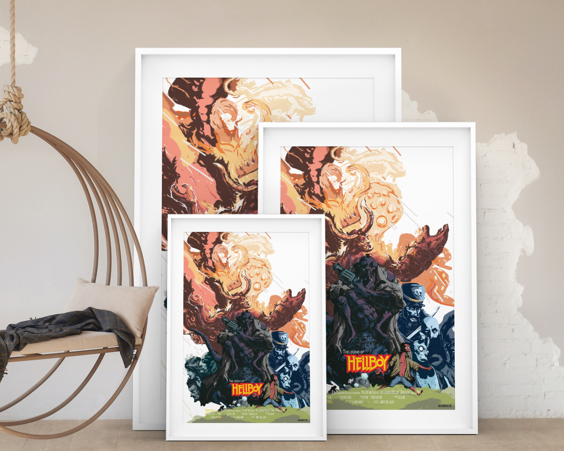
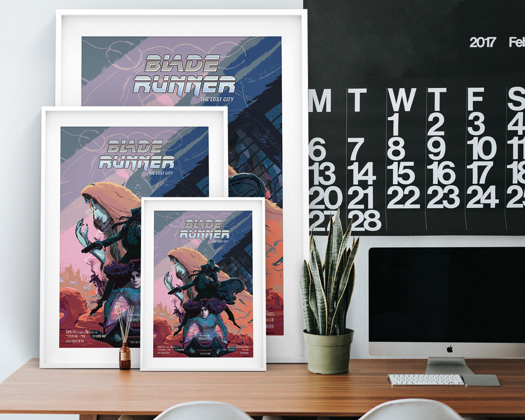
The Large and Medium Prints are limited edition, matte finish. 15 prints were created for the large size, and 25 for the medium. The non reflective material makes it easier for it to be framed inside glass without having to worry about the sunlight.
Movie posters, much like movie trailers is a lure, enticing the viewer with promises that are sure to excite them. I did not need to fully flesh out the story in order to create the poster I just needed a lure, for the viewers and for myself (so that the process becomes more fun).
02- C
CLOSEUPS
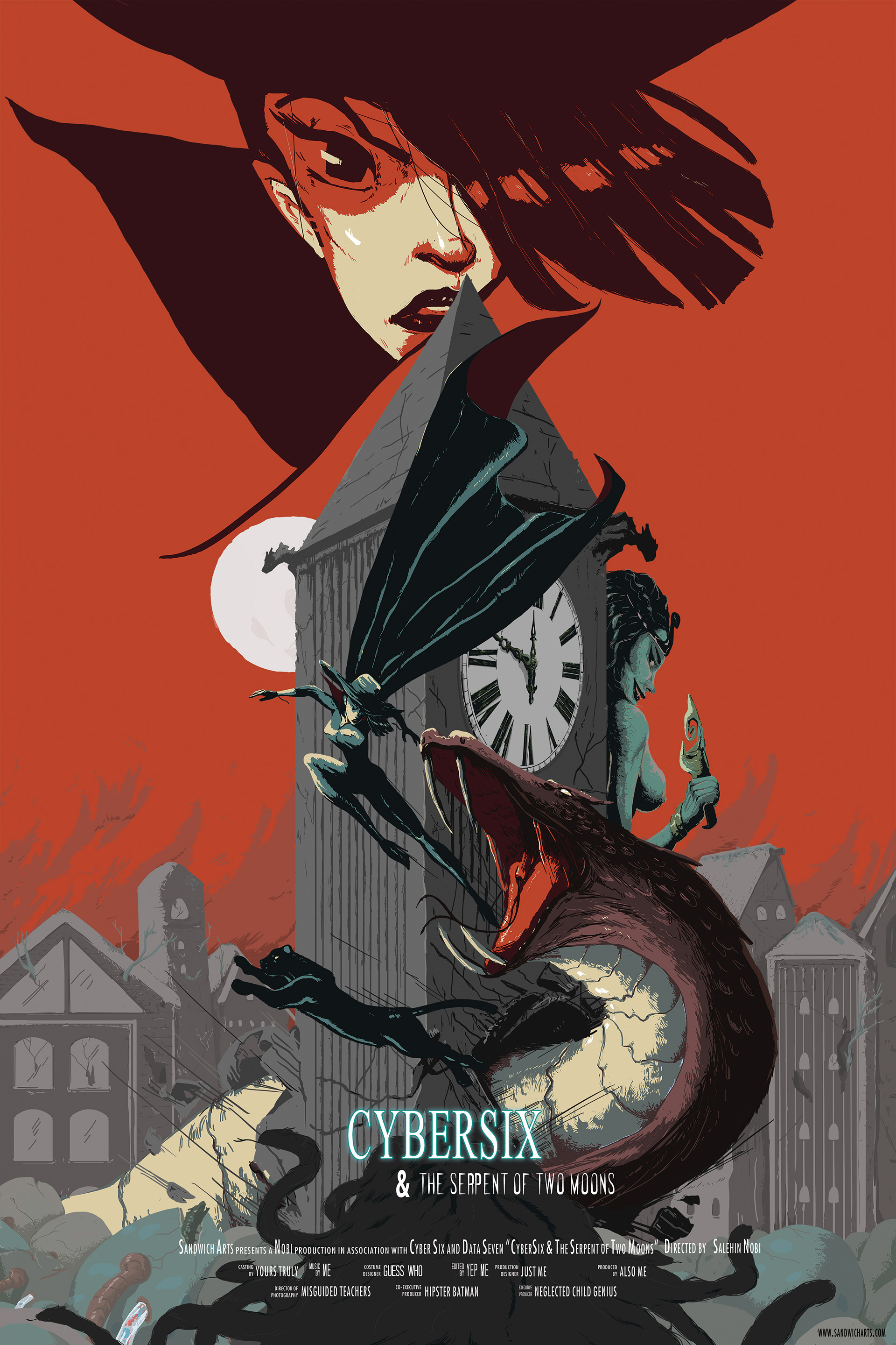
Gothic Sci-fi sums up the genre of Cyber Six quite well. I put together elements of sci-fi, like the tubes flowing into giant serpent eggs. Themes of ancient curses, such as the character at the bottom whose hair is turning into snakes, and the green scaled woman by the clock tower with a ceremonious looking dagger. Added in a neglected city, couple of gargoyles, and a focal composition twisting much like a snake, and Cyber Six & The Serpent Of Two Moons was born.
02- D
PROCESS
I wanted to create curiosity in the viewer's mind. Who is that woman by the clock tower, is that the same person that's at the bottom? Is one of them controlling the giant serpent or do they transform into it? What does the clock tower have to do with this, is it just for setting or does time have a specific significance in this story. I went through several vague renditions of the story before providing the final set of characters, prop, and setting. From there I hope the viewer can have fun interpreting the story however they would like.
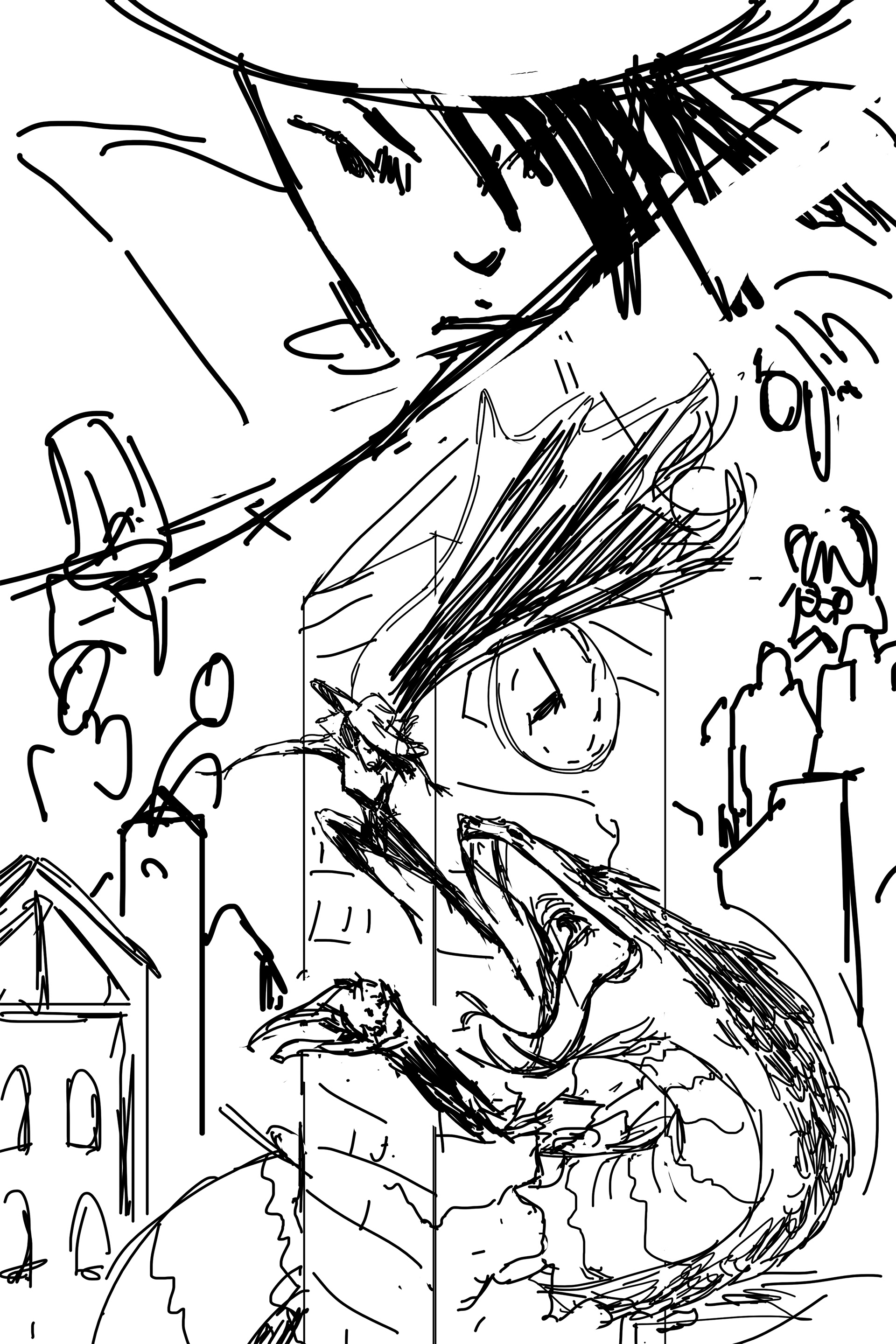
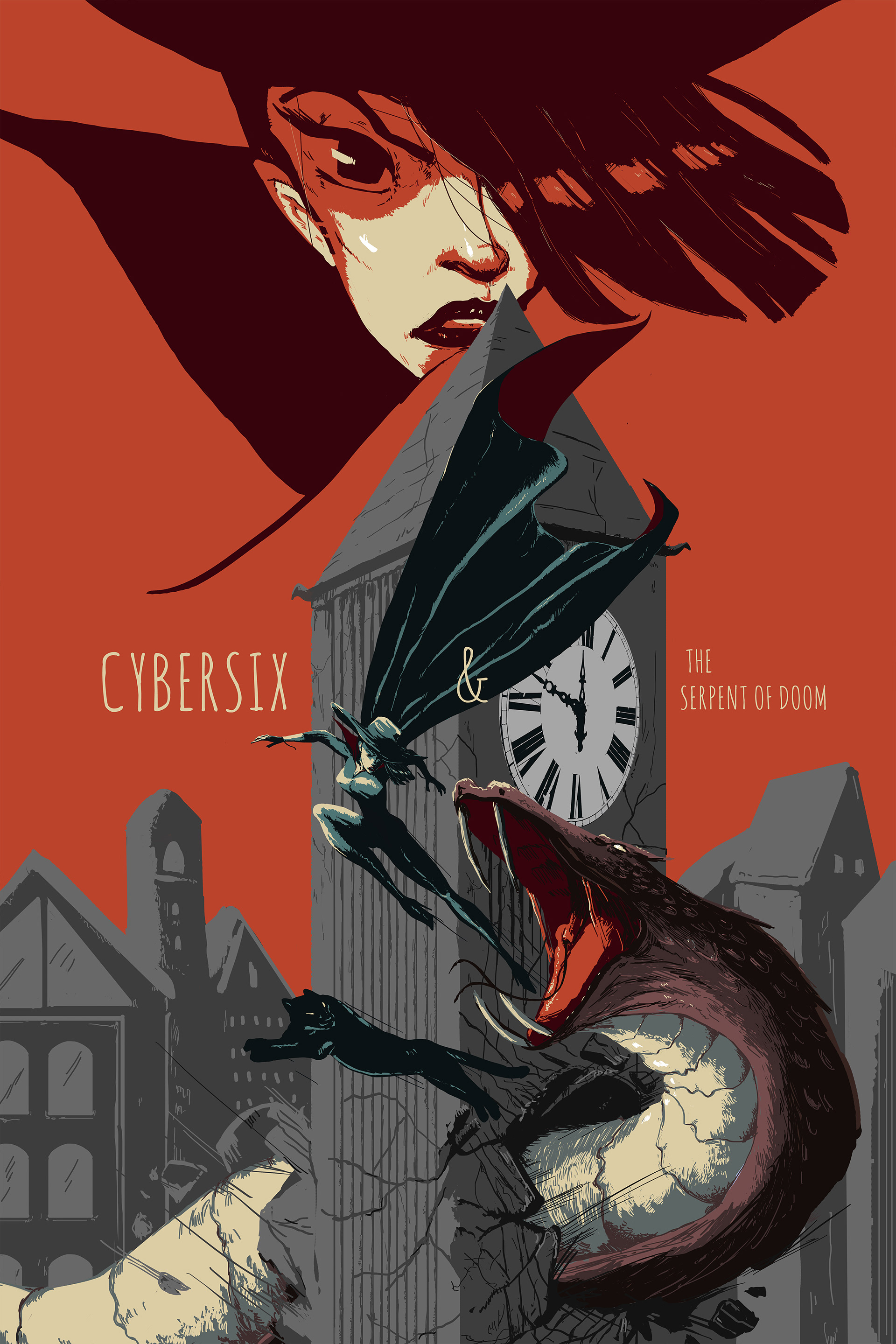
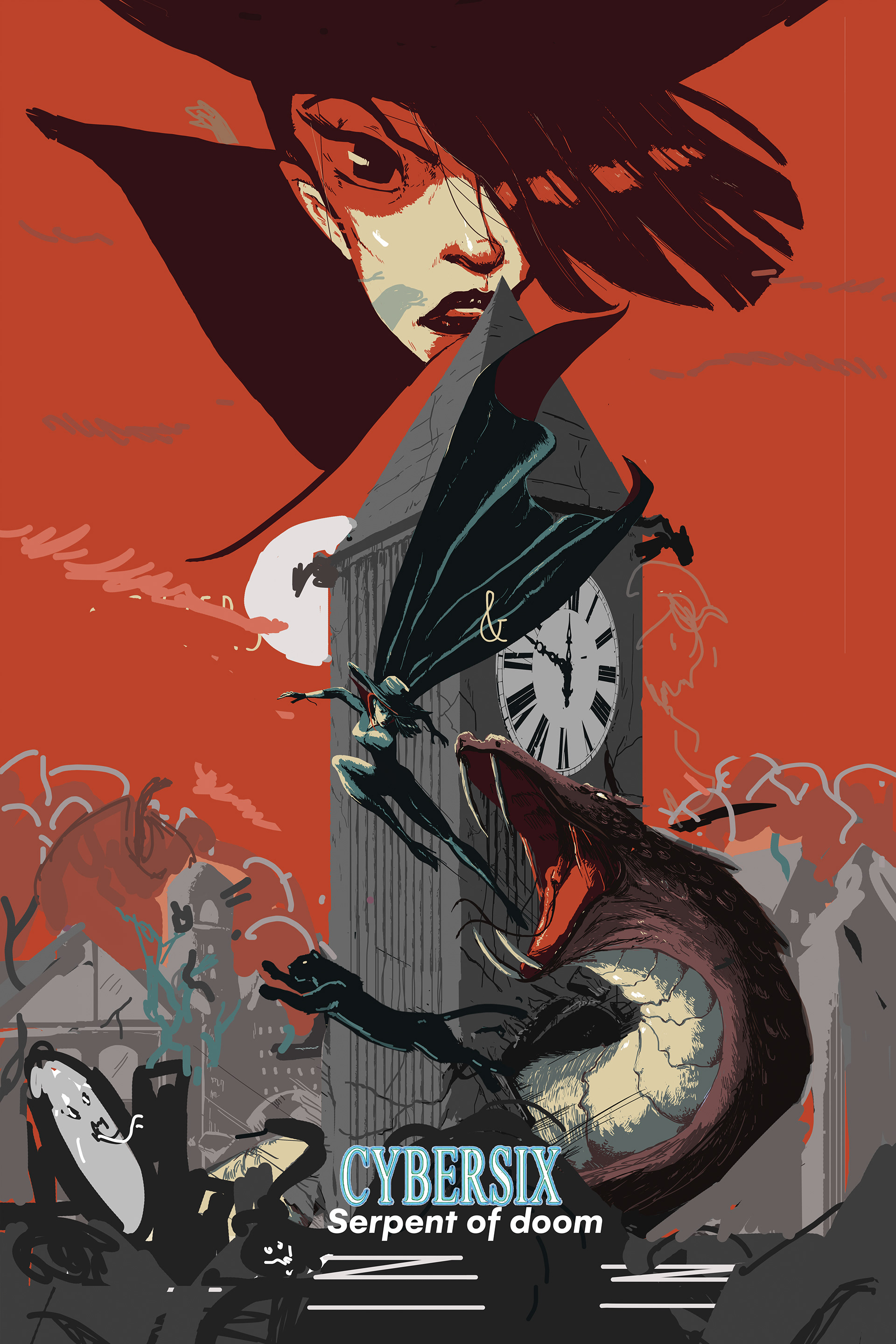
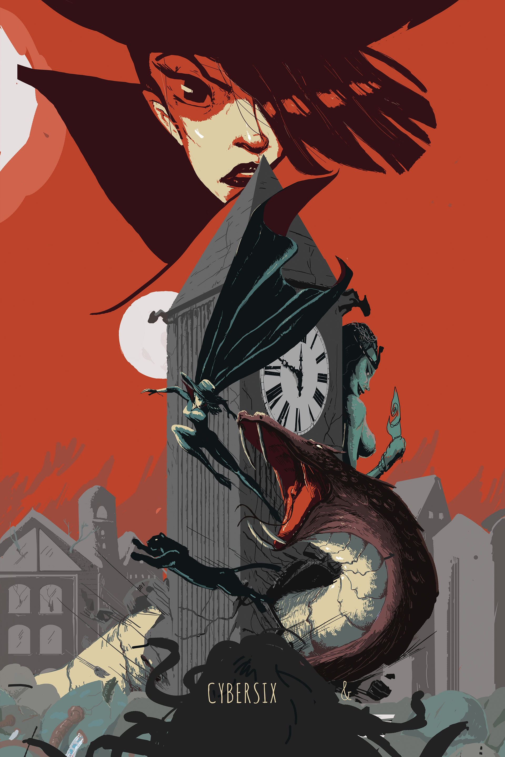
On a more detail oriented note, one might wonder: the poster is titled "The Serpent of Two Moons" but there is only one moon in the final version of the illustration. However originally the movie was named "Serpent Of Doom". When the name was changed, an attempt to add the second moon was there but it threw off the composition. So instead all the structures and characters are then lit by two light sources, one of which is off screen. Much like the imagined story behind this poster, the second moon is an illusion.
03 Poster 2 of 4
The Legend of
HELLBOY
03- A Why Hellboy
I was introduced to Hellboy later in my years. I've always been drawn into the darker themed fictions as a kid. And for the fiction with visuals it may have started with Batman, (to be more accurate Bruce Timm's Batman), but it ventured into Spawn and the likes of Berserk. Hellboy seemed like an obvious choice but I wasn't aware of it back then.
Before I tried to get into the story of Hellboy, I fell in love with the art, specifically how the shadows were drawn. There was always a sense of macabre, mythic, and mystery, just something fantastical in the loom. Hellboy was definitely much more popular than Cyber Six, but just from the subject matter and style alone I felt it fit right in for my series.
03-B
ABOUT THE PRINTS
Large
24” X 36” | 60.96cm X 91.44cm
24” X 36” | 60.96cm X 91.44cm
Medium
16” X 24” | 40.64cm X 60.96cm
16” X 24” | 40.64cm X 60.96cm
Small
12” x 18” | | 30.48cm X 45.72cm
12” x 18” | | 30.48cm X 45.72cm
The Large and Medium Prints are limited edition, matte finish. 15 prints were created for the large size, and 25 for the medium. The non reflective material makes it easier for it to be framed inside glass without having to worry about the sunlight.
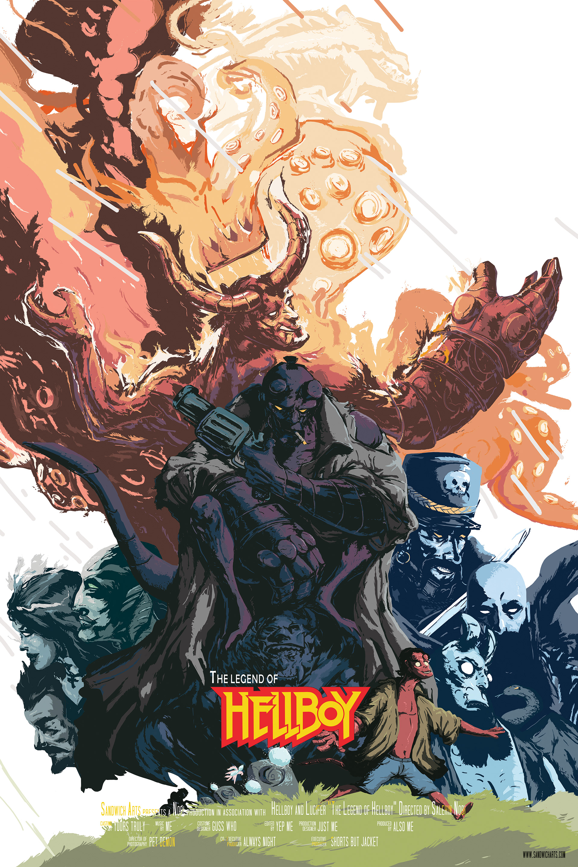
I loved both of the Guillermo Del Toro Hellboy movies. After which, I decided finally to peek into the world of Hellboy. By the time Fan Expo rolled around I was still getting to know some of the villains in the story. They had a rich range of fantastical, demonic, mythical roster of characters, and I decided I didn't need to create my own villains and side characters for the fake story for this movie poster.
03- C
CLOSEUPS
There was so much I didn't know and through this "movie" I would be fully lunged in to that world. That is also why I brought the idea of Hellboy from a kid, to adult, to the fully formed apocalypse version of himself.
03- D
PROCESS
What if there was an avenger-esque movie for Hellboy. Because it's just a movie poster I don't have to deal with the actual complication of having too many prominent characters in one movie. I was already a fan of the Hellboy villains and I barely knew some of them, my imagination ran wild and created my own back story for each. I wanted to see them all together in an epic fantastical story. From there I decided to create the story of "The Legend Of Hellboy"
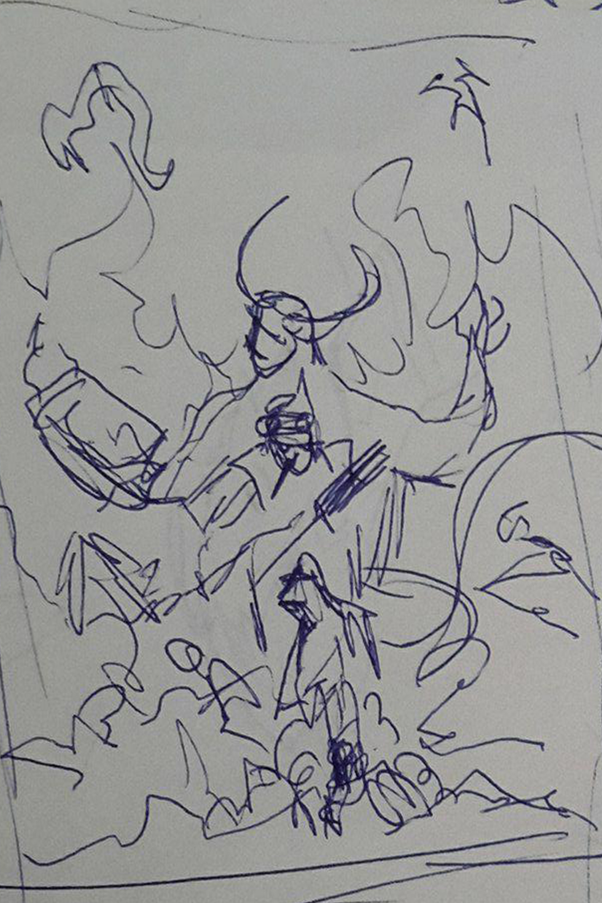
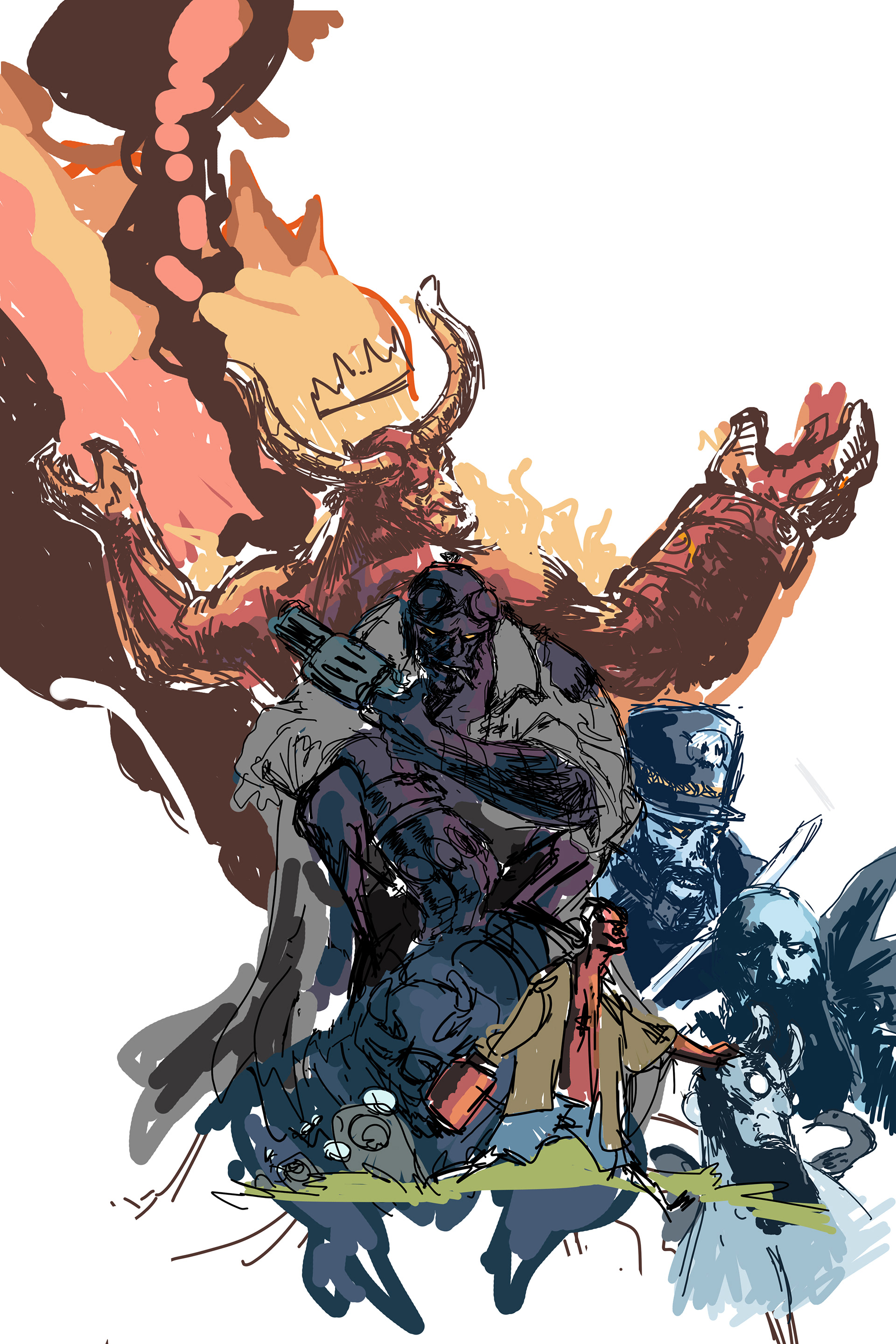
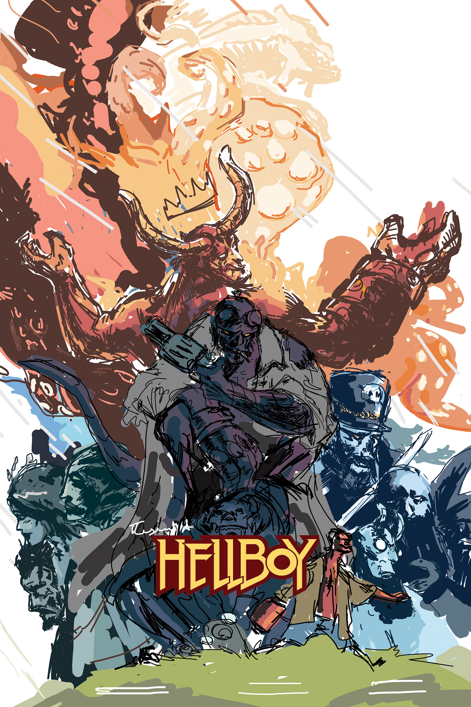
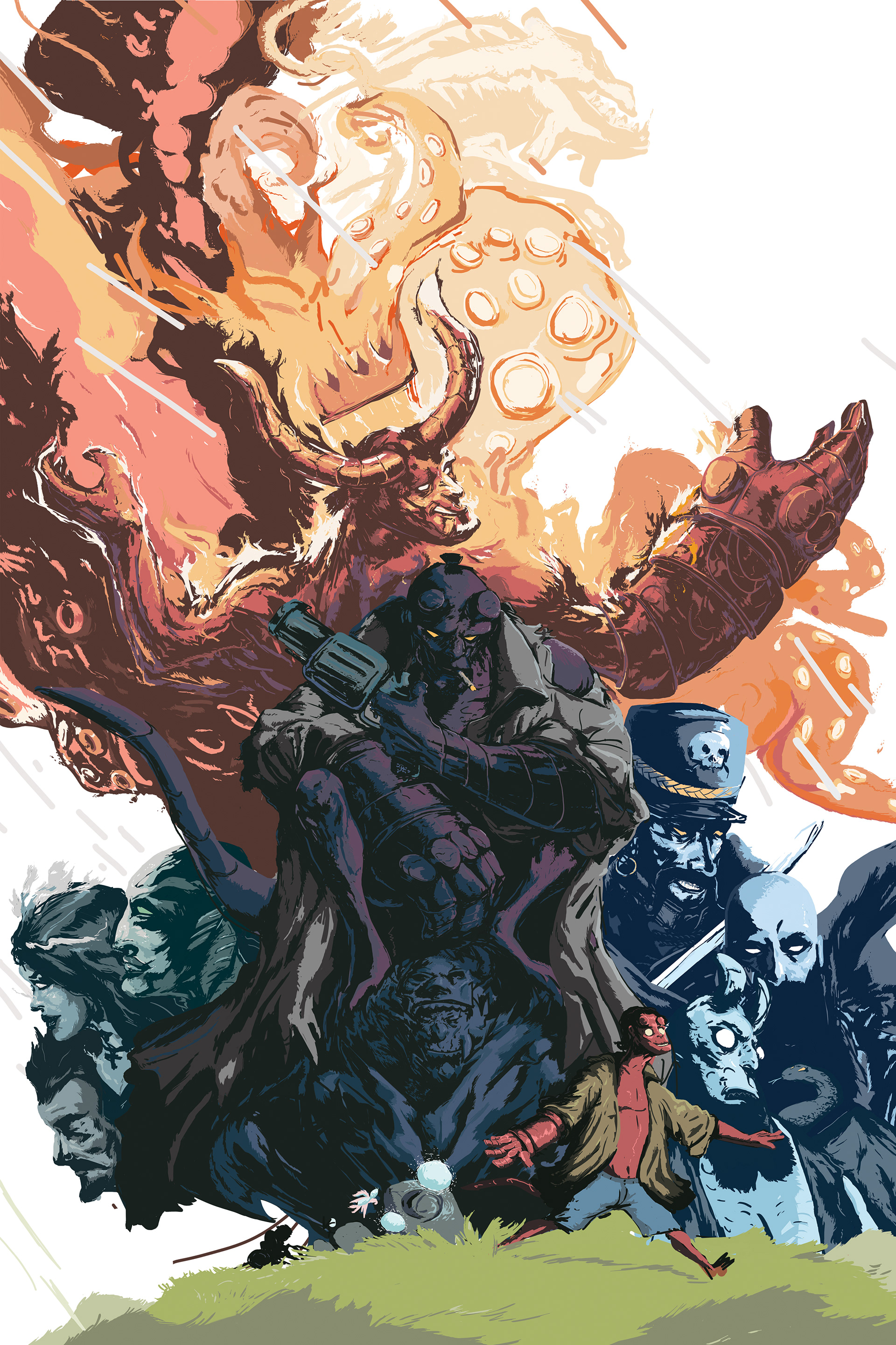
During the process of thumb-nailing for this poster I came up with an idea to go beyond a traditional print for this series. Printing foreground, to mid ground, to background on different acetate/ glass/ other see through material, to give a sense of depth. That printing method was too complicated as print stores don't print on acetate in that large format. I am still looking into a way to create that print and possibly only create 3 or 5 or maybe just 1 for each of the series.
04 Poster 3 of 4
BLADE RUNNER
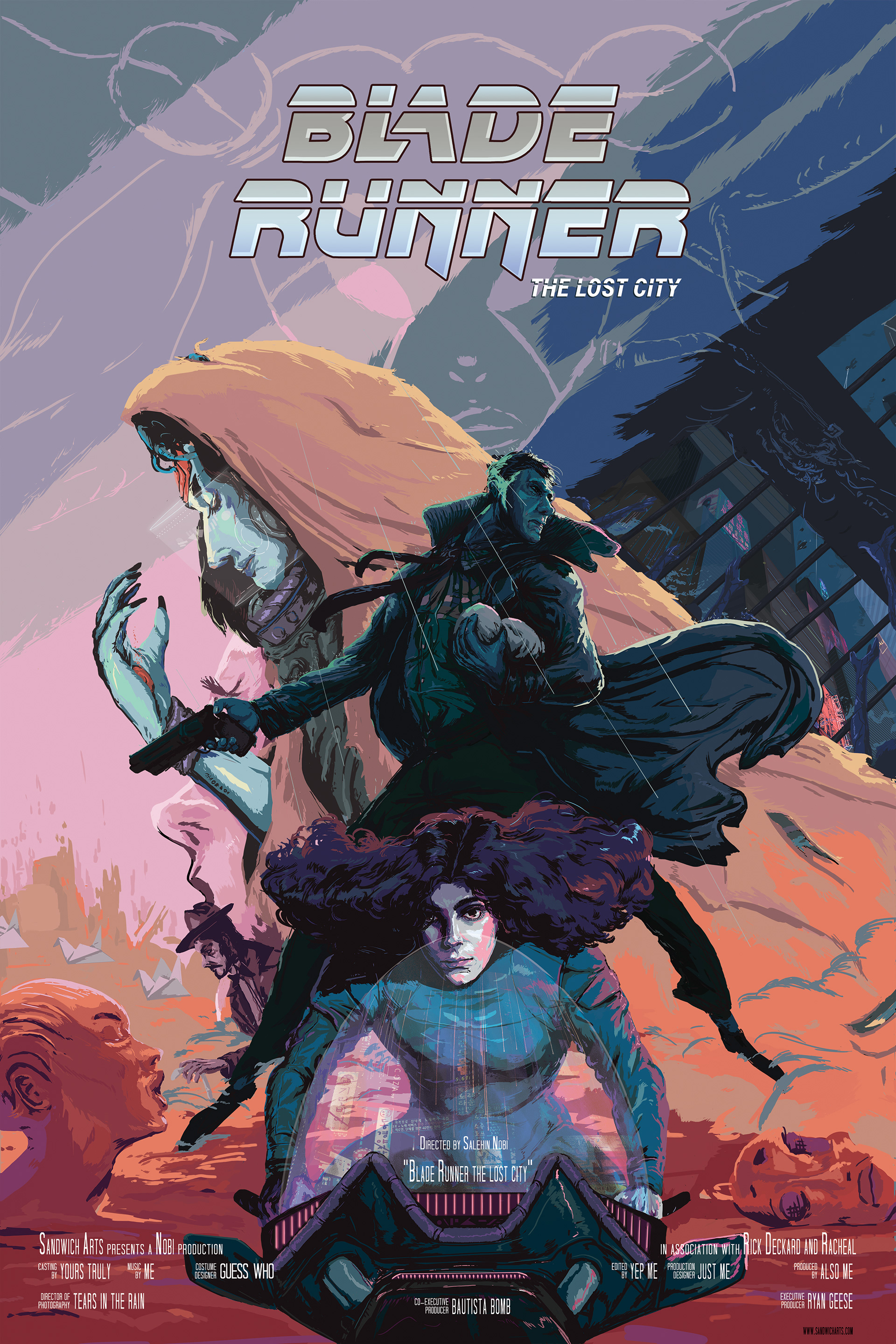
The Lost City
04-A Why Blade Runner
What is it to be real? Blade runner has always been one of my favorite movies of all time, and it's not because of the story. The visuals, the atmosphere, the sound, all of it together created this melancholic, dream like, ethereal feeling that still haunts me. From the echoes and reverb of the soundtrack and dialogue, to the reflection of water all around, to my favorite death scene in any movie "retiring Zhora". The feel of the movie coupled with my imagination grabbed a hold of something lurking deep inside that I cannot shake. How can you know you are really real?
For me the movie does a beautiful job in creating that abstract reality, and I wanted to try and give it form. I enjoyed the second movie as well, but that was much more concrete than the pensive dream like sensation of the first. However the idea from the second movie of an android giving birth is a very strong concept, so I decided the timeline for my Blade Runner story was going to be in between the two movies.
04-B
ABOUT THE PRINTS
Large
24” X 36” | 60.96cm X 91.44cm
24” X 36” | 60.96cm X 91.44cm
Medium
16” X 24” | 40.64cm X 60.96cm
16” X 24” | 40.64cm X 60.96cm
Small
12” x 18” | | 30.48cm X 45.72cm
12” x 18” | | 30.48cm X 45.72cm
The Large and Medium Prints are limited edition, matte finish. 15 prints were created for the large size, and 25 for the medium. The non reflective material makes it easier for it to be framed inside glass without having to worry about the sunlight.
The sadness of someone who's convinced that they're real. There are quite a few fan illustrations of Sean Young as Rachael from the first movie, with the hair done up. Even though the look is quite iconic I was never that drawn to it. It wasn't till the scene when she appears in Deckard's apartment and she's confronted with the idea that she might have been created and not birthed, and her hair is let loose, that I truly fell in love with the movie, and consequently with her.
04- C
CLOSEUPS
The sadness in Rachael's large eyes, and the wildest bushel of hair I've ever seen, being physical with Rick in order to feel something real, all of it together made me feel something that I still carry. That is the look I wanted to portray in the poster, not the neat done up hair, not the confidence in her walk, but the confusion and sadness. She was much more interesting to me in the movie than Harrison Ford (Rick Deckard), I wanted to somehow replicate that melancholy.
04- D
PROCESS
I brought forth some elements from both the first and second movies. Origami flying birds beside Gaff, Rick tightly holding a baby on one hand and a gun on the other, the dust filled statues etc. Then I sprinkled in my own characters, and some settings such as the view from underneath the sewer looking up at the massive city towers, with hands that reached up, seemingly riddled with skin disease.
I wanted to give a sense of "on the run, and protect the child", maybe from the cloaked cyberpunk inspired character, or from the large ominous, abstract face in the background. Perhaps Rachael's determined face or the reflection of the city lights on her motorcycle suggest that she's coming back to civilization save the day. Hopefully the viewer can enjoy piecing together their own story from these mystery details.
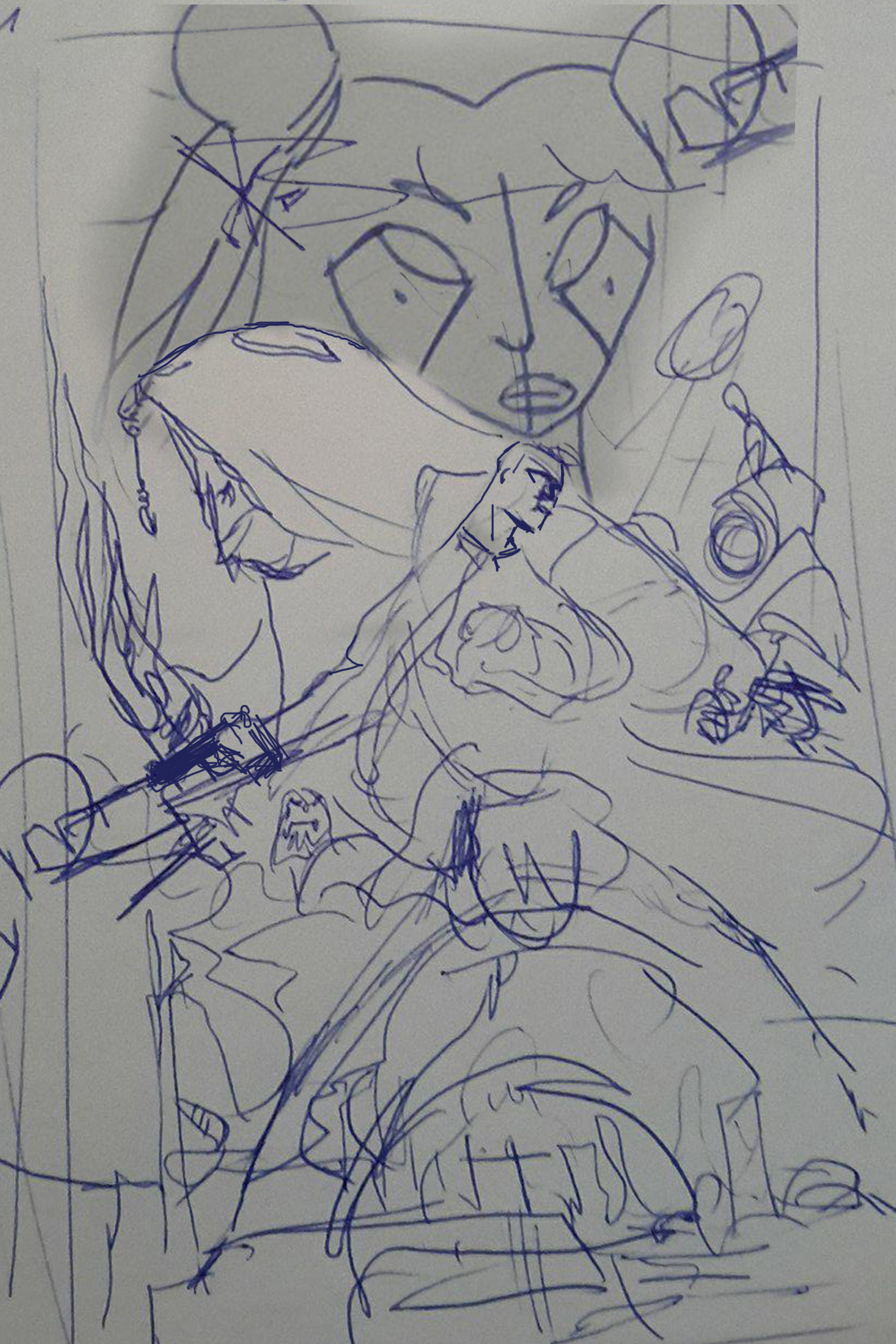
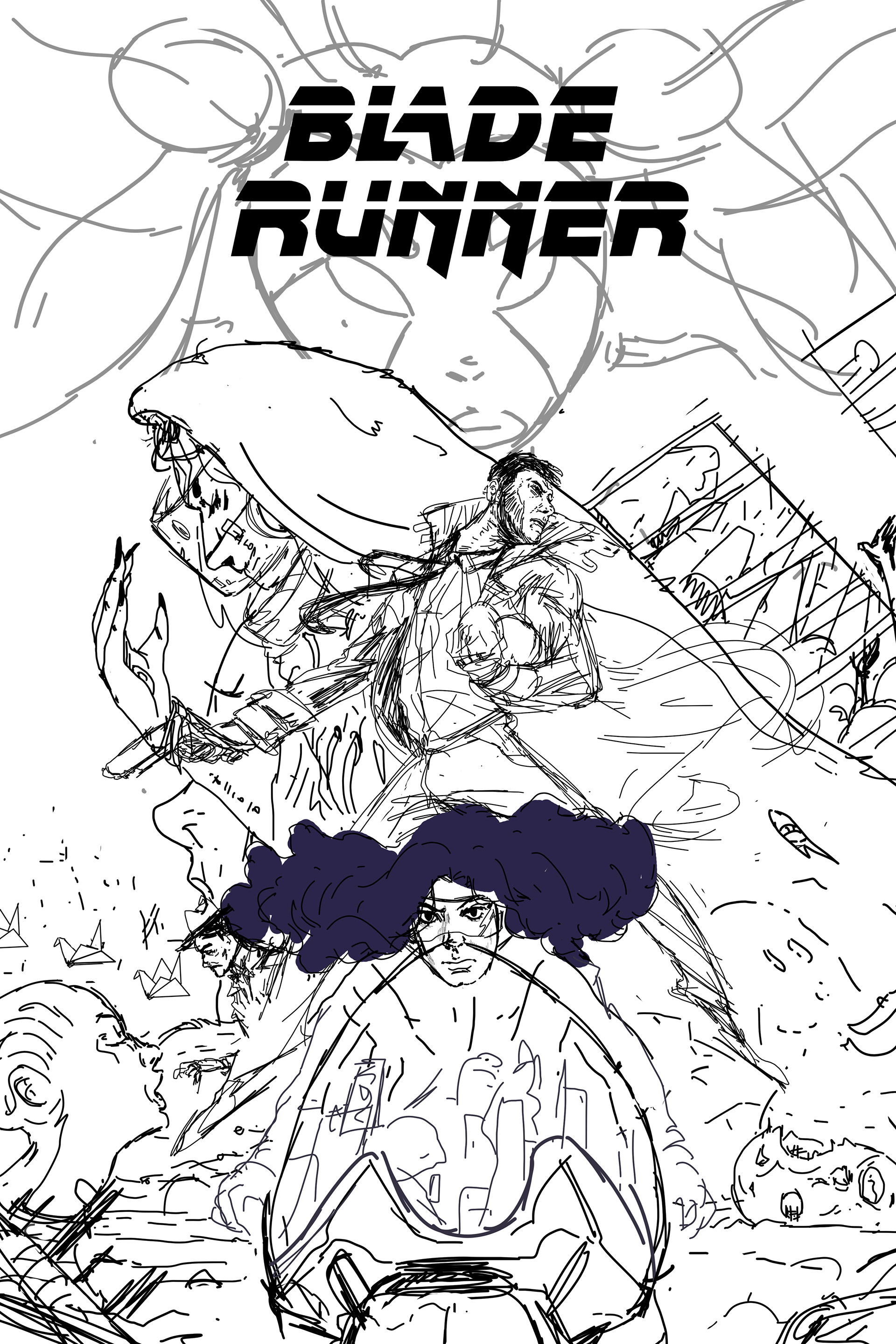
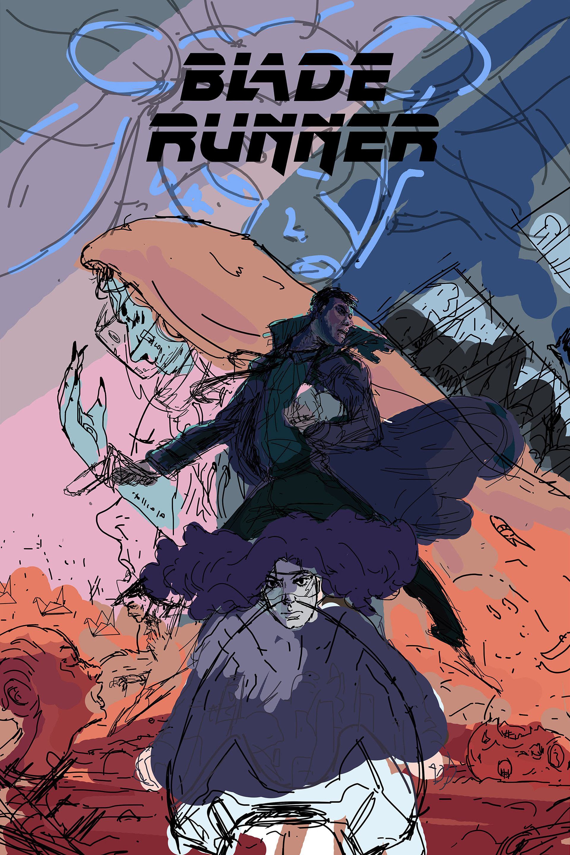
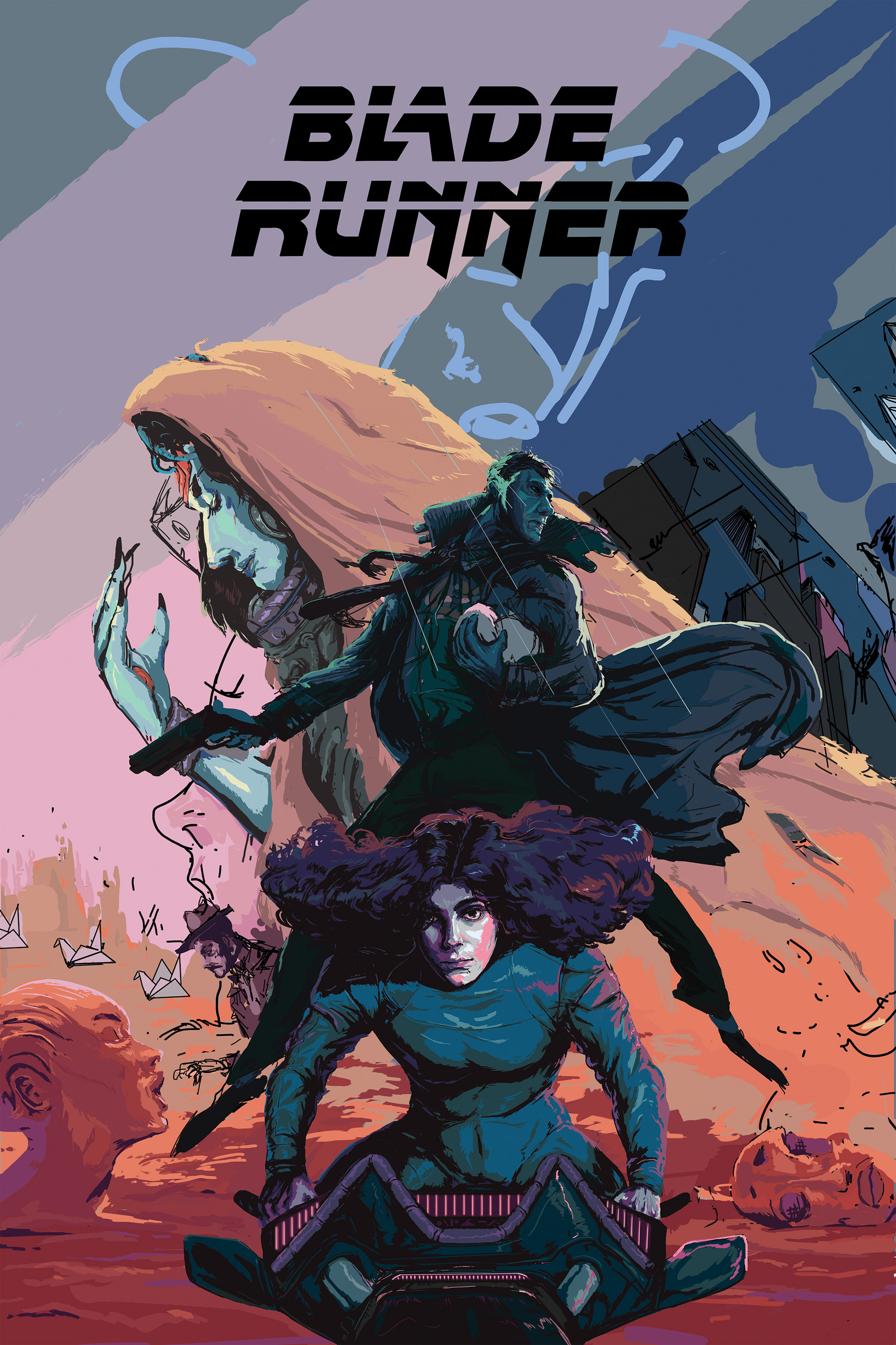
The second movie brought forth some concepts from "Do Android Dream Of Electric Sheep", which was missing from the first. Like where Rick finally makes his appearance in city; with endless orange dust due to the aftermath of nuclear wars. I quite liked how the sequel visualized that barren city and added ominous, surreal, giant statues. Since Rick ended up there in the second movie, I incorporated those statues in the poster to give a hint of a final setting.
05 Poster 4 of 4
GARGOYLES
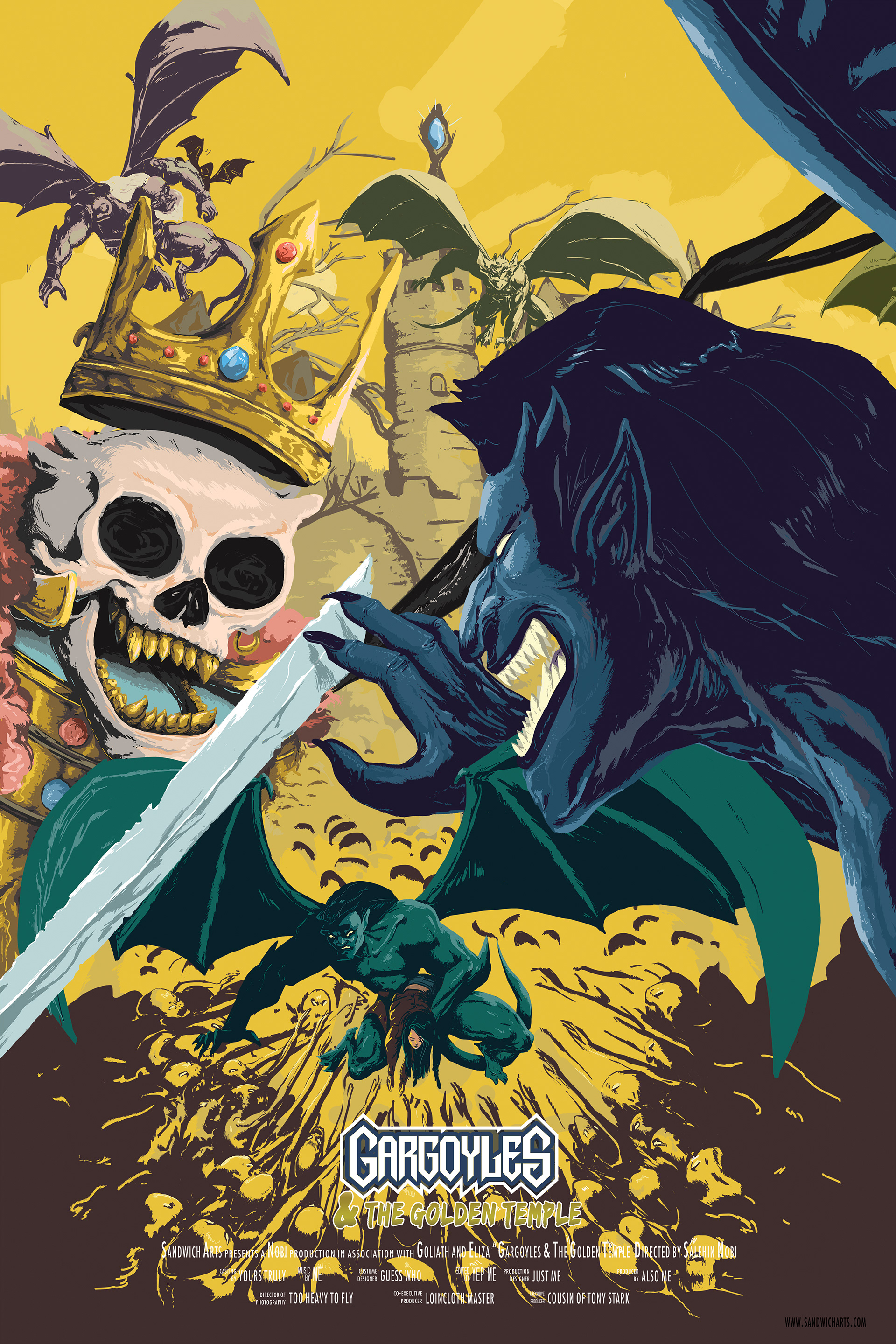
& The Golden Temple
05-A Why Gargoyles
Gargoyles for me is the other side of the coin when compared to CyberSix. The Characters only coming alive at night, replace the cyberpunk with occult and magic, a sense of medieval blended with the future, and not to mention they are literal gargoyles, a true symbol of the Gothic style I love. The color scheme is dark, but warm and earthy, opposing CyberSix's dark and cold.
So after choosing CyberSix this became an obvious second addition for the series. Again another of those shows, that wasn't very well known but demanded respect, with its mature themes, hints of darkness and sorcery coupled with an idea of mystery, to really savor in that cult taste. I remember being excited in elementary school when I would find another rare Gargoyles viewer, and talk about how cool the show was.
05-B
ABOUT THE PRINTS
Large
24” X 36” | 60.96cm X 91.44cm
24” X 36” | 60.96cm X 91.44cm
Medium
16” X 24” | 40.64cm X 60.96cm
16” X 24” | 40.64cm X 60.96cm
Small
12” x 18” | | 30.48cm X 45.72cm
12” x 18” | | 30.48cm X 45.72cm
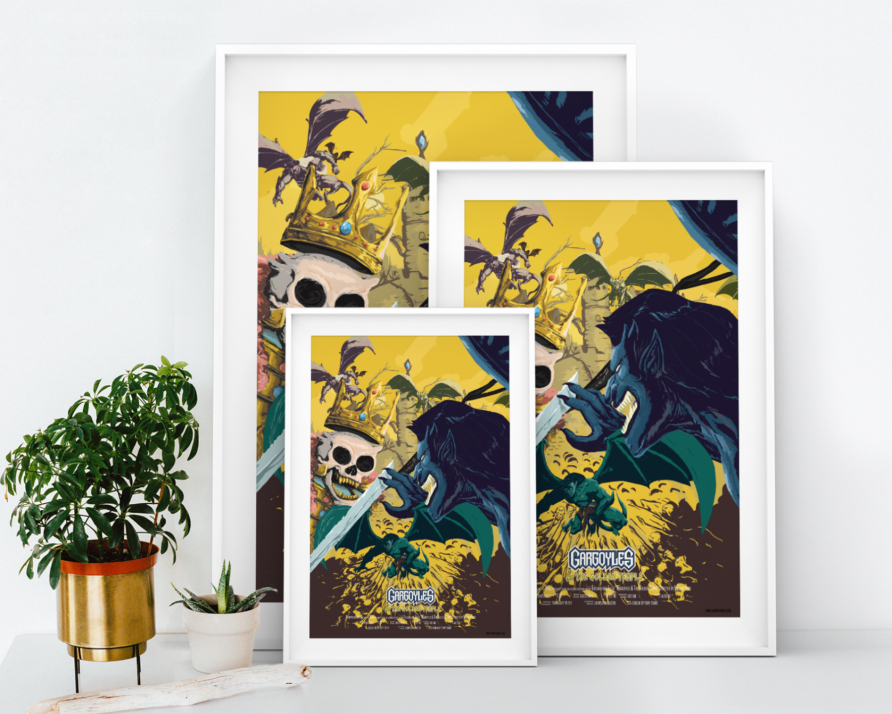
The Large and Medium Prints are limited edition, matte finish. 15 prints were created for the large size, and 25 for the medium. The non reflective material makes it easier for it to be framed inside glass without having to worry about the sunlight.
Gargoyles always had a brush with the usual suspects of horror; from vampires to demons, but to my recollection they've never dealt with zombies. So the characters fending off some sort of a vicious mob, an undead army of sorts, seemed to fit the narrative while keeping it fresh.
05- C
CLOSEUPS
Originally I named the poster "Gargoyles & the Undead Army". However every army needs a general, a commander, or perhaps a king. So I built upon that story and sprinkled some details in for the viewer to interpret.
05- D
PROCESS
I changed up the initial design and I decided to add a medieval castle in the background, perhaps it is something from their past. A large blue stone rests upon the tallest tower of the castle, maybe the stone is re-animating the dead. Maybe the gargoyles have fought there before, and the crowned skeleton that Goliath (the main gargoyle) is fighting is an old foe, coming to life to by the power of the stone to take revenge on the Gargoyles. Or it could be that the crowned skeleton (who has much more of a distinguished design than the zombie horde) is a dead king who tried to take the stone and is now cursed to guard the stone forever. The stone granted the king power to revive his dead army into a hungry, mindless, demon like, form to aide him. There are lots of possibilities for the viewer to conclude to.
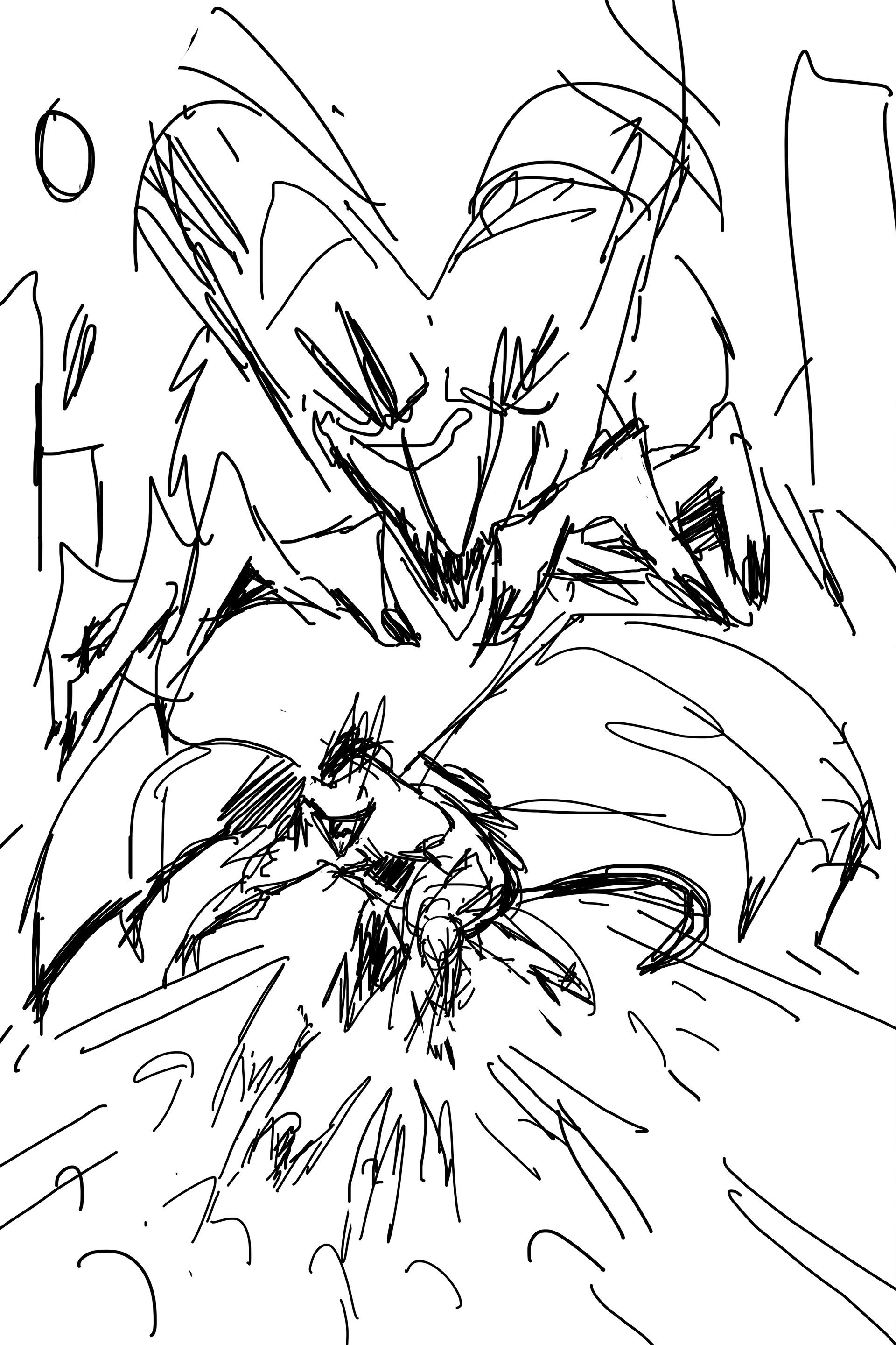
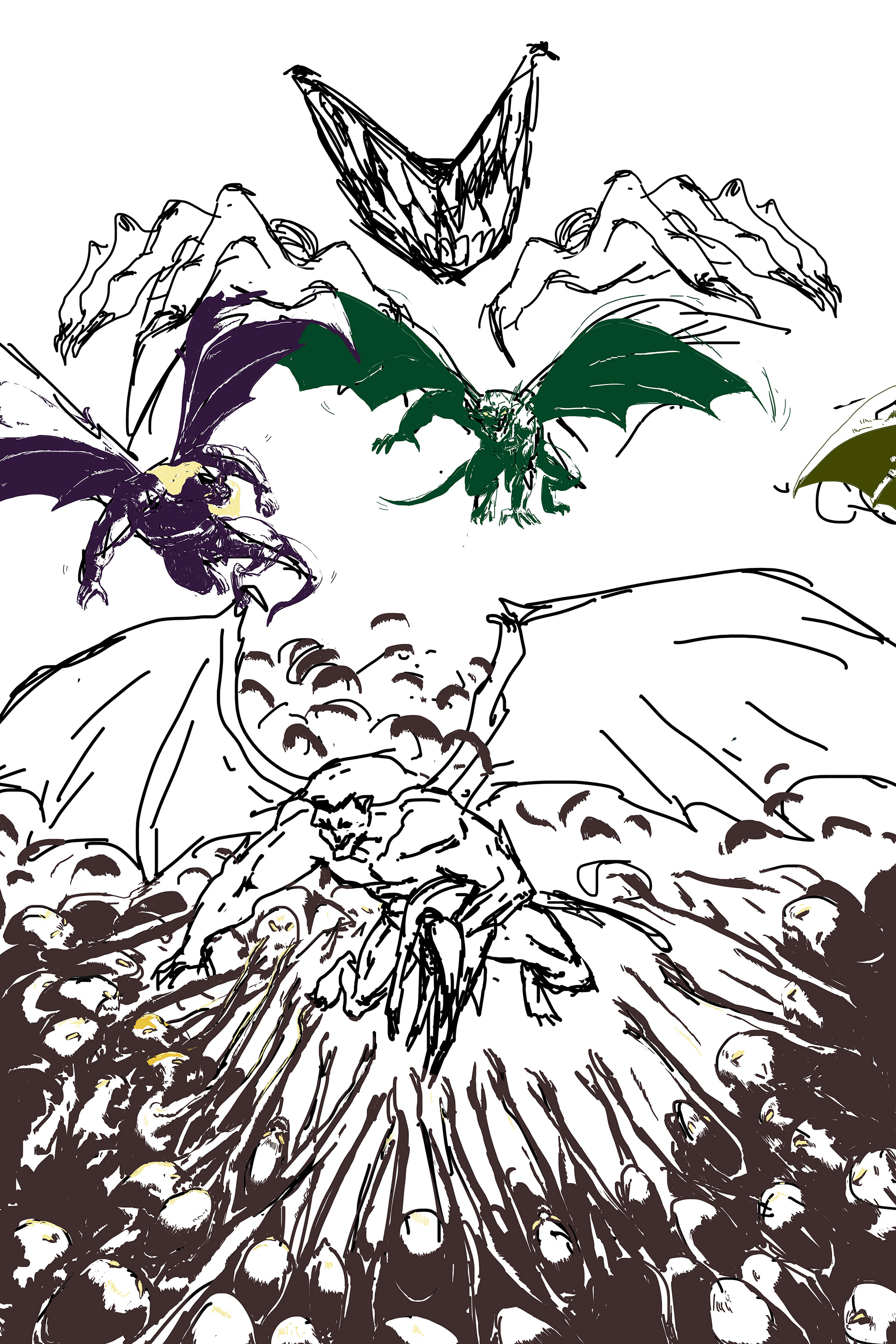
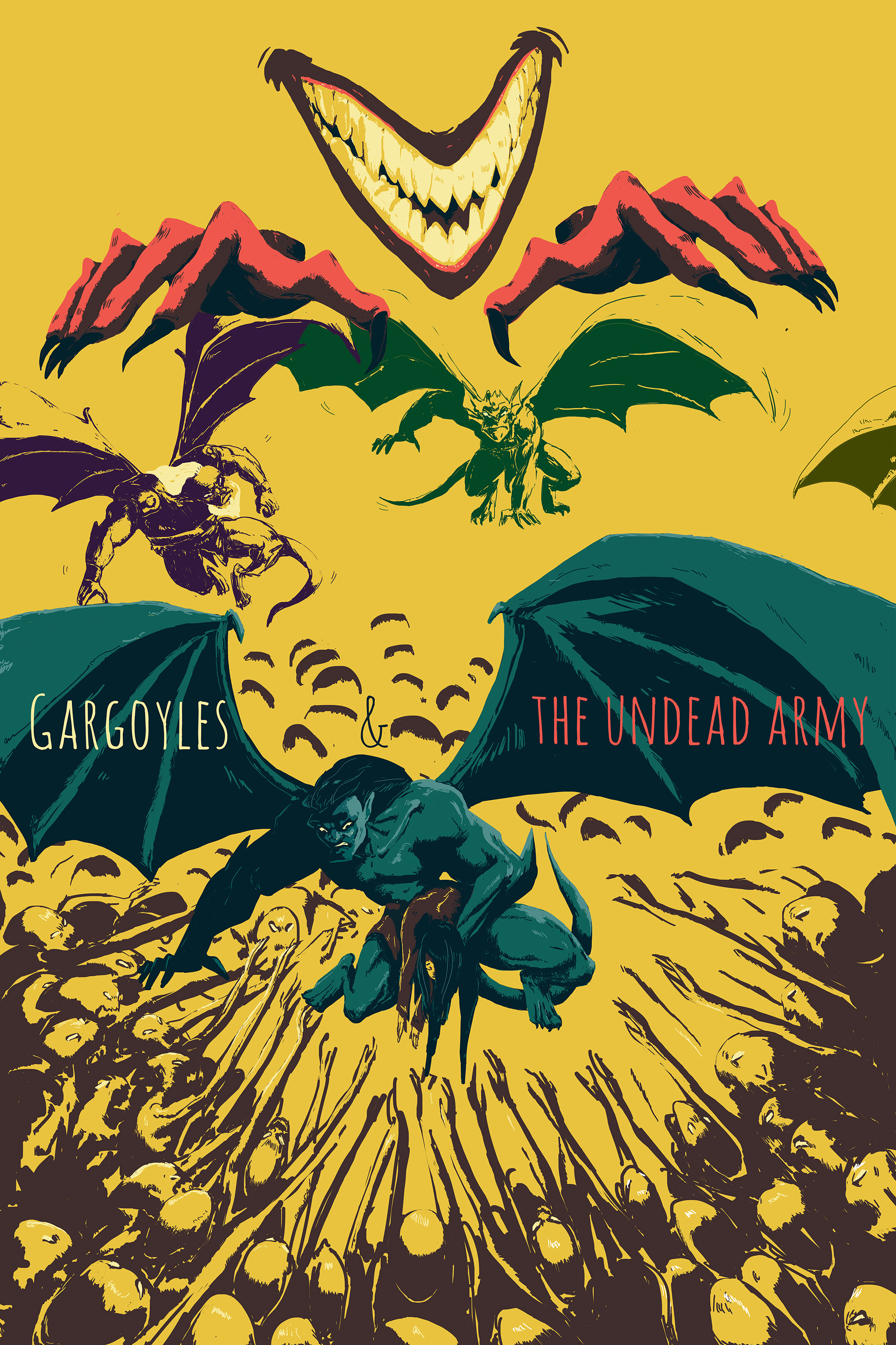
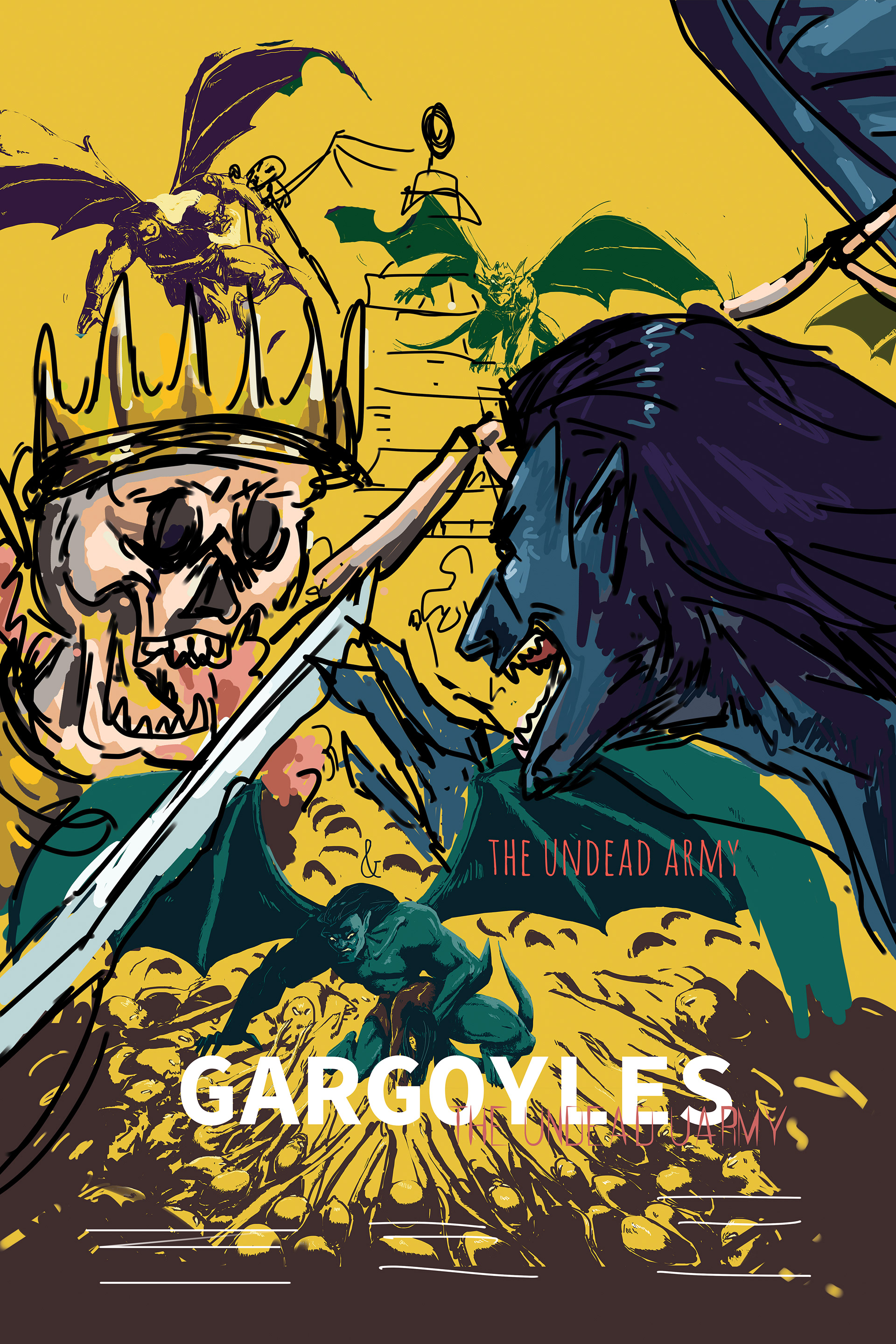
In the beginning the commander/ the evil behind it all, had more of an ominous lure. I only decided to show a demonic smile and puppeteer like hands to give hints that someone else is in control. However I felt that the imagined story was lacking depth, and the top composition was a little weak. So I changed the name, to "Gargoyles & The Golden Temple" and made it more about the setting, and brought forth the main antagonist in a face off against Goliath. This added more of a mystery surrounding the plot, and the viewers mind could give birth to questions mentioned in the previous section. Furthermore it created a fuller and more appealing composition.
06 Synopsis
Cult Classics
2018
This series was a ton of fun, and it was very enjoyable to stroll down memory lane and dig up memories to draw from. Seeing people's expression during expos when they stumble upon my work was also priceless. Their excitement was not necessarily just for the craftsmanship, but for the same nostalgic air I breathed while I worked on these pieces. Granted there's an age cut off for some of these pieces , very few teens remember CyberSIX or Gargoyles. But seeing their friends or family educate them on these shows with bright enthusiasm was enjoyable too.
I will do something similar soon. Stay Tuned!
___________________________________________
Thank you for viewing!


