

01 Overview
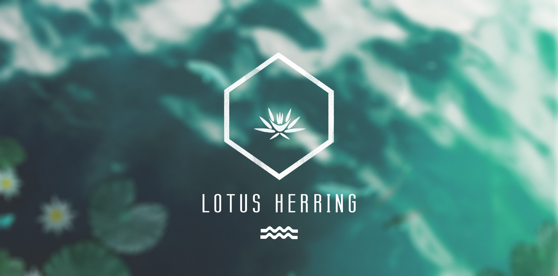
LOTUS HERRING
Lotus Herring is a clothing company starting from the ground up with fresh and new ideas for fashion. It was a joy working with them and finding out that we had a lot in common. Targeting young, city dwelling professionals, they wanted a clean and balanced look that could appeal to both masculine and feminine tastes.
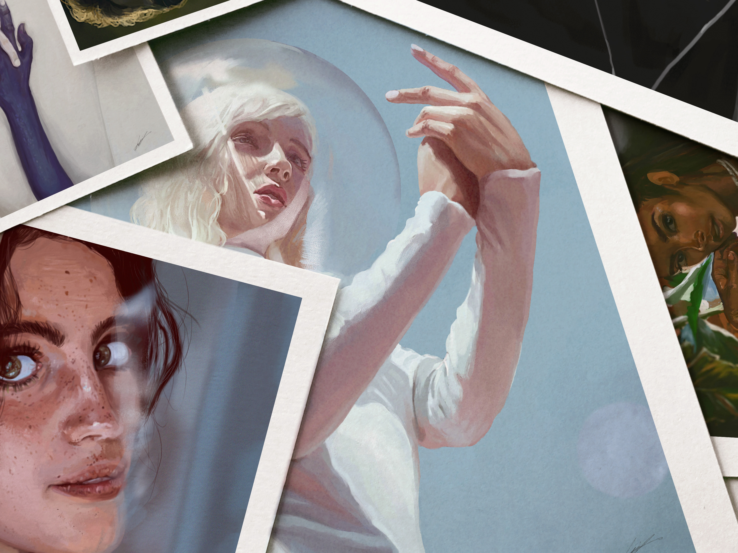
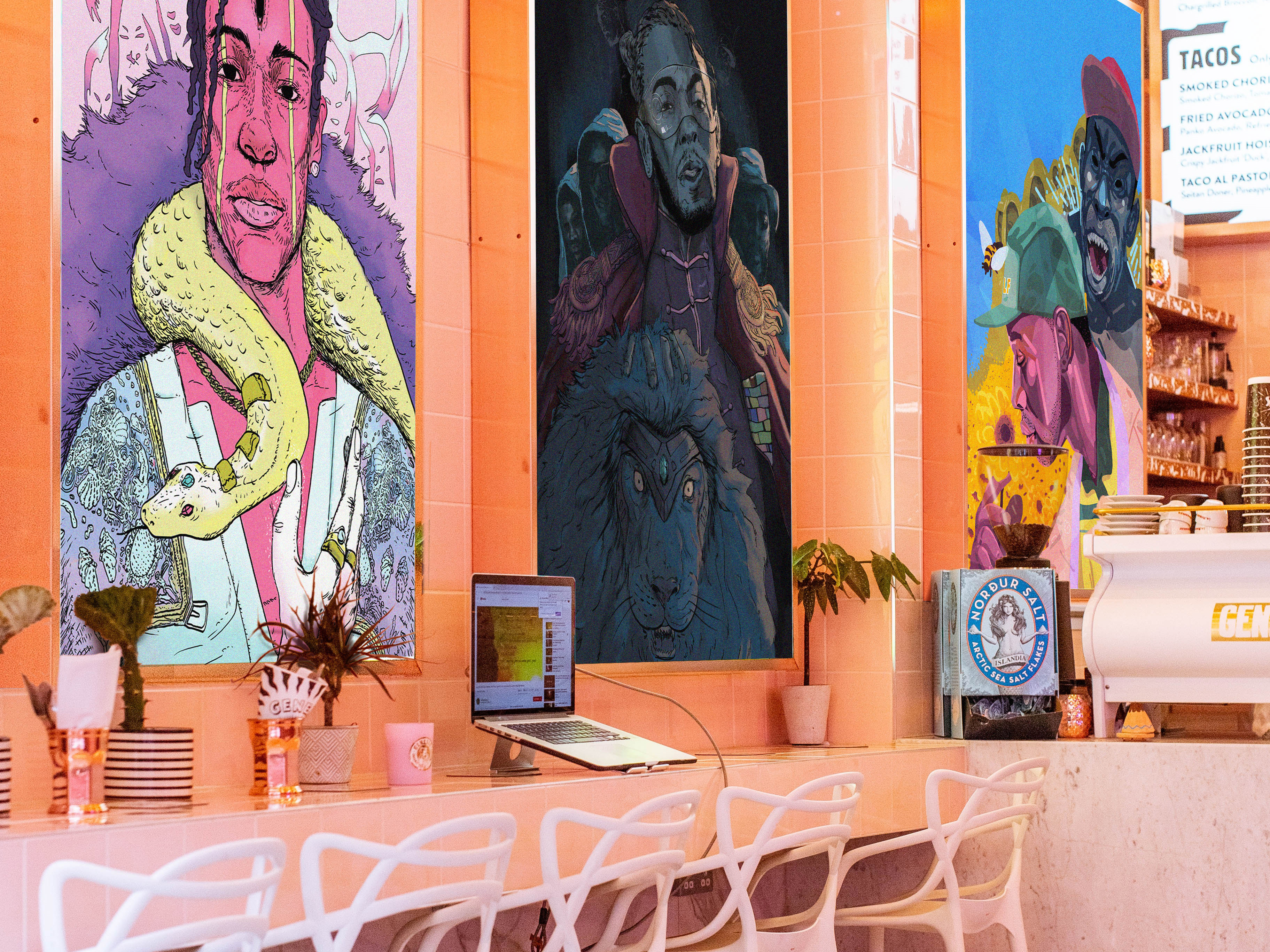
Naming | Logo & Branding | Web & UI/ UX Design | Marketing & Stationery Design | Print Production | Photography | Packaging | Copywriting | Social Media Content | Art Direction

02 Branding Collateral
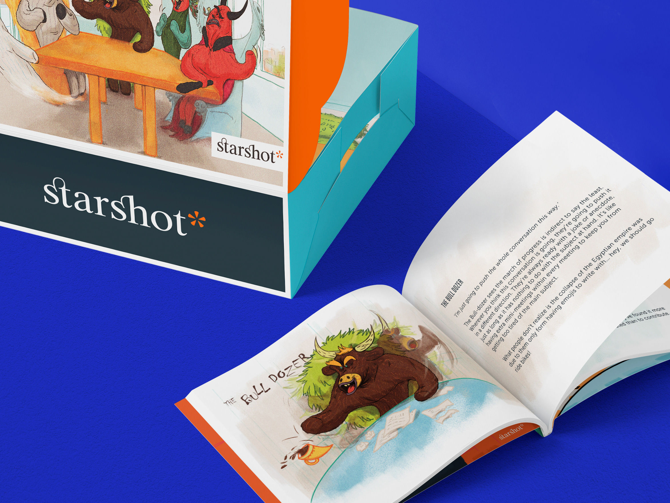
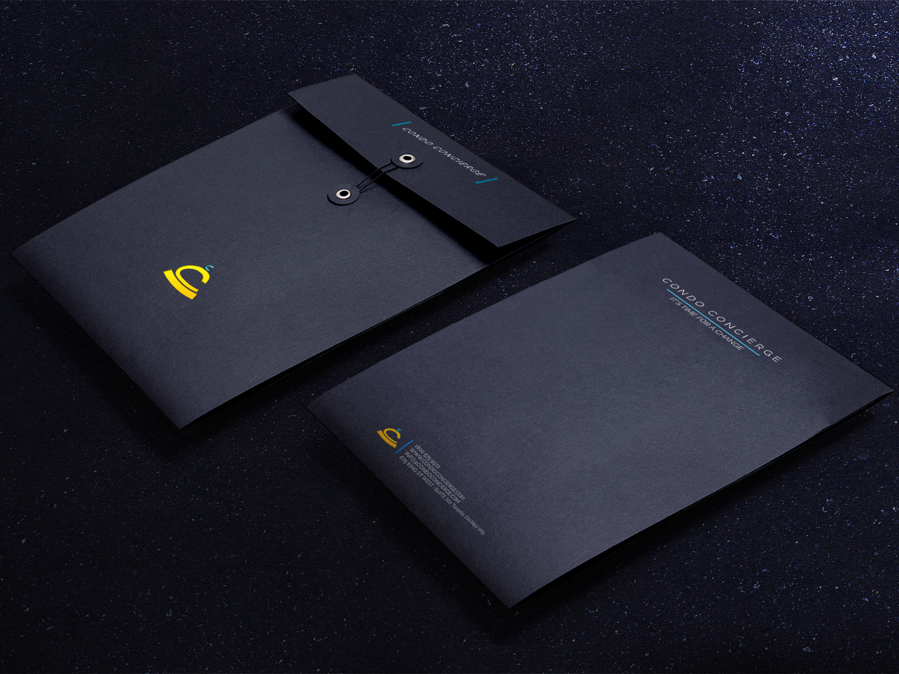
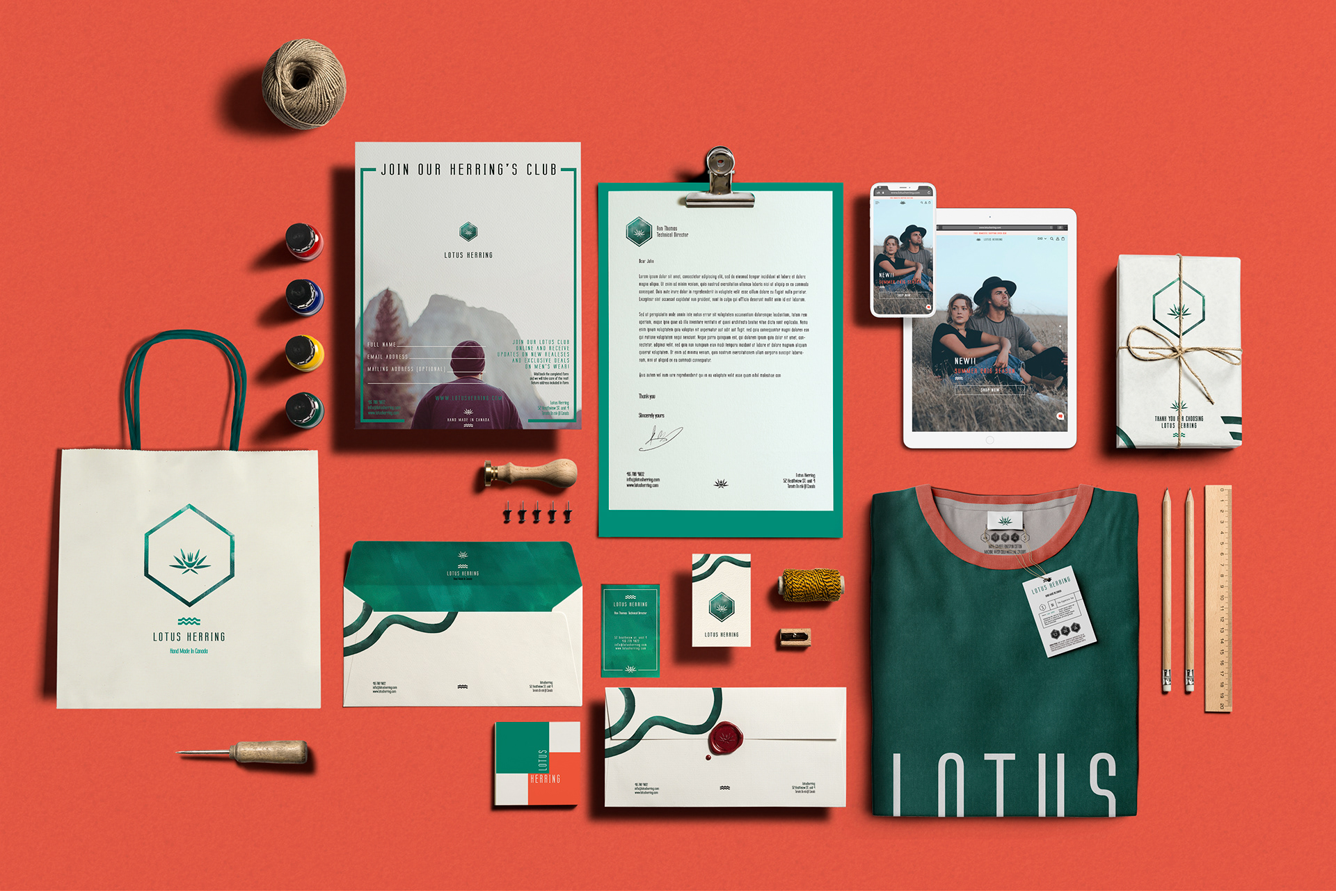
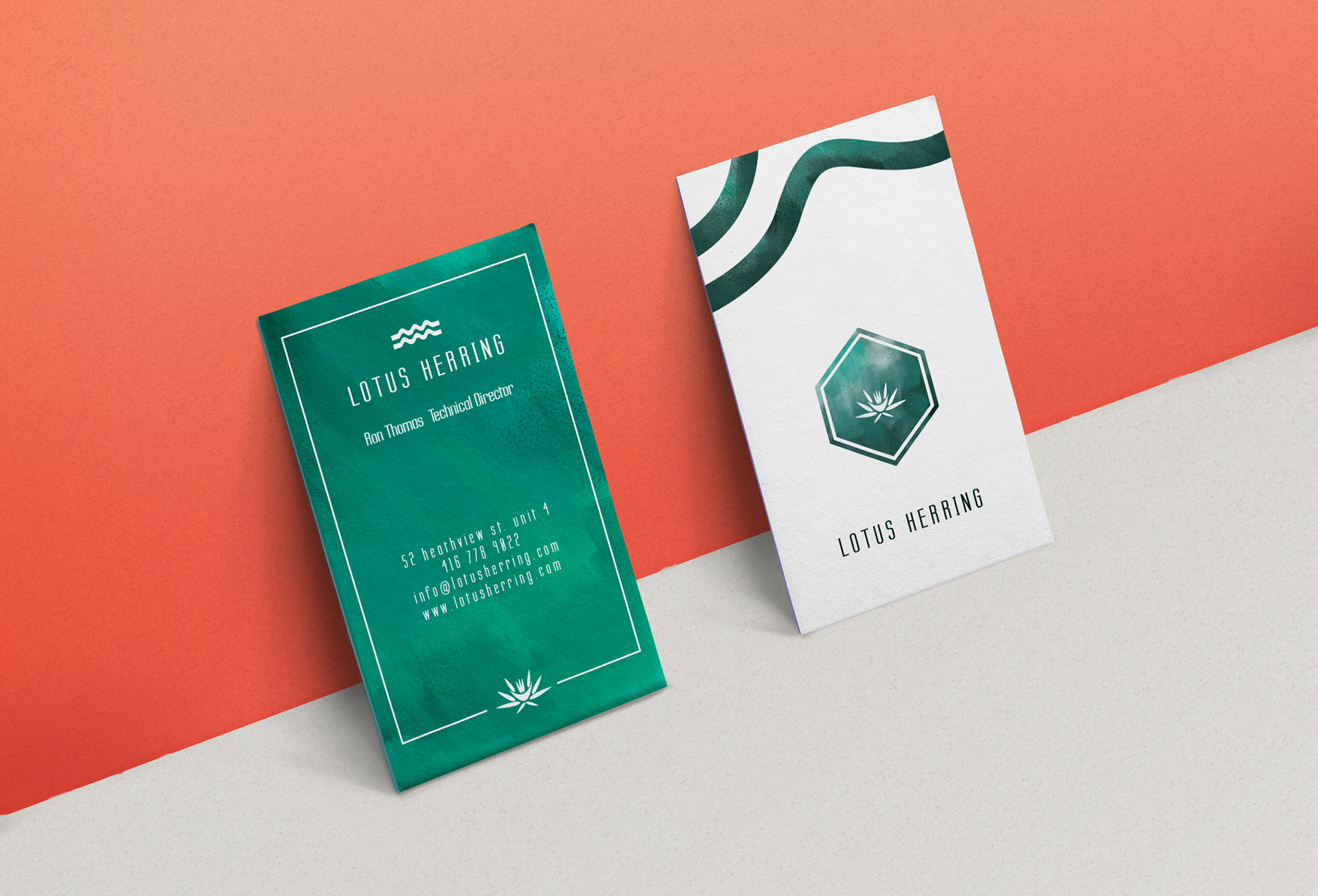
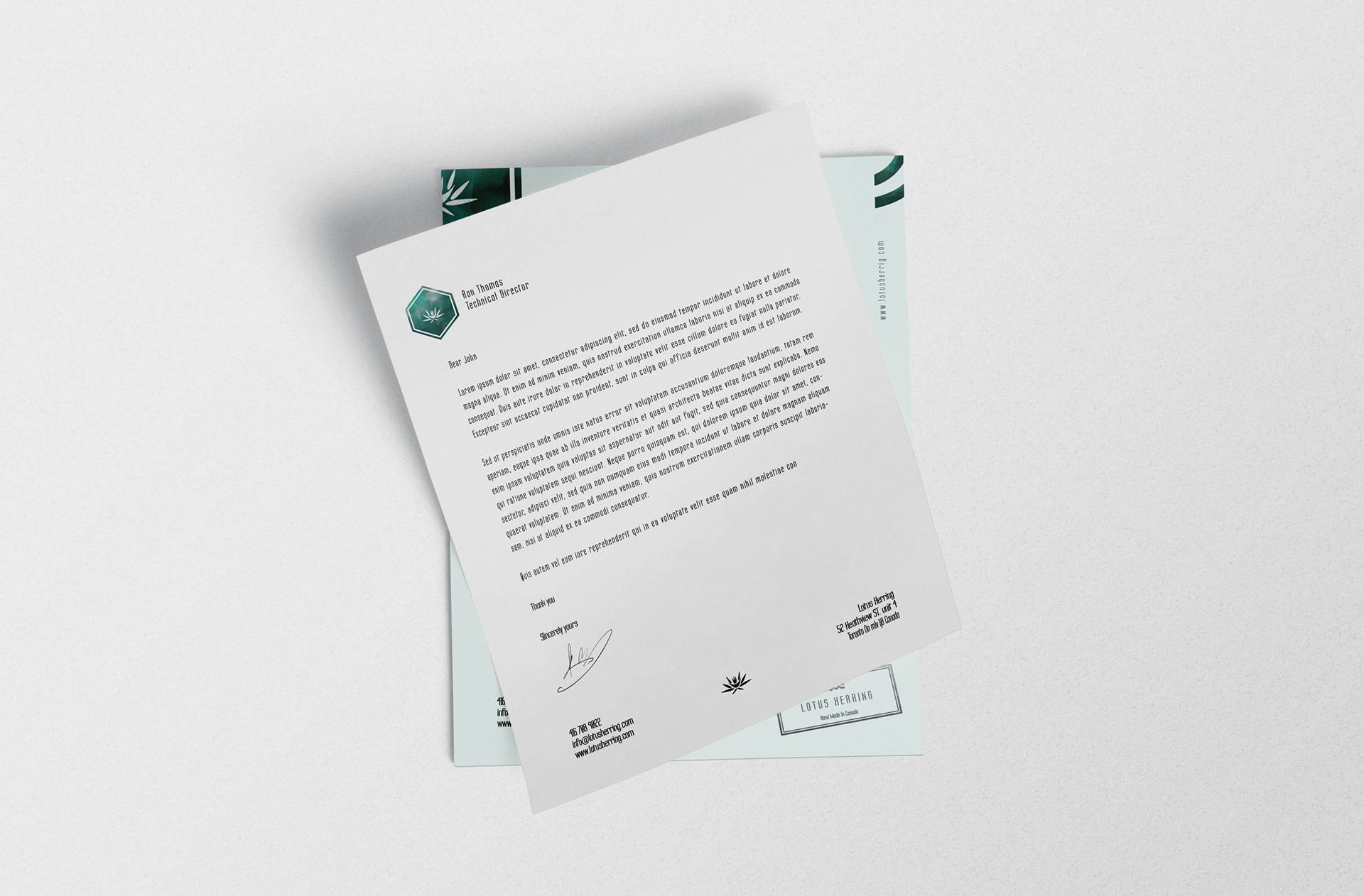
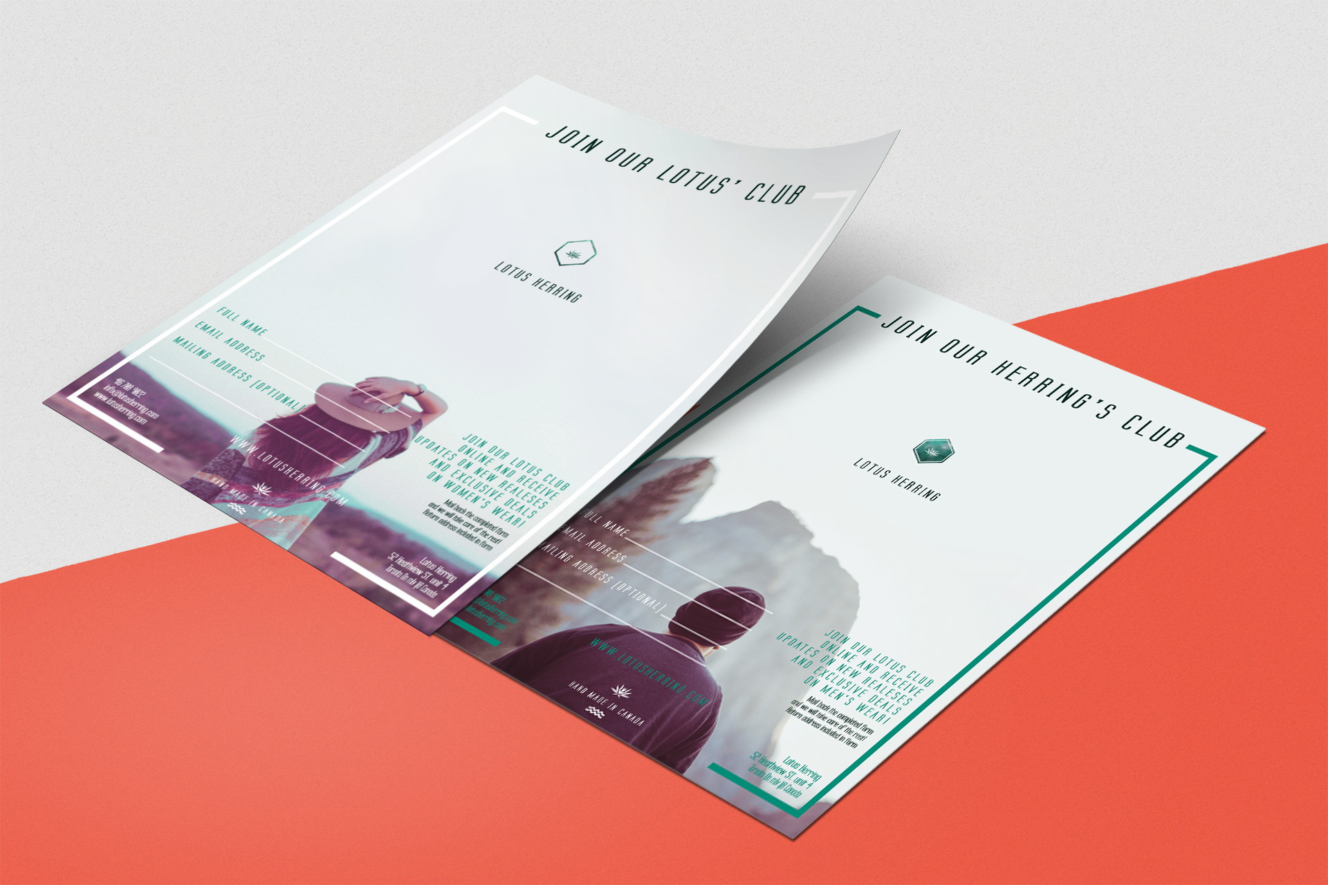
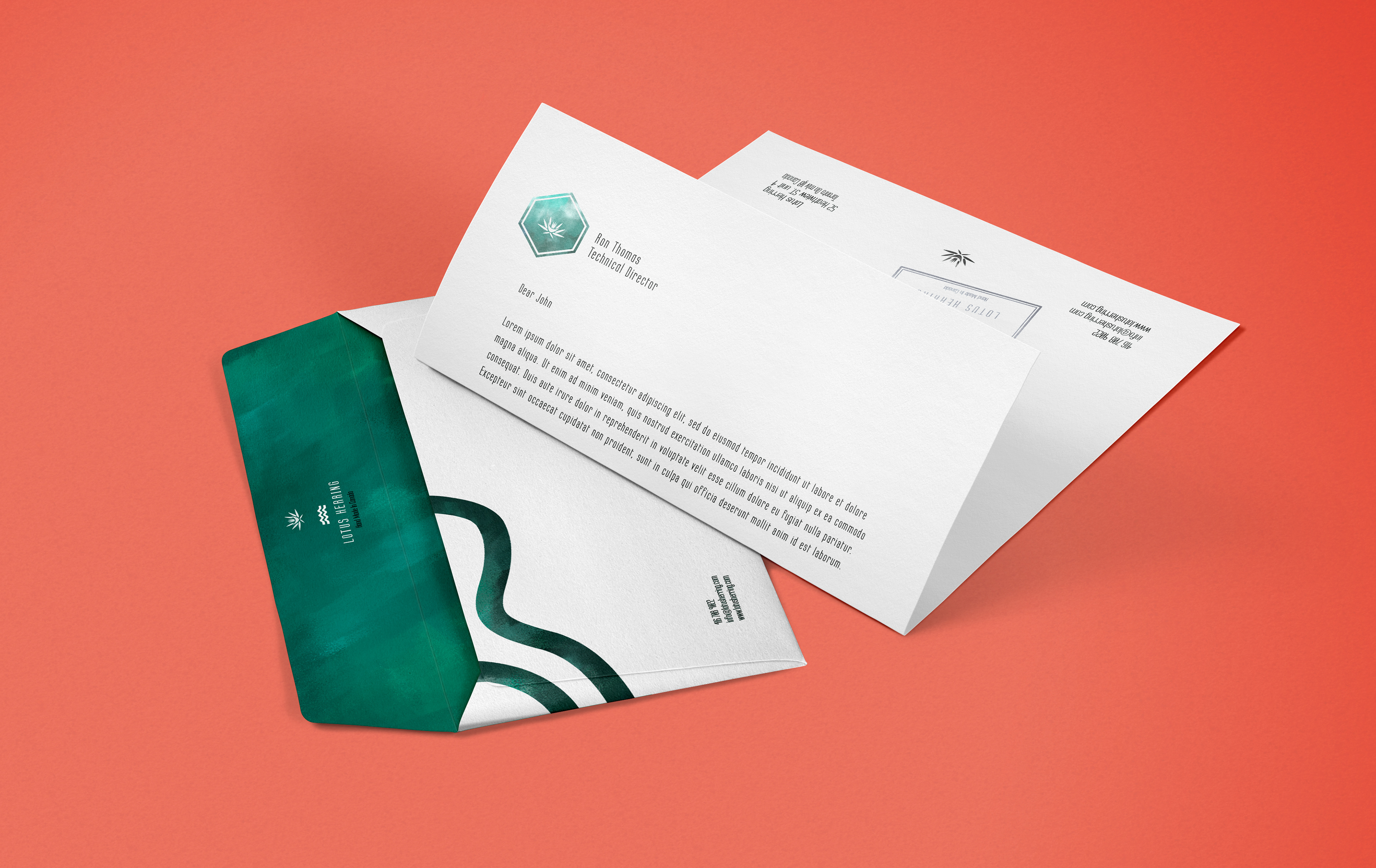
PRINT & STATIONERY
02 -A Origin Story
I created the name Lotus Herring, which plays with the idea of water, and I knew that I wanted to show that in two ways. I used cool green shades to show the calmness of a pond filled with lotuses, and a salmon (or a red herring if you will) tone to remind their audience of the living energy that travels through a flowing river. The choice of colors also captured the different sexes the company wanted to appeal to, and it was important that they could work well together.
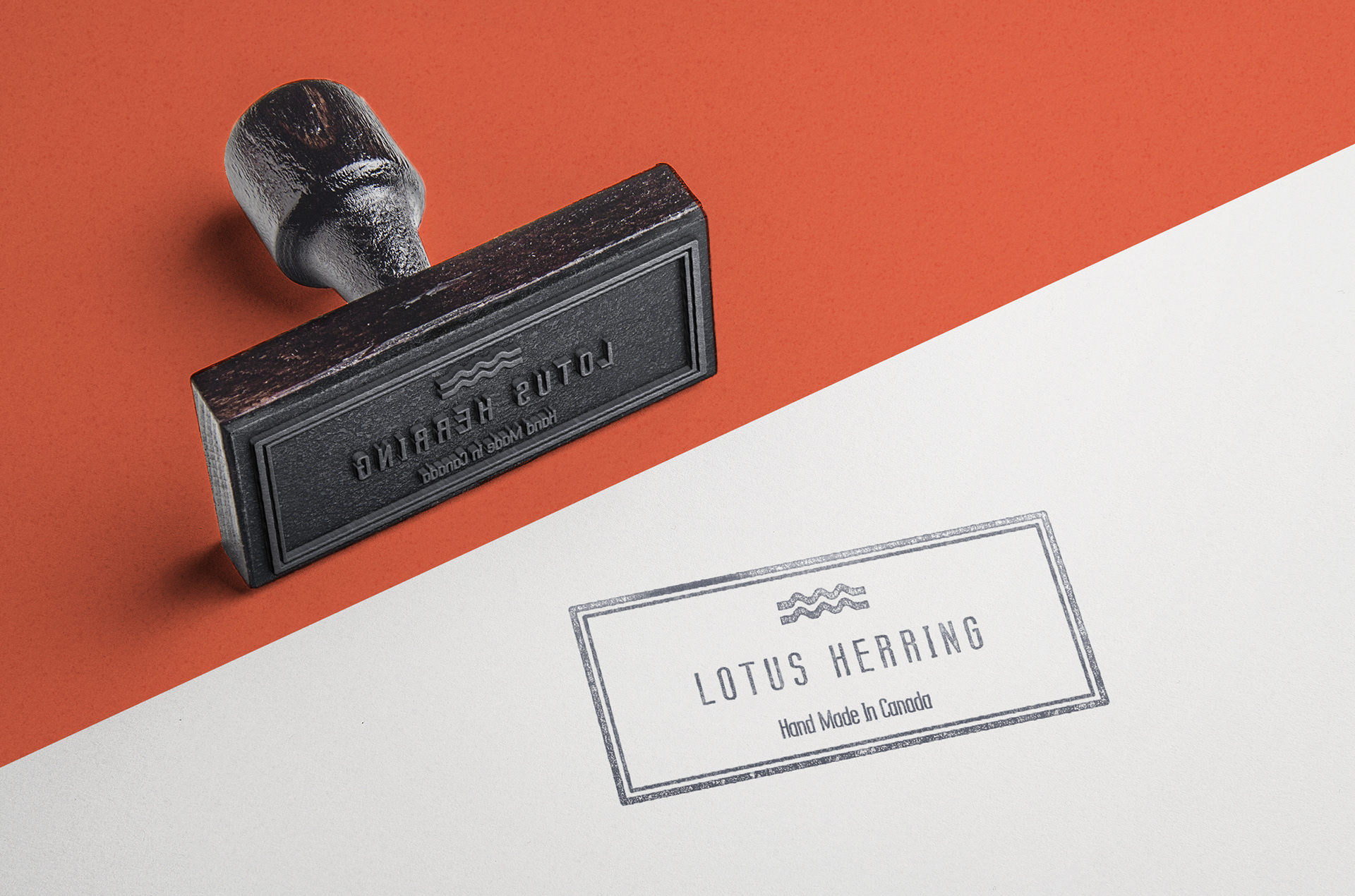
The style of the logo was created to appeal to young professionals. I made sure to utilize textures that would be attractive to popular youth culture. And much like young professionals the logo was created with a sense of movement and stability. The story of Lotus Herring will take you where you need to go, but keep you where you need to stay.

02 -B The Split
There was a split in between the two core colors, and the green that represented the more masculine side was used for the collateral, and the salmon for femininity was used as the base of the materials to be presented on, from backdrops for the clothing to interior décor of the store etc.
02 -C Symbolism
The shapes were designed with various wave like symbols, which encompasses the logo and graphics as icons or as more illustrative patterns on the collateral. Providing a sense of fluidity, and to provide structure the hexagonal shape was added, adding a feeling of calm as the sides of the shape introduces an illusion of fitting into one another (like patterns on a soccer ball), but stands out as it isn’t one of core rectangle, circle, or triangle that’s frequently used to define a brand.
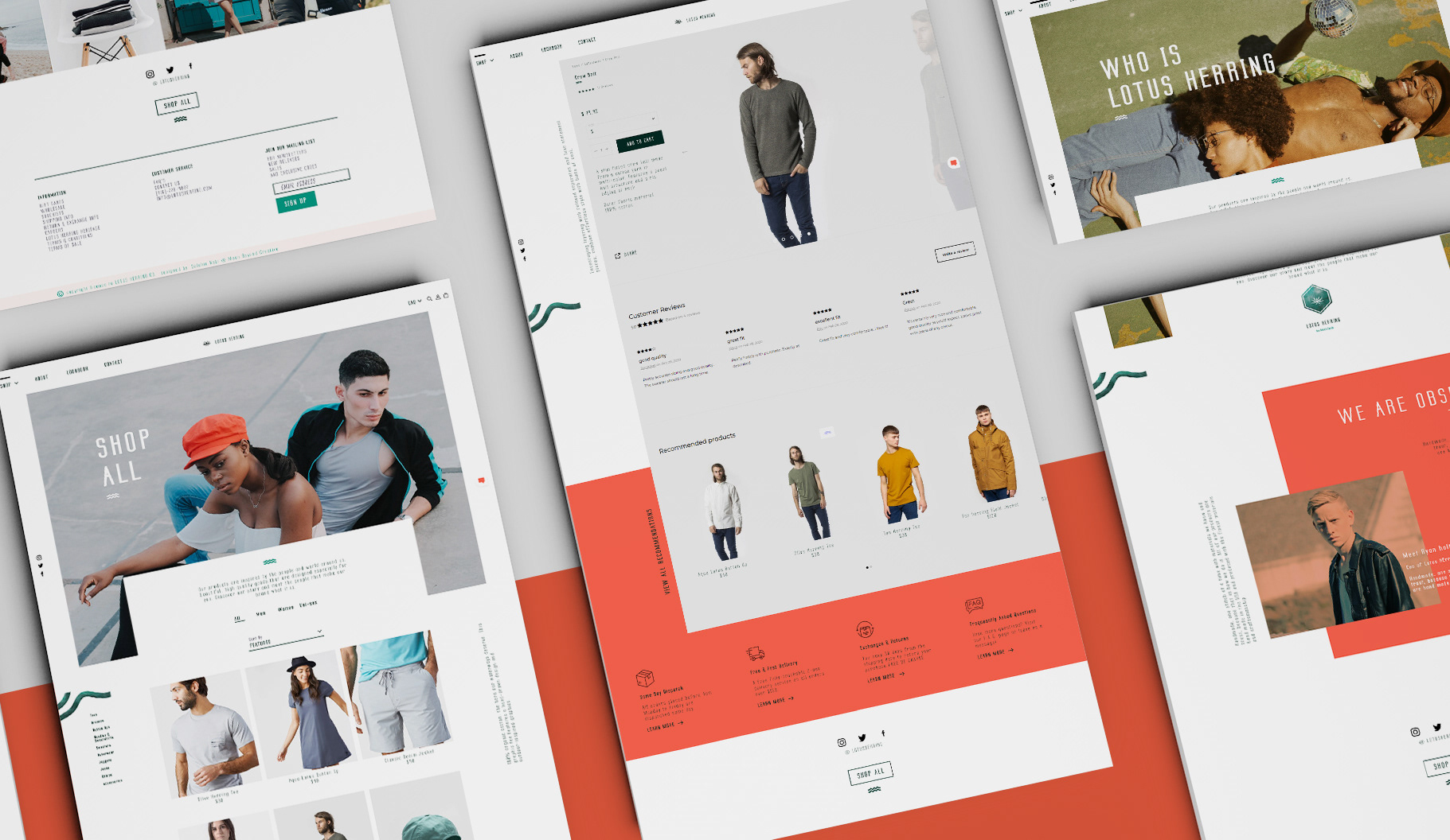
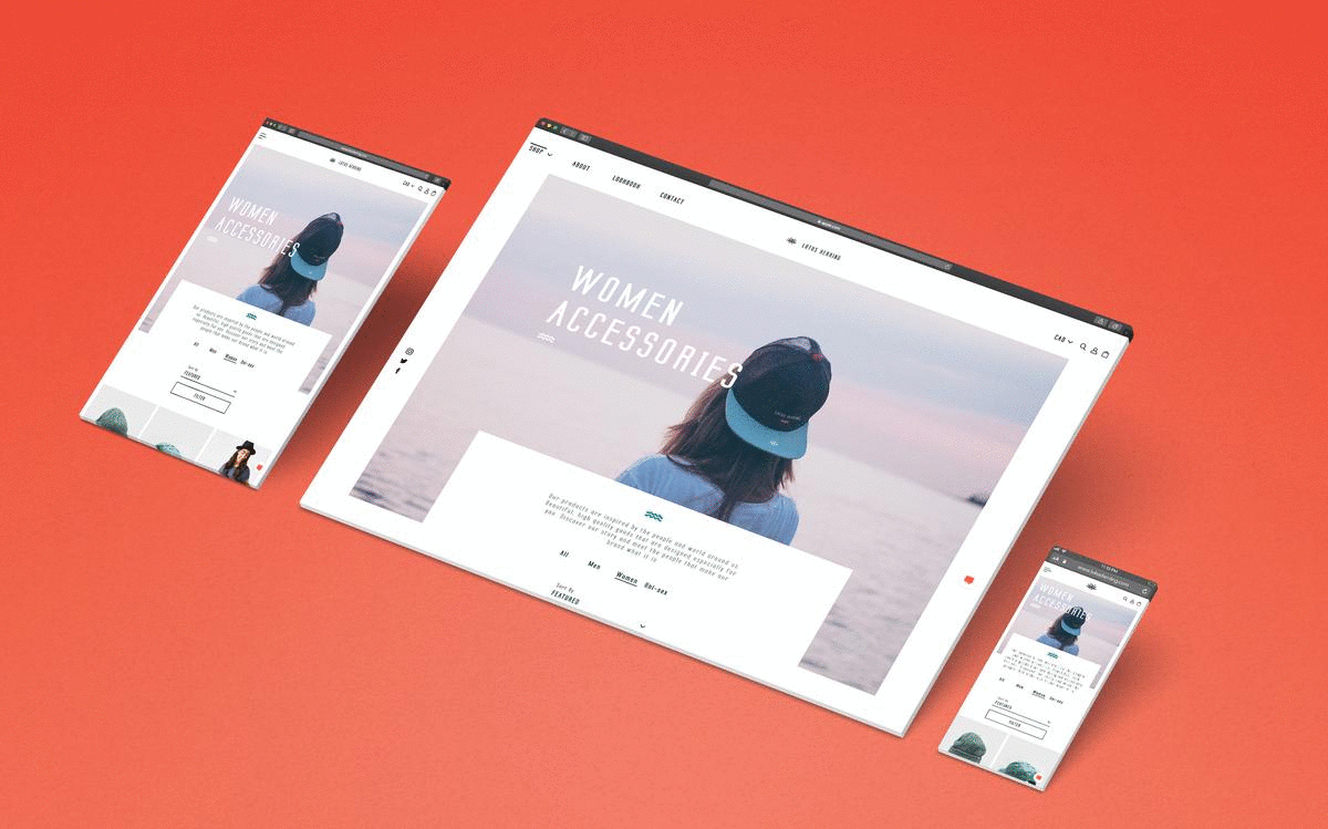
03 The E-Commerce Site
DIGITAL PRESENCE
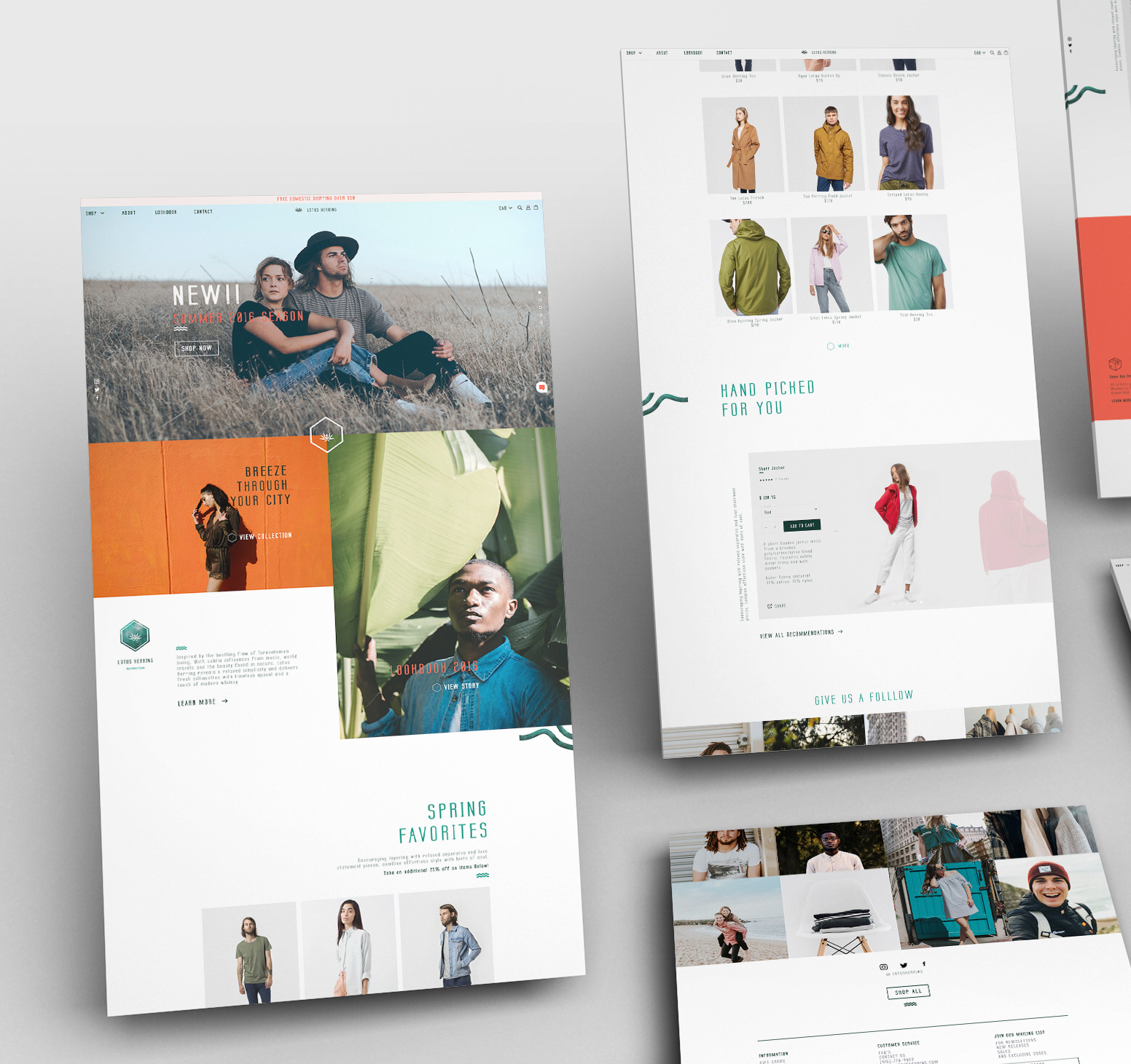
I wanted the Lotus Herring website to be more than just a place for their customers to buy their clothing. So each page was created with large header images providing a sense of their culture and brand. A formula was put in place so that the site is always updated with new and interesting collections. Revisiting old products, introducing new ones, sales, seasonal wear, collabs and more. Providing that Lotus Herring energy of taking you where you need to go, and keeping you where you need to stay.
The site also has a lot of overlapping elements providing a sense of depth and adding to the visual interest. The layout alignment is stacked in odds and evens providing a sense of curiosity to the viewers when they come across a negative space block where they expected content. The negative space is always coupled with angular visual elements to keep the viewers eye moving to the next thing. Making the pacing of the site more enjoyable.
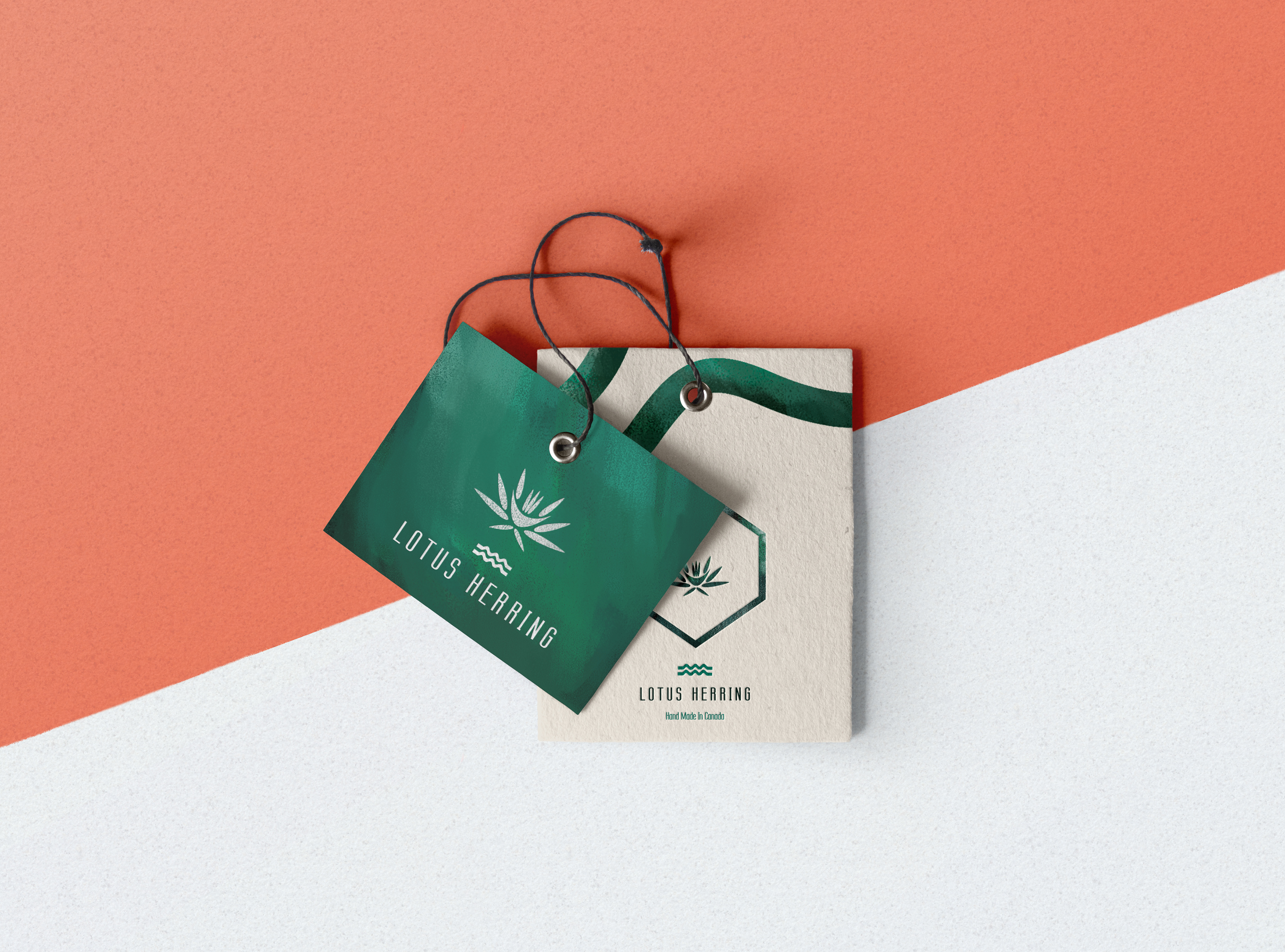
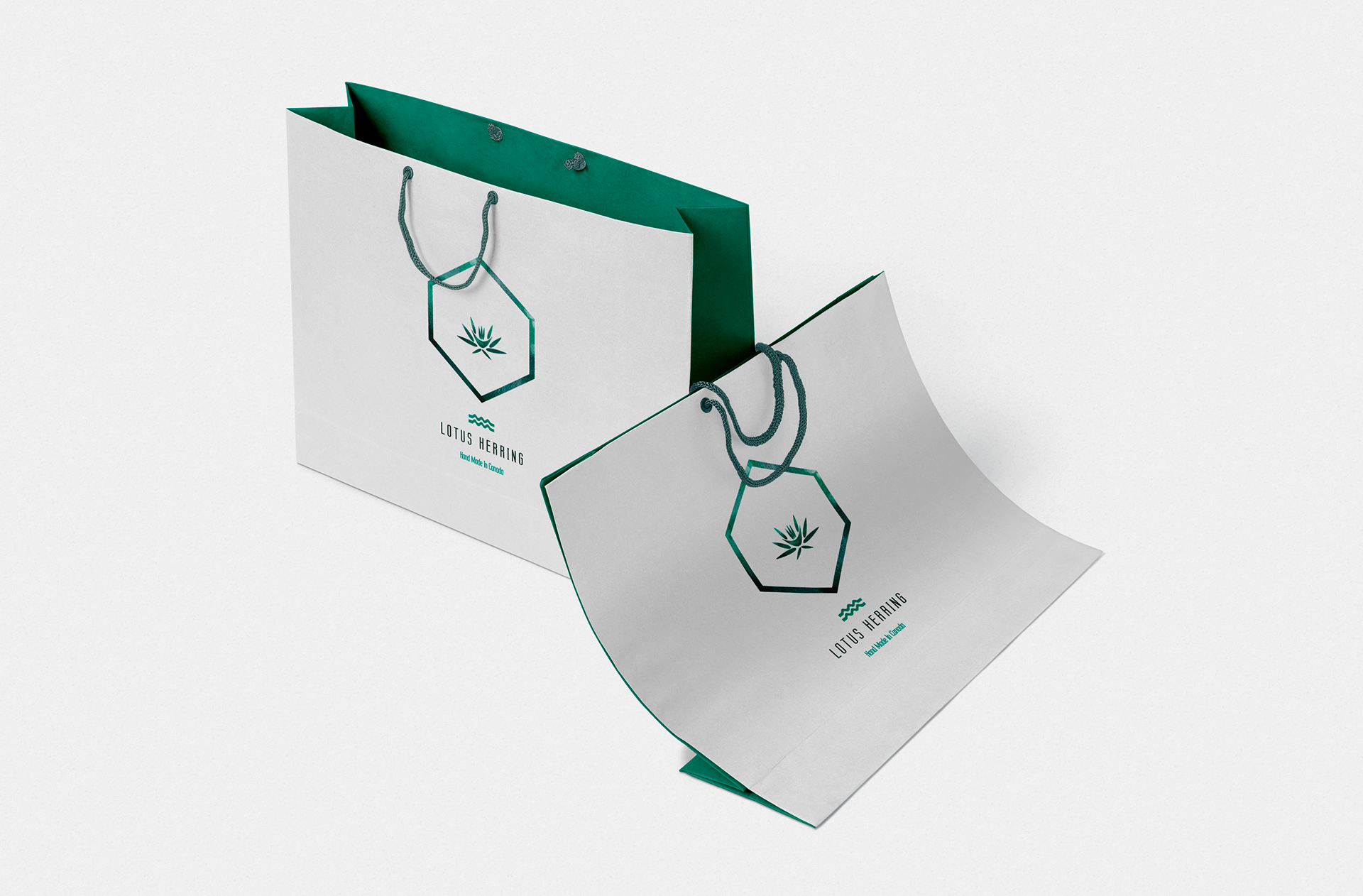
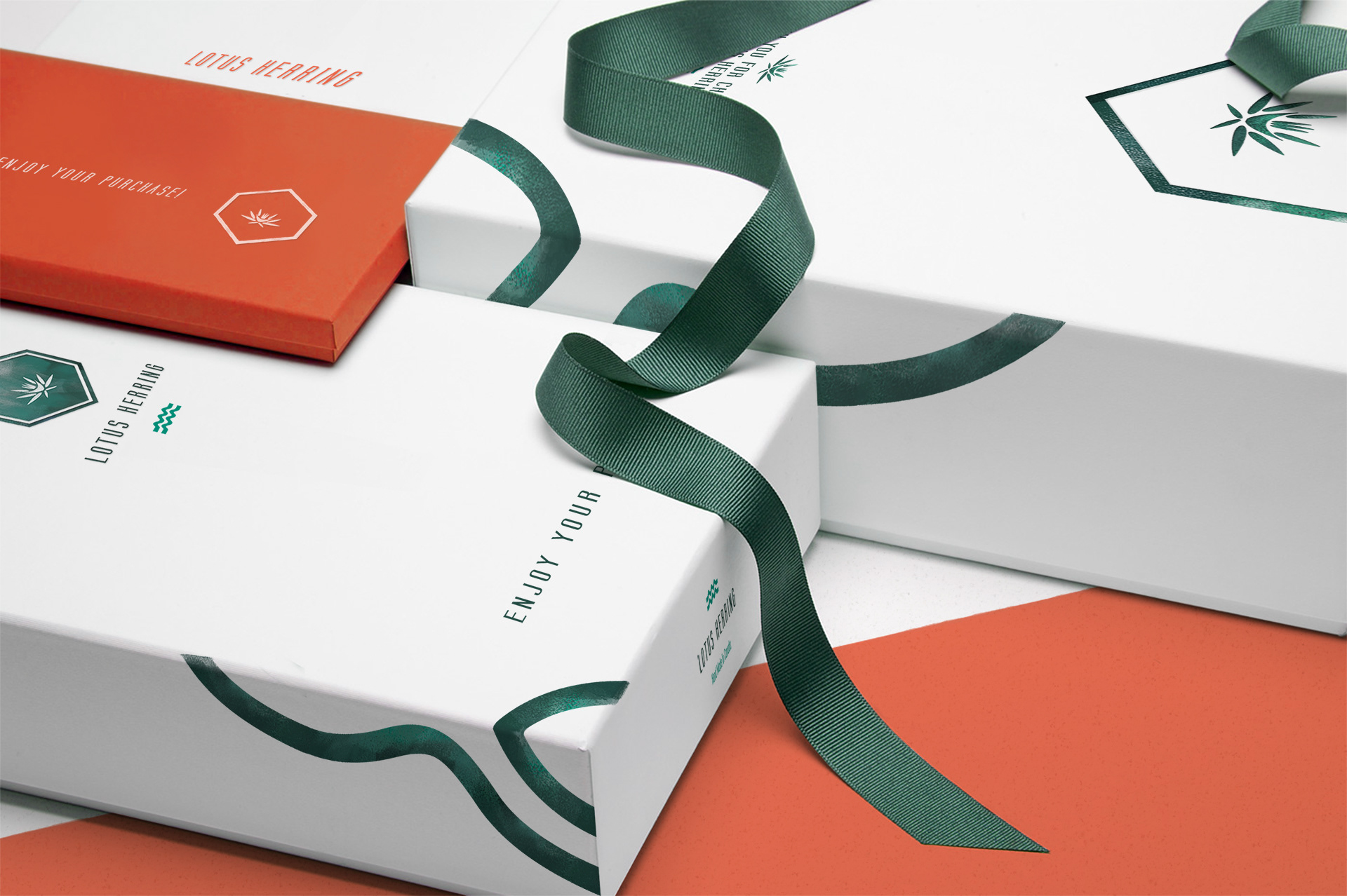
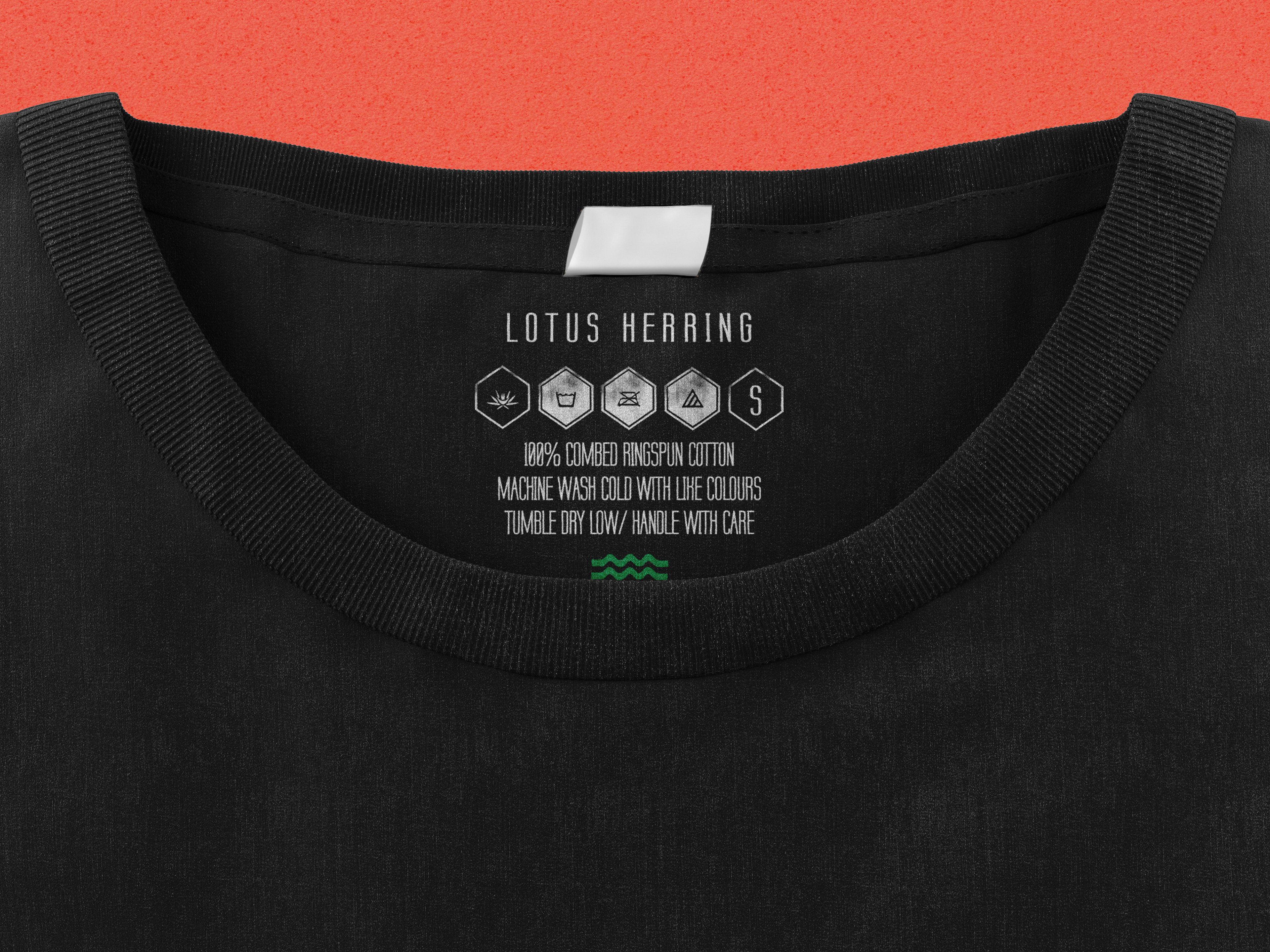
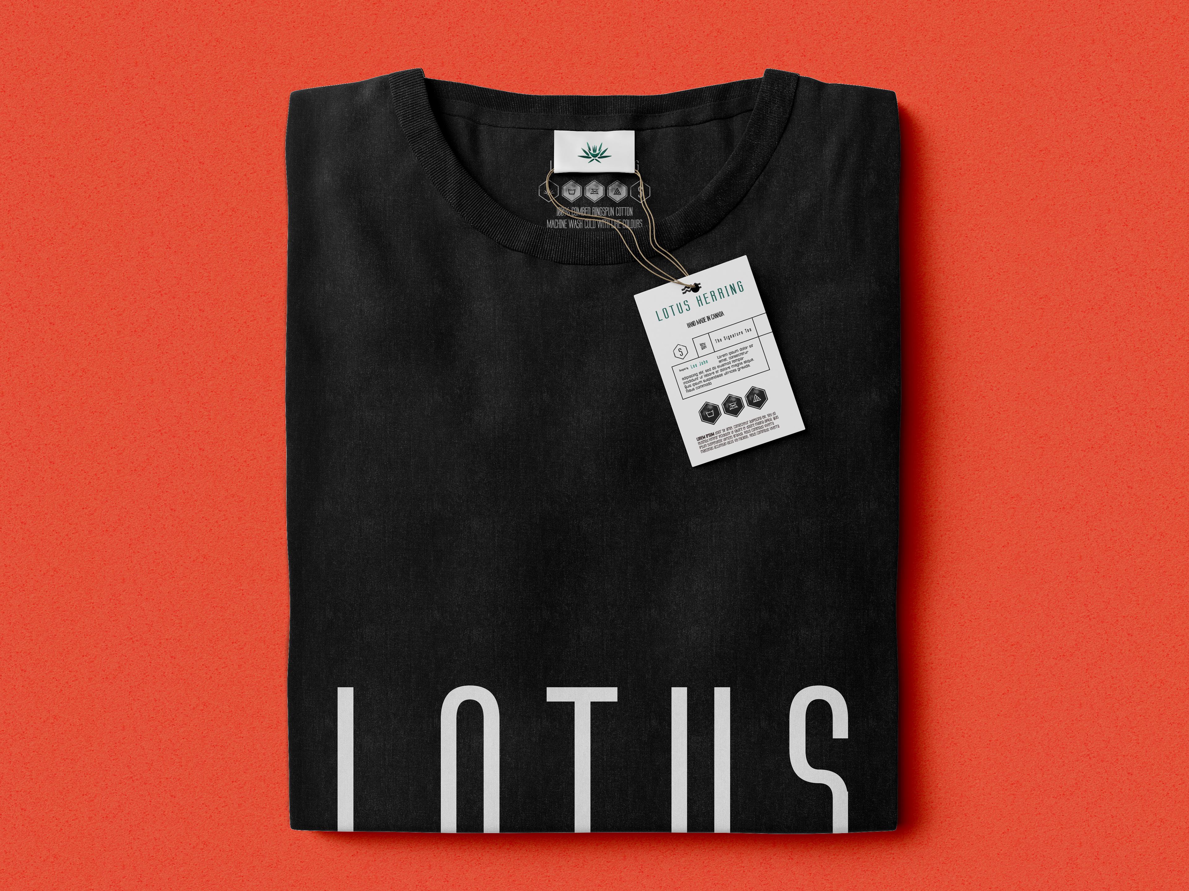
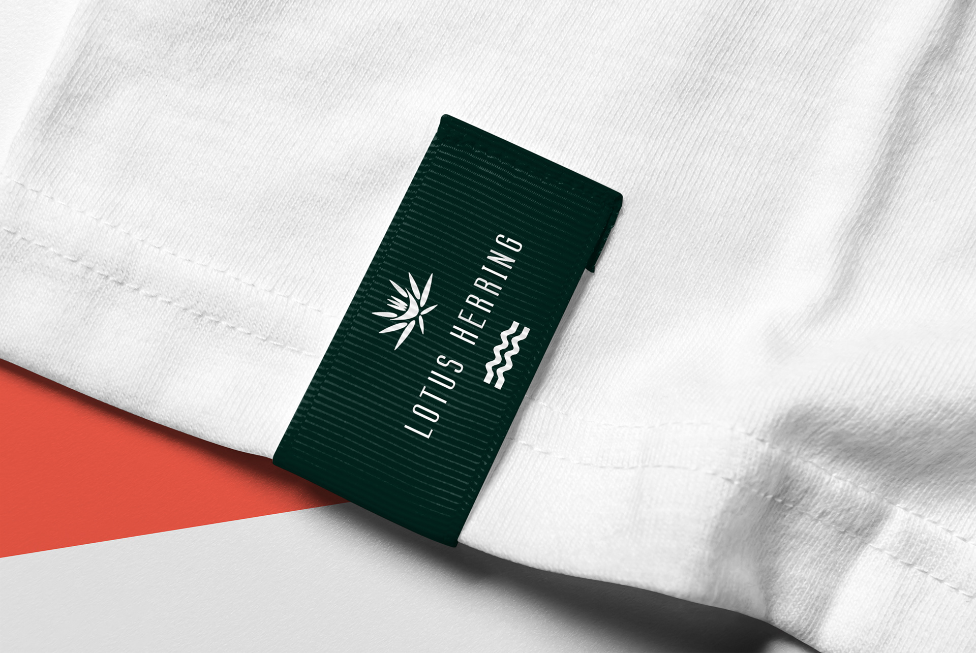
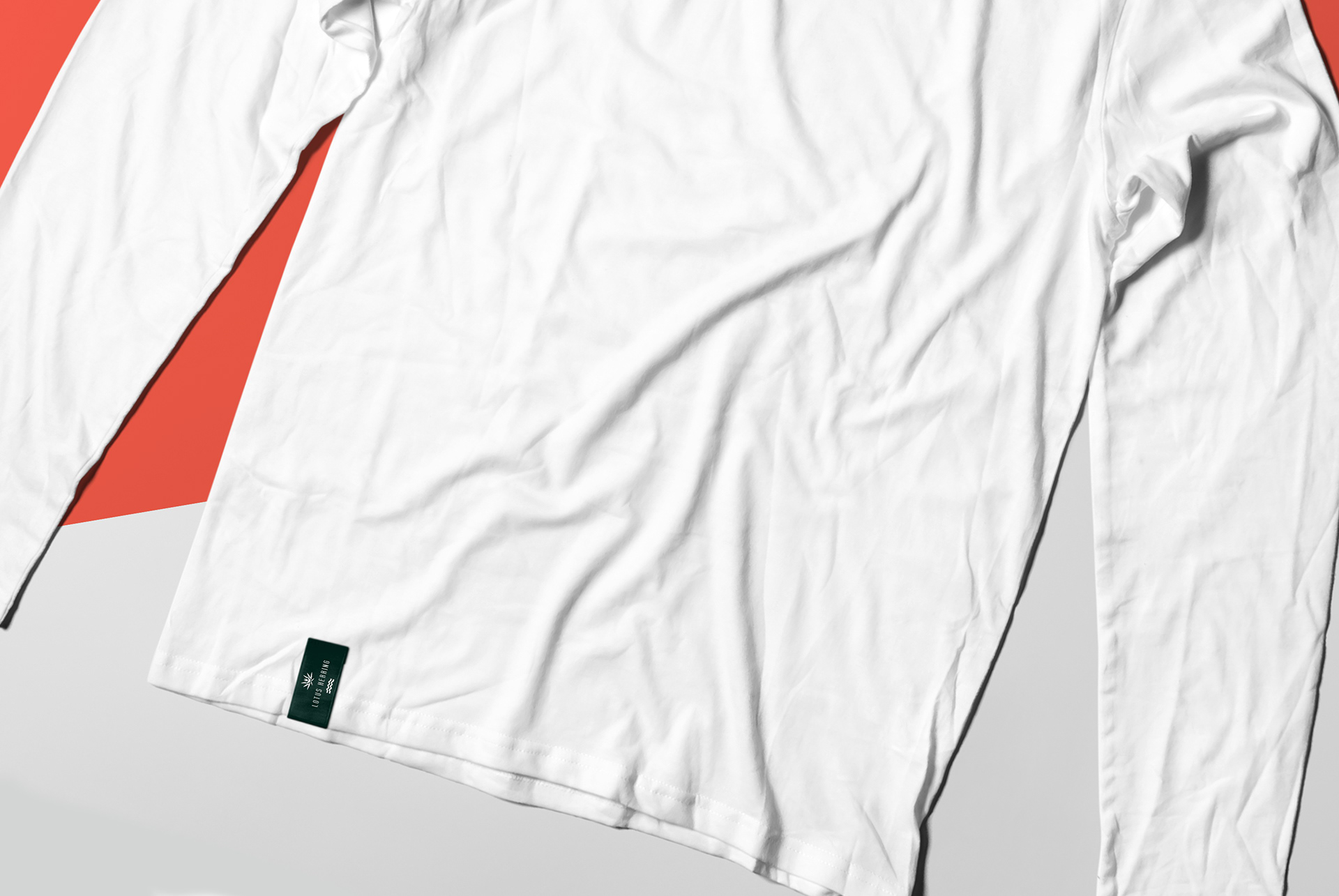
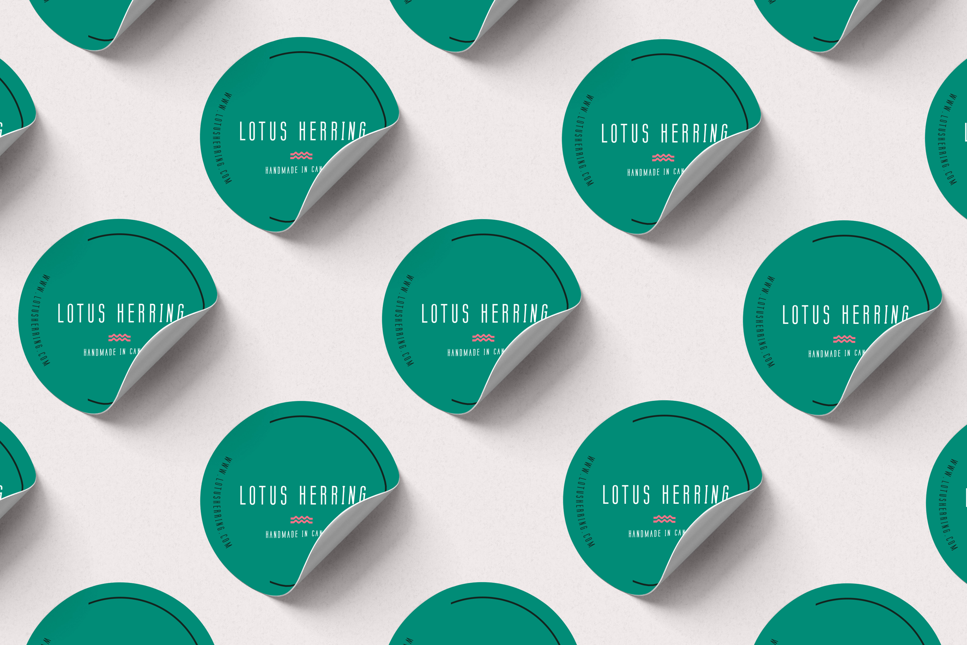
04 Packaging & Labelling
SOMETHING TO TAKE HOME
From clothing labels/ tags, to shopping bags, to packages for the products, a variety of external collateral was created. Something that the customers can feel and touch outside of the actual product. Such as a shopping bag they would like to show off as they walk down the street, or a package presented with a bow that would make them feel special when they receive it in the mail.
However as many other brands that are getting off the ground, keeping a low production budget is always a primary concern. Creating custom labels, and adding trinkets and such to packaging and labelling can add up. So I added the customization in terms of the design of the collateral, adding an illustrative touch, providing texture, finding ways to reuse material, so that the brand can still have the uniqueness it deserves within the budgetary limitations of a startup.
05 Synopsis
LOTUS HERRING
2018
I was able to mold Lotus Herring’s visual story from start to finish, and that’s always an amazing feeling. To work on a brand from birth, name it, watch it take shape in front of your eyes, create its support and collateral so it can stand on its own, and also plan for its future so it knows which path to take when it grows up.
The owners of the brand welcomed me into their narrative, helped me understand what it is they wanted and what their goal was, and I was able to create a vision for their brand that we could get behind. Once the core of the brand was created thoroughly, the variety of content from their online store, to packaging, to stationery came together in an unified and complete fashion quite effortlessly. I am grateful for that experience, and I hope to revisit that feeling again.
___________________________________________
Thank you for viewing!