

01 Overview
CUMBERLAND STUDIOS
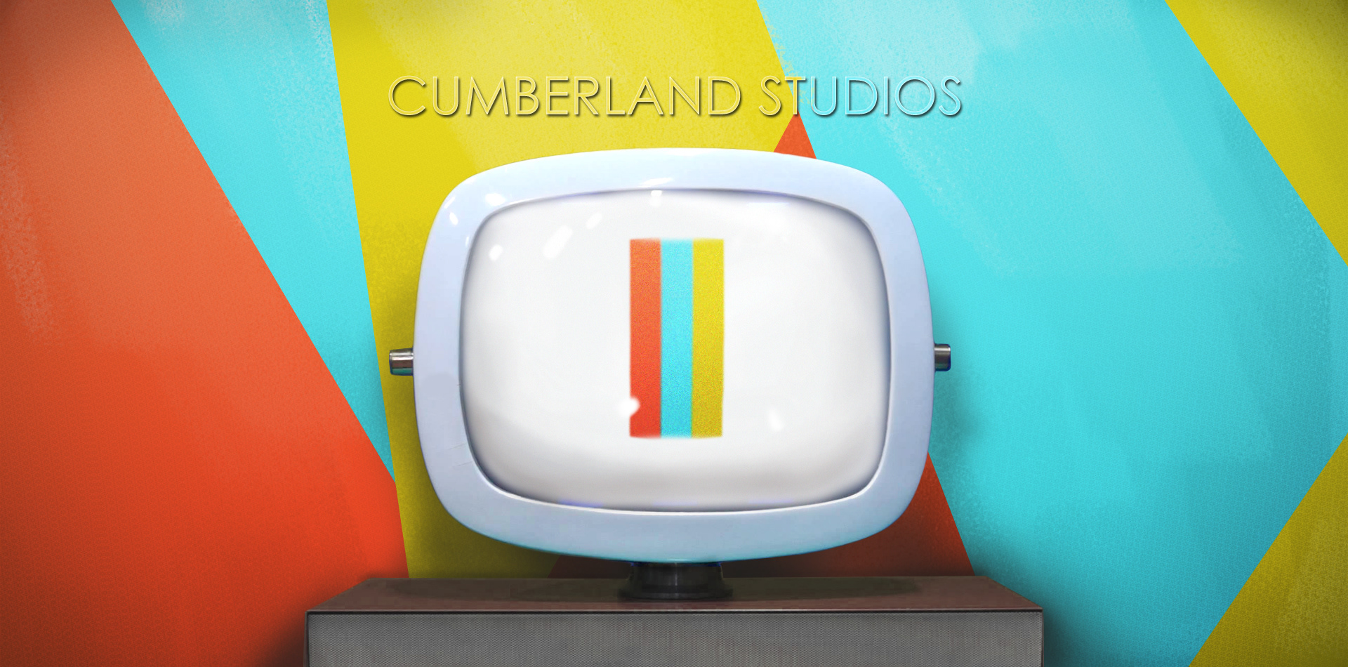
Cumberland Studios, is a post production and digital effects agency. Another client I knew I would have fun with by exploring unique visual presentations. Colors are a large focus in both of our fields and I was given free reign in order to show off the playfulness of their company.
Naming | Logo & Branding | Marketing & Stationery Design | Print Production | Typography | Art Direction

02 Branding
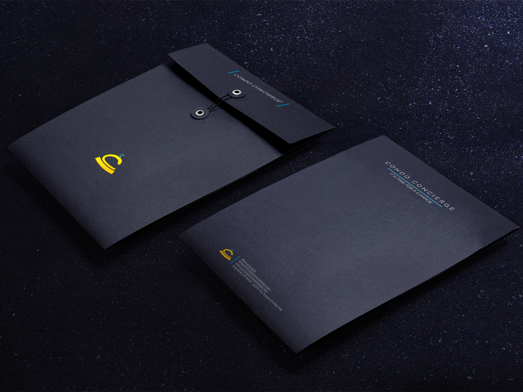
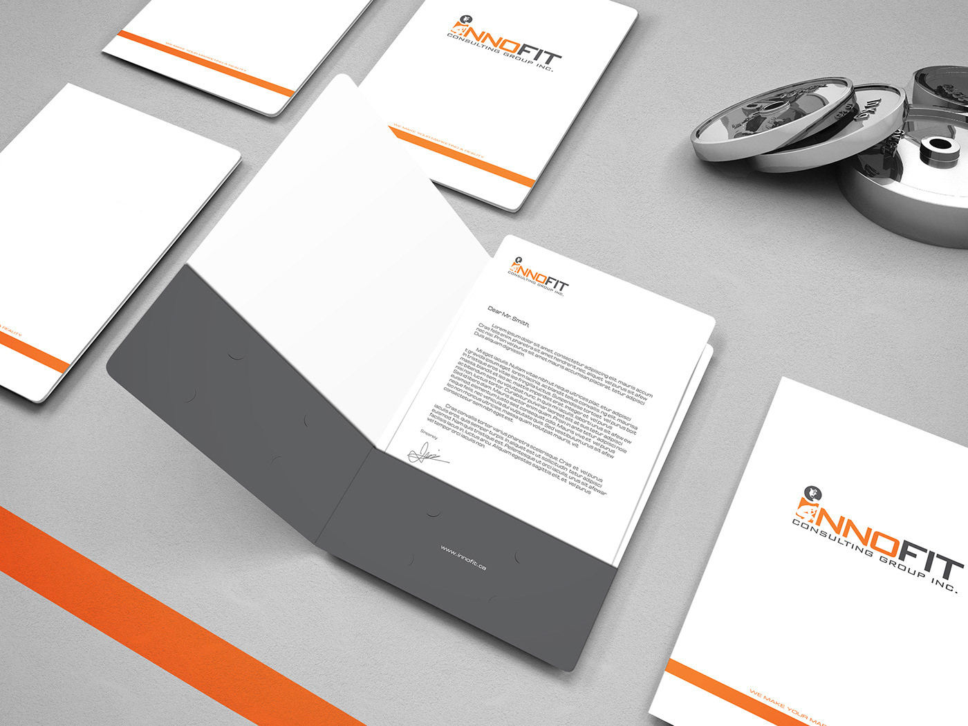
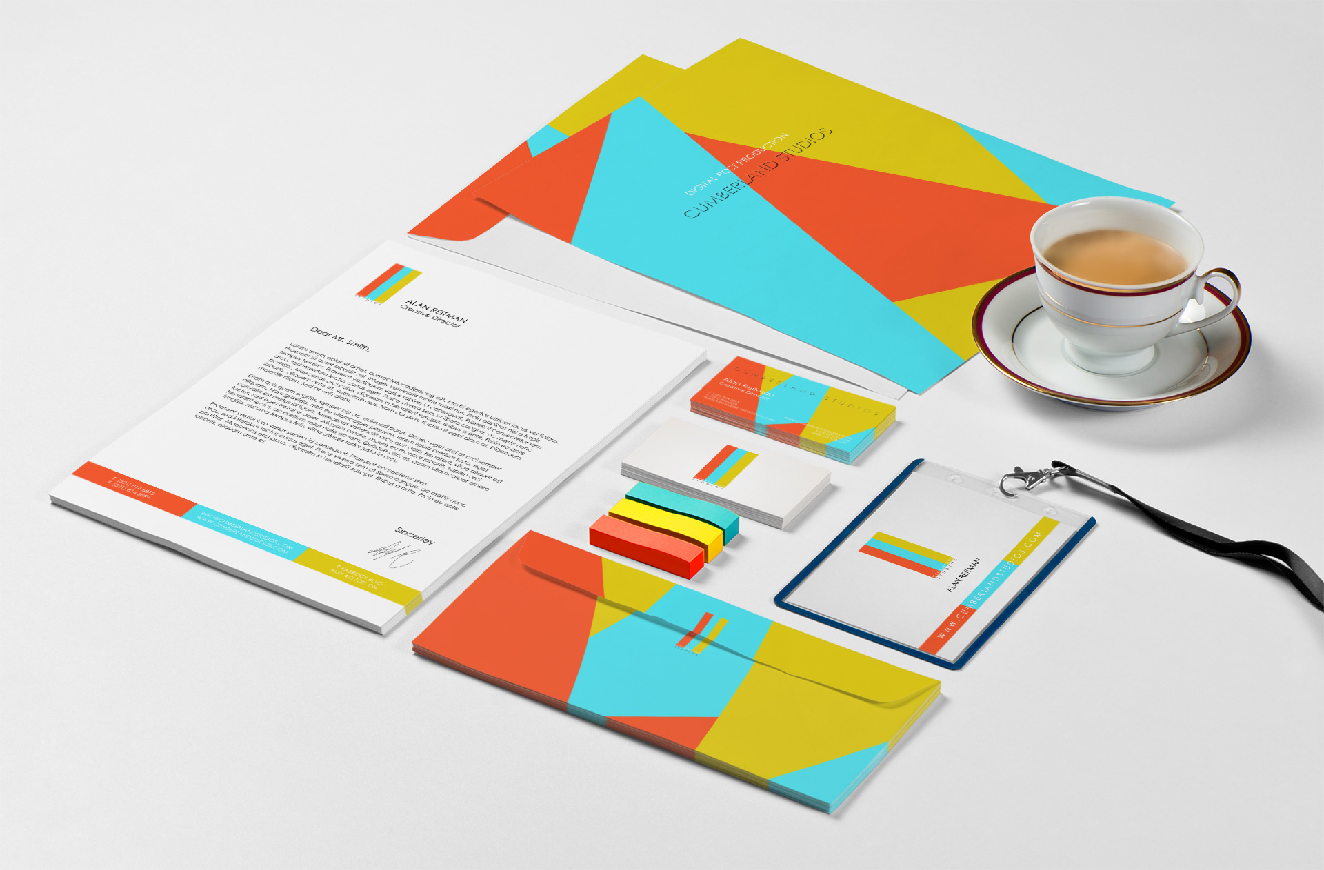
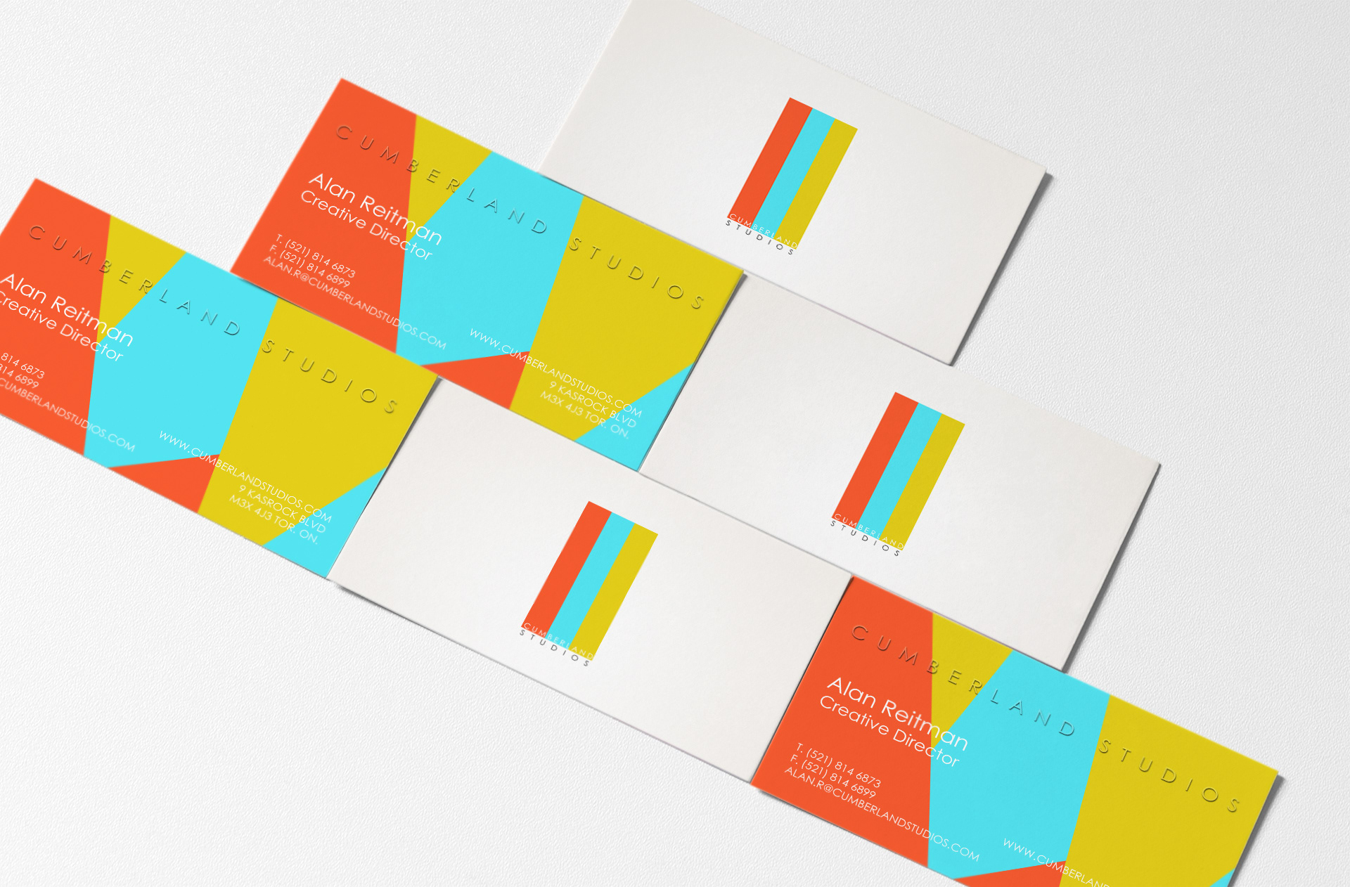
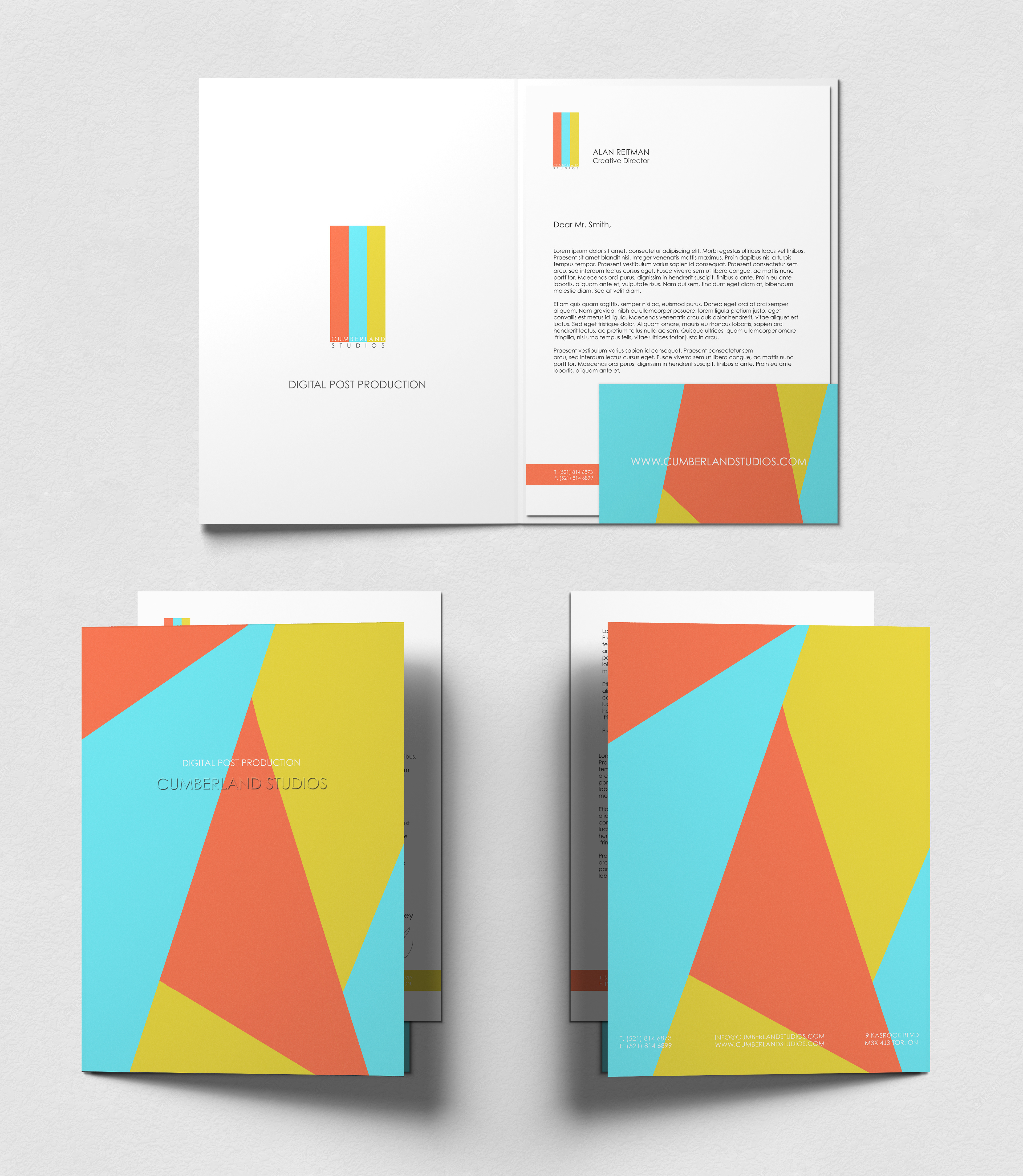
The Collateral
Color correction, one of the basics and primary functionality of post production work. So I decided to define the logo with the three primary colors: red, yellow, and blue and also made colors be the brand’s identifying look. I purposely chose to slightly offset those colors to show how altering colors is a major part of post production.
The design is balanced by perpendicular colored lines against white when the viewer needs to focus on certain material or with colored patterns to present a full section. The triangular shapes and bright colors give the project a modern look that is both unique and energetic. The shapes match the font style, with its sharp angles.

In the end the studio, like most studios, is an organization that provides services. So the bright palette not only provides the essence of post production work, but also give a sense of friendliness, and establishes the company’s culture.
03 Synopsis
CUMBERLAND STUDIOS
2016
The Vancouver based studio was just getting themselves off the ground when we were connected. It is a small agency filled with bright eyed, ambitious hard working dreamers, and we had great chemistry, since my mindset is essentially the same. They wanted a simple name to always remind them of their roots. So after some research and back and forth we landed on Cumberland Studios. Which was the original name of the location where they opened shop, before it was renamed in the 1920s.
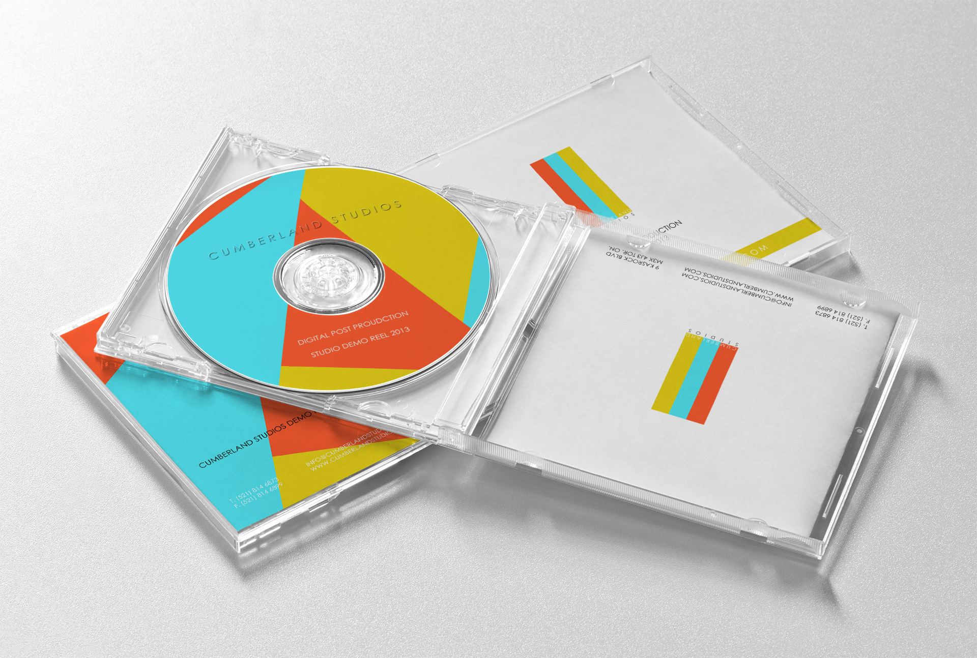
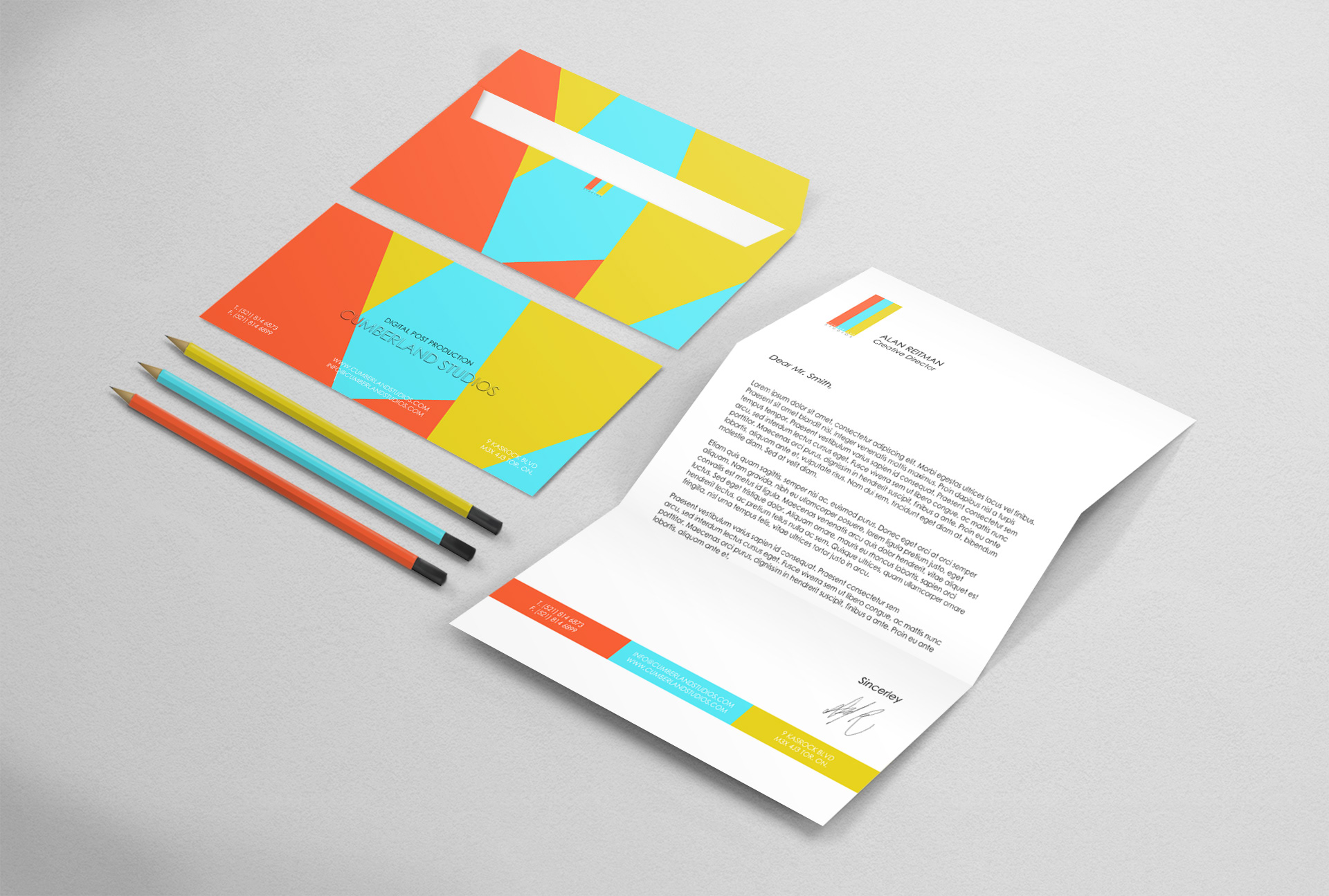
When the groundwork with the name, colors, and shapes was established the next key factor was to make sure the presentation was solid. From designing their demo reel cd, to the presentation folder, everything needed to be cohesive but not repetitive. It was a really fun challenge to have levels of hierarchy with the patterns and palette, to ensure when multitude of materials are presented together, it tells the same story, without really saying the same story.
___________________________________________
Thank you for viewing!