01 Overview
NOT EVERYTHING NOT EVERY TIME (VOL. 1)
A Collection of Editorial Portraits
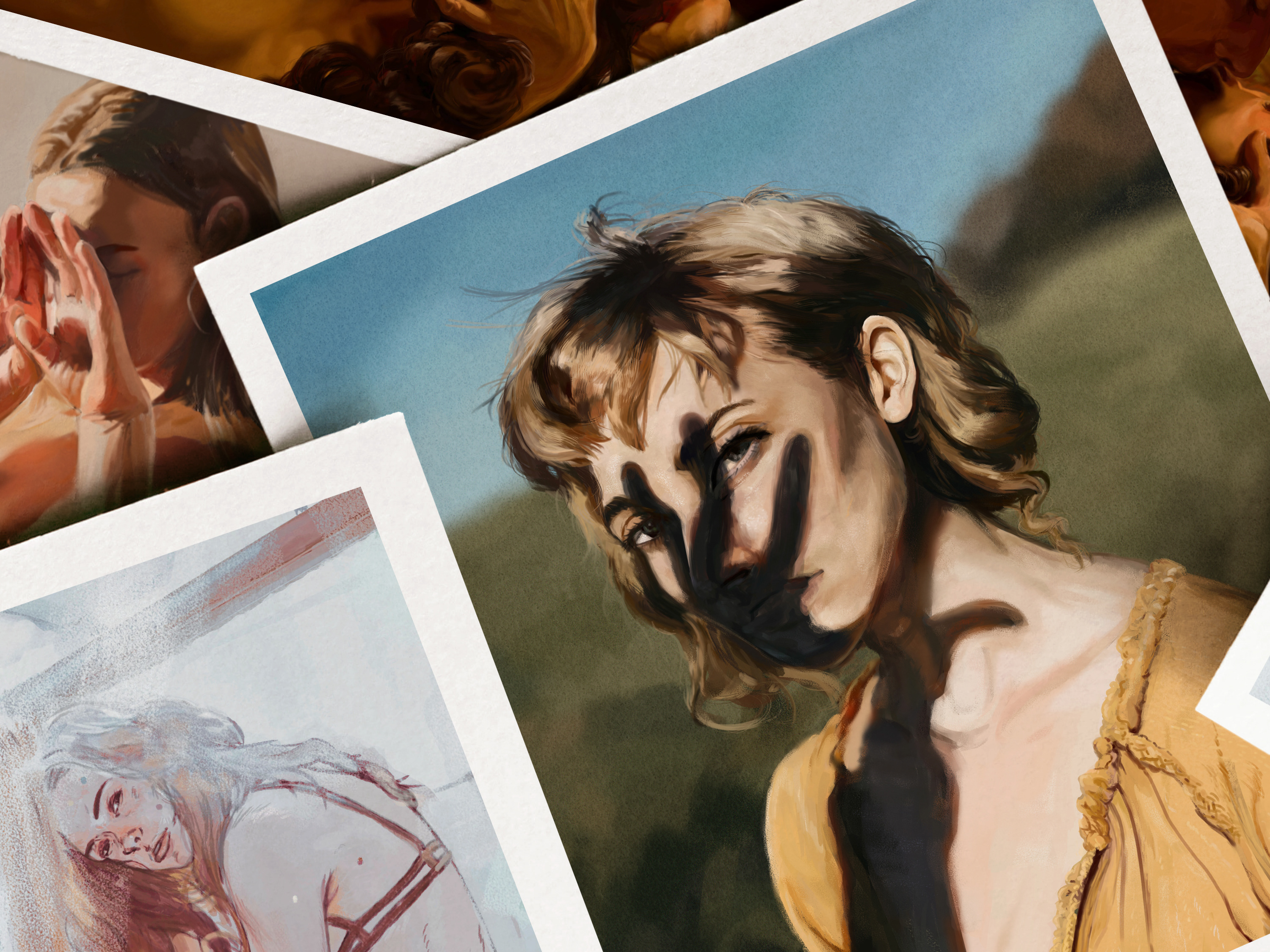
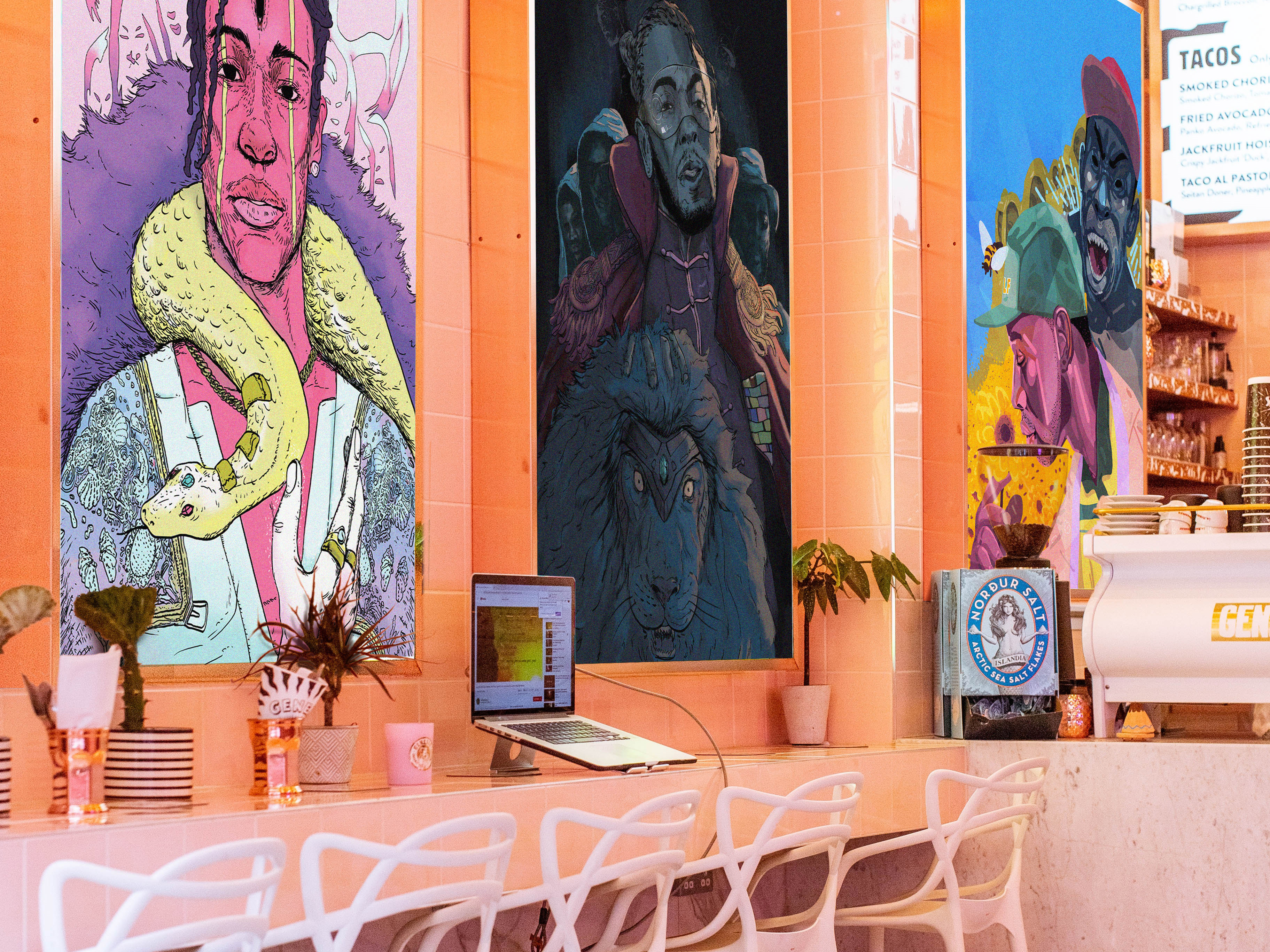
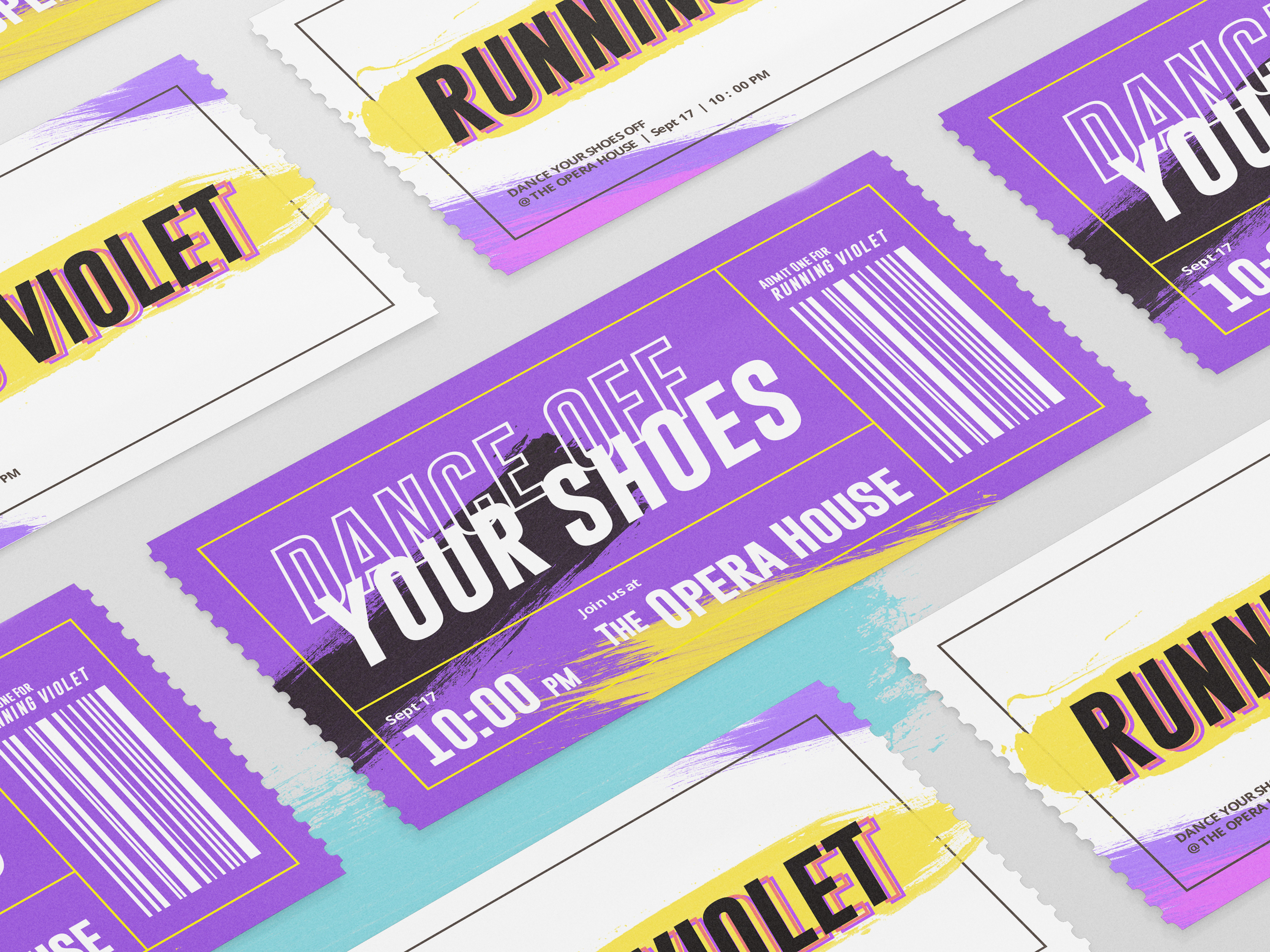
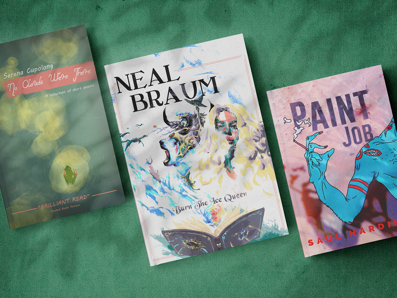
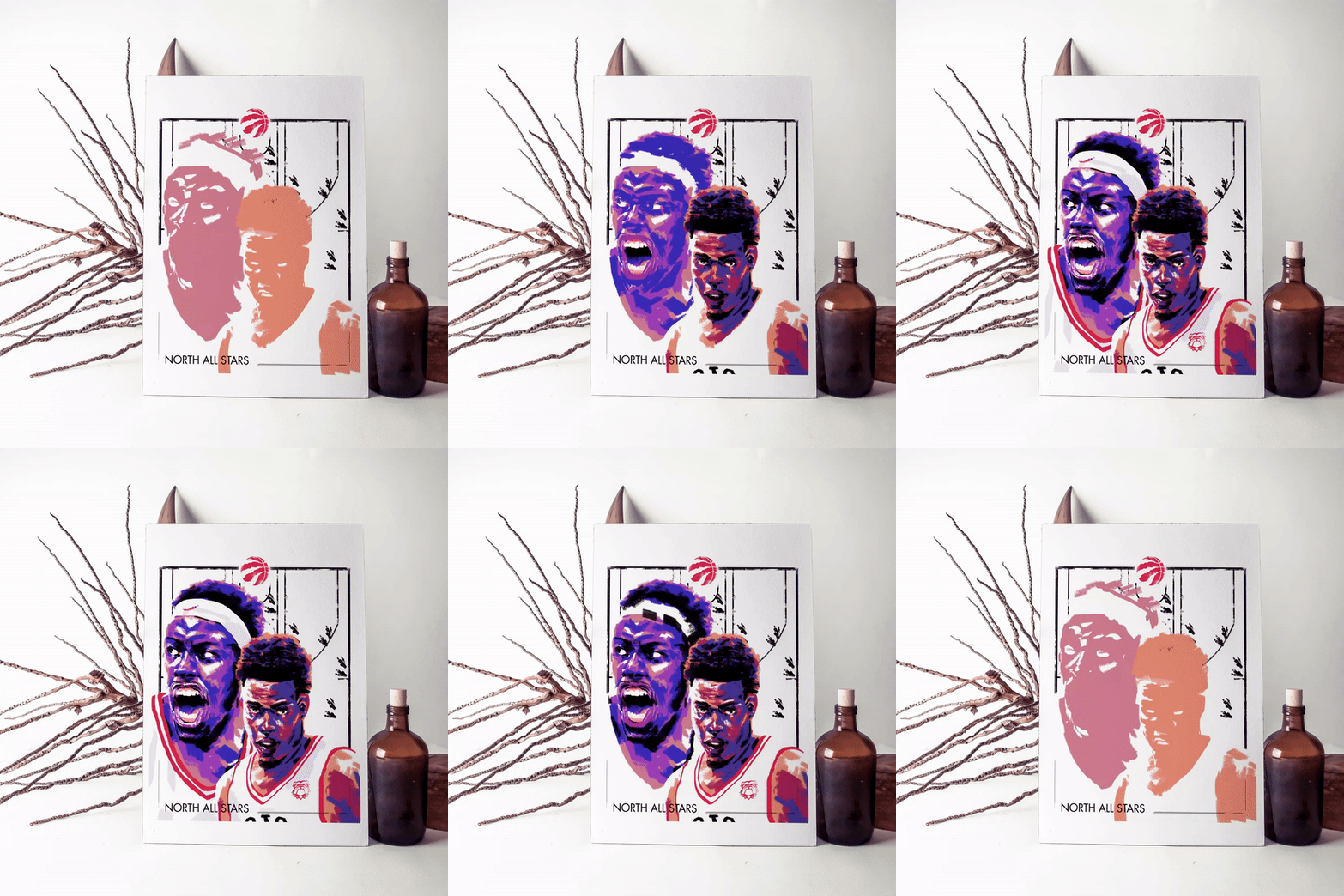
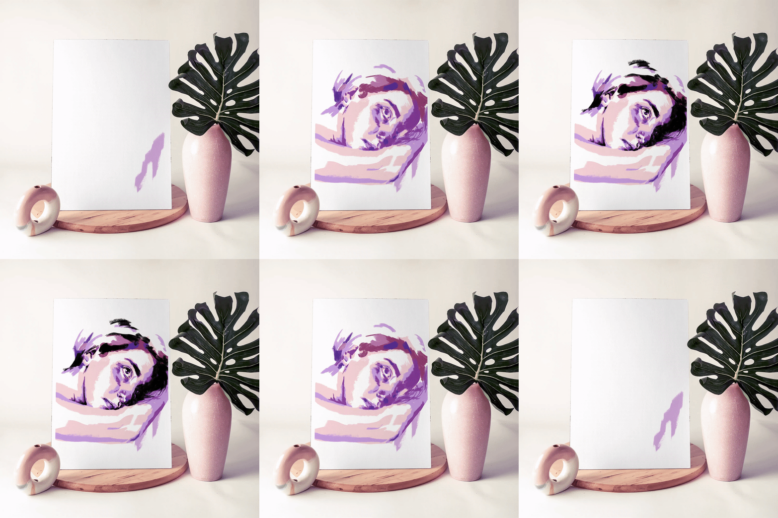
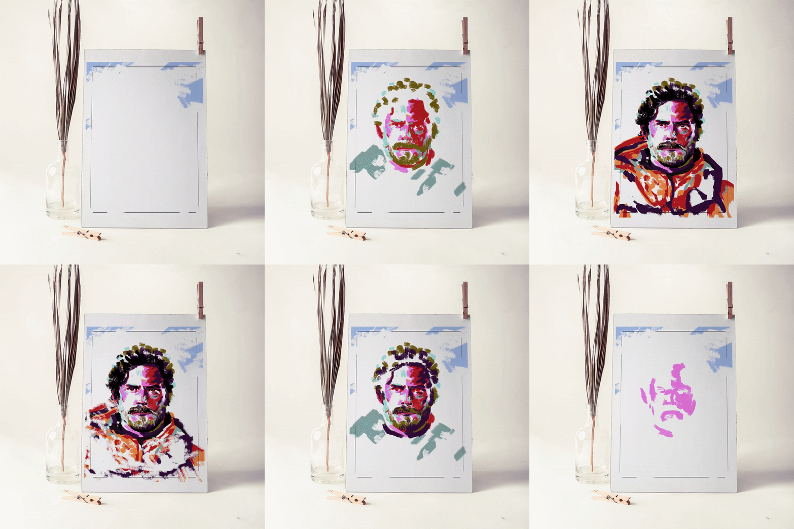
I wanted to create an illustration style, mainly for portraits or closeups, for editorial purposes. Something that is realistic in nature, bright and poppy in colors, efficient to create, and would look good in a cover of a magazine or a book.
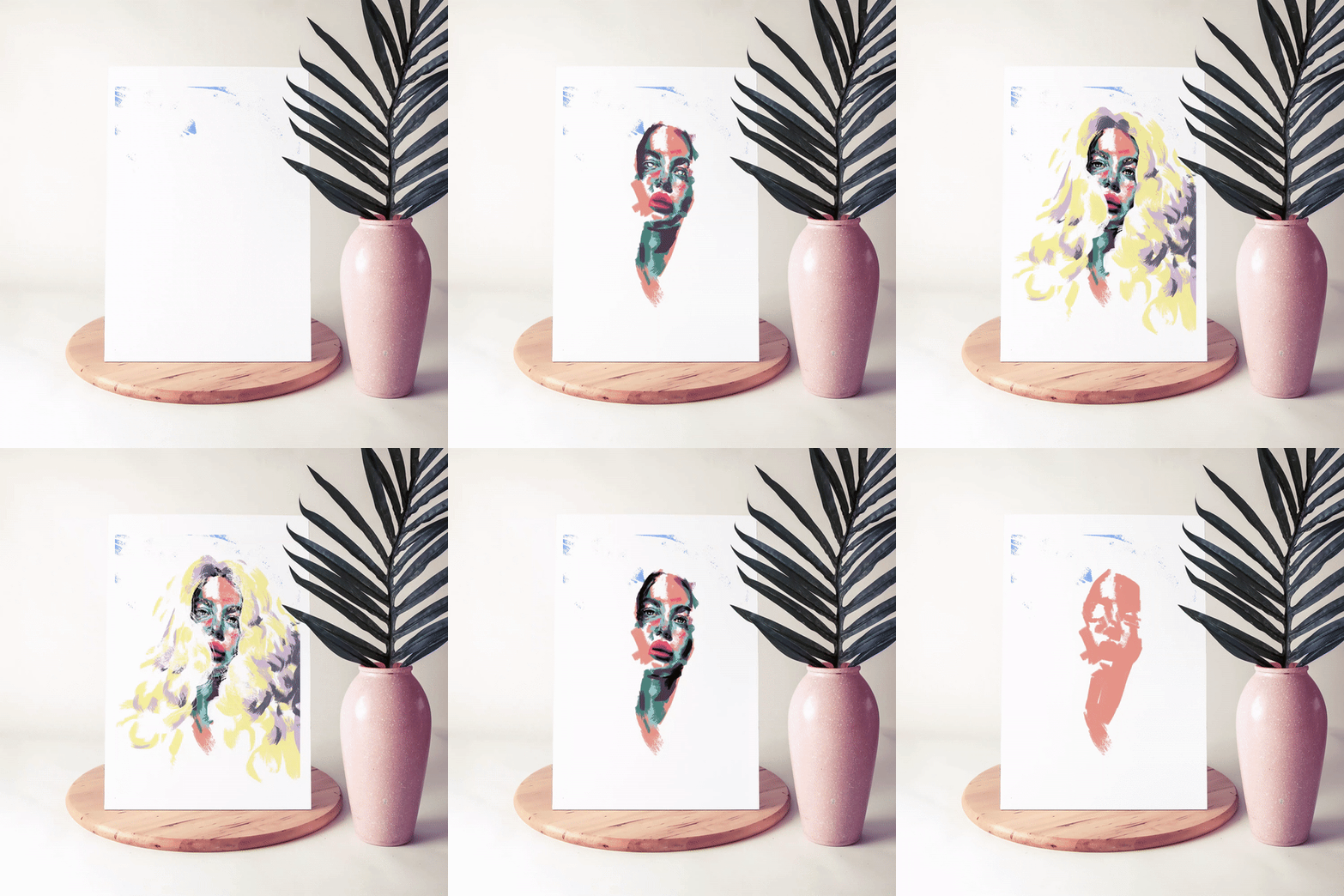
After playing around with several different styles, I've come up with something that fits the bill. Using only 4 to 5 colors per element (i.e. 4 to 5 colors for skin, 4 to 5 colors for clothing, 4 to 5 colors for hair etc). Also using the darkest black to overlay the bright colors, creating high contrast, and touch of inked finality to the style. These are four of my favorite pieces I've created using that style from January 2020 to June 2020, take a look!
02 Synopsis
NOT EVERYTHING NOT EVERYTIME (VOL. 1)
2020
I titled this series as "Not Everything Not Every Time" because an artist doesn't always need to create a full realistic painting in order to get the story across. In fact I have always felt that bringing out the concept from your head the fastest way possible is always the most fun. Why use 4 lines when you can get the job done with 2? I wanted to see how far I can strip down a realistic portrait and still get a similar feeling. I realized as long as the shapes are intact, no matter what color you throw at it, the portrait will still keep a sense of realism.
This style really suits me because I get bored easily, and once I get bored my work suffers. However this way I can keep playing around with different colors, and I can wrap up an illustration quite quickly leaving no time for me to get bored. Hope you enjoyed this collection, Keep an eye out for more to come.
___________________________________________
Thank you for viewing!


